We love a good optical illusion at Creative Bloq. Normally, it's just to take a break and mess with our minds for a moment. But sometimes optical illusions can be educational, particularly for anyone who works in graphic design.
Type designers will know that letter forms can play tricks on us. Sometimes an equal amount of space between letters looks wrong, requiring kerning adjustments. Sometimes a stroke of the same width can look thinner or thicker depending on whether it's vertical or horizontal. It's important to be aware of such illusions in font design, and a design studio has just created a handy resource, rounding them up in a blog post.
7 Optical Illusions in Type Design from r/typography
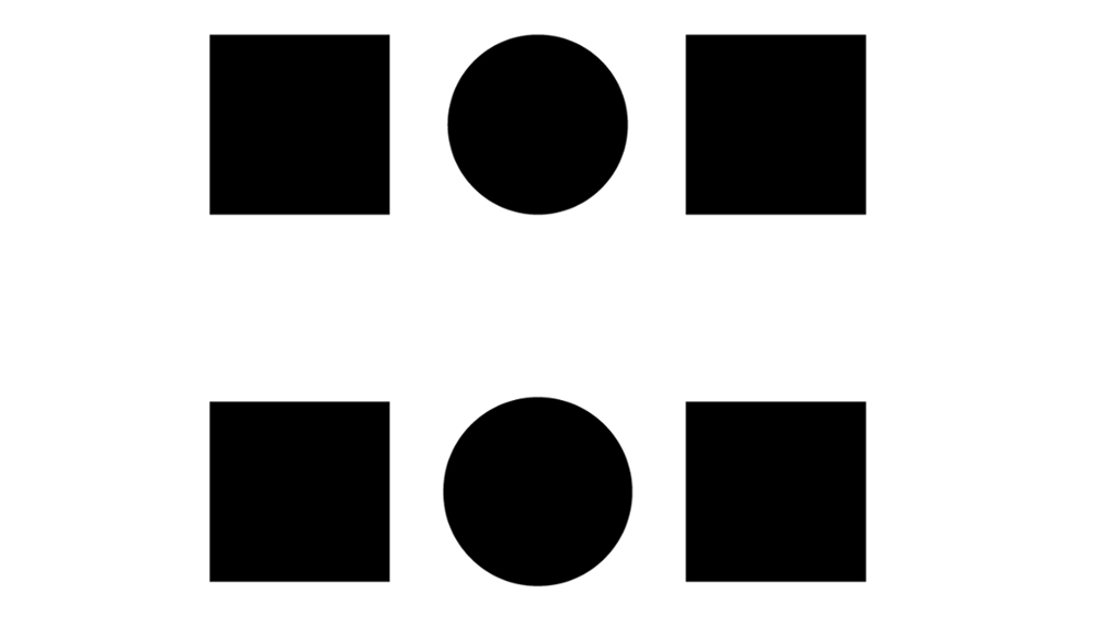
Nostalgic Dolphin is a studio founded by Igor Petrovic and specialising in branding, typography and UI/UX design. It's made a blog post presenting 7 optical illusions that every graphic designer should now, complete with illustrations.
The list covers the overshoot, which can cause curved or pointed shapes to look larger or smaller than shapes that end with flat lines, and the bone effect, which causes a disjointed look where a straight line meets a half-circle. Other culprits include sharp joint darkening, which causes a union to look heavy when two lines cross at a sharp angle, which can require use of an ink trap.
Read the full piece at Nostalgic Dolphin's website. For more on graphic design news, see the outdated design trends designers want to disappear.
.png?w=600)