As promised, the coalition government has released spending by over £25,000 by every department. The data is huge, comprehensive and somewhat overwhelming. Everything is covered: suppliers, grants, contractors, right down to the minutae - the basic running costs of business. Like postage, printing and the hiring of temps.
I was curious about this minutiae. How streamlined are these offices of government? And who really does spend the most on stamps? Phone calls? Electricity?
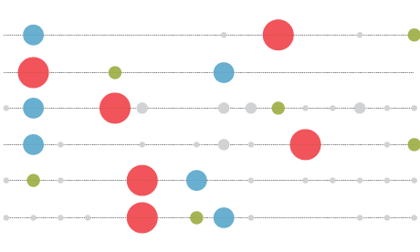
I worked the data, making sure it was proportion to each department's budget, and came up with this visualization. The percentage figures here are the percentage of each department's total spending, as released in the data today. The Foreign & Commonwealth Office were the last to release data, late last night, so they haven't been added to this yet.
Data here: http://bit.ly/beancounters
Additional research: Hanna Woodside
Additional design: Joe Swainson
About me
I run InformationIsBeautiful.net, dedicated to visualising information, ideas, stories and data. Twitter @infobeautiful. Explore my book of infographic exploria, Information Is Beautiful.
Can you do something with our data?
Flickr Please post your visualisations and mash-ups on our Flickr group or mail us at datastore@guardian.co.uk
World government data
• Search the world's government datasets
• More environment data
• Get the A-Z of data
• More at the Datastore directory
• Follow us on Twitter