- The most significant Google TV redesign since it launched
- A simpler, less cluttered design with AI features incoming
- Appears to be a limited test rather than a big rollout
The Google TV interface has been with us for a long time in tech years: it's barely changed since it launched in 2020, bar getting some slightly rounder icons last year. But now a more significant update is appearing on some people's TVs and, according to 9to5Google, things look rather different.
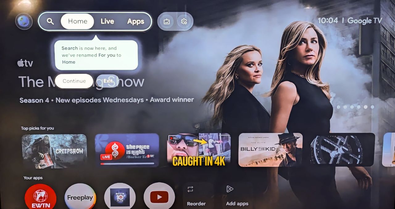
The first thing you'll notice is that all the navigation buttons now live in the top left corner of the screen, and there are fewer tabs than before: For You is now Home and it appears alongside tabs for Live and Apps.
The profile selection button is at the very far left and there's a new button to the right of the tabs for fast access to the screensaver settings. Your watchlist and library are accessed via the profile button, as are Your Services and your Content preferences. Those two previously lived in Settings > Accounts & Profiles.
What else is new in the updated Google TV interface?
The settings menu is no longer visible on the Home page, and for now we don't know where it's going to turn up. That's also where the Google Home features lived, so that's quite important.
This looks very much like a work in progress, because it's not appearing widely: it looks like Google is in early testing with a select few users rather than starting a rollout.
We know that there's more to come: Google is also bringing its Ambient Display home hub and its Gemini AI to the platform: as we reported back in January, it's getting a "hefty infusion" of AI smarts, improved photo gallery features and better recommendations.
One of the interesting Google TV features that's incoming is presence sensing, and the first TV to support it is now available: TCL's QM9K is the first Google TV with Gemini, and its sensors can wake the TV when someone enters the room to show them artwork, Google Photos and Gemini-created AI images.