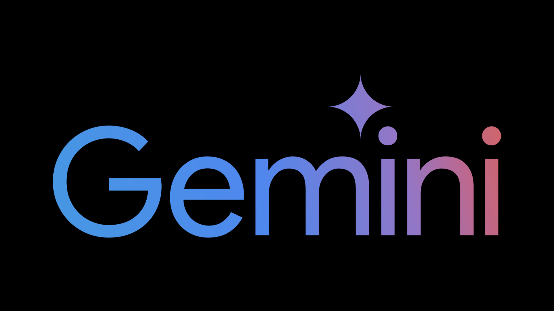
Since its launch back in 2023, Gemini has always felt a little estranged from the Google brand due to its contemporary design, but thanks to a little revamp, it finally feels like part of the family. While the tweaks are small, they make a mighty difference, proving the power of colour in Google's iconic brand identity.
I often find the best logos can capture a brand without being obvious, and Google's identity is a prime example of this. Timeless, simple and instantly recognisable, the new Gemini logo now effortlessly integrates into the brand, proving that it's not just an estranged AI tool, but a valued member of the Google Workspace.
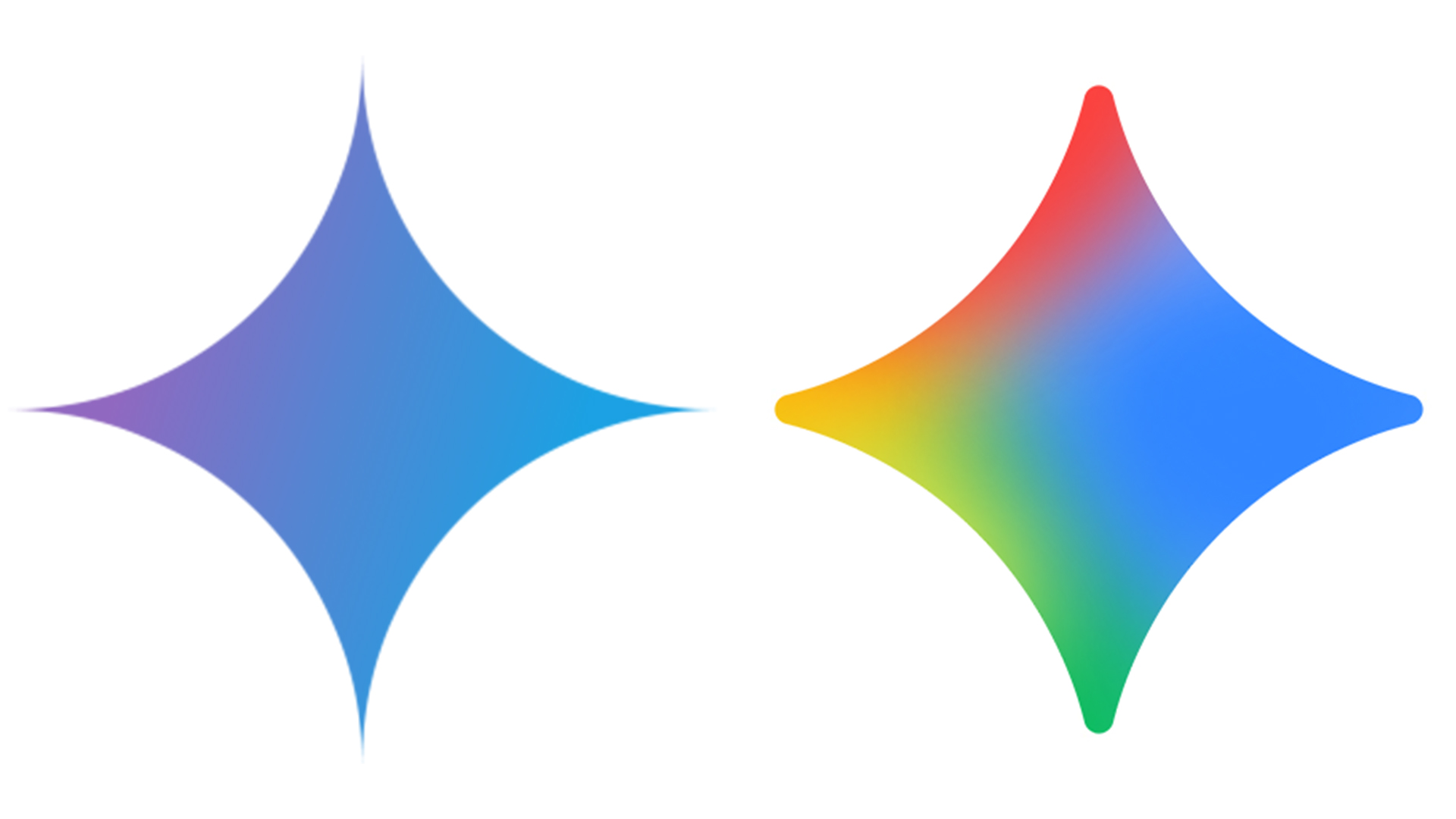
Gemini is known for its iconic star shape design (a motif that seems to frequently pop up in AI company logos), but the previous blue and purple colour scheme left it feeling isolated from the Google brand. The new look features a gradient of Google's signature red, yellow, green and blue, alongside curved points that give the design a softer, more organic appeal.
Gemini's updated logo is a prime example of Google's strong brand identity. Instantly recognisable thanks to its vibrant colour makeover, the new design remains graphic and scalable, while still being consistent with Gemini's original look. (If Google could just fix its janky AI overviews now, that'd be great.)
For more design news, take a look at the new Google logo that's proving popular online, or check out TripAdvisor's hot new logo that was announced in the most unexpected way imaginable.