Enjoy our content? Make sure to set Android Central as a preferred source in Google Search, and find out why you should so that you can stay up-to-date on the latest news, reviews, features, and more.
What you need to know
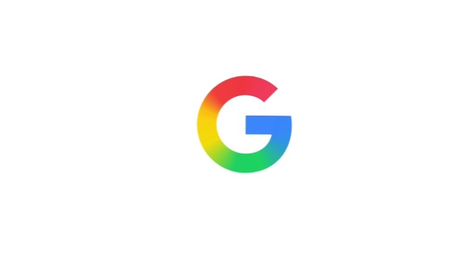
- Google’s icon “G” logo gets a new look, with the old blocky colors now gone, replaced with a clean gradient blend.
- The design aligns with Gemini and other AI branding, signaling Google’s AI-first direction.
- Only the standalone “G” got the refresh, while the full “Google” logo remains unchanged.
After a decade without major tweaks, Google has quietly reimagined its iconic “G” logo, and the shift is more than just cosmetic. The new version replaces the rigid, blocky color divisions with a smooth gradient blend, resulting in a more modern and fluid look.
Google says this update shows its growing focus on AI. The new gradient, which blends red, yellow, green, and blue, matches the look now seen in Gemini and other AI-related branding.
Although subtle, the new design also aims to enhance the logo's appearance at smaller sizes (such as favicons and app icons). The smoother transitions reduce visual hard edges and help the logo sit more harmoniously next to other app icons.
The change first appeared in the Google app’s iOS version and on Pixel phones. Soon after, the Android version (via Google app version 16.18) adopted it too. On the web and within some Android environments, the old version still lingers, though that’s expected to change.
Meanwhile, Google Home’s logo was quietly updated to match the new gradient aesthetic, at least in the iOS version of the app.
Wordmark stays put

Nevertheless, Google left its wordmark alone, so the familiar “Google” lettering stays the same for now. The update focuses on the “G” icon, which serves as a key visual for the brand.
Also consistent is the brand’s commitment to its four signature colors. The difference: instead of hard boundaries, those hues now flow into each other.
This redesign may be seen as a smart play: the tweak feels evolutionary rather than disruptive.
Going forward, we’ll have to wait and see whether logos for Gmail, Maps, Chrome, and others will also go the gradient route. But given how the new “G” is being positioned, it’s hard to imagine those staying rigidly block-colored forever.


