What you need to know
- Google is rolling out a redesign for bookmarks on Android phones, doing away with icons displayed alongside links.
- The change will now provide a preview to the website for saved links in a bookmark folder.
- The change follows a month after Chrome's new tab redesign on Android and shortly after Google's latest browser improvements for tablets.
Google is rolling out a user interface change for our favorite web pages in Chrome on Android.
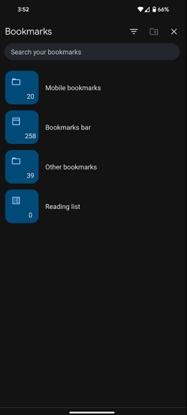
The change is rolling in as part of Chrome 120 for Android devices, as spotted by 9to5Google. Chrome's new bookmark page shows much larger blue folders indicative of the "core" folders for mobile bookmarks, bookmarks bar, other bookmarks, and the reading list.
A preview image for these folders isn't always guaranteed, however, they appear more prominently in another area.
The web pages you've saved directly now appear a bit larger, partly due to the preview image that accompanies them. It's a notable change as, previously, Chrome displayed the icon of the destination instead of any preview.
This design choice shows about nine bookmarks in a single view, unlike Chrome's previous behavior of squishing more onto your screen sans any preview.

As previously mentioned, this update is rolling out for Google Chrome on Android devices only at the moment. We've spotted the change on our devices, which means it should be quite widespread. If the update has not reached you, check the Play Store for an update.
Apple's iOS has yet to receive the update, but it shouldn't be too far behind.
This is the second Chrome redesign to come in recently, with the first arriving in November for the browser's new tab page on Android. Material You's design influence revamped the "Frequently Visited" websites portion, placing them in a rounded corner box with a colored background mirroring your phone's coloring.
Moreover, the company enlarged the pill-shaped search box, which looks very similar to the changes done to the main Google app.
Additionally, Google recently highlighted detailed a change arriving for Android tablets, stating such devices will now view websites in desktop mode by default. This concerns "premium tablets" (a 10-inch display minimum) and will solve some limitations revolving around tablet users' former option of forcing desktop views.
Websites should appear much more natural on Android tablets, with proper scaling, alongside the option of reverting to mobile view, as well.
King of the Androids
The Google Pixel 8 Pro continues to attract the eye with its design and rounded corners. The flagship provides a strong 50MP primary camera and, internally, there are several AI-based features ready to clear up your recorded videos and photos. The Pixel 8 Pro is the best friend to have for capturing memories or for controlling smart home devices.