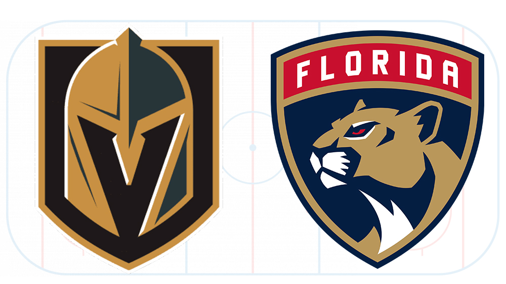
Tonight sees the Golden Knights vs Panthers NHL clash in the Stanley Cup Final. Taking place at the T-Mobile Arena from 8pm ET, it's the fifth game in this year's elimination tournament to decide the winner of the NHL post-season trophy.
The Golden Knights have won three games so far, meaning they need just one more victory to clinch it. But what we're concerned with here is the much more important issue of how the teams compare in terms of design. Below we pitch Golden Knights vs Panthers in an NHL logo battle to see who comes out on top (see our pick of the best sports logos of all time for more winners).
The Vegas Golden Nights logo
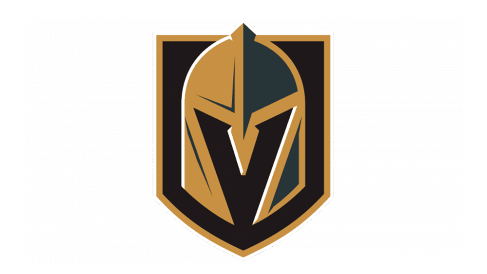
The Vegas Golden Knights are a very young team in the NHL, having only started playing in the 2017-2018 season. This relative modernity may be why it has such a unique logo design. Unlike many NHL logos, the Vegas Golden Knights didn't take inspiration from a mascot (the team's represented by a gila monster lizard called Chance – we feel there's a missed opportunity here.)
Introducing the Golden Knights mascot, CHANCE! pic.twitter.com/2VCu9H93MuOctober 14, 2017
The design does however make clear reference to the team's name. It shows a knight's helmet on a shield framed in gold. There's enough detail to give the mark some depth, and it may be a coincidence, but the use of black reflects initial plans to call the team the Black Knights (the team is owned by Black Knight Sports & Entertainment).
On top of that, we have what is one of the most clever uses of negative space we've seen in a sports logo. The space between the protective elements of the helmet, where the wearer's face would be, is designed to form of a 'V' for Vegas. This makes up for the lack of text in the logo. Now, we're big fans of textless logos, but for such a new team, the lack of written identification could make it hard for them to gain recognition among more casual hockey fans.
All in all, the Golden Knights logo feels serious and intimidating enough to put fear into its Stanley Cup final rival in our Golden Knights vs Panthers logo battle. The heraldic theme recalls knightly contests linking this very young team to a long sporting tradition.
Florida Panthers logo
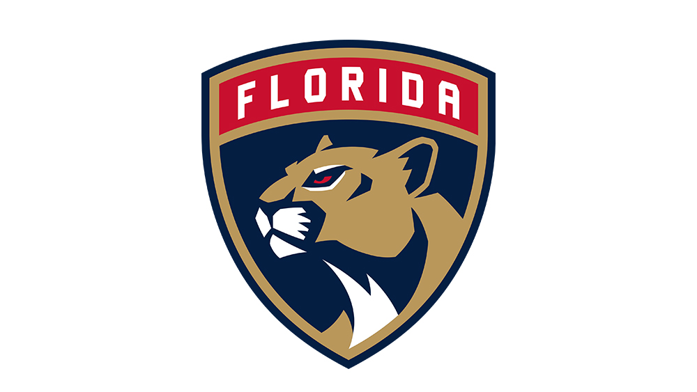
The Florida Panthers logo has changed a few times over the years since the team has been around since 1993. Like the Golden Knights logo, the current design takes the shape of a field. In this case, it contains a panther and the text 'Florida'. The use of text in the logo leaves less doubt as to what team is represented, and the team colours of red, blue and gold are also well-established by now.
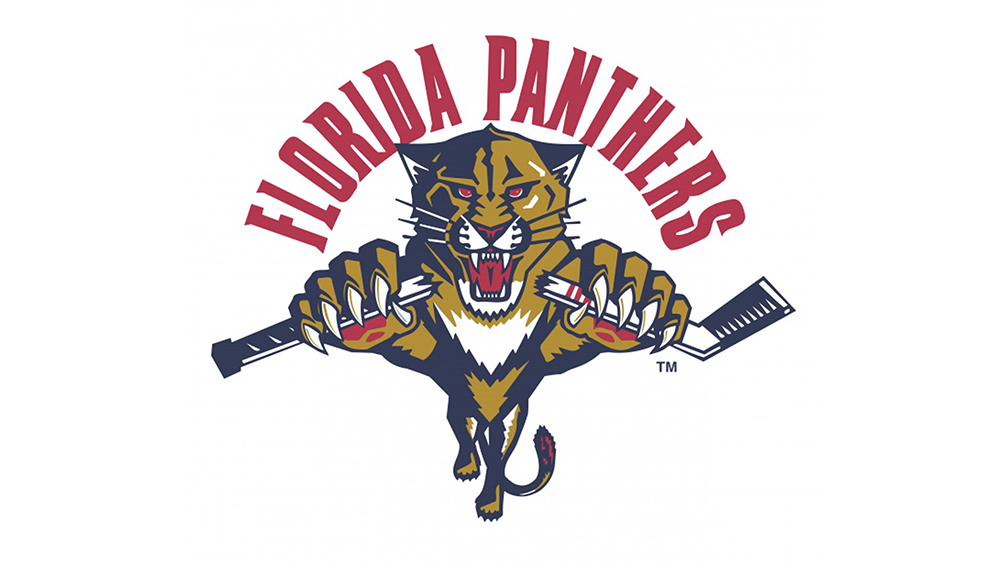
The current 2016 design is a more mature, stoic and reflective evolution from the previous logo, which showed a panther in a more aggressive stance leaping directly at the viewer with its claws ready to tear into their flesh. An alternate version of this logo even showed the panther snapping a hockey stick. Raa!
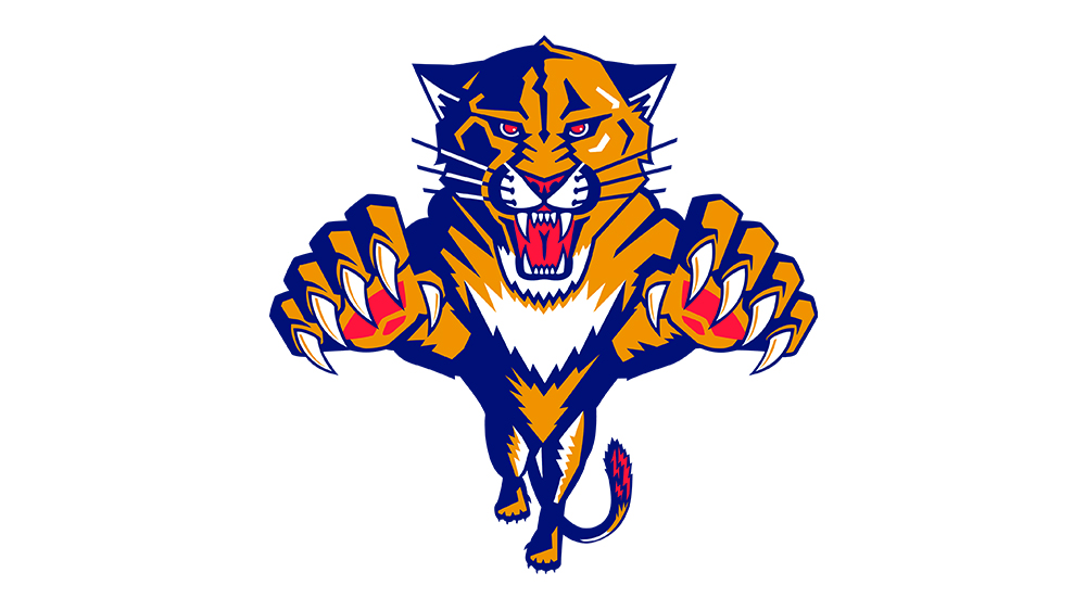
So who wins in Golden Knights vs Panthers? It's a tough call. The current Panthers logo today is very smart, and its simplification has made it more usable while also reflecting the evolution of a more mature team. But is that what we want in an NFL logo? Or do we want a leaping wild cat ready to draw blood? The logo feels like it's been tamed.
On the other hand, while we'd much prefer the Golden Knights to be called the Vegas Gila Monsters, the logo has a knightly menace to it. Best of all, its use of negative space puts it up there with the Minnesota Wild logo as one of the cleverest designs in the NHL. I think we have to hand this one to the Golden Knights.
For more sports logo clashes, see Golden knights vs Panthers.