Here's a rare thing these days, a rebrand everyone loves. After 20 years of having the same design, Remedy Entertainment, the game developer behind hit PS5 and Xbox games Control and Alan Wake, has redesigned its logo, and fans love the results. If that weren't enough, there's a secret hidden in here too.
After the disastrous HBO Max logo that stripped back the brand to simply Max, it's easy to think all mainstream rebrands are a mess these days. After all, Max is the name of your mum's boyfriend, not one of America's biggest streaming services. For game developer Remedy Entertainment to rebrand after 20 years is a big step, but this signifies a break with the past and celebrates the deft storytelling and innovation of today's Remedy.
The game developer won countless plaudits for its last game, Control, a dimension-shifting surrealist adventure with an outstanding visual style. The new logo embraces this aspect of the studio; a visual identity that represents the developer moving forwards and experimenting with new ideas and art styles.
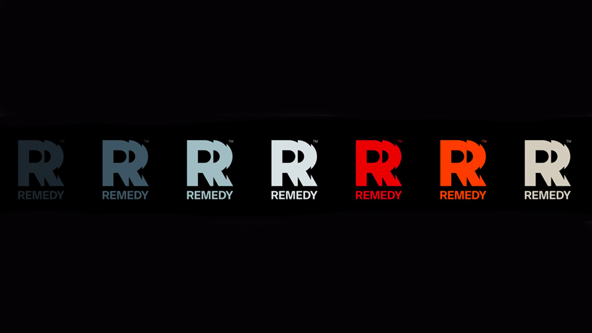
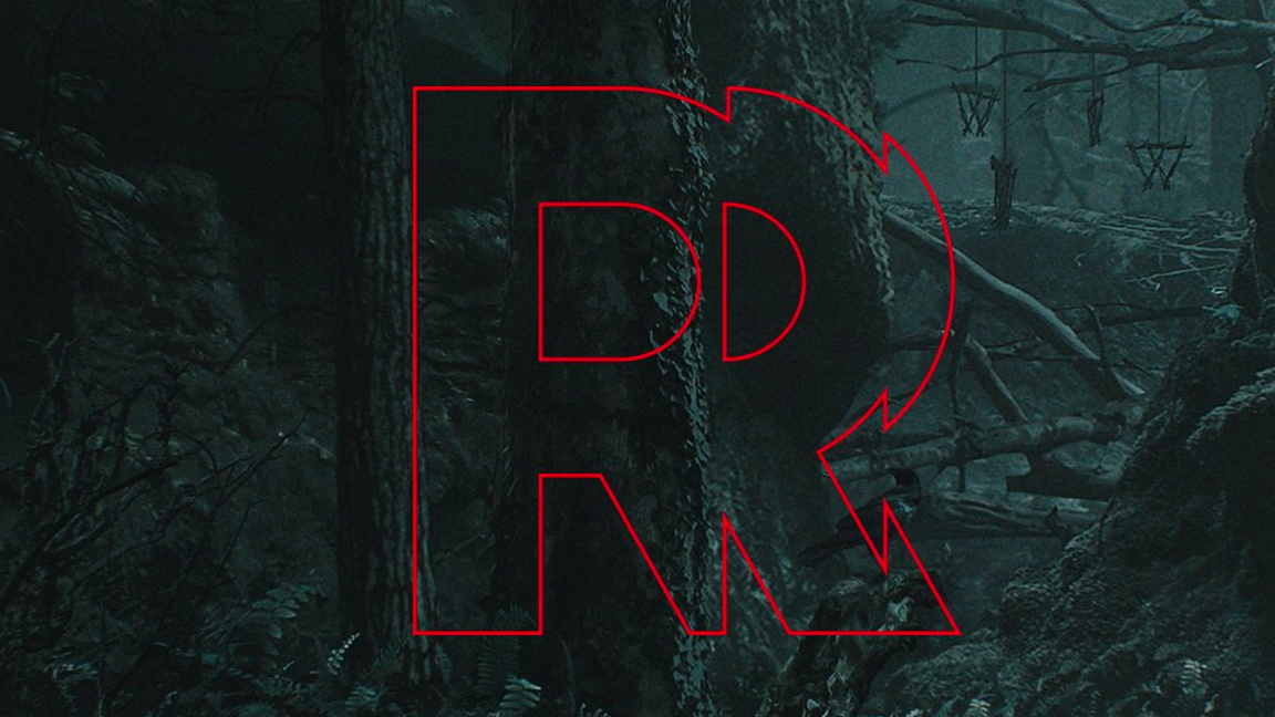
The new Remedy logo is made from three letter 'R's chopped and stitched together as if the letter itself is moving; the curved right side of the R is shaped into an arrow and the points of the character form further arrows, pointing in new directions.
On the Remedy blog communications director Thomas Puha wrote: "We want to create memorable worlds, stories, and characters for you to experience through our games. We wanted our new logo to reflect how we constantly evolve and continue creating exciting games with the very best people. However, it’s all still one Remedy where courageous creativity thrives. We hope you like the new look."
Fans are happy with the approach, too. Writer Ashley Esqueda took to Twitter to say, "Oh, this is a GREAT new logo!" while artist Rowan wrote, "congrats guys you’re officially a million times cooler now". My favourite is reserved for whoever writes the GOG.com Twitter, as they simple typed: "you could say the old logo situation has been... remedied."
The new logo launched against a wooded backdrop and teased a hidden message to fans. Along with Control, the horror game Alan Wake has been a huge hit, and the logo's backdrop references this year's sequel, Alan Wake 2.
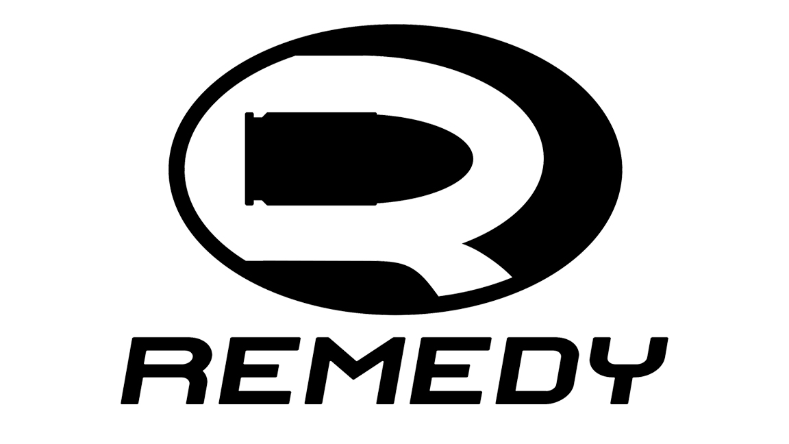
The previous Remedy Entertainment logo also featured a hidden message, of sorts. The old logo, used when Remedy was known for the Max Payne shooter series, had a hidden bullet designed into the dead space of the letter R. I've been looking at this logo for 20 years and have only just noticed it.
We've been on a run recently of poorly received logo rebrands, with the Still, the recent impossible to read Kia rebrand and Nokia's move away from mobile getting fans of these brands riled up. It's nice, then, to find a logo change met with excitement and applause – I for one, love the new Remedy logo.