Gallery: How the MEN website has evolved since 2000
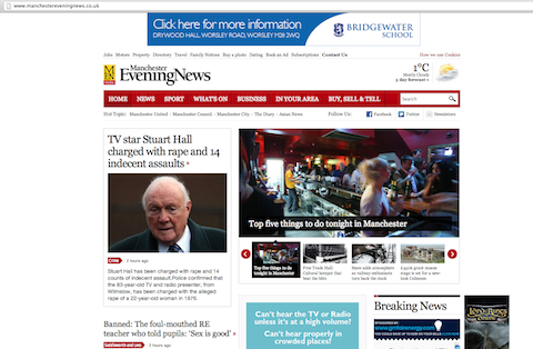
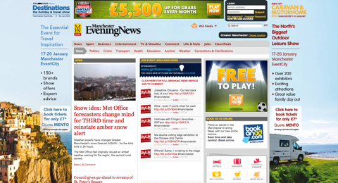
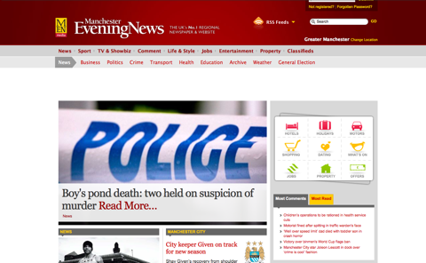
Launched on January 23. A fresh new look with more pictures and white space. The breaking news element given more prominence and a map to explore stories features below the scroll.Photograph: Public domainVery recent version snapped on Friday 18 January. Very colourfully commercial with that blue wrapround advertisement drawing the eye around the full width of the screen. Illustration: guardian.co.ukBack to 2010 when a large photograph dominated and the prominent links to a directory on the right-hand side. Also interesting to note the very easy to find RSS feeds flagged right in the centre of the masthead and searchbox.Photograph: Public domain
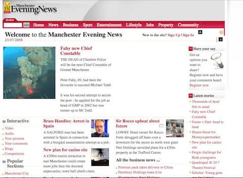
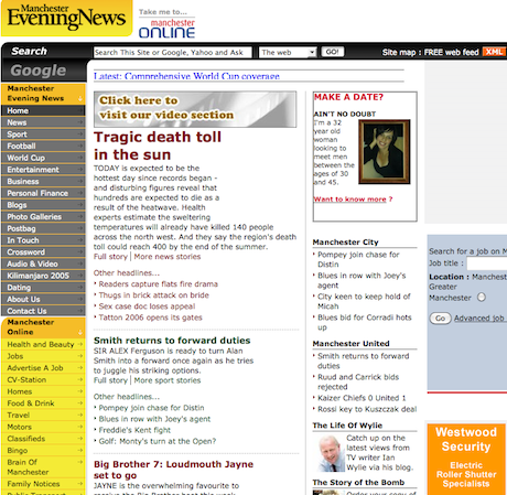
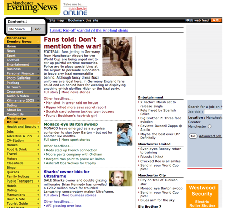
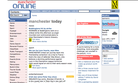
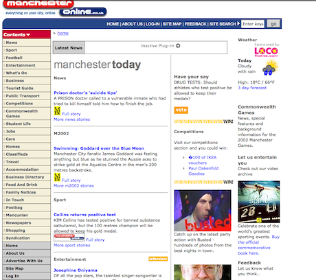
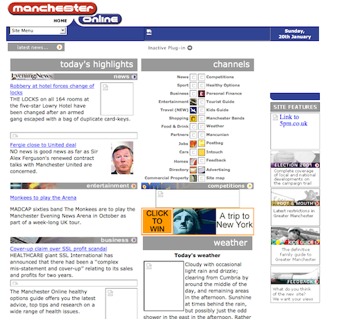
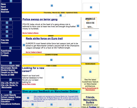
The design stayed largely the same in 2007, 2008 and 2009. The importance of user contributions now more visible as can be seen reflected in their location on the left-hand side under the 'interactive' tag in addition to the 'your comments' button on the prime real estate of the top right. The white space in the centre would have been used for advertising.Photograph: Public domainWell hello video! Right at the top of the page, an invitation to visit the video section. The convergence programme with Channel M was underway, broadband connectivity more commonplace and video journalism was eagerly embraced. Photograph: guardian.co.ukYellow, yellow everywhere! 2005 and the first MEN website which attempted to also incorporate its predecessor Manchester Online. As you can see, high story count on the home page started to be important.Photograph: Public domainAnd now all the way back to before the MEN site with its own domain even existed - 2004. There was still a Boddingtons and it looks like Selfridges needed staff. The red and blue were intended to be balanced in order to keep the football peace. Missing content .The Fugitive, in the centre there was an interactive treasure hunt style game around the city.Photograph: Public domainIt's Commonwealth Games year and a dedicated section, M2002, attempted to follow all the action. Still pre-MEN domain but now the different sources of content from around the organisation were flagged up with logos. The 'busted' image visible there pre-dates the sort of activity you'd now get almost exclusively on Facebook - snaps of people out and about in Manchester's pubs and clubs. The large Harold Shipman archive of content has just crept above the crop there too.Photograph: Public domainQuite a different look in 2001 with the navigation via 'channel' buttons in the middle of the screen. At this point the website also had a 'splash' screen which came before the user arrived at this content. The pre-page contained a featured image of something Manchester related.Photograph: Public domainFinally, the rather sad remains of the 2000 version with lots of bits missing now. If you squint carefully you can just see there was a link to 'postbag': "Friends, Mancunians, Surfers". Seems quaint now! Comments hadn't been introduced yet and online users had to put up with comments from a previous day's newspaper with no way to respond back. The left-hand navigation also shows a link to Eyewitness which was a brilliant, probably ahead of its time, photo archive of the city from Aidan O'Rourke that ran for some years.Photograph: Public domain
Sign up to read this article
Read news from 100’s of titles, curated specifically for you.