From Nasa to Ikea: the story of the classic font Futura
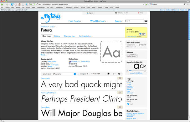
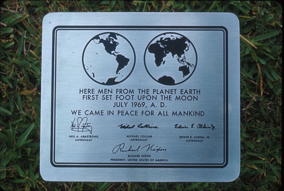
Futura, a range of sans-serif typefaces designed in the 1920s, is the most enduring work of the Bauhaus-influenced German typographer Paul Renner Photograph: Myfonts.comIt is loved worldwide for its clean, elegant curves – especially by technology companiesPhotograph: Justin Sullivan/Getty ImagesThe font has even gone to the Moon: Nasa decided to use it for the plaque left by Apollo 11 astronauts 40 years ago Photograph: Charles H Phillips/Time & Life Pictures/Getty Images
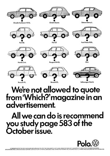
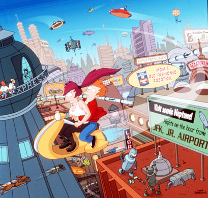
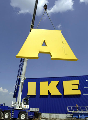
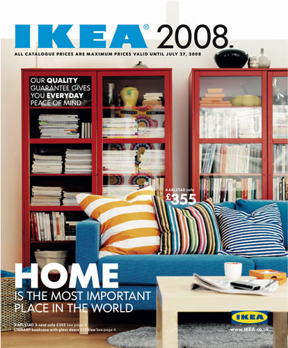
One of Futura's most iconic uses is in the branding of German car giant Volkswagen – seen here in a 1978 advert – which uses a custom-designed variant (they even decided to christen the world's first gull-wing-door people carrier the 'Futura')Photograph: AdvertAs well as being Stanley Kubrick's favourite font, Futura has cropped up repeatedly on our screens, notably in Matt Groening's cartoon series FuturamaPhotograph: Sky TVNow it's all change at Ikea, which has ditched its version of Futura in favour of Microsoft's web font Verdana, designed by Matthew Carter (the company's logo typeface is different, but we just loved the picture) Photograph: Jens-Ulrich Koch/AFP/Getty ImagesSo here's a final glimpse, as seen on the cover of Ikea's 2008 catalogue: enjoy it while you can …Photograph: PR
Sign up to read this article
Read news from 100's of titles, curated specifically for you.