Rebrands can go in various directions, from delicate visual refinement to downright existential chaos (hello, Twitter [or X [or whatever you're called now]]). One way things don't traditionally go is backwards – the design world often has a penchant for trend-hopping (sorry, 'pivoting'), hence why it can feel like every logo looks the same. But it seems a few brands are opting to lean into their heritage, with impressive results.
Some of the best rebrands we've seen in recent years have involved brands doing away with plain, flat design in favour of something from their own past. Old logos are making a comeback, with everyone from Burger King to Burberry to Co-Op to Kodak releasing modernised versions of previous designs. (Of course, many of the best logos of all time are so iconic that they'll probably never be retired in the first place.)

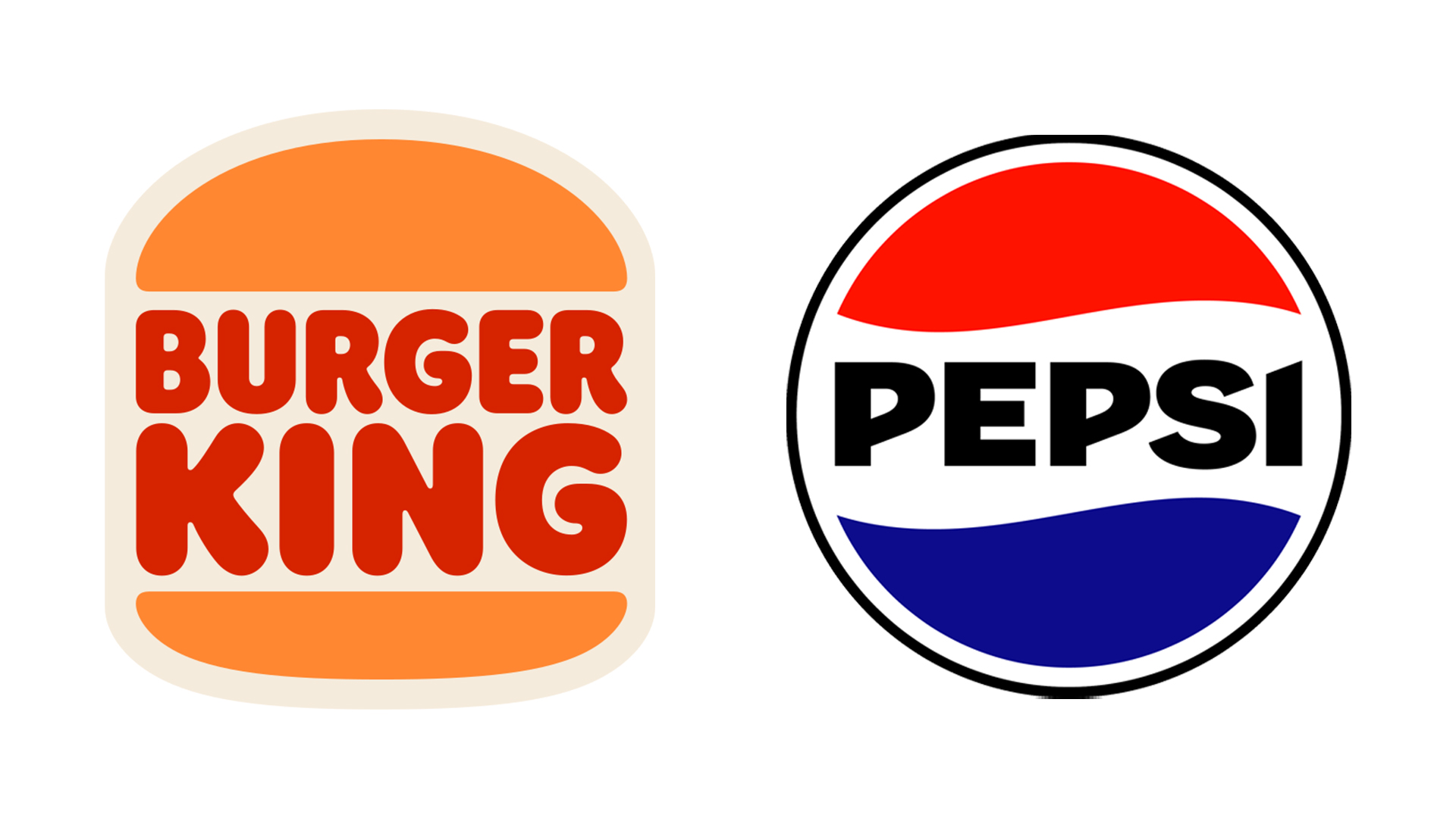
One of the most notable 'retro' rebrands we've seen in recent years is Burger King's 2021 effort. Evoking 1970s psychedelia and featuring a bespoke typeface titled Flame, it manages to combine flat design with vibrant colour in a way that somehow feels both classic and contemporary. But it's the logo that stands out the most, with its design practically lifted from the existing 1969 iteration.
The result was a hit, and at the time we were particularly impressed with how the brand managed to join the flat design party in such a celebratory, personality-driven fashion. The rebrand became one of the most talked about of the year, and the brand itself claimed that it was a throwback to when it "looked at its best".
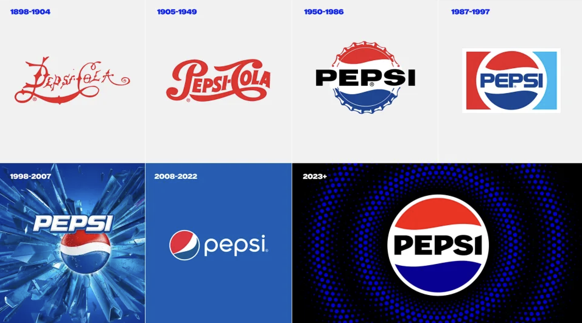
We saw something similar from Pepsi this year. Unlike the 2008-2022 logo (still most famous for its hilarious leaked design blueprint), the new design is a nod to a past design. From 1962 - 1991, the name 'Pepsi' sat in the white negative space of various iterations of the logo, and the 2023 design places it right back where it belongs. But rather than a carbon(ated) copy of a previous design, this new version features bold, black text.
"We wanted to create something that nods to Pepsi’s past but leaps boldly into the brand’s next chapter, PepsiCo's chief design officer, Mauro Porcini, recently told Creative Bloq. "We thoughtfully transformed the type, palette, and logomark. Black – that same black in our Pepsi Zero Sugar identity – paints the wordmark, outlines the globe, and blends into the blue to radiate into the world with a new, ownable Pepsi pulse."
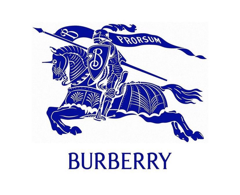
And then there's Burberry, which is winding the clock back further than the 1960s. In fact, it's taking things all the way back to 1901. Earlier this year, the fashion house went back to its roots with a new "archive-inspired" sans-serif look. And the company also resurrected its 1901 '‘Equestrian Knight Design’ (EKD) symbol for good measure (above).
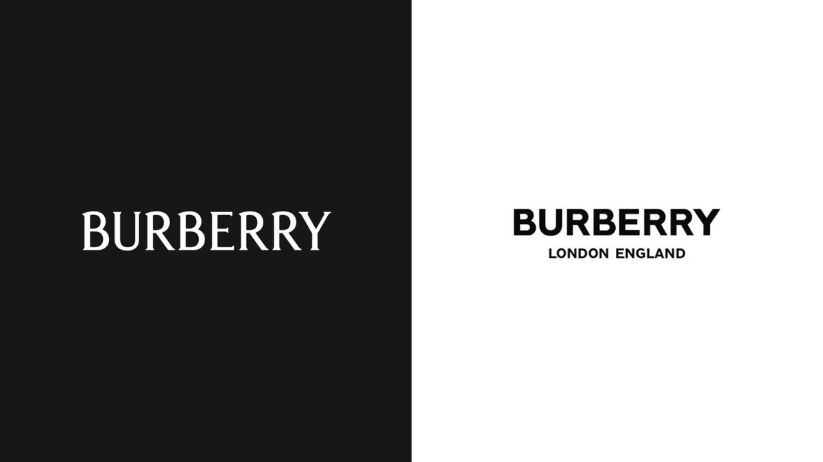
The rebrand comes as new chief creative officer Daniel Lee has taken over the company. According to Burberry, "The original Equestrian Knight Design was the winning entry of a public competition to design a new logo, circa 1901. The design features the Latin word 'Prorsum' meaning 'Forwards'."
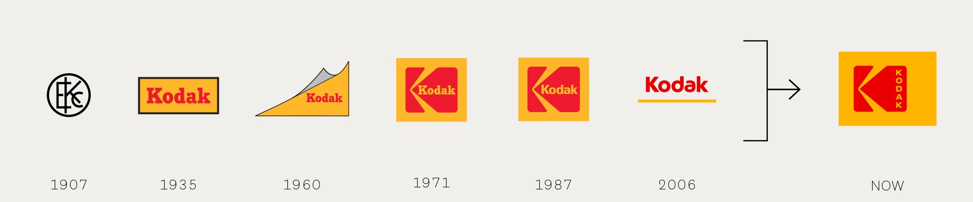
And these are by no means the only retro logos we're seeing reemerge with a modern twist. From Co-Op to Kodak and Citroen, we've seen lots of old logos become new again in the last few years. So why are brands starting to take a leaf out of their own history books?
Ben Behrooz, Founder & CEO of Branding Los Angeles, has an idea. "I don’t think I’m going too far out on a limb to say that, as a culture, we’re going through a challenging time right now," he recently shared in a LinkedIn Post. "These simplified old-school aesthetics can be reminders of what seems like an easier time... even for younger people who don’t remember the first go-round, the designs themselves tend to be softer and simpler, with a more humble use of color and shape. It’s not hard to see how this approach can make brands seem friendly, relatable, reliable, and comforting."
And of course, it's no secret that trends – design or otherwise – tend to run in cycles. Things that were once in fashion become the pinnacle of uncool, then come right back around. On the way back up now is ye olde Y2K aesthetic. And hopefully, it'll be a long time until Corporate Memphis becomes cool again.