In a world of finite time and apparent infinite choice, how are publishers encouraging readers to stick around? And how, especially, are they persuading them to stay for the longish reads? One answer is to provide visual or text-based cues to indicate how much time readers will need to invest in a particular article.
Here are five innovative approaches.
Bloomberg’s horizontal time bar
When the Bloomberg Business site relaunched at the beginning of the year, one of the least noted features of a visually arresting redesign was a thin, horizontal blue bar that fills up as the reader works through an article. Many web users already instinctively track the vertical scroll bar on their browser as an indicative guide of progress. Bloomberg’s approach clearly borrows from this but whereas the vertical scroll indicates where you are in relation to the end of the page – a page that is likely to include related links, adverts, promos, a boilerplate and all – the horizontal time bar tells you where you are in relation to the end of the article.
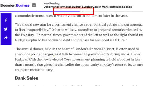
Visual appeal: 6/10
Utility: 7/10
Aeon’s word count
Aeon prides itself on long, sometimes esoteric, reads. To help the reader gauge how long an article might take to complete, aeon offers a word count with every story. Should the thousands of words quell initial enthusiasm, there’s a ‘Read later’ option that takes you to Instapaper, Pocket or Kindle, among others.
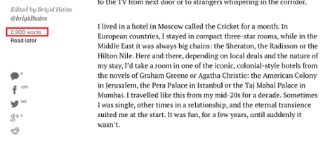
Visual appeal: 6/10
Utility: 8/10
Medium’s read time
Going one step further than aeon, Medium offers not a word count but a probable reading time. Its estimates are based on an average person reading around three words per second – so if you are an especially slow or especially fast reader, make allowances.
Visual appeal: 6/10
Utility: 9/10
Digiday’s TLDR button
Digiday has appropriated the social media meme TLDR (too long, didn’t read) and is using it as a label for summary versions of all its articles. TLDR is for the time poor. Switch it on and it turns 500-700 words into an abridged 50-75 words.
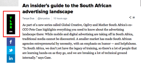
Visual appeal: 7/10
Utility: 7/10
Quartz ‘Read full story’ button
This is a pragmatic response from Quartz to our online impatience. Visitors only see the ‘Read full story’ button from a smartphone and then only when coming to the site from a ‘side door’ (via a social media, predominantly). This is a hedge against the casual visitor’s tendency to leave a story – and the site – after the opening couple of paragraphs. Click on the ‘Read full story’ button and you’ve made a decision to read on. Ignore the button and the next thing you’ll be exposed to is an advert which will keep the commercial team happy, at least. Get past the ad and there’s a selection of article promos, one of which may prompt you to click.
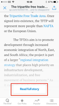
Visual appeal: 5/10
Utility: 6/10
Jon Bernstein is an independent digital media consultant and writer, formerly deputy editor, then digital director of New Statesman and multimedia editor at Channel 4 News. He tweets @jon_bernstein
To get weekly news analysis, job alerts and event notifications direct to your inbox, sign up free for Media & Tech Network membership.
All Guardian Media & Tech Network content is editorially independent except for pieces labelled “Brought to you by” – find out more here.