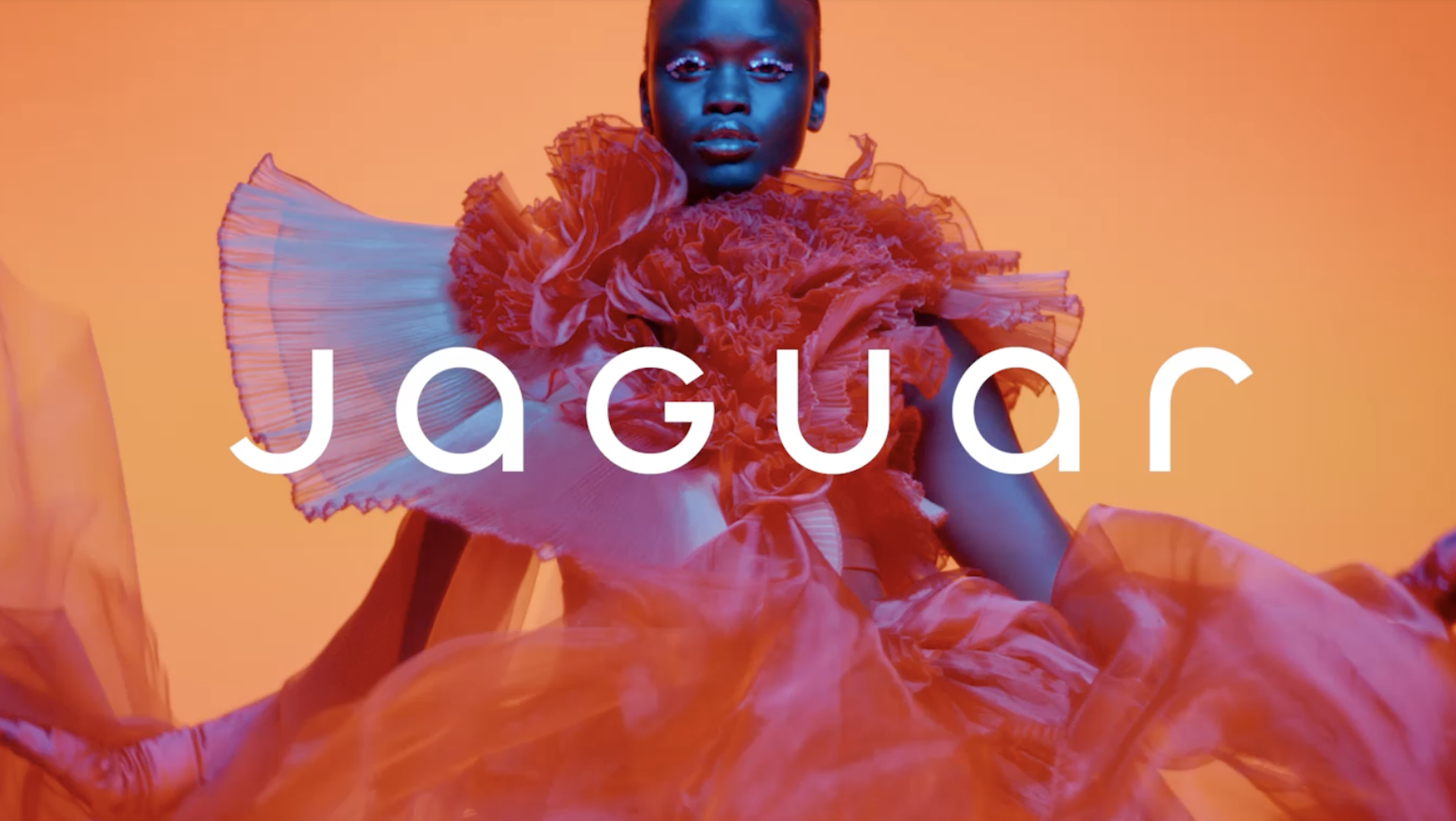
Last year we saw plenty of splashy rebrands drop, perhaps most notably the controversial new look for Jaguar. Rather than simply introducing a new logo, it brought an entirely new aesthetic to the brand – and for a day or two back there it was all anybody could talk about. But so far in 2025, the best rebrands have been an altogether quieter affair.
We've seen new identities arrive for the likes of Adobe and Amazon – although at a glance, you might not know it. Straddling the line of brand refresh and full rebrand, these new identities aren't designed to hog headlines. But when it comes to overall brand equity, they might be all the more powerful for it.
One reason you might not have noticed Adobe's new look is because it has emerged steadily over the last two years. Mother Design was brought on board to "rethink and codify its brand system," tweaking everything from the logo to the brand's colour palette. All the hallmarks of a full rebrand, then, but one that subtly iterates on existing assets rather than throwing them out. Indeed, so subtle is the new look that Adobe didn't even announce it, although Mother Design shared it on Instagram.
Amazon's new look might look like another squint-and-you'll-miss-it refresh, but the details add up to an overall reinvigorated sense of authority. Branding agency Koto has brought cohesion to the visual ecosystem of Amazon's many brands by standardising the design language to focus on that signature smile. The smile itself has been tweaked too, with subtle tweaks to refine its appeal, such as a "deeper and more emphatic smile" and sharpened emphasis on the swooping arrow motif.
But while rebrands like this might be subtle at a glance, their effect can be profound. Speaking about Amazon's subtle new identity, Frontify's director of brand recently told Creative Bloq, "I would make a bet that nine out of 10 people are probably not going to notice the individual assets that have evolved in the Amazon rebrand in isolation, but over time, through all the various touchpoints that they go through, there will be subliminally a lift in how they perceive that brand, and it will be all the small pieces of the jigsaw puzzle collectively, making that versus one of the individual assets making that."
Indeed, with their tweaks to the logos, these new identities are all-encompassing enough to fall under the 'rebrand' category, but their subtlety has a lot in common with the lesser-spotted brand refresh. "A brand refresh and a rebrand serve very different purposes, and understanding that distinction is key," Ljubica Jovanova, Senior Director of Brand and Content Marketing at Bynder, told Creative Bloq earlier this year. "A refresh is the right approach when a brand has strong brand equity and recognition in the market but needs to evolve visually or strategically to better reflect its current positioning. It’s about building on what’s already working, refining elements like visual identity, messaging, and tone of voice, without losing the essence of what the brand stands for."
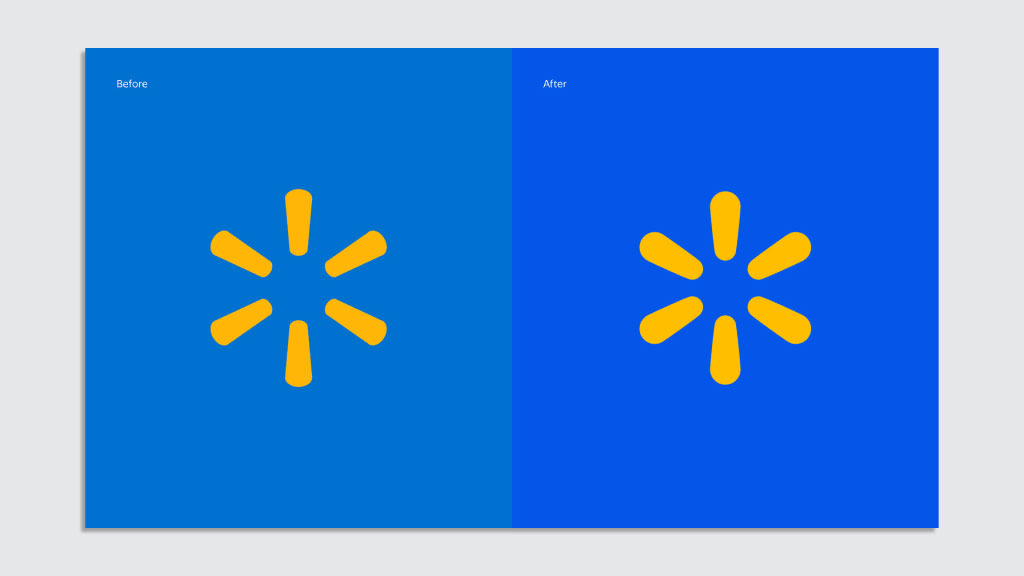
If the last couple of years have been all about the return of heritage logos (which in itself was a welcome development after the minimal logo era), then it seems the emerging trend in 2025 might be brands building on what they've already got. From Walmart to Brussels Airlines, we've seen plenty of brands prove that a rebrand doesn't have to mean a brand new logo in 2025.