“Graphic design has become too easy,” says Fraser Muggeridge. “In today’s world, it’s relatively straightforward to do something that looks kind of good, clean and nice. InDesign is so sophisticated it almost does it all for you.”
As Adobe has made it possible for anyone to produce an accomplished layout with a few clicks, Muggeridge – who runs a design studio in London’s Clerkenwell, with clients including the Barbican and Serpentine Gallery – has found himself drawn to a rougher, tougher, more amateurish world. As screens grow higher in resolution and printing processes ever more precise, he’s become a determined champion of the lo-fi. Or, as he puts it: “I’m interested in things that look a bit crap. Stuff that’s so bad it’s good.”
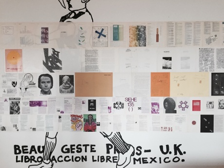
In a new exhibition at the De La Warr pavilion in Bexhill, he’s gathered an enticing world of wonky, shonky, haphazardly printed matter – four publications from the 1960s and 70s produced by people with no conventional training. Carefully disassembled into individual pages and pasted on to the walls, the publications are a riot of clashing paper types and misaligned printing, alive with crooked Letraset and inconsistent gradients.
Titled Towards An Alternative History of Graphic Design, the show combines issues of Schmuck, POP, bRIAN and Assembling – titles likely to be new to even the most fanatical collectors of obscure print matter.
“This is stuff that simply doesn’t feature in the history of graphic design,” he says. “It was produced at a time when it first became possible for artists to make their own publications, with the advent of cheap litho plates and Gestetner machines. It comes from an outsider perspective, free from the conventions of graphic design.”
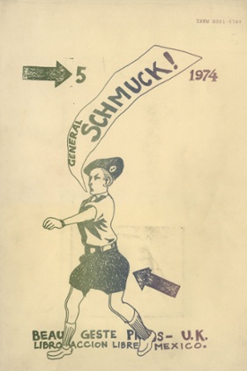
Schmuck, which ran for eight issues from 1972–8, was made by Beau Geste Press (“the beautiful Gestetner”), named after a stencil-based duplicating machine invented in Tottenham Hale in 1906. Based at a farm in Devon, the magazine was designed and printed under one roof: its creator, David Mayor, is credited with layout, design, platemaking, binding and finishing, demonstrating a fanatical level of care over every detail. The pages bristle with pull-outs, cut-outs, little envelopes and tactile treats, including a lollipop stuck into one issue.
The copy was set on a portable IBM Selectric typewriter, which had a spherical typeball, allowing easy change of fonts in a single document. Printing was a combination of litho and Gestetner, allowing manual colour fades – a technique Muggeridge has revived for his own exhibition leaflet.
“The printers think we’re mad,” he says. “You have to manually block off the ink with little bits of cardboard, so it doesn’t mix. You start off with no fade, then you begin to get a good fade as the colours mix, and by the end it might be a brown mess. Each print is unique. That’s the beauty.”
The next publication, bRIAN, is way more obscure than Schmuck; Muggeridge isn’t even sure what it actually was. Made by the students of Hansjörg Mayer at the Watford College of Printing in the 1960s and 70s, it consists of bound volumes of litho prints, made by students who played around with a single plate, varying the print every time. Each volume was bound with the aluminium plates as the cover. Pushing the possibilities of the printing machine, every one is a hymn to the chance of the printing process itself, and the beauty of happy accidents.
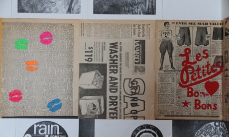
Then comes Assemblings, the work of New York artist Richard Kostelanetz, who collated 13 anthologies of supposedly unpublishable material between 1970 and 1982. Mixing known and unknown artists, the content, design and printing was left entirely to contributors, who had to submit 1,000 copies of up to four pages of material, the only constraint being the format of US letter size. Described by Muggeridge as “a feast of consistent inconsistency”, the pages range from New York Times cuttings overprinted with fluorescent lips to a chocolate smear by Ed Ruscha.
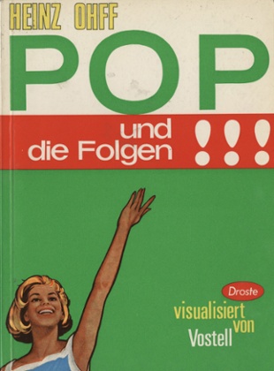
Finally, there’s the intriguing work of German artist Wolf Vostell, a leader of the décollage movement (like collaging, only rather than building layers up, you take bits away piece by piece). A small booklet from 1963, Television Decollage, is full of badly-laid Letraset, with cracks and glitches and words that don’t quite fit on the lines. Muggeridge’s studio recently aped its look in a series of posters for a project in Southend, setting type in a handcrafted way that looked ever so slightly wrong, forcing you to give the poster a second look.
“I think you have to make a bit more effort now,” says Muggeridge. “If you’re sending an invite or making a flyer, it used to be just about the information you needed to communicate. Now you get all that stuff from an email or the website, so the printed matter is about what you communicate subconsciously.”
In these four publications by obsessive outsiders, which he says are just “the tip of the iceberg” of an alternative history of graphic design, there’s a real sense of the designer’s hand at work, a feeling so often absent from contemporary typography. In a world where everything is set to a template, this exhibition is a joyful reminder of the thrill of the unpredictable.