
While the design world has embraced warm neutrals for the past few years – think soft creams, beiges, and taupes – as a timeless backdrop for sophisticated spaces, their omnipresence can, at times, feel... predictable. But color trends and predictions are pointing to a shift for 2026: a return to cooler, refreshing tones, specifically the serenity of blue. We're not talking moody navy or bright primary shades; the true trendsetter is the soft, enveloping powder blue.
This shift provides the perfect opportunity to update established, warmer pieces with a cool, modern contrast. A peek at Jane Fonda’s wall color choice only solidifies that this cool-tone shade is on the up, offering a masterclass in modernizing a classic look and how to make it work with those warm neutrals everyone loves.
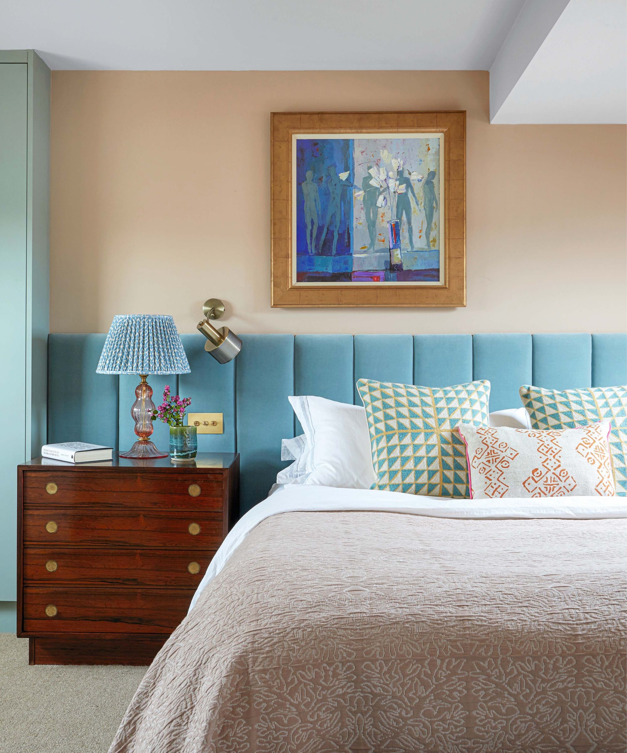
The actress showed her cream-colored bouclé sofa in a recent social post. But rather than the classic, griege or taupe wall in the background, she's opted for a soft blue-gray hue.
Decorating with blue, specifically a powder blue, behind the seating area provides the perfect sophisticated contrast to the sofa’s tactile, cream warmth and the rustic feel of her rounded, natural wood tables.
The entire composition, right down to the geometric textures and blue-gray accents in her rug, elevates the look by doing the unexpected: it marries those warm, enveloping neutrals with cool, powdery blues. This sophisticated balance of warm and cool tones is the ultimate key to a scheme that feels both current and enduring.
5 rules for decorating with powder blue in 2026
1. Master the warm-cool equilibrium: The trick to mixing pale blue with warm neutrals is finding a shared temperature. Pair the blue with rich, earthy tones like terracotta, soft camel, or deep cream, rather than stark white. This prevents the blue from looking icy and allows the warm neutral to act as an inviting anchor, creating a sophisticated and balanced scheme.
2. Texture is the antidote to flatness: Because pale blue naturally lacks deep saturation, it requires textural substance to feel weighty and luxurious. Incorporate highly tactile materials such as brushed velvet, chunky bouclé, distressed linen, or high-pile rugs. These surfaces catch the light differently, adding necessary depth and dimension to the otherwise ethereal hue.
3. Ground the scheme with a dark anchor: To prevent a pale blue room from feeling too 'sweet' or washed out, introduce an element of drama and gravitas. Use small, sharp doses of charcoal, matte black, or a deep bronze (a powder blue kitchen with dark bronze fixtures would be beautiful) – think in hardware, light fixtures, or accent furniture frames. This powerful contrast prevents the soft shade from feeling meek.
4. Let the light guide the intensity: Always observe the room’s natural light. For north-facing rooms (which receive cooler light), choose a pale blue with a subtle gray or green undertone to keep it from appearing sterile. In south-facing rooms (which receive warm, bright light), you can confidently opt for a purer, clearer shade of blue without fear of it washing out.
5. Treat the ceiling as the fifth wall: Pale blue is magnificent when used in unexpected places. Applying a very light shade of the color to the ceiling, slightly lighter than the walls themselves, subtly mimics the color of the sky. This creates an immersive, serene canopy that draws the eye upward and beautifully expands the sense of space. It's also a beautiful shade to color-drench a room in.
Shop the Look
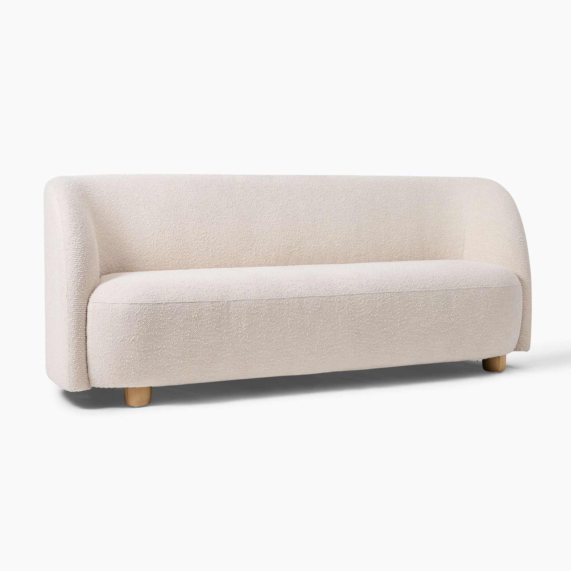
This mid-century modern bouclé sofa is perfect for bringing some curve and texture into your living room.
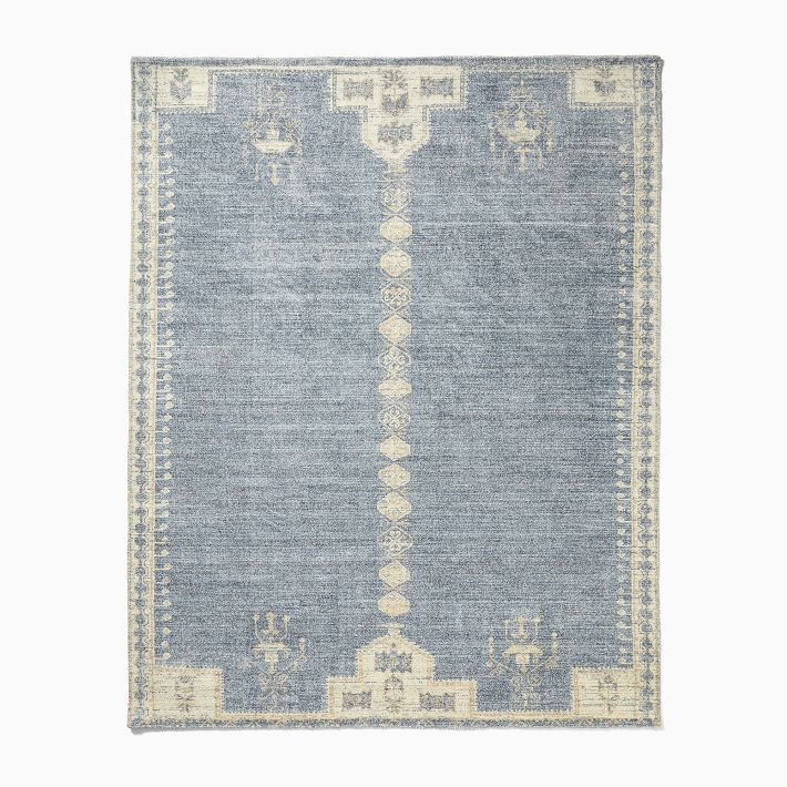
Mixing a pale blue with a softer cream makes this the perfect rug for rooms that combine warm and cool colors.
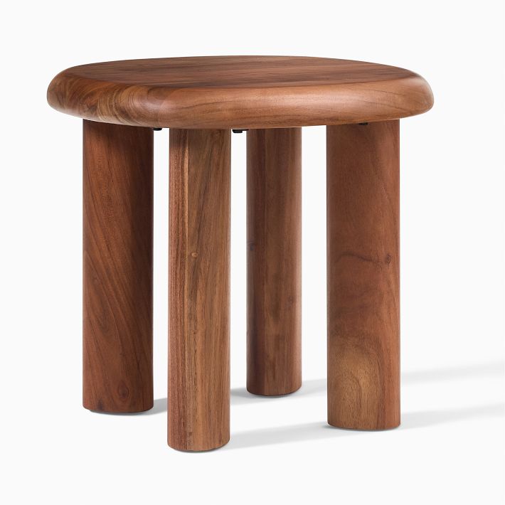
This natural wood rounded table will help create a warmer, layered space when decorating with a light blue.