Football kits: 30 of the most weird and horrendous – in pictures
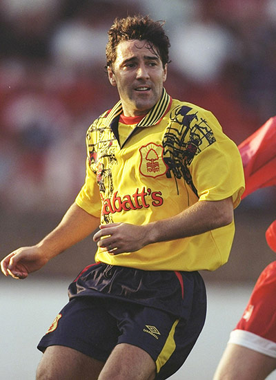
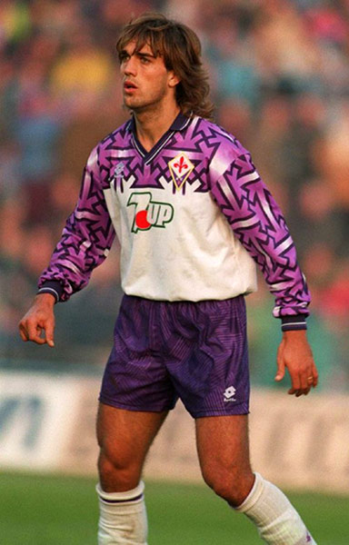
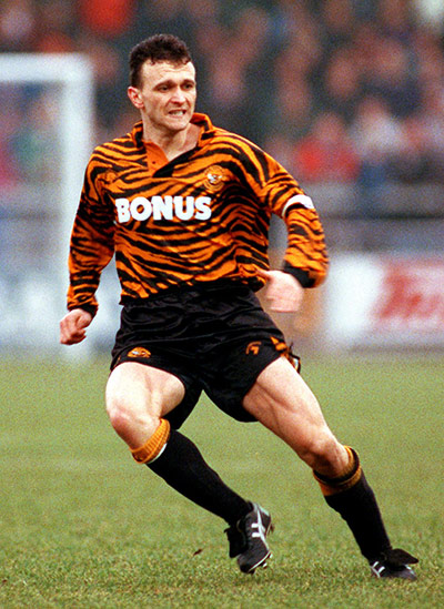
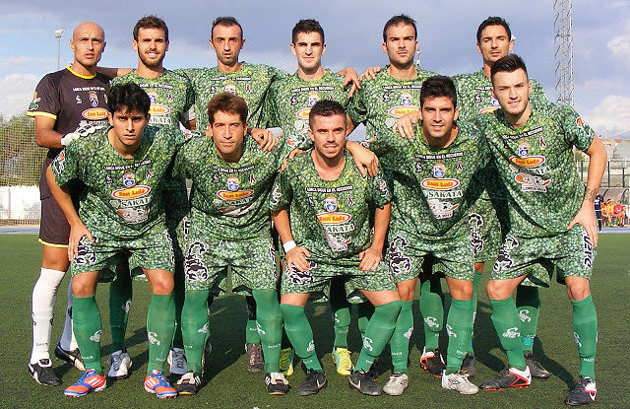
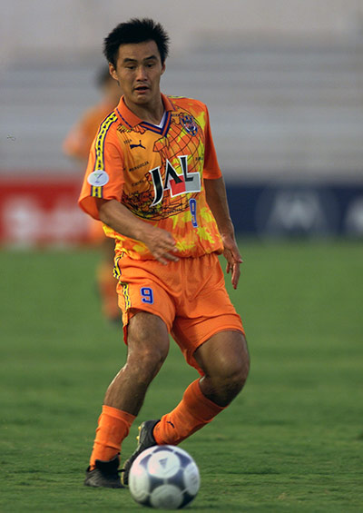
Nottingham Forest decked themselves out in this garish 'Jackson Pollock' number away from home between 1995 and 1997, recalls iposter. Indeed, they wore it in the quarter-finals of the Uefa Cup in the 95-96 season, when they were dispatched 7-2 on aggregate by the eventual winners, Bayern Munich. But we're inclined to say their lesser-spotted lime cordial effort from 1991-93 was worsePhotograph: Clive Mason/Getty ImagesHow could we forget this one? (as several of you kindly pointed out). Like a Magic Eye book, it might take you a minute to spot what was going on in this Fiorentina design from 1992-93 - yep, that's right, a few dozen swastika-style lines were 'accidentally' incorporated into what the manufacturers called 'an optical effect'. Hmm. It took until December 1992 before anyone actually noticed and complained. Surviving jerseys are now collectors' itemsPhotograph: PASo many of you wrote about this tiger-print kit that we felt obliged to dig it up. Presumably all Hull's future kits will be like this now the owner, Assem Allam, has changed the club's name to Hull City Tigers against fans' wishesPhotograph: Barry Coombs/EMPICS Sport
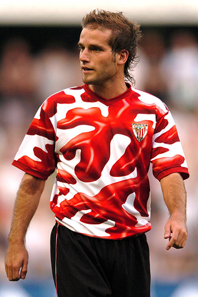
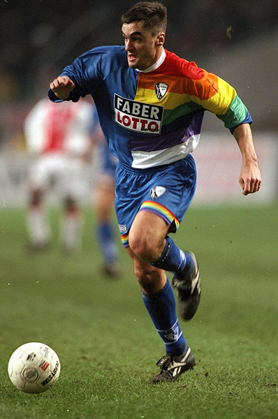
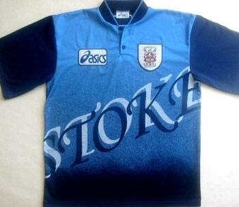
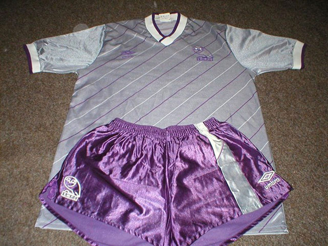
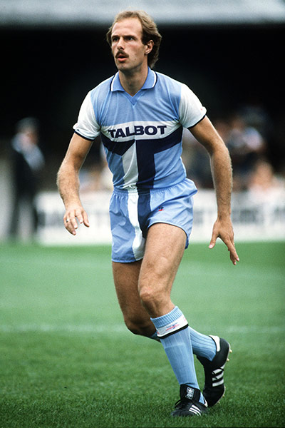
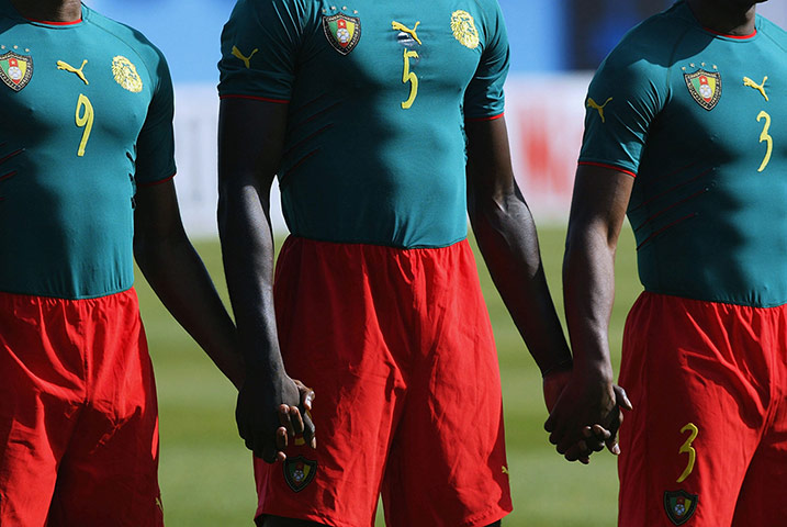
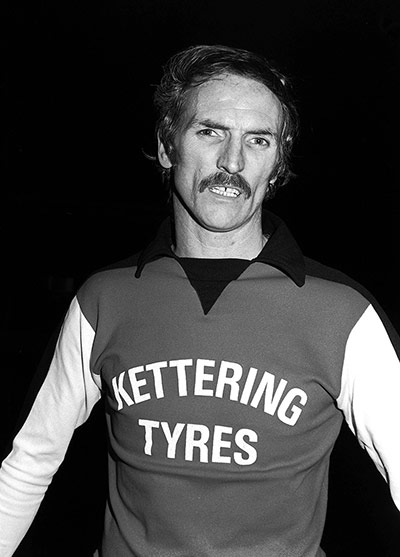
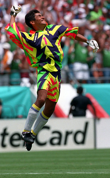
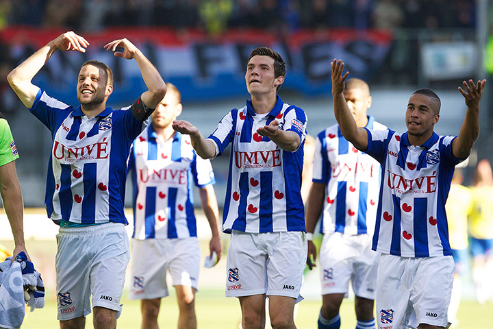
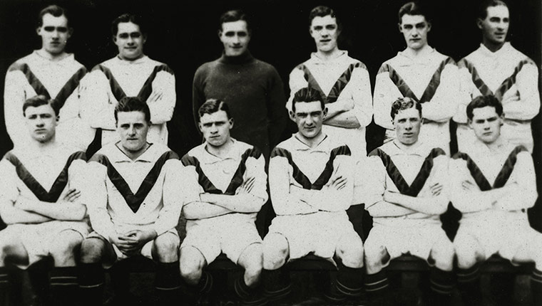
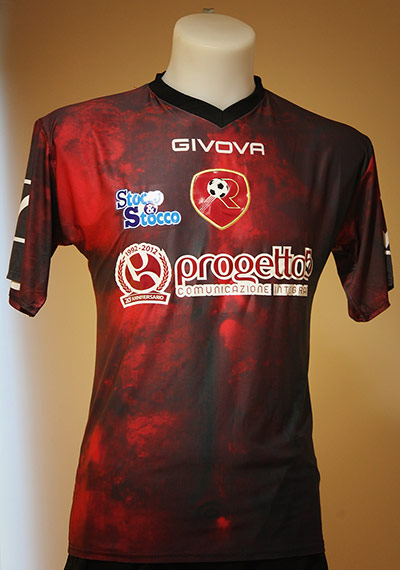
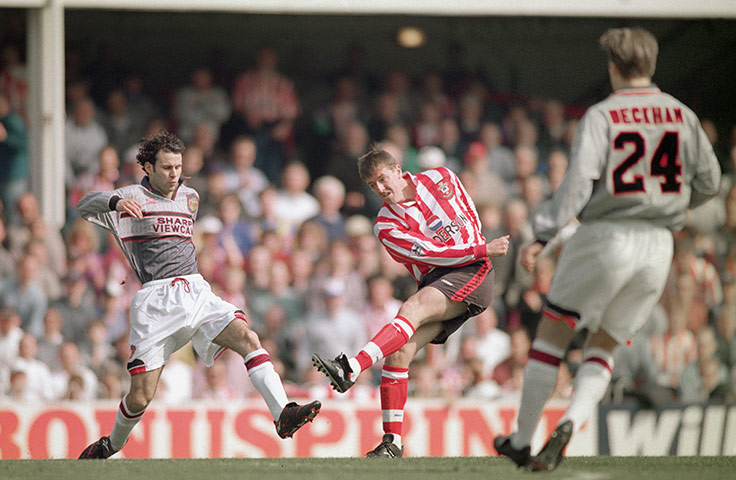
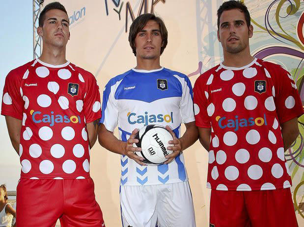
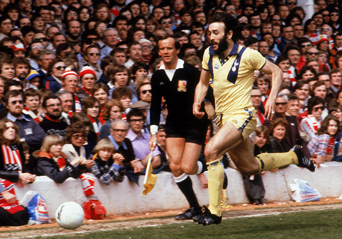
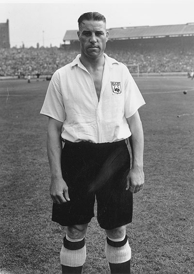
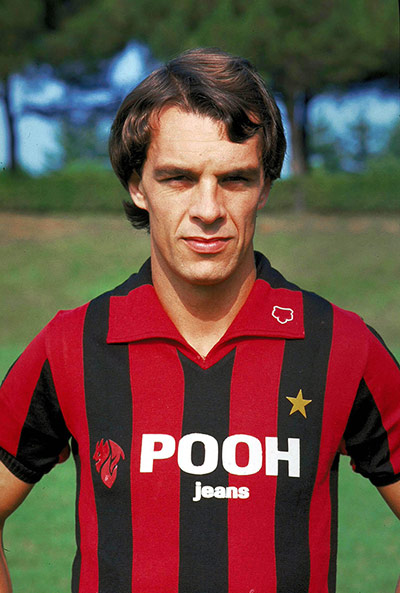
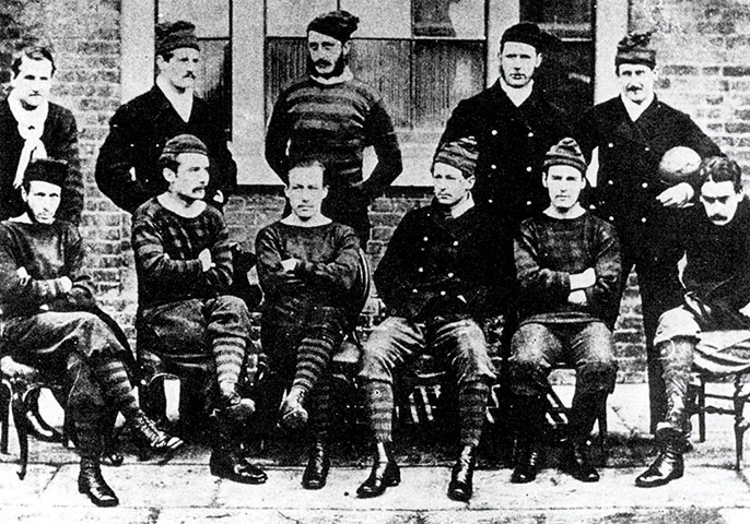
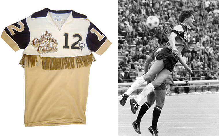
Anyone thinking the 90s was the most visually offensive era for kit design should have a look at Liverpool's recent efforts. If this one isn't bad enough, their third kit is split into thirds. The days of the classic Crown Paints kit are long gonePhotograph: Thananuwat Srirasant/Getty ImagesBilbao became a home for Spanish arts when Frank Gehry's Guggenheim Museum opened in 1997. Seven years later, to mark the local football club's centenary, Basque artist Dario Urzay, inspired by works he'd seen at the museum, designed this splatter-effect football kit - as highlighted by RichmuteyPhotograph: John Walton/EMPICS SportUncleFester proposed Barcelona's 'Sunny Delight' away kit as a contender for the worst design - or the most thirst-inducing. More shocking, perhaps, was their kit 12 months earlier when they ended their long and admirable refusal to wear corporate sponsorship on their shirtsPhotograph: Valerio Pennicino/Getty ImagesCombining gold and maroon (who else would dream of such things? Bradford, Motherwell, Galatasaray - OK, quite a few) this kit by Dukla Prague spawned the song 'All I Want for Christmas is a Dukla Prague Away Kit' by Half Man Half Biscuit. Credit to newenergyspace for digging that gem out of the archivesPhotograph: Zdenek Havelka/PAOpiumEater reminds us of VfL Bochum's technicolour attire from 1997. Handy as it is to wear a paint chart, the idea didn't stick. Not that Bochum's kits have improved: this distressed design is rather, umm, distressingPhotograph: Shaun Botterill/Getty ImagesManicstreetpotter was only too happy to point out Stoke's transgression of 1992-93 (a purple version of Huddersfield's kit from that same season). And while we were hunting for it, we came across this awful kit from 1996-97 - you'd almost think they were proud of itPhotograph: PROf all the satin-shorts to grace football fields in the 1980s, these mauve creations, worn by Sheffield Wednesday in 1986-87 (and posted by caroline457) have to be the most emetic. Teamed with a silver diagonal-striped top, it was a kit that even Lee Chapman couldn't look good inPhotograph: PRIn the long and unglamorous history of awful football kits, no one (to the best of our knowledge) has ever dared create a kit that looks like a stick of broccoli – until this one. La Hoya Lorca, who were in the Spanish Tercera Division, unveiled this outrageous kit last season. The club is based in Murcia, 'the vegetable garden of Spain' – justification of sorts for a truly bizarre design. They went on to win the league last season and, fittingly, they've released another broccoli-based design this season which, we hear, is selling fast all around the world Photograph: lahoyalorcacf.comCoventry City have been much derided for their infamous brown 'egg-timer' kit of the 1970s, often cited as the worst kit of all time, but this supposedly ingenious design, worn from 1981-83, trumps even that one. The brainchild of former manager Jimmy Hill, it incorporated the sponsor's logo into the kit design, giving the brand extra emphasis. The only problem was the TV companies had banned all kit sponsorship for televised games, so, even without the word Talbot, it fell foul of the laws and City were forced to wear a bland alternate strip any time they were in the limelight Photograph: Getty ImagesAt the African Nations Cup in 2004, the Cameroon team sported what could reasonably be called a onesie. It was so bad the Cameroon Football Federation were fined $154,000 and docked six World Cup qualifying points for contravening football regulations which stated that: 'The basic equipment of a player is a jersey or shirt, shorts, stockings, shinguards, footwear'. The points were later restored as common sense kicked in. Cameroon had previous, of course, having worn a sleeveless vest in 2002Photograph: Shaun Botterill/Getty ImagesHitachi are often blamed for the uglification of football kits, as it was they who paid Liverpool to become the first top-flight club to wear a sponsor on their shirt in 1979. Yet, three years earlier, Kettering Town did the unthinkable and plastered lettering for a local firm across their chests. Derek Dougan, then chief executive and manager, is seen here in their home top, having organised the deal. It was worn in a Southern League game against Bath City, before being outlawed by the FA. Kettering Tyres are the real villains, thenPhotograph: Bob Thomas/Getty ImagesGoalkeepers jerseys have a rich tradition of being garish – don't believe us … check out this archived gallery – but none could beat this one, a fluorescent Count Dracula effort, designed and worn by Mexico's goalkeeper Jorge Campos at the 1994 World CupPhotograph: Billy Stickland/Getty ImagesHere's an unusual design with an interesting premise. SC Heereveen's kit is based on the Frisian flag, the official flag of the Dutch province of Friesland. The seven red Pompeblêd – seal lily leaves – symbolise seven independent regions from Medieval timesPhotograph: VI-Images via Getty ImagesA plunging V-pattern is more typically associated with jockeys' silks, but Manchester United's footballers sported them on their home kits in the early 1920s. If the design doesn't seem peculiar enough, how about this: the majority of the kit was white. It only lasted for four years from 1922, but by that stage United had already been wearing red home kits for 20 years (aside from FA Cup final of 1909 when a similar white kit was worn). The only other time United have not worn a red home kit was in 1934 when a lucky maroon and white horizontal striped kit was adoptedPhotograph: Popperfoto/Getty ImagesThis Reggina shirt looks inoffensive, but closer inspection reveals something rather weird about the blurry design lurking behind the logos. Yes, it's a male torso. Surely the only thing that could be as bad as this is an animal print – say, um, that of a tigerPhotograph: Maurizio Lagana/Getty ImagesA kit loathed by the players who wore it, according to Sir Alex Ferguson at least. It was worn just five times and, remarkably, United never won in it. One of its outings came against Southampton at the Dell in 1996. Ferguson made the players switch tops at half-time, when they were 3-0 down, blaming the kit for United's poor passing game. ‘The players couldn’t pick each other out; they said it was difficult to see their team-mates at distance when they lifted their heads,’ he claimed. United pulled one goal back in the second half but still lost 3-1Photograph: Shaun Botterill/Getty ImagesChelsea also had a grey kit; theirs came in 1995 and featured panels of orange for a nauseating high-vis effectPhotograph: Gary M. Prior/Getty ImagesRecreativo opted for a polkadot away kit last season – and what's most surprising is that Danish manufacturing legends Hummel were responsible for it. It was predictably mocked for looking like it was inspired by Minnie MousePhotograph: PRThis Tottenham kit from 1977 was shocking not only for the number of times the Admiral logo appeared on it (a close rival came two decades later when Kappa designed an awful kit for Manchester City in what was practically shell-suit material), but also for the bizarre paneling which ran down from the shoulders. Let's call them shoulder sideburns. The lemon yellow wasn't too clever eitherPhotograph: Peter Robinson/EMPICS SportHalf-and-half tops have been around as long as the game itself, but when San Jose Clash unveiled this razor-edged gold, turquoise and white number they went a step too far in our bookPhotograph: Otto Greule Jr/Getty ImagesJapanese side Shimizu S-Pulse have a habit of wearing eye-popping kits – this effort, from 2001, is among of collection of bright orange designs featuring world maps across the chest. Note also the subtle camouflage pattern in the backgroundPhotograph: Stanley Chou/Getty ImagesBack in the day, 1949 to be precise, Derby County took the button down approach several steps too farPhotograph: Topical Press Agency/Getty ImagesHuddersfield Town went all tie-dye in the 1991-92 season. Their away goalkeeper jersey of 1993-94 was pretty vile tooPhotograph: Neal Simpson/EMPICS SportAnother classic 90s kit, here, which took all the worst colours from the colour wheel and splattered them on to Scunthorpe United's kit. And to think, this came two years after Norwich's similarly chronic home kit which was released in 1992Photograph: Paul Marriott/EMPICS SportWhat a way to ruin a perfectly acceptable kit. Joe Jordan, seen here in his Milan days, surely wouldn't have been too happy about this choice of shirt sponsor in 1981. But the real question is, what on earth were the founders of Pooh Jeans thinking when they named their company?Photograph: Studio Buzzi/Buzzi/Press Association ImagesAnd speaking of founders, check out the clobber worn by The Royal Engineers team who competed in the first FA Cup Final in 1872. Hats and leggings for a team-photo, no less. They lost 1-0 to the Wanderers at the Kennington Oval in LondonPhotograph: Popperfoto/Getty ImagesNow here's a serious abomination, featuring tassels on what looks like a horse polo top, which is beige, of all colours. We actually didn't believe this was real until we hunted around for pictures of it being worn, and, lo and behold, we found some. The shirt belonged to the 1978 Colorado Caribous of the North American Soccer League. They only played one season and, frills aside, weren't especially dazzling; they lost 22 of their 30 gamesPhotograph: Denver Post
Sign up to read this article
Read news from 100's of titles, curated specifically for you.


