It's back to basics
A white name on a black box gives little away, you might think. But, judging by this, Slimane's first collection for the brand might be sublime simplicity. Sounds like something we can get behind.
Font speaks volumes
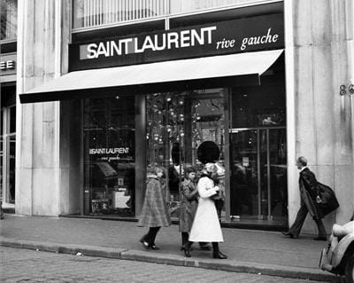
While the name change of the ready-to-wear provoked debate, YSL co-founder Pierre Berge heartily approved. He will definitely like the font used here. It recalls the branding first used to launch the ready-to-wear – originally titled Rive Gauche – in 1966. Slimane's approach to heritage? Use it subtly.
Be just different enough
This design might not come with bells and whistles but it's considered. A black box, yes, but it's still different from any other designer packaging out there – and instantly recognisable. A good approach to designing clothing, too.
Black and white is timeless
If Slimane's career as a photographer was largely dominated by black and white images, he's taken that preference over to his new design gig. A stack of boxes on a marble table plays with light and shadow. Expect elegant lines in September.
Classic and modern mix well
The starkness of monochrome is softened here by the label-style centrepiece – which could come from a vintage hatbox. Maybe modernity and history are on the cards for that much-anticipated collection. It's certainly a very Saint Laurent combination.


