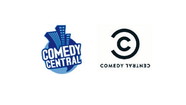
Judged “boring” by bloggers, the creator of the new Comedy Central logo (due to go live in 2011) defended it by dubbing the old one “like showing up in a Hawaiian shirt at a Fortune 500 company”. Photograph: Public Domain
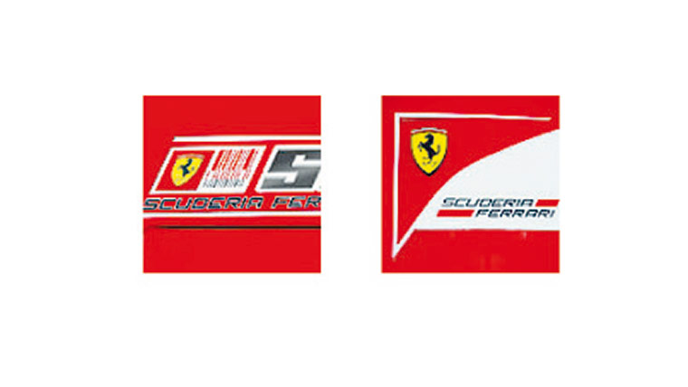
After its red and white bar code-style logo for Formula1 was seen as too similar to the branding of the tournament’s sponsor, Marlboro, the team changed to a slicker triangular affair in July. Photograph: Public Domain
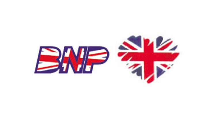
Unveiled in December, the British National Party logo shows a caring, sharing side, with the union jack turned into a touchy-feely heart. Strangely, it’s rather similar to the Conservative Party’s logo. Photograph: Public Domain
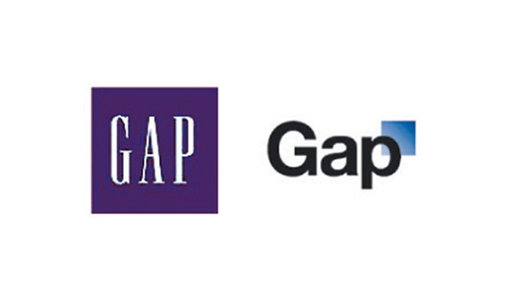
Its new logo, introduced in October, was retracted by the end of the month - after a Facebook campaign and Twitter feed defending the old logo. Yes, really, people do care that much. Photograph: Public Domain
Launched in September, with its very own Twitter feed, Steve Jobs was forced to defend the new logo after online commenters (who else?) said it “sucks”. Jobs’ reply was: “We disagree.” So there. Photograph: Public Domain