Farrow & Ball is one of the most popular paint brands out there that many look to for inspiration. So when the company released 12 new paint shades a couple of months ago - the first drop since 2022 - everybody, myself included, got super excited. And one of the new launches called the Scallop is already trending – so if you, too, are becoming enamoured with it, consider this your guide to how to use the Farrow & Ball Scallop paint shade.
I first came across this new paint trend on Pinterest a few weeks ago when the Scallop shade from Farrow & Ball was first properly trending. Pinterest saw a 30% week-on-week increase for ‘Scallop painted wall’ at the start of May, while ‘Farrow & Ball neutrals’ has seen an 85% rise.
A softer, more muted sister shade to Farrow & Ball's Dead Salmon, this versatile neutral shade with pink undertones is what everyone's talking about.
From the 12 new Farrow & Ball shades, Scallop is the softest, most neutral and versatile colour of the bunch. And considering the likes of Skimming Stone, a stony off-white, is one of Farrow & Ball’s most popular shades, it’s not surprising that Scallop is enjoying so much popularity.
‘Scallop’s been one of the most popular shades from the latest launch and rightfully so,’ says Michael Rolland, paint expert and managing director at The Paint Shed, one of Farrow & Ball’s stockists. ‘It’s a soft, shell-inspired neutral with a hint of pink, so it feels soft and warm.’
What rooms does Scallop look the best in?
When asking experts how to best use the Scallop shade, they all agreed that it’s such a versatile, flexible and easy-to-use colour that you can’t really go wrong when decorating with it.
‘Scallop has universal appeal,’ says Patrick O'Donnell, Farrow & Ball’s brand ambassador. ‘See it as your decorating friend for trim, ceilings or walls. The slightly “dirty” quality to it (think of it as a less clean version of Pink Ground) stops it ever feeling too pretty, too neat.’
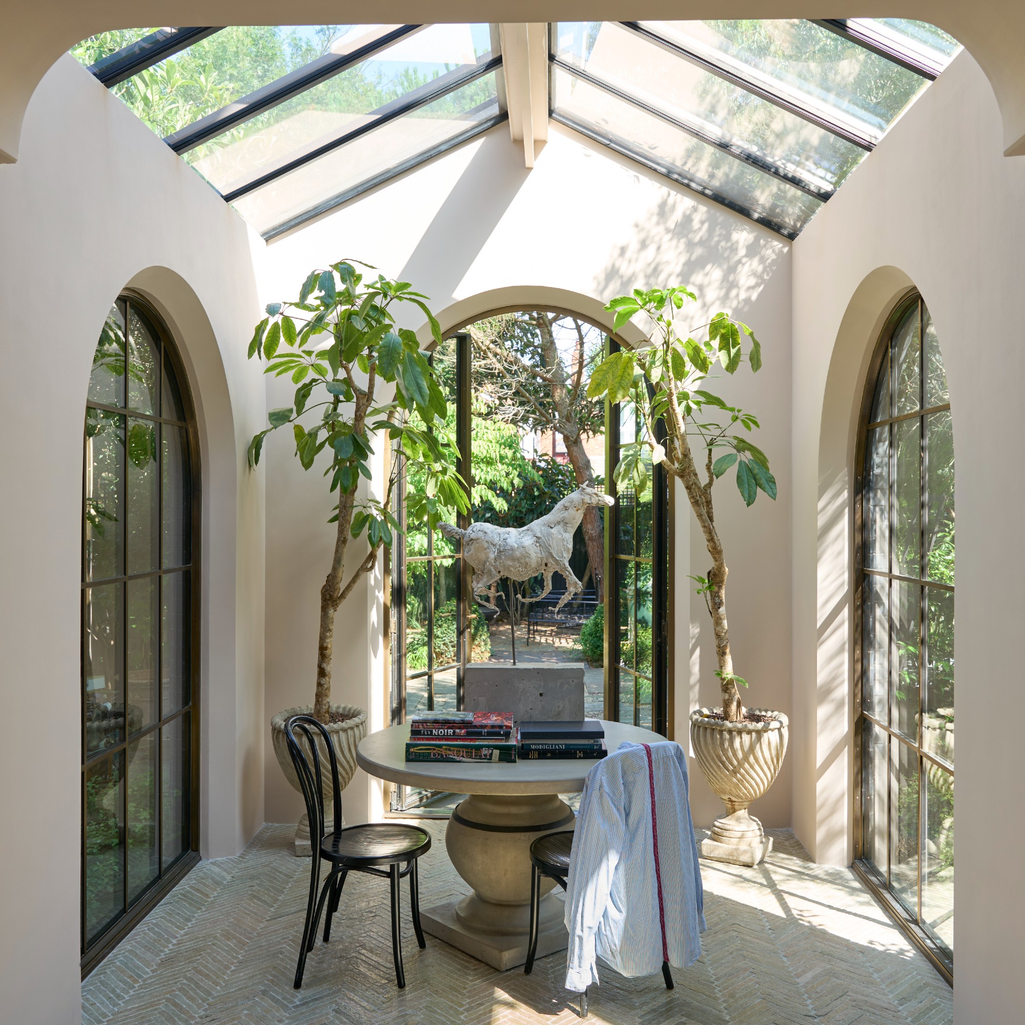
But rooms with plenty of natural light is where this shade truly thrives. ‘Scallop looks great in rooms with plenty of natural light. That’s where it really comes into its own; it feels fresh and light, and you start to notice the soft pink tones coming through. I’ve seen it work really well in spaces like bedrooms with skylights or even conservatories. The natural light gives it a bit of a glow and keeps it from feeling flat. That said, it’s subtle enough to use in smaller rooms with less natural light too, due to the lightness of the colour,’ Michael at The Paint Shed explains.
Patrick continues, ‘It has a gentle warmth when hit with lots of light but neutralises to a nuanced off white in full daylight. Come evening and lamps are on, it has a wonderful ethereal quality, the pink notes are very discreet which means it will respond as a great foil to most decorating tastes and styles.’
What rooms you shouldn’t use Scallop in
Based on the previous advice, you may have already guessed what types of rooms this shade might not be the right fit for – or rather, it won’t reach its full potential when used in rooms with a lot of artificial light and little to no natural light.
‘In rooms that face north or in spaces flooded with harsh artificial light, Scallop can sometimes take on a peachy hue or appear a bit dull,’ says Alex Stubbs, Flitch interior stylist. ‘It doesn’t quite mesh well with ultra-modern kitchens that feature stainless steel or cooler tones, where it might seem a bit out of place. If your decor leans towards a sharp monochrome or an ultra-minimalist vibe, the warmth of Scallop could end up clashing instead of enhancing the overall look.’
But before dismissing this paint shade, it’s worth ordering a tester pot and living with a sample on your wall for a little while since you shouldn’t paint your walls straight away after moving in or as soon as you decide to redecorate a room anyway.
How to style Scallop
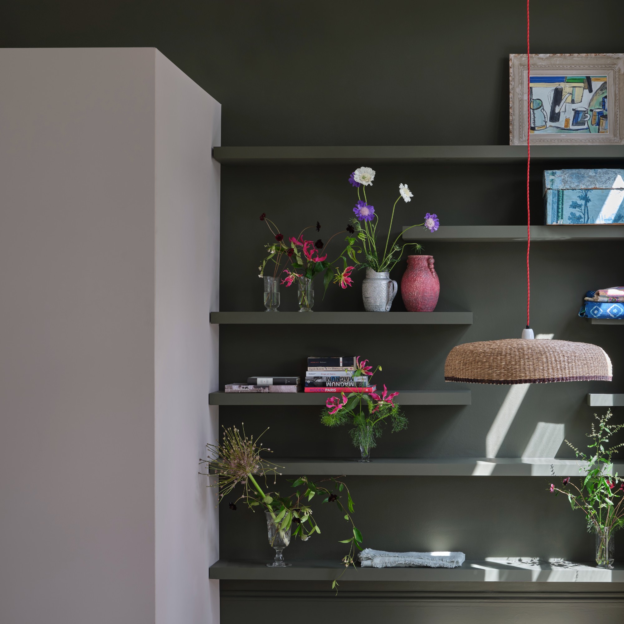
While you can absolutely go for a full-wall or colour drenching moment with Scallop, the shade also looks great used on features like skirting boards and ceilings – all the places you ideally shouldn’t paint white.
‘Use as a trim or ceiling colour for bolder choices on your wall – which can run from muddy browns such as Broccoli Brown through to khakis like Treron or Dibber. It will play to almost anything,’ Patrick at Farrow & Ball recommends.
It also lends itself beautifully to natural textures and materials for a truly warming and cocooning feel. ‘The soft hue of Scallop beautifully complements layered neutrals. It’s perfect for creating a warm-on-warm aesthetic, especially when combined with tactile elements like linen curtains or rattan. This colour shines in colour drenching techniques in bedrooms or hallways, particularly when paired with deeper wood tones,’ Alex at Flitch advises.
Home accessories to pair with it
I have similar voile curtains in my living room - although mine are IKEA - and they're one of my favourite features of the room. It effortlessly elevates the room and creates a beautifully draped effect.
Even something like a mirror can bring natural texture to your home that will pair well with Farrow & Ball's Scallop, as long as you choose the right design like this one from Dunelm.
I'm seeing rattan lamps increasingly more often - and when seeing this one at the John Lewis press show earlier this year, I couldn't wait for it to drop in stores. And the soft scalloped edge only adds to it.
Dark furniture is having a major moment right now. And pieces like this oak console table from La Redoute create a beautiful contrast against the softness of the Scallop shade.
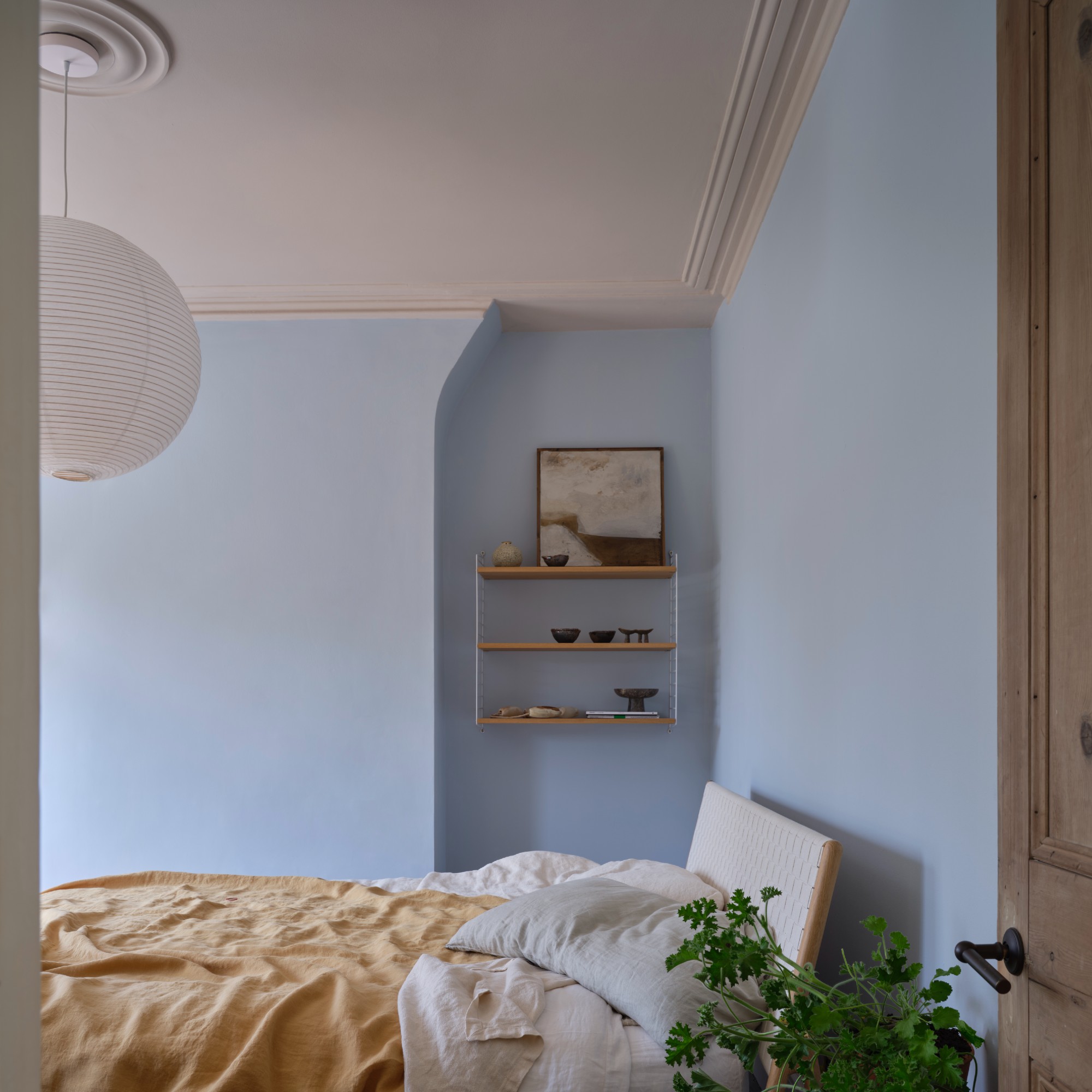
Seeing the Farrow & Ball bedroom shot pairing a Scallop-painted ceiling with baby blue walls made me realise it's a match made in heaven. But instead of paint, you can go for soft blue accessories or furniture like this Urban Outfitters chair with those beautiful soft curves. Obsessed!
Speaking of things everyone's obsessed with, the same goes for this linen bedding set from La Redoute that's perfect for hot summer nights and several Ideal Home team members swear by it. And this dark green will go perfectly with Scallop.
‘With so many of us craving comfort and warmth in our homes, it’s no wonder this soft, sun-kissed hue has quickly won over so many hearts,’ Alex concludes.