Did you know that until now Fanta's visual identity has differed in different parts of the world? We can't say that we'd noticed, although we have noted it tastes different in different places. But starting from today, Fanta has launched a new global visual identity, created by Jones Knowles Ritchie (aka jkr).
The new identity aims to "inspire people to find the fun in life and make the plain playful, with a look that remains unmistakably Fanta", says a press release. It's true that the look feels very much in line with previous iterations of the brand. See below for a before and after on the logo.
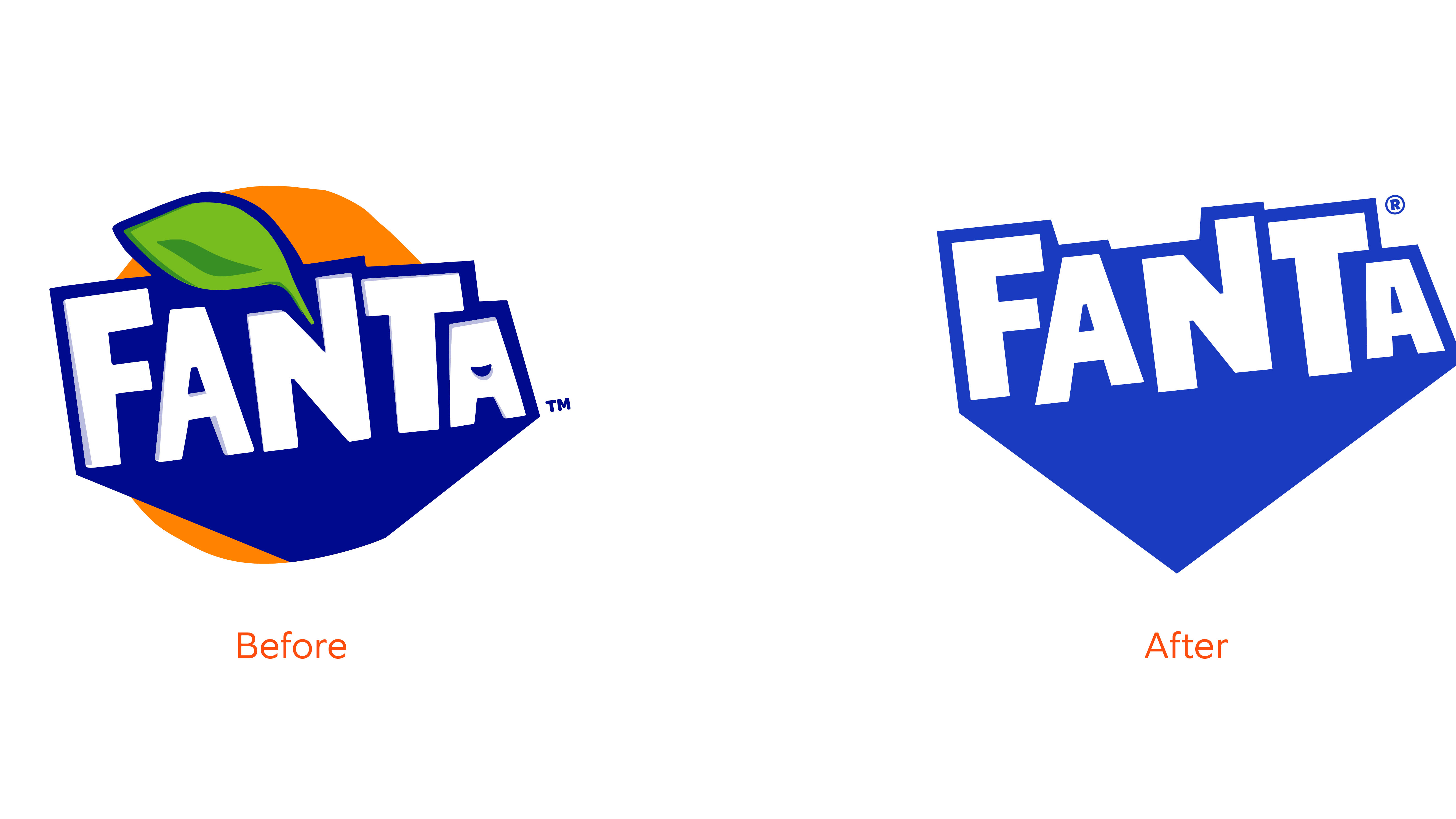
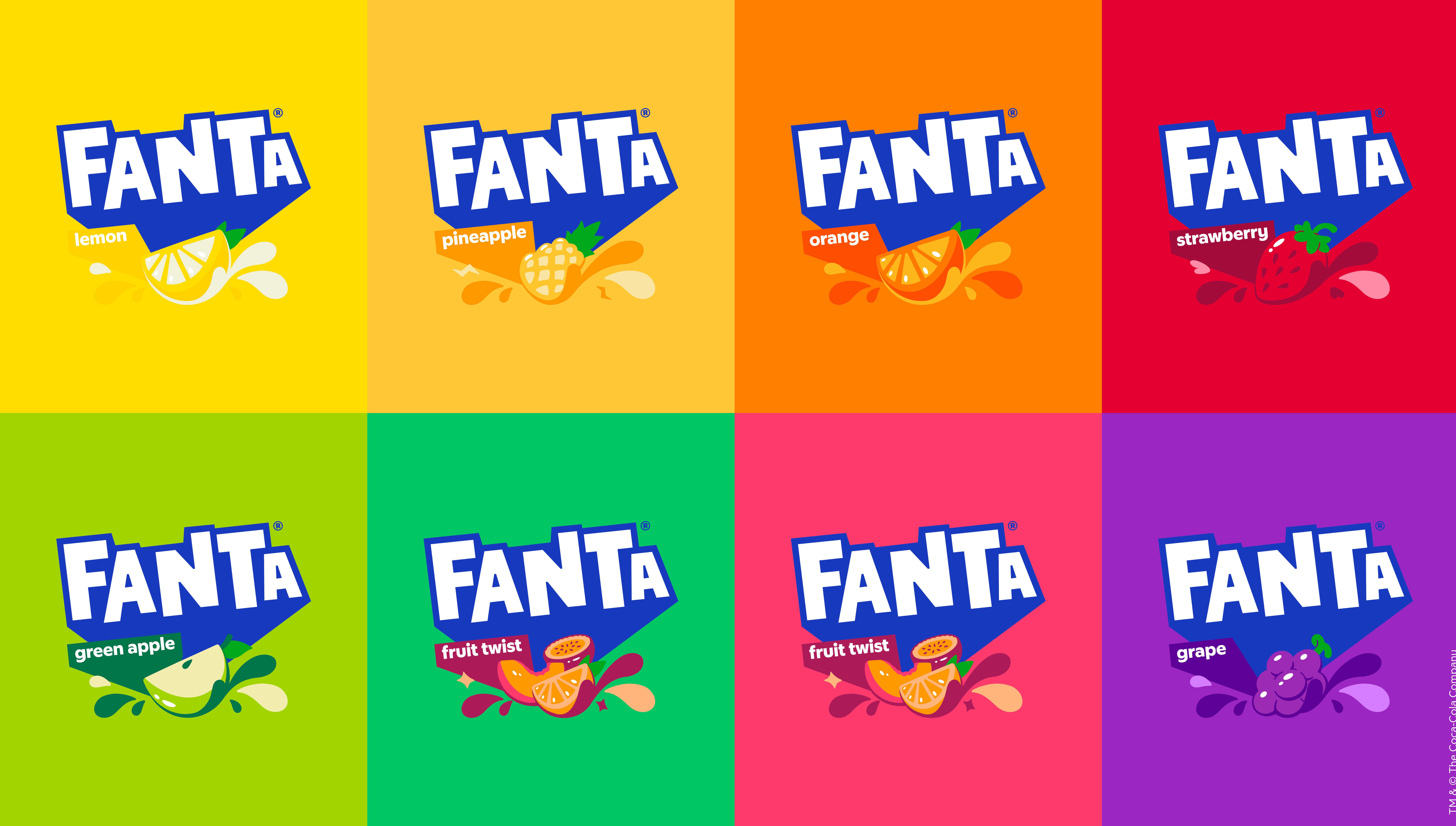
As you can see, Jones Knowles Ritchie has dropped the leaf and leaned into the blue of the previous logo (as well as previous iterations), going for a bolder, more striking tone. The orange background has also gone, which makes the logo work better across a range of different iterations of the drink, and reflects that Fanta isn't always orange in terms of flavour.
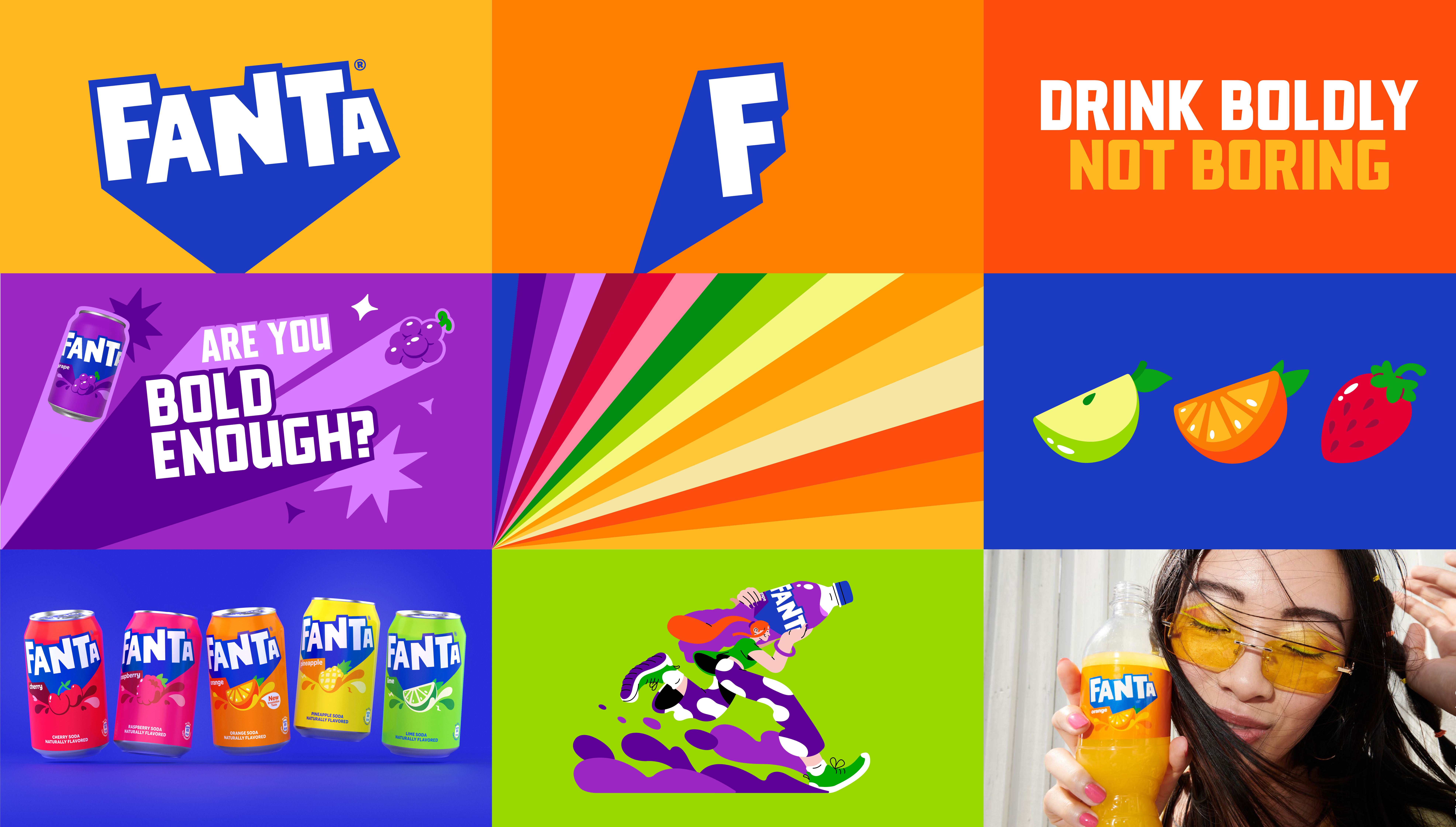
A sizzle reel (below) talks about moving away from a boring world and injecting colour fun and playfulness into the brand. It claims include that it now features a logo that pops and fizzes, a typeface that's playful with a pop, illustrations that move and pop (and pop, and so on).
"We were really inspired by the idea of bringing playfulness to consumers of all ages when we started to ideate around how to bring the brand’s purpose to the masses," said Lisa Smith, ECD Global of Jones Knowles Ritchie. "By thinking what this meant for the brand’s expression, attitude, and actions, we were able to build a distinctive brand identity that signalled Fanta’s commitment to fun at every level – from real life to digital."
The change to one global identity around the world brings Fanta in line with Coca-Cola and Sprite. Overall we'd say it's a solid job that does exactly what it says on the tin. The brand now feels more unified, and the message is clear.
"Fanta’s identity, and particularly the logo, has evolved significantly from the 1940s to today," said Sue Murphy, senior director of design at The Coca-Cola Company. "With this refresh, we aimed to crystalize each element of the brand to be bold and iconic so that we could ensure it would stand the test of time and be recognised around the world."
Will the wordmark ever become as iconic as Coca-Cola's? Perhaps not. But seeing as the previous Fanta logo wasn't an icon of the branding world, this feels like a step up.
Fanta isn't the only soft drink company to get a new look lately. This rebrand comes hot off the heels of the Pepsi rebrand. Which do you prefer?