I have a confession – I'm a musical fan. Ever since I heard Cynthia Erivo hitting that closing high note in Defying Gravity, I've been highly anticipating Wicked's sequel, Wicked: For Good. I'm sure you can imagine my excitement when the official poster dropped earlier this week, but I'm sad to say, first impressions weren't so sparkling. I can't help but feel that the design has misplaced the film's magic, and it seems I'm not alone.
The original Broadway design remains one of the most iconic poster designs of all time, so when the original Wicked film poster design controversy rocked the internet, I wasn't surprised. It's a tough act to follow, but naively, I'd hoped the marketing team would've learned from their mistakes. If heated fan backlash is anything to go by, the new poster design isn't nearly as popular as they'd anticipated.
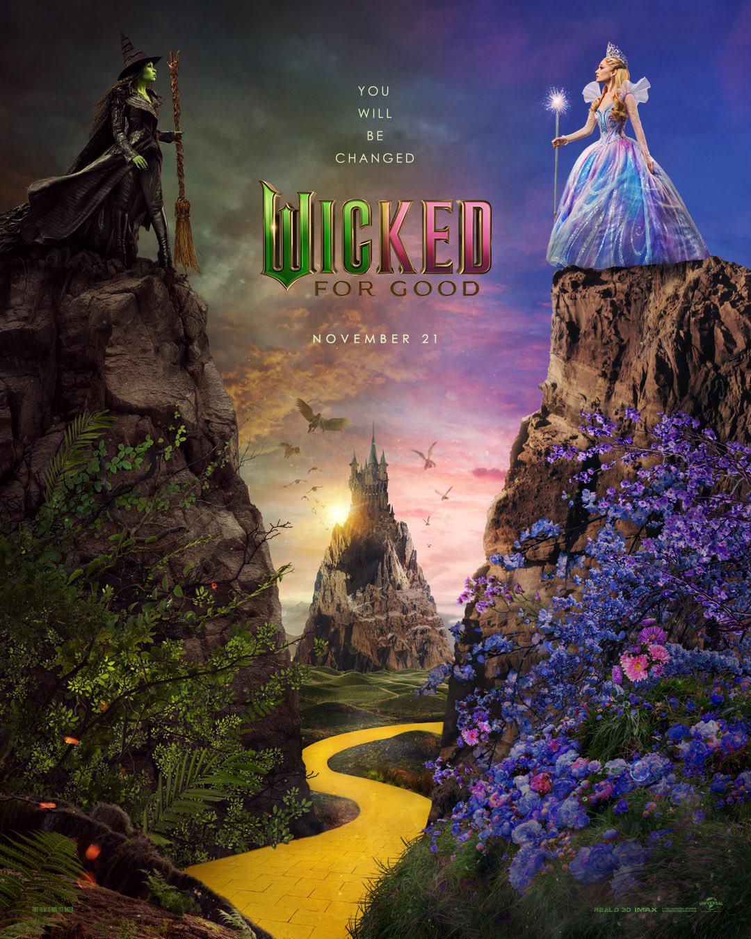
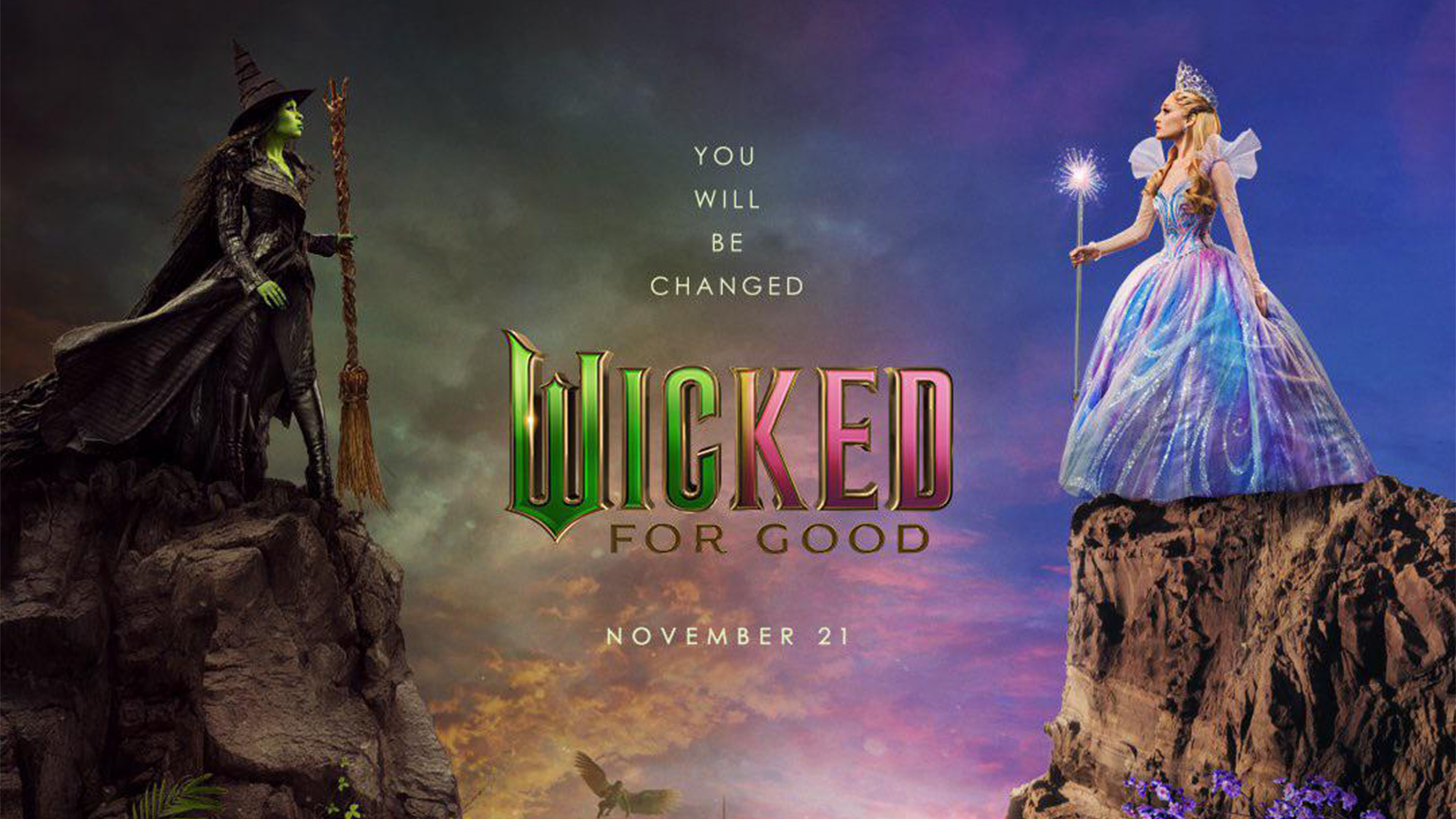
On first impressions, the new Wicked: For Good poster is a little... safe. Featuring Cynthia Erivo and Ariana Grande as Elphaba and Glinda (respectively), the good vs evil motif is slightly lacklustre, with not enough contrast to create a visually striking design. (Not to mention the poor lighting that makes Glinda look like a cake topper.) A gloomier sky and darker foliage create a tepid manifestation of darkness, offset by the vibrant CG visuals that give the overall poster an artificial flatness.
Over on the r/movies subreddit, fans were quick to pick apart the editing, with one user writing, "That's absolutely horrendous photoshop for a 100+ million movie. Glinda's dress and shadow look so off on that cliff. Appalling." Another added "They're both stood on rock formations that have been massively shrunk down, shadows all over the place, no depth... looking at it I just see flowers.jpg grass.jpg sky.jpg."
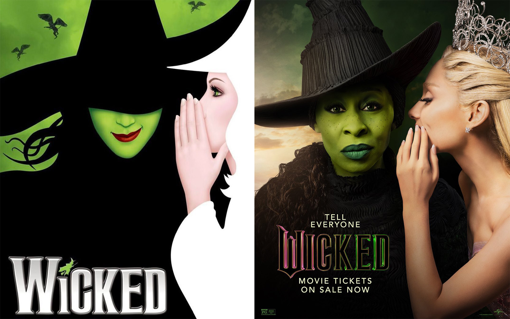
It's hard not to be a little disappointed by the new Wicked poster, given that the sloppily pasted visual assets read more like a collage than a finished poster design. But as we saw with the first Wicked film poster, a bad design doesn't necessarily equal a bad film, so I'm still keeping my hopes up. For some inspiring poster designs, check out the best movie posters of the month.