Changes to sports logos can provoke strong sentiments among fans. For every success like the new New York Jets logo, there's logo redesign that prompts ire in the stands. The jury's still out, but it seems the new Arsenal logo might fall into that latter category.
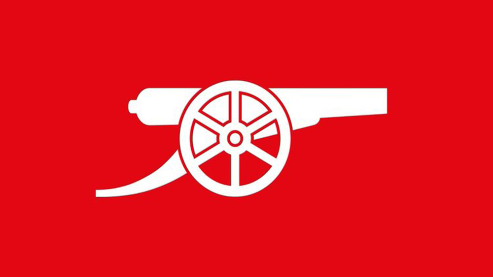
It appears the Premiere League club is planning to adopt a radical minimalist logo design to replace the crest on its main shirts for the next season. The design, which is currently in use on the club's third shirt, features only the traditional canon from the club emblem without the shield and wordmark. While some fans like the simplicity of the new look, others argue that it renders the club crest meaningless. And people have some things to say about the shirt design too.
With The New Arsenal home kit featuring the Cannon logo for the first time in over 30 Years do you think this should be main logo for the future? Juventus and Liverpool have both done this in recent years. pic.twitter.com/jcwMUvjv24April 18, 2024
Just to clarify, it appears that Arsenal won't be doing away with the full crest design. Lasted updated in 2002/03, it will still be used in certain applications. However, it appears that for the first time, the club's main kit will sport only a stripped-back canon logo: the same design that the club has started using in its social media posts and other digital assets.
Fans are torn over the move. While the canon itself is part of the club's tradition, the more minimalist look doesn't feel traditional. According to a poll on X, most favour the current design. One person described the move as a "horrendous decision", writing: "[It] renders the club badge absolutely meaningless. Always thought Liverpool were ridiculous for not using their club badge on any kits and now Arsenal follow suit. Delete the club badge then, it is absolutely worthless if it's not on the kits."
However, another fan wrote: "Fantastic news, not a fan of the 'Wordart' badge. It makes certain sense for Arsenal to make the design change. The canon is the club's most famous emblem, and it has a longstanding connection to the team's name and history. The streamlined design is already being used across most digital assets, and it's a more immediate way to identify the brand since the shape stands out from the typical shields and roundels used in football logos.
pic.twitter.com/xVI9wqg22CApril 20, 2024
However, fans also have some concerns about the apparent new kit design. Some think the new jersey looks like it depicts a Coca-Cola bottle. We'll have to wait for the official reveal. In the meantime, if you need a laugh, get a load of these football logos drawn from memory.