Few logos are more famous than Apple's, so it's hardly surprising that the company isn't in the habit of messing with it. Sure, it occasionally brings back the rainbow version, but most of the time the logo looks exactly the same – plain, flat, and grey, white or black.
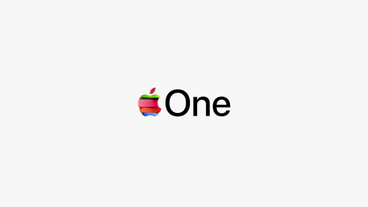
So it's a little surprising to see Apple quietly drop one of the boldest takes on its logo we've seen for a while. Amidst the announcement of its Apple TV rebrand, the company has also been pushing its Apple One subscription service, along with a quirky 'spliced' Apple logo made up of stacked pieces.
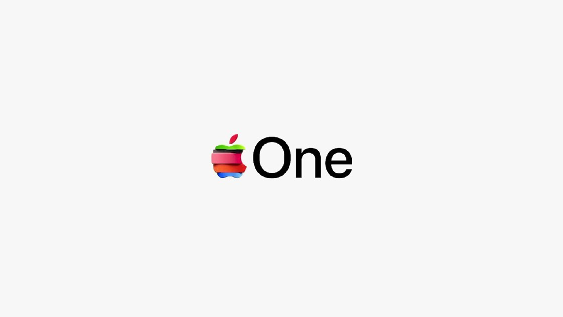
The logo appears on the new Apple TV web page. Those colourful pieces almost look like stackable wooden blocks, giving the whole thing a rather playful toy-like vibe. But the design isn't proving a winner online.
"Liquid Glass, the iPhone 17 Pros and now this. Has the Apple design team swallowed a fugly pill?" One commenter complains on MacRumors' news story announcing the design. "I swear, between things like this and some of the Liquid Glass stuff, they have "designers" just jerking around with filters and effects in graphics software. There is no coherence to any of this," another adds. One user summarises, "Ugly, childish looking. Jobs would be firing someone."
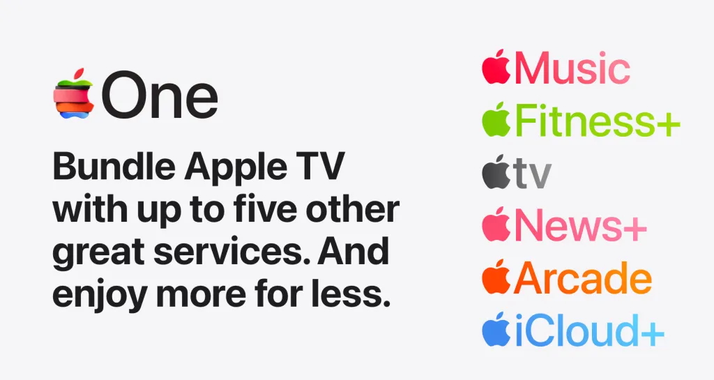
But is the whole thing an overreaction? For my money, yes. Is it so wrong for Apple to have a little fun with its logo, particularly on a such an insignificant page of its website? I'm a big fan of Apple's colourful, retro past – not everything has to be grey, grey or grey. And the 'stackable' motifs makes sense, given the different services making up the Apple One subscription.
And then there's the fact that the logo isn't even all that new. It's been appearing on video ads for Apple One for a while now (above) – this is just the first time it's graced the Apple website.
As another MacRumors commenter puts it, "Stop moaning. It’s a colourful stripy Apple logo. it’s not as if there hasn’t been a colourful stripy Apple logo before."