What you need to know
- Google Contacts gets Material 3 Expressive redesign with container-style contact cards.
- Contact info page features larger pill-shaped icons and cleaner layout.
- Google is also testing customizable full-screen calling cards in the Phone beta app.
Google seems to be rolling out the new Material 3 Expressive design for most of its apps just in time for the Pixel 10 release, and the Google Contacts app is the latest to get the new design treatment.
As spotted by 9to5Google, Google is now rolling out an update for the Contacts app that brings the Material 3 Expressive design language to the app. Many other Google apps, like Gmail, Messages, and the Play Store, have already been upgraded to this new design language.
In terms of changes, while contacts in the main "Contacts" page were previously displayed flat, one after another, the app now shows each contact in its own container. The color of each container has a slightly different background from the main page, making them more prominent.
Google Contacts just got more brighter and expressive
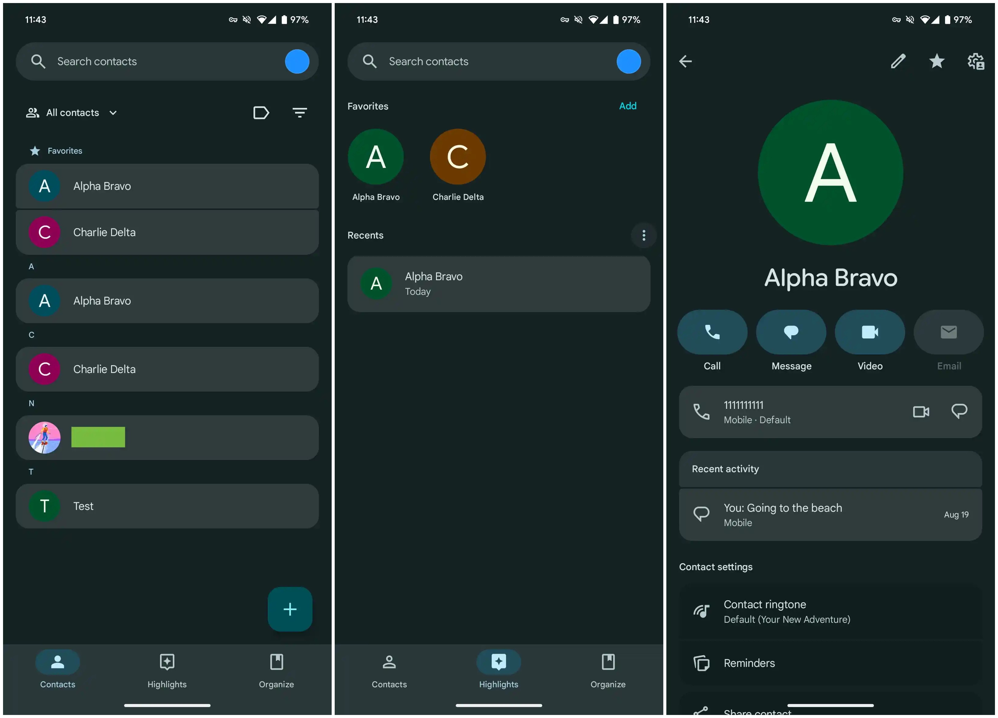
There aren't major visual changes in the Highlights and Organize tabs — apart from each section and contact using the same Material 3 Expressive containers — while the "Create contact" page remains untouched. The actual contact info page, however, has some new UI changes.
The icons for Call, Message, Video, and Email are now larger and pill-shaped, similar to other apps updated with Material 3 Expressive design. The new shape makes them more prominent and easier to tap.
Other changes include the removal of the "Contact info" label above the phone number, while remaining details on the contact info page are placed in matching containers like the rest of the app.
If you don't see the new UI yet, it's because it's rolling out with the 4.6.1.x version via the Google Play Store. Updating should bring the refreshed design.
Incoming Call screen is also getting a major design upgrade
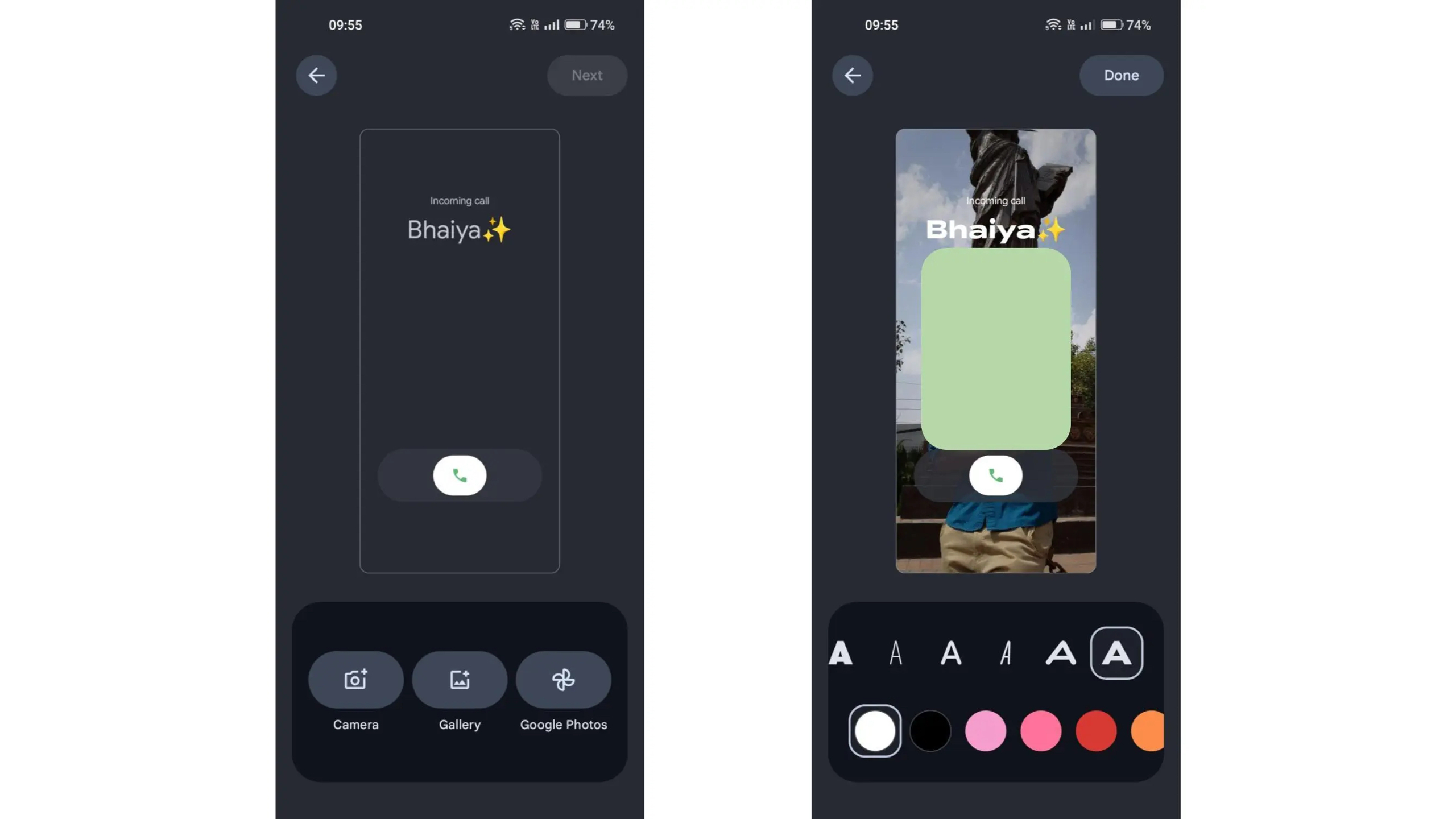
Alongside this redesign, Google is also testing new calling cards for the Phone app. Currently, when you get a phone call, you only see a small profile image of the caller in the middle of the screen (if you've added one) and nothing more. By contrast, iPhones show a full-screen contact image, making calls feel more personal.
Google appears to be adding a similar option on Android. In another report, 9to5Google has detailed that customizable calling cards are rolling out to some Phone beta users.
Calling cards let users add a full-screen image of the caller. They can also choose from different fonts and colors, making the entire incoming call screen more customizable. Once the update rolls out, the Contacts app will prompt users to create calling cards directly from the contact info page.
The new calling cards aren't widely available yet, showing up only for some people on the Phone by Google 188 beta app version. There's no official word on when they'll roll out, but with the Pixel 10's release approaching, it could happen sooner rather than later.