When the graphic designer Louis Danziger met the art director Helmut Krone at Esquire in 1948, Krone was in the shadow of a somewhat intractable giant. Danziger’s Aiga medal for design was still decades away; Krone was only 29, yet to make it big with Volkswagen’s Think Small campaign. “If you want to be as good as Rand,” Danziger advised his young colleague, “don’t look at Rand; look at what Rand looks at.”
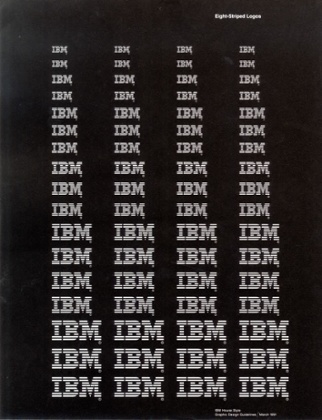
“Rand” was, of course, Paul Rand: graphic designer, evangelical modernist, self-proclaimed autodidact, native New Yorker, writer and teacher. His work combined radical boldness with formal asceticism, synthesizing image and language in smart, sharp and instantly memorable iconographic forms. His corporate branding set benchmarks for impact and efficacy, most notably the eight-bar IBM logo (1972) and black ABC circle with white Herbert Bayer-like font (1962), both of which are still in use.
Rand’s work shifted the entire landscape of 20th century American design — visually, discursively, even structurally. While working at ad agency William H Weintraub & Co, he was the first art director among so many on Madison Avenue in the 40s and 50s to insist on collaborating with copywriters, allowing him to respond directly to the client rather than to a copywriter’s brief. At the height of his success at Weintraub’s, he famously negotiated for half-time and double-pay.
Rand was big. He’s still big. But despite its all-encompassing title, derived from one of Rand’s trademark aphorisms, the Museum of the City of New York’s Everything is Design: The Work of Paul Rand, curated by Donald Albrecht, is small: 150 items from Rand’s 60-plus-year career, contained in one and a half rooms.
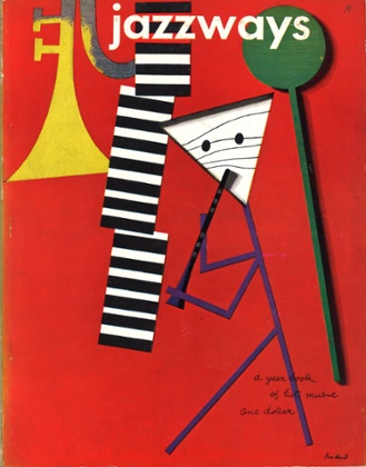
The anteroom’s two vitrines are hard to parse as an intended introduction. We meet Rand in the late 1930s when he is already “Rand”, designing covers for Apparel Arts magazine (before it became GQ) and independent arts journal Direction. We are largely left to interpolate Rand’s all-important reference material from pointed elements in the covers’ designs: stars and vectors from the Constructivists; body parts as pure form and the domestic as humorous from Dada; font and proportion from the Bauhaus school; harmony and contrast from the Suprematists and cohesion in commercial art from AM Cassandre.
Absent from the beginning is Rand’s actual beginning as Peretz Rosenbaum, born to Orthodox Jewish parents in Brownsville, Brooklyn, in 1914. Before he changed his name to look balanced and sound Gentile, Rosenbaum learned of European avant garde art via volumes of the British design journal Commercial Art at the New York Public Library. Only one item appears from this time – a 1929 issue of German design magazine Gebrauchsgraphik, telling little about Rosenbaum’s formative self-education.
In the antechamber, we miss the opportunity to see Rand through seeing what the designer saw. But in the exhibition’s main room, seeing only Rand is a satisfyingly expanded experience. Bright, blown-up reproductions of his logos, campaigns, book covers, posters and photographs cover the walls like galley proofs, conveying the dynamism and bigness of Rand’s visual thinking. The vitrines no longer gape with omitted information but rather achieve, as Rand did, fullness through order.
Of particular interest are Rand’s pitch booklets, which presented to clients in fastidious detail the elements and rationale of a proposed identity. Several spreads are displayed from the so-called Graphics Identification Manual and Image by Design guide Rand made for the American electronics company Westinghouse in 1961. Rand enumerates 15 instructions and strategies for the use of his logotype, a circle containing a W topped with smaller, filled circles and underscored to resemble a crown. Rand’s issuances range from meticulous – “When the selling statement is used as the last line of body copy, the type-face should match the body type, in italic or bold face of the same type-face” – to pedantic – “The light [version] will be particularly useful when a more delicate effect is desirable” – to outright bossy – “The old hand lettered style of type for the selling statement should never again be used.” The design, as always, is treated as inevitable: the functional, beautiful, logical answer to the “problem” of corporate image.
Rand’s work for IBM, displayed extensively in Everything is Design, bridges an era of optimism for branding as a communicative tool and our modern skepticism toward its saturation and intent. From Rand’s work with the company in the 1950s – the same period in which Eero Saarinen designed IBM’s sprawling blue research facility in Rochester and Charles and Ray Eames curated branded exhibitions – we see bright and friendly packaging for typewriter ribbons and cartridges using pink, blue, green and white, and Rand’s original solid block letter logo.
But by the 1980s, we are in different territory: Rand’s new, eight-bar IBM logo has become an icon and modern consumer culture is entrenched. A reproduction of a poster from this period bearing the updated logo and some Randian instructions (“White stripes look thicker, especially when lit (signs, TV screens)”) is boldfaced and humorless; in its monochrome austerity, it is an ominous historical signpost.
Rand liked to argue that manipulation is integral to design. It is a designer’s job, he wrote in Thoughts on Design (1947), to manipulate ingredients in a given space – to manipulate symbols through juxtaposition, association and analogy. These days, it is difficult to separate logos and branding from other, more insidious forms of manipulation. A recent return to flatness in corporate design – emblematized by Apple’s decision to abandon skeuomorphism in 2013 – could be seen as an attempt to invoke Rand’s heyday, when consumers trusted a brand’s visual cues to communicate some essential truth.
This is an important aspect of Rand’s legacy, enormous and complicated as it is. Although Everything is Design stops short of addressing the lasting implications, artistic and otherwise, of Rand’s work, it provides us with a necessary basis from which to do so. Danziger’s advice to the contrary, looking at Rand is valuable if we want not just to be as good as Rand, but to understand the complexity of what it is to be good.
- Everything is Design: The Work of Paul Rand is at the Museum of the City of New York until 19 June. Details here.