As ever, when it came to today's Apple WWDC event, most of the rumours turned out to be true. Apple changed its naming conventions to adopt a yearly approach, replacing iOS 18 with... iOS 26. The company also revealed new features for the beleaguered Apple Intelligence. But it's Apple's new design language, Liquid Glass, that appears to be raising eyebrows.
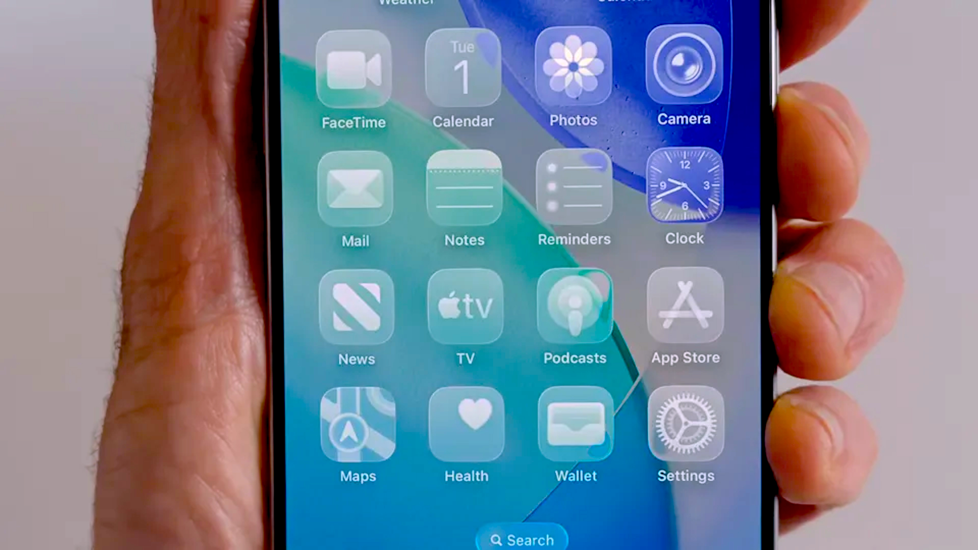
Inspired by VisionOS, iOS 26 features tons of translucent UI elements designed to take advantage of the iPhone display's rounded edges. Apple says the new look "brings a new level of vitality" to iOS, but some users are drawing comparisons with another software – one that's older than the iPhone itself.
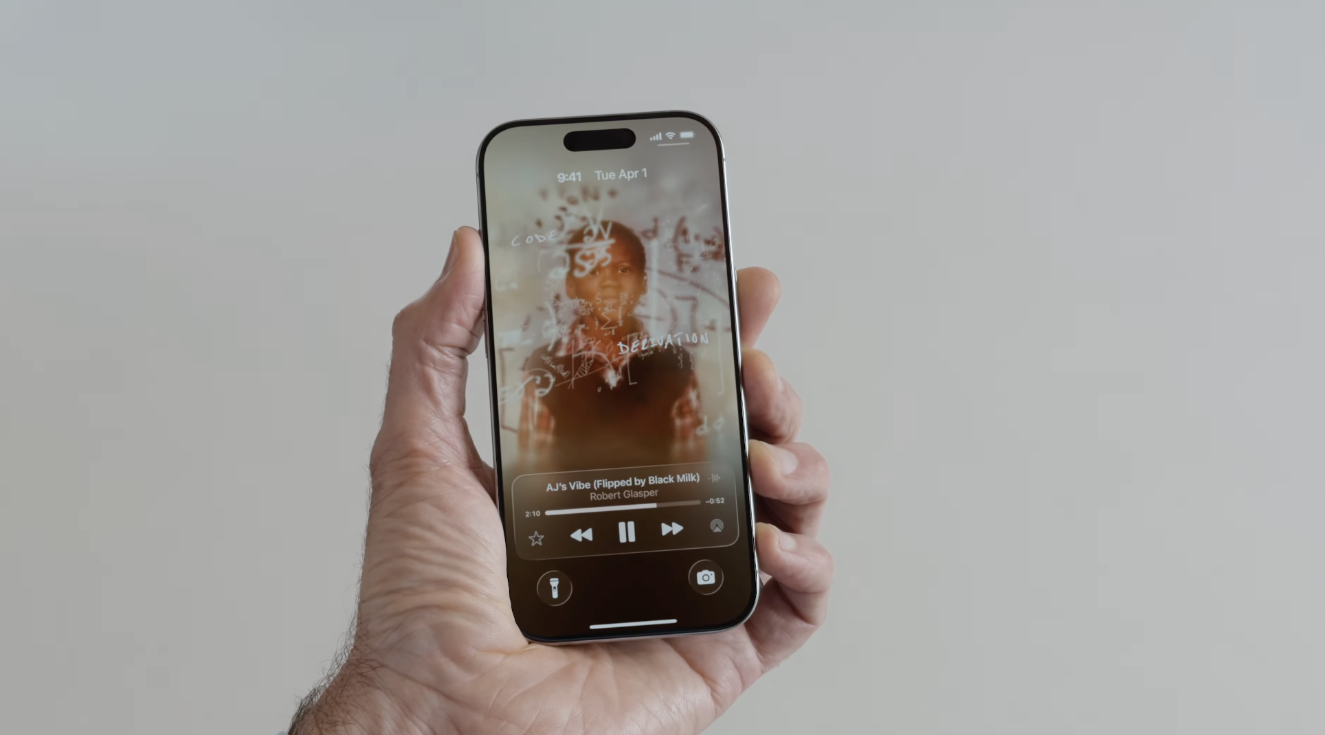
Perhaps the clearest (pun intended) representation of the new Liquid Glass design language is the iPhone's new transparent mode, which joins Light Mode and Dark Mode as visual setting for icons and interfaces. As the name suggests, rather than light or dark, it makes elements transparent. Which all looks rather a lot like 2007's Windows Vista.
Can’t wait to use “liquid glass” on my mac!#WWDC25 #WWDC2025 #wwdc pic.twitter.com/JryK0MIrIRJune 9, 2025
iOS 26 looks amazing pic.twitter.com/VUdo4ihGArJune 9, 2025
Introducing Liquid Glass #WWDC25 pic.twitter.com/rI4RN8yLuYJune 9, 2025
This is like a jailbreak tweak from 10 years ago #WWDC2025 https://t.co/99kUob8XBK pic.twitter.com/EEvvokJhirJune 9, 2025
Of course, iOS 26's visuals aren't only about transparent icons. The update includes a redesigned Phone app, simplified camera controls and a customisable Messages app. But even this early on, it seems clear that, at a glance, folk are going to remember this one as "the glassy one". Let's just hope that doesn't become "the Windows one".