
Right, let's get one thing straight from the off: the Daily Mail's breathless coverage of the Gov.uk rebrand is not journalism – it's performance art. Bad performance art. The kind where someone pretends to be outraged about a dot moving, whilst completely ignoring the actual story unfolding in front of them.
Yesterday's Mail Online piece screamed about the government "blowing over half a million on 'vanity' makeover for website which involved moving a full stop." A full stop! The audacity! Except, of course, that's not what happened at all. But why let facts get in the way of a perfectly good frothing session?
Here's what actually occurred. The Government Digital Service has undergone a significant organisational restructure, merging teams from GDS, the Central Digital and Data Office, the Incubator for AI, and other units into a new department under the Department of Science, Innovation and Technology.
This required a complete brand refresh to reflect the new scope and structure – not just "moving a dot," but creating a comprehensive visual identity system that works across web, mobile, apps, physical spaces, and countless other applications. Much of the work was actually complex programming to make everything work together digitally (as the best rebrands often do).
Nuance, shmu-ance
But nuance doesn't sell papers, does it? Much easier to reduce months of strategic design work by a professional team to "someone got paid to move a dot." It's the journalistic equivalent of describing brain surgery as "doctor pokes head with stick."
The pattern is so predictable you could set your watch by it: government announces visual identity work, tabloids scream about "vanity projects", readers work themselves into a lather about their hard-earned taxes, and everyone studiously ignores the actual purpose and value of professional design work.
What makes this particularly maddening is how it reveals a fundamental misunderstanding of what branding actually does. A rebrand isn't about making things look pretty – it's about creating a coherent visual system. One, in this case, that will help millions access essential government services more easily.
Good design is invisible precisely because it works so well. But try explaining that to someone convinced that all graphic designers do is "move dots around."
There's also the delicious irony of newspapers – those own websites are masterclasses in chaotic design and user hostility – lecturing anyone about visual communication. The Mail's site is a sensory assault course of flashing ads, clickbait thumbnails, and migraine-inducing colour schemes. If they spent half as much on user experience as they do on traffic-driving hysteria, their readers might actually be able to find the news amongst the digital debris.
Undermining governance
What really gets my goat is that this kind of coverage actively undermines good governance. When every design decision becomes a political football, civil servants become afraid to invest in proper brand work.
The result? Confusing, inconsistent public services that cost more to maintain and leave citizens frustrated and confused. "Penny wise, pound foolish" doesn't begin to cover it.
The truth is, professional design work saves money in the long run. It's not all about the best logos either. Clear visual hierarchies reduce support calls. Consistent branding builds trust. Accessible design prevents exclusion. But these benefits are cumulative and hard to quantify, making them perfect targets for bad-faith criticism.
So next time you see a headline about "government wastes millions on logo", do yourself a favour: dig deeper. Ask what the work actually involved. Consider the scale and complexity. Think about the alternative – a confusing mess of inconsistent branding that serves nobody well.
Because the real scandal isn't that governments invest in professional design. It's that newspapers can get away with calling it "moving a dot" and somehow keep their readers' respect. Now that's what I call a waste of time and money.
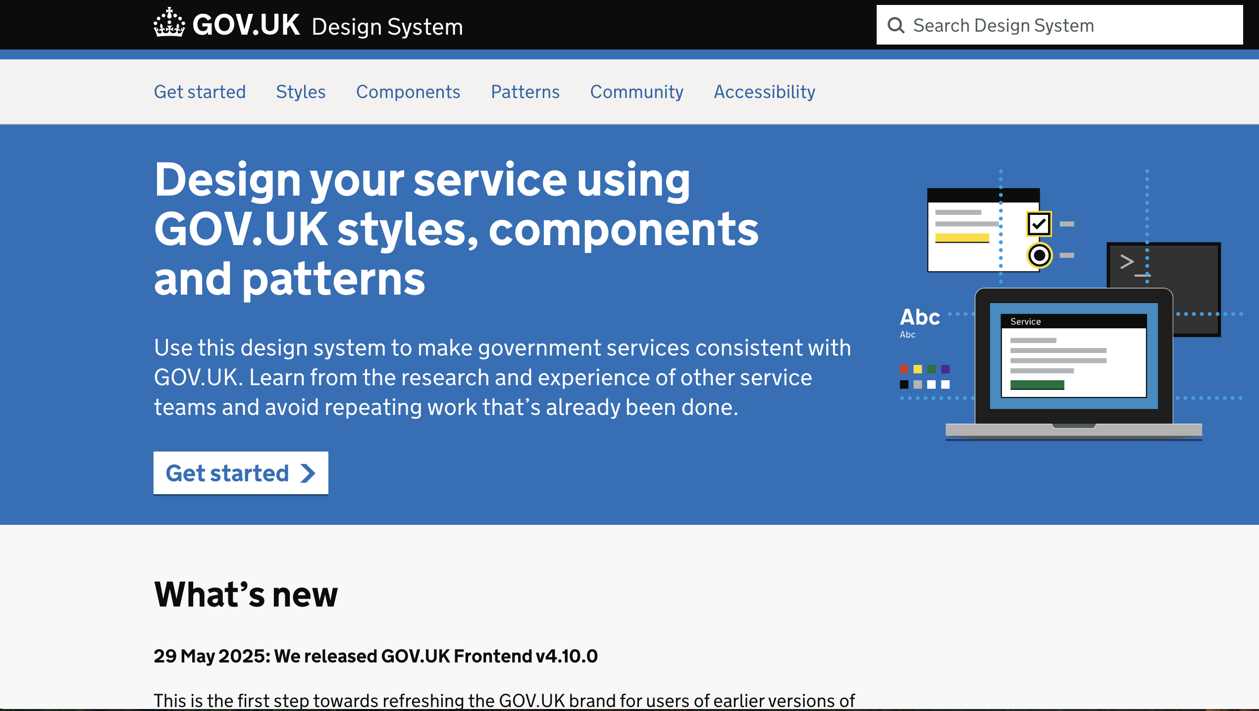
In the meantime, the new design system should go live in a couple of days, on Wednesday 25 June, but you can already peruse the details on this mini-site (perhaps on a laptop for graphic design).