
While some websites might try to test UI changes slowly quietly, there isn't much chance of the likes of YouTube getting managing that. As one of the most familiar websites in the world, even the subtlest tweak can cause uproar. So it's no surprise that changes to the platform's video player itself have users up in arms.
Rolled out this week, the “cleaner and more immersive” new look includes updated controls and new icons, designed to "make the viewing experience more visually satisfying while obscuring less content." Along with the new video player, YouTube has revealed new transitions on mobile and a new structure for comment threads.
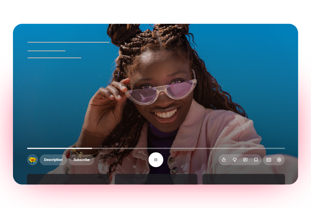
A little like Apple's Liquid Glass UI, the new video player is much more transparent, with round floating buttons. It's certainly cleaner and more minimal, but it's already proving divisive.
How i do get rid of this ugly UI?? PLEASE HELP ME! from r/youtube
I don't like it. I much rather prefer the UI from back in the mid-2010s. The previous UI design was meh, but I still hate it when social media companies went all in for "Apple minimalism"", one Reddit user complains, while another adds, "If you copy Apple's ugly bullsh*t. You will end up with ugly UI that looks cheep at the same time." Another chimes in, "Everything is starting to look like Apple, not that Apple is a bad thing, but every big company is losing their identity to something nobody ever even asked for."
Indeed, the YouTube Reddit page is utterly awash with complaints about the new look right now, with users asking, nay, begging, for any advice on how to roll back the changes (spoiler alert: you can't).
But of course, there's probably an aspect of the shock of the new at play here. Much like changes to home screen icons, which often draw ire since users see them every day, changes to the YouTube player affect something many internet users stare at daily. The noise will probably die down after a while – hey, nobody's complaining about that "controversial" Airbnb icon ten years later.