The battle for the Women’s World Cup is underway, but the contest for the best kit at the tournament has never been stronger.
The biggest ever Women’s World Cup means there are more new shirts to dive into than ever before, while Nike and Adidas have taken their creative experimentation process to another level in Australia and New Zealand.
Like in 2019, the Women’s World Cup features a host of unique designs - with Adidas unveiling a selection of nature-themed kits and Nike taking inspiration from various artistic movements. The results are wild.
Here are the Women’s World Cup 2023 kits, ranked and rated from worst to best:
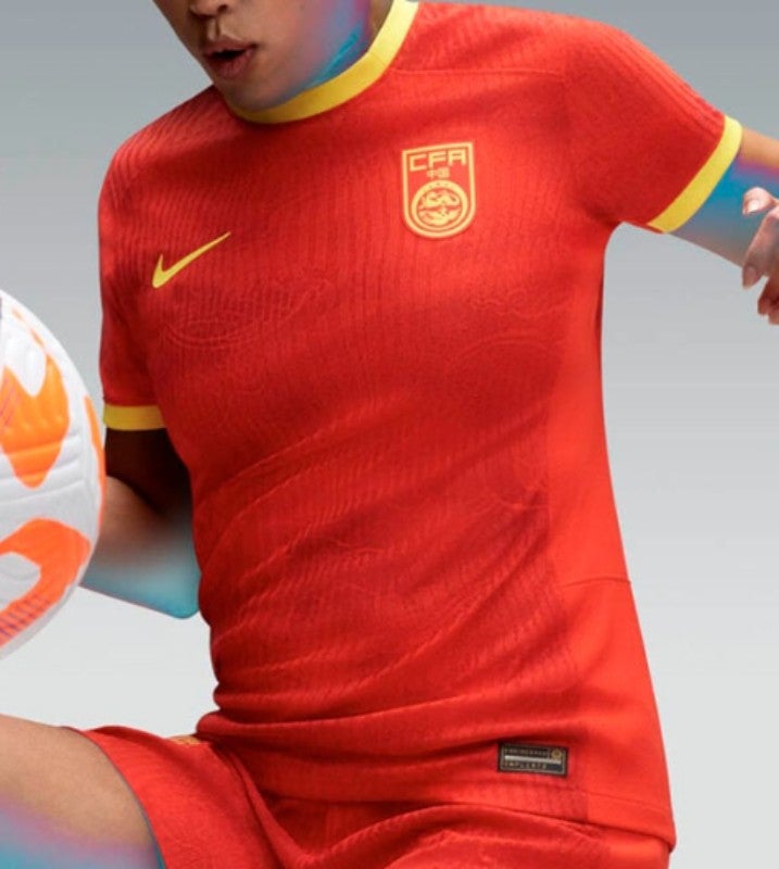
China - away
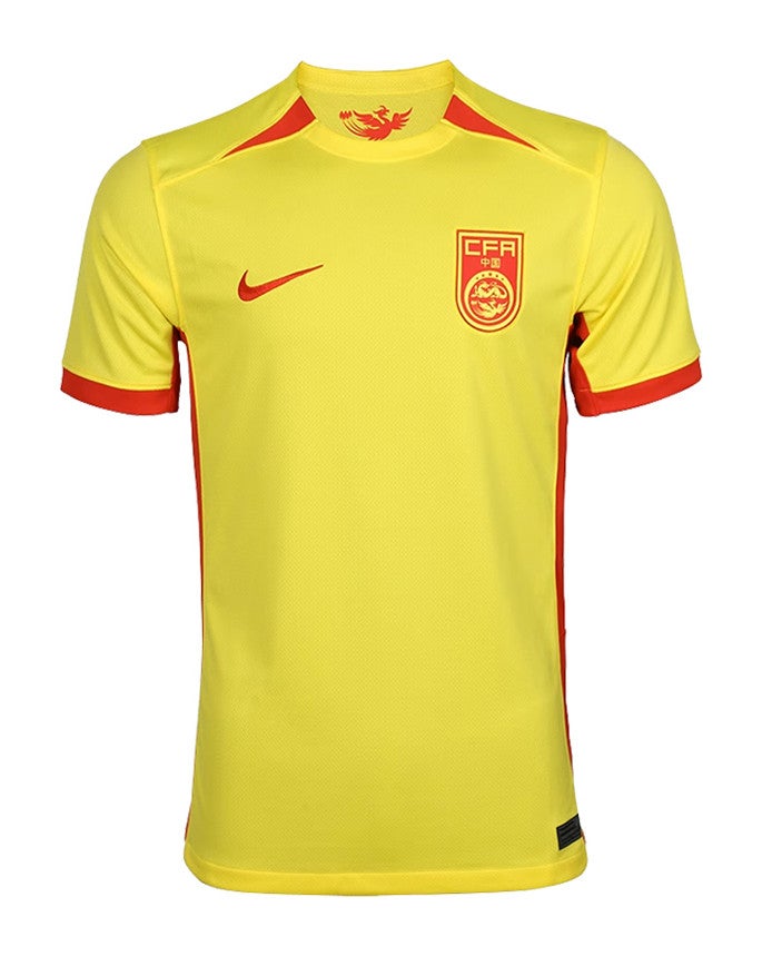
A rival to Liverpool’s disastrous 2014-15 away kit as football’s answer to Thunderbird 4. Yellow and red is a dangerous combination which, unless you are Partick Thistle, is very difficult to pull off.
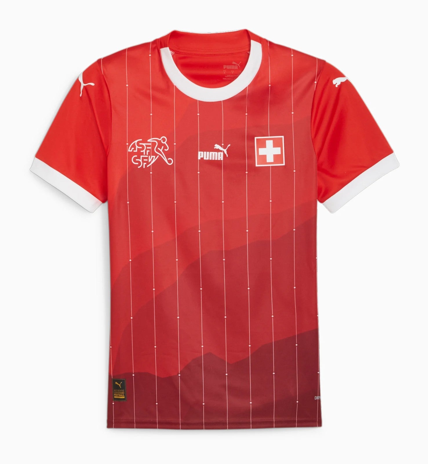
Switzerland - away
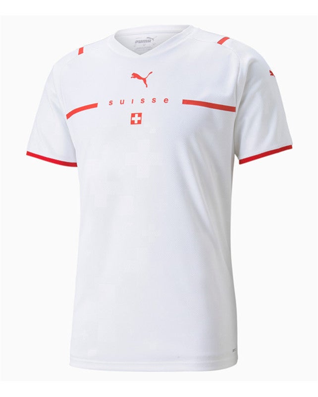
Incredible: this isn’t just leaving your class project until the night before its due, but finishing it on the bus into school. If you need to spell out your country’s name on the front you’re probably not doing a great job of selling any sort of identity.
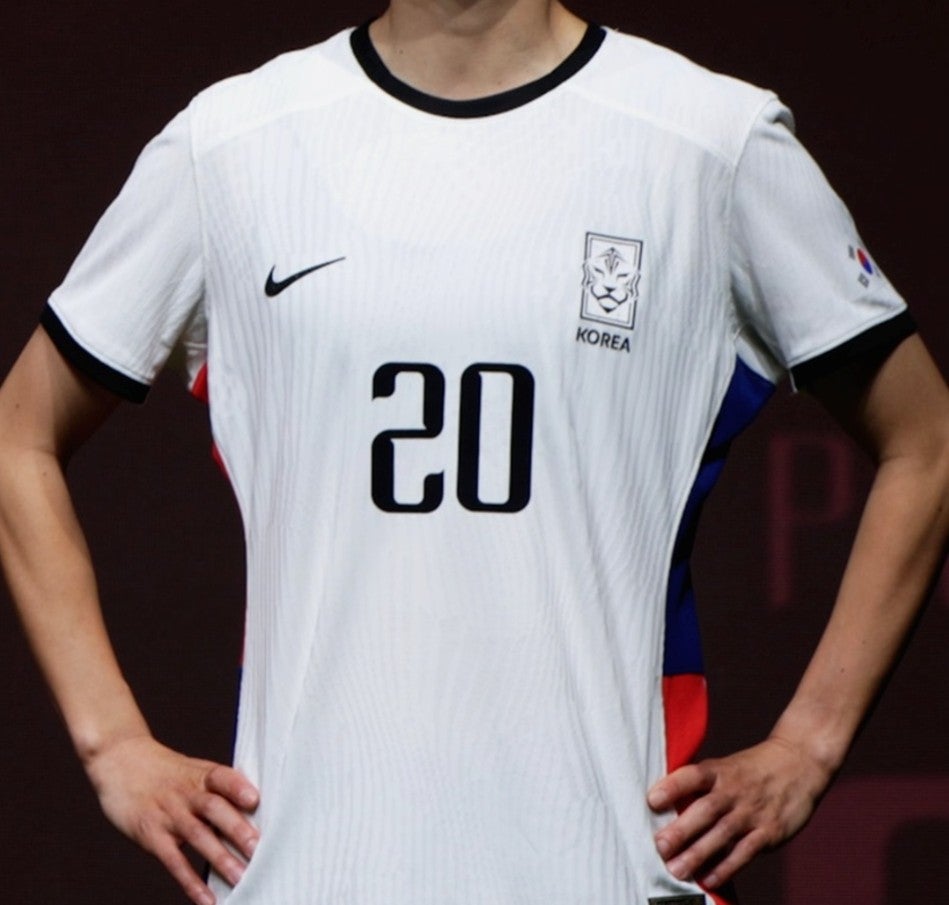
South Korea - home
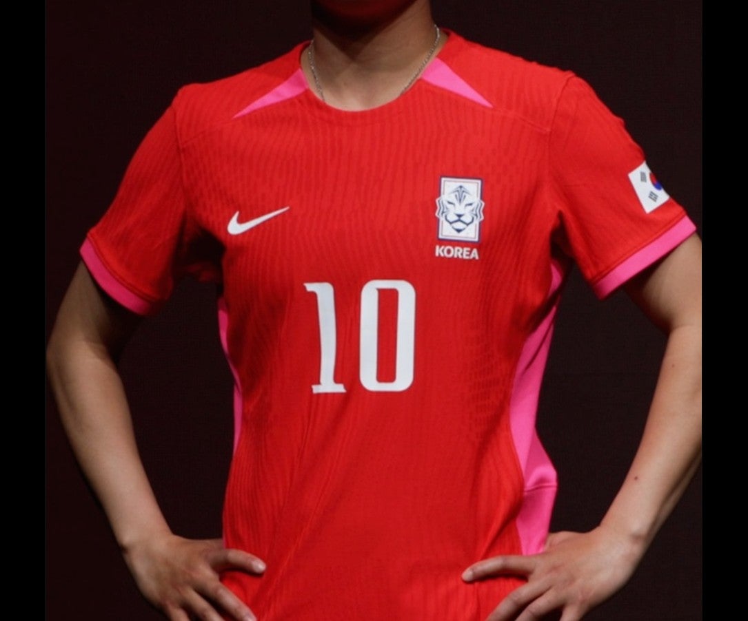
South Korea’s big twist for the World Cup is a flash of vibrant pink on the sides. The question is why.
Zambia - away

Let’s be honest: it doesn’t look like a lot of effort has been put into this. It’s a reverse of the home shirt, which is at least decent, except the all-black side strip just looks like something has driven over it.
Portugal - away
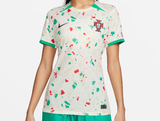
Arguably, too much effort has been put into this. Over to Nike, as football meets “modern art”. Explanation: “The away kit features a vibrant colour scheme and bespoke pattern inspired by the country’s famous calçada Portuguesa design.” Ok, great, but it also looks like a two-year-old just been let loose with a paint brush, which may reveal my feelings about modern art.
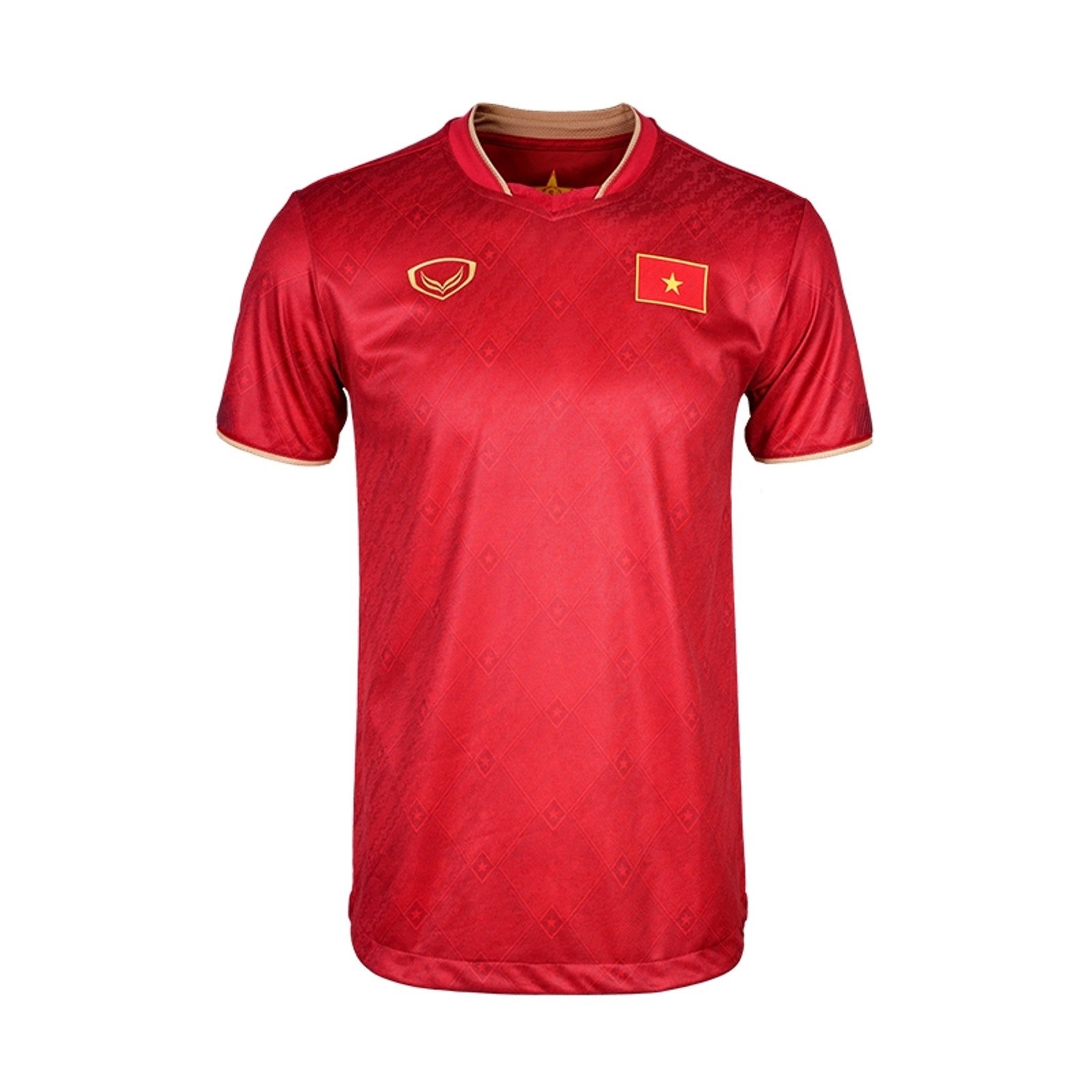
Vietnam - away
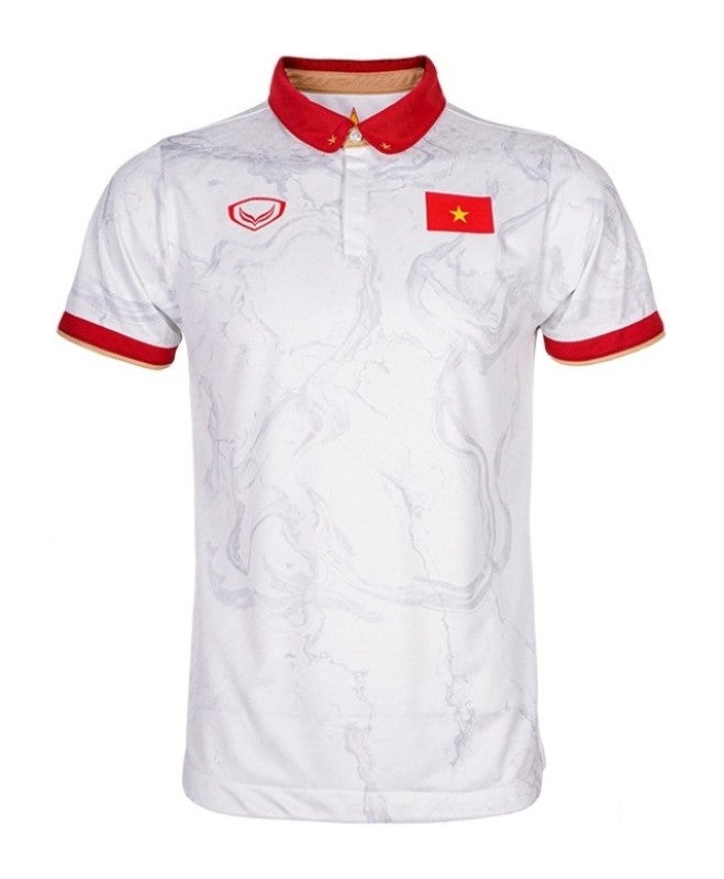
What a remarkably strict collar this is from Vietnam - it would suit a midfield enforcer rather well. A disciplined kit lacking in vibes, aside from the faint swirly pattern in the background.
Haiti - home and away
Haiti - home— (SaetaSports)
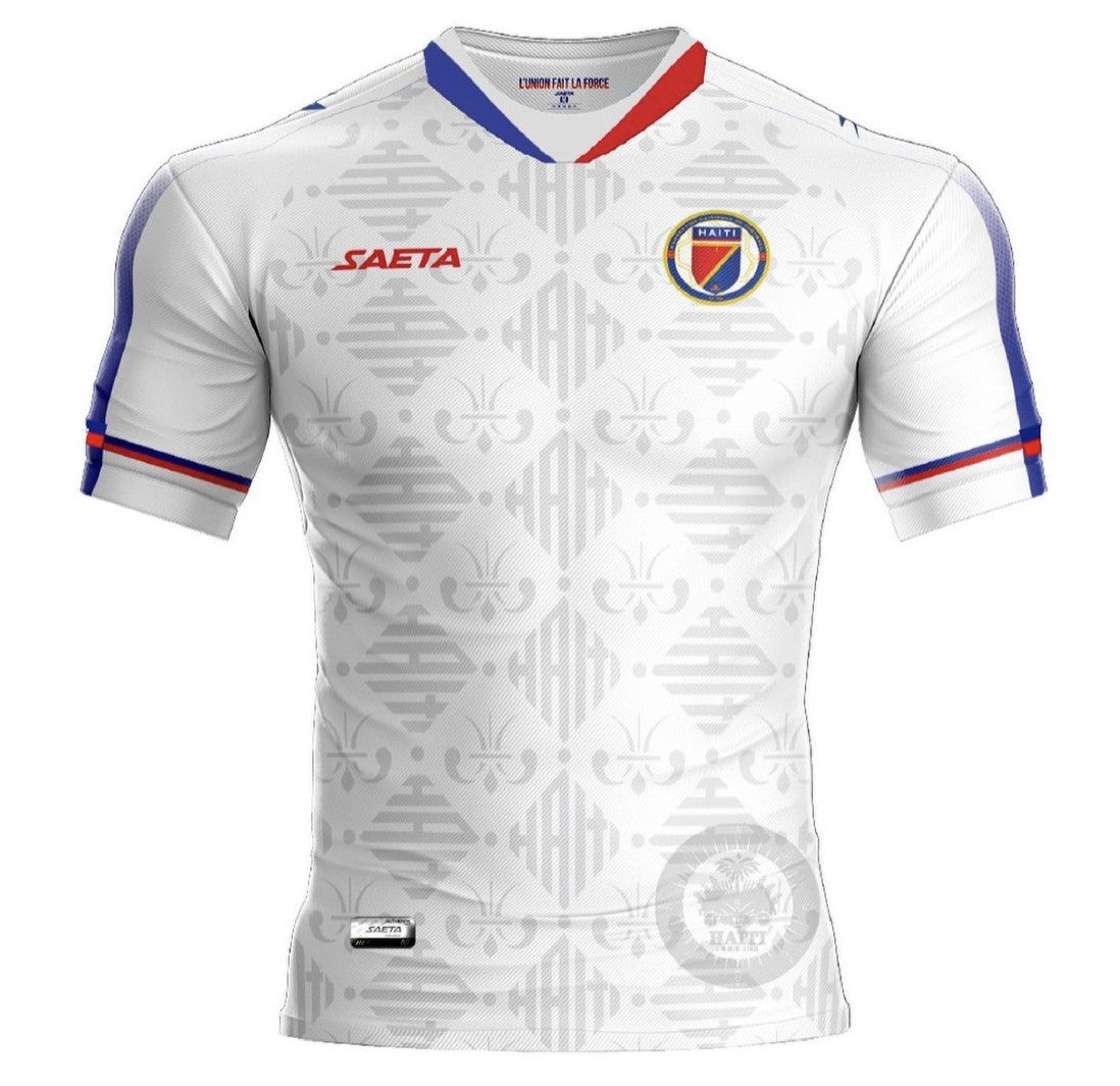
A rogue entry from the good people of SaetaSports, who based their promotion of this Haiti kit around “armour”. It perhaps explains why they appear to be so tight. There are so minor tweaks to the away, but it follows the same design. The problem is neither look like real kits.
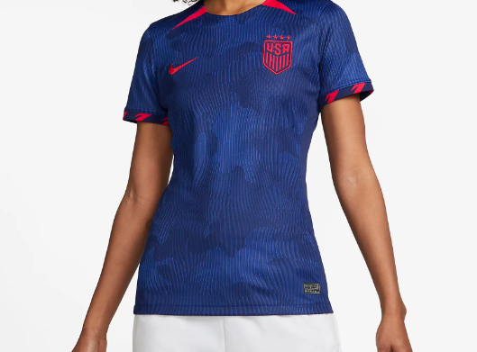
USA - home
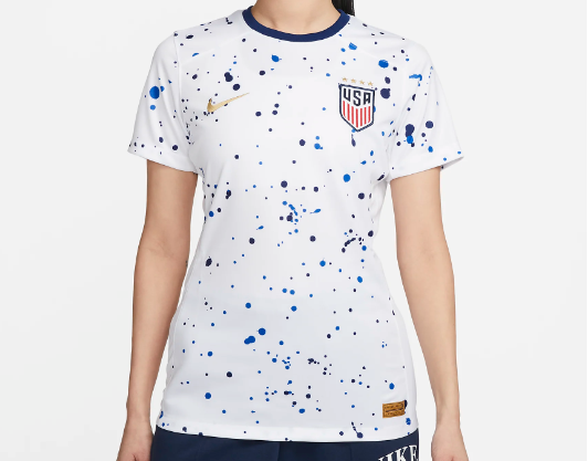
Even the defending champions can’t escape another Nike dive into modern art! This time the final product is a statement featuring the “movement of abstract expressionism”. I’ll let Nike explain: “the home kit features a distinct drip-paint technique pattern, highlighting the energy of the women’s national team — though different, they are united”. Excellent chat, but again, a five-year-old has just been let loose with a bucket of paint and you won’t convince me otherwise. It’s a wild move from the four-time winners.
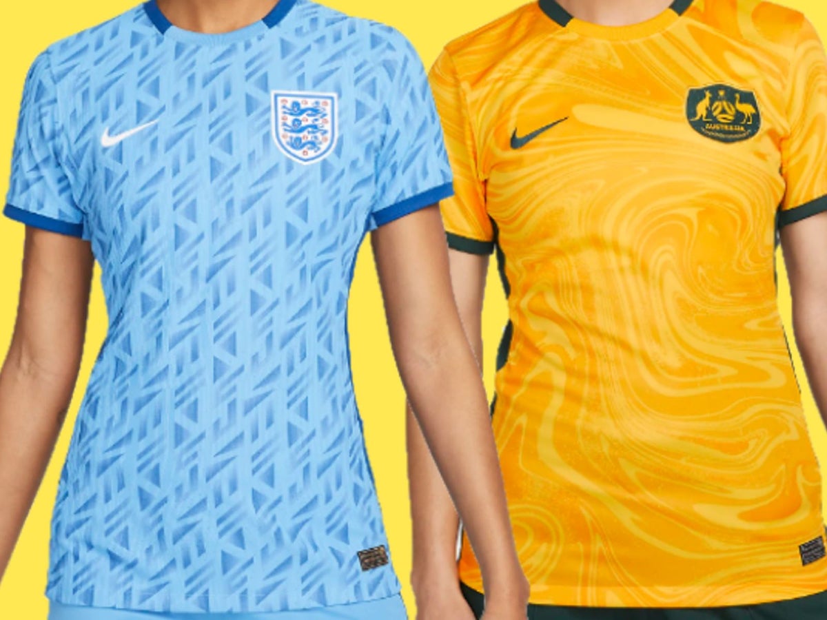
Australia - away
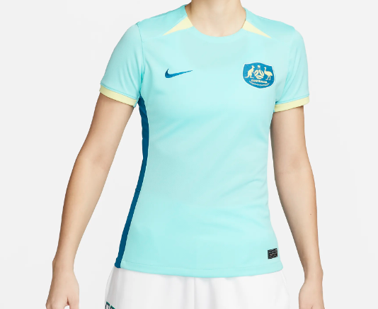
A training top at best, but Australia should only have to wear yellow at their own World Cup and, thankfully, their home kit is a beauty.
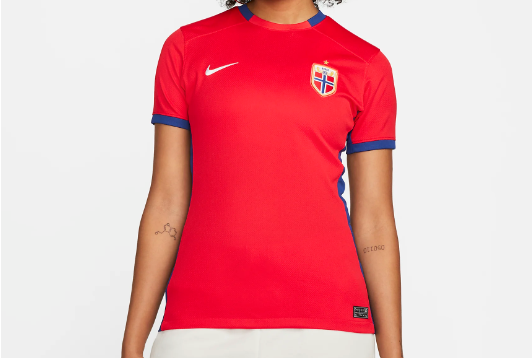
Norway - away
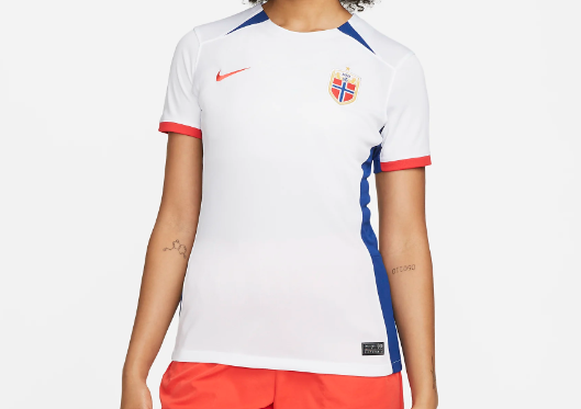
Clearly, Norway missed out on Nike’s funky away shirt list. This is bland, and the mismatch between the shoulder and sleeve trim isn’t working for me.
China - home
China have no interest in taking part in Nike’s experimental designs. The home is an obvious improvement, but neither will win awards.
New Zealand - home
New Zealand are called the Football Ferns, so it’s fairly obvious to see what is going on here. I like the ambition, but the spray paint pattern is faint, looks like it’s fading and doesn’t quite hit. It’s certainly no Canada home.
Canada - away
Incredibly plain, but the budget has been spent elsewhere (you’ll understand why when you get to what has been created for Canada’s home kit).
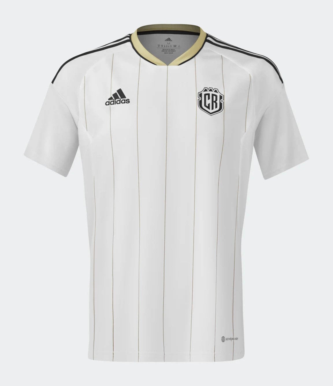
Costa Rica - home
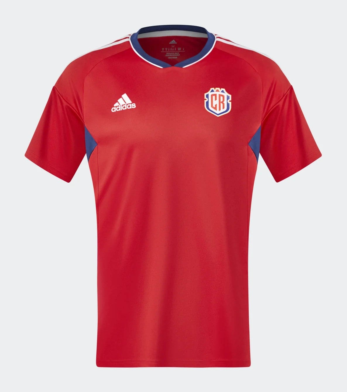
The collar area features a clean trim but Adidas have left very little else to get excited about. Moving along.
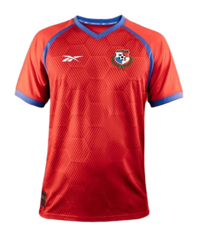
Panama - away
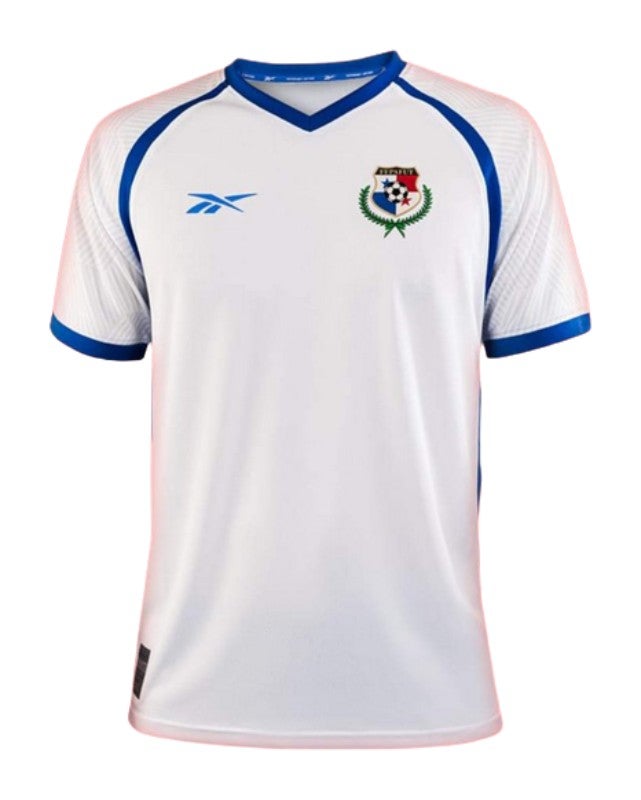
It’s good to see Reebok making an appearance at the World Cup. It’s a shame they’ve brought this weird shoulder trim with them.
Vietnam - home
Vietnam will carry a bright, bold sheen into their first World Cup with this kit, which carries a much more relaxed vibe with the collar area loosened around the neck. It’s fine.
Costa Rica - away
Is this Costa Rica or a World XI kit from an old Fifa game? This is a smart kit, sure, but it’s not screaming Costa Rica to me - and I don’t think you can get away with gold trim with having only one appearance at the Women’s World Cup (2015: played three games, two draws, one defeat, no wins).
Italy - away
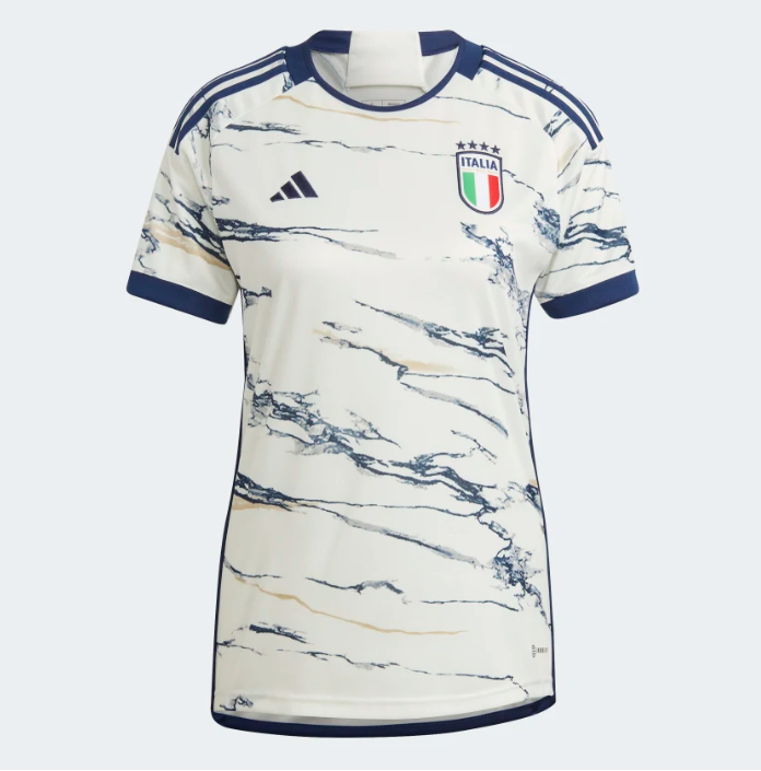
We begin the Adidas ‘nature’ series with Italy... and marble. “This Italy away jersey owes its eye-catching look to a rock that has permeated the region’s culture for millennia,” Adidas explain here. I’m not against it, but I’m not a fan either. When you’re designing football shirts from rocks you’ve probably gone a bit meta.
Panama - home
This looks like a little ‘early 2000s unlicensed soccer movie’. A big moment for hexagons.
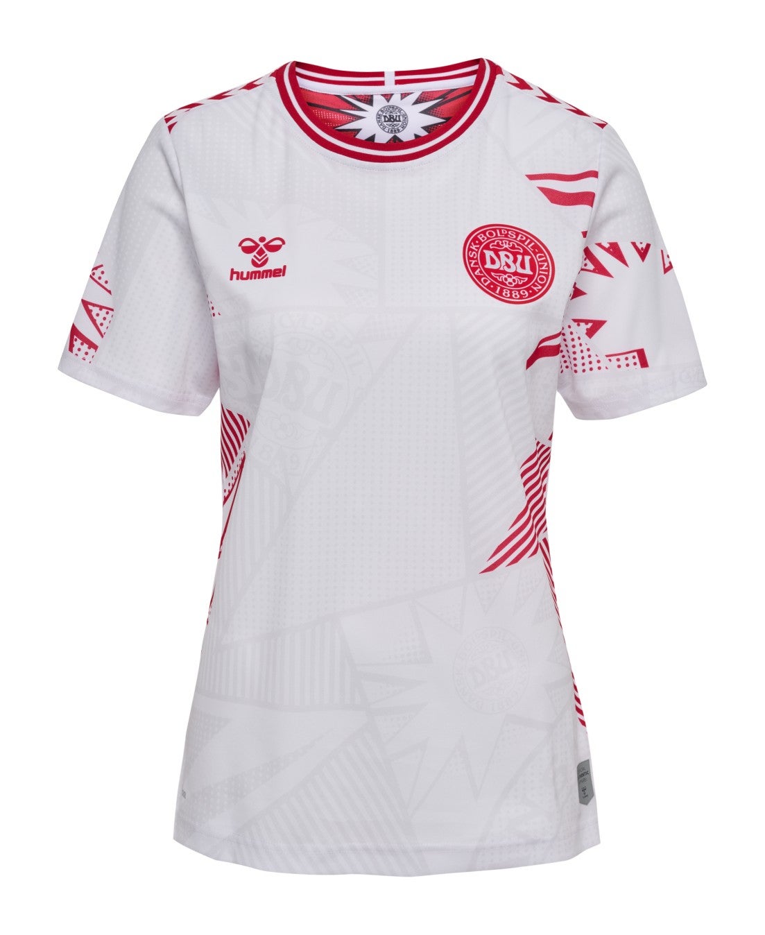
Denmark - home
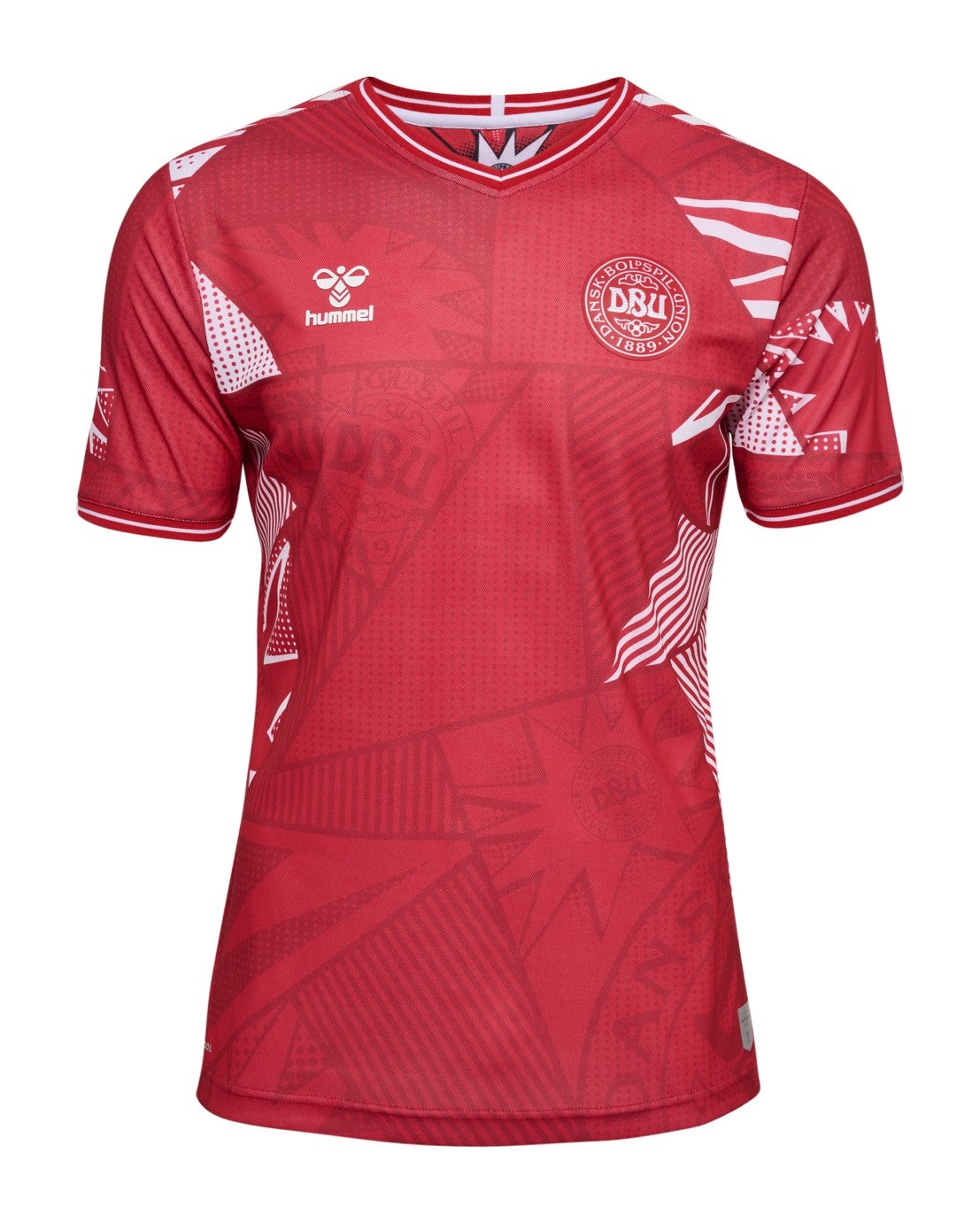
Welcome to the party, Hummel. Clearly, there were several texture designs on the table here, they couldn’t decide what to go for, so threw as many as they could onto the shoulders and sides. The background looks like a sketchbook and it’s all a bit too whacky.
Denmark - away
I will include Denmark away here as the approach just seems to be, ‘the same, but a bit less, and with a reverse colour scheme’. It has been marked accordingly.
USA - away
It feels like the USA’s away kit was an after-thought following on from the home. A dark blue and red combo peaks with the cuffs but is quite forgettable elsewhere.
Netherlands - away
Cool colours, but this is all a bit too wild. No, your eyes are not playing tricks on you, those splodges are actually lionesses, with the designers taking the team crest and “combining its shape with geometric modern patterns”. They are still splodges to me.
Philippines - away
The overall colour palette is refreshing and the shading of the stripes is interesting, but I fear this kit will be quite forgettable.
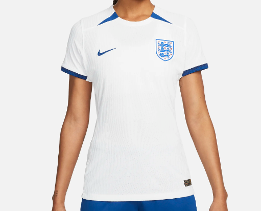
England - home
Struggles to even attempt to recapture the magic of last year’s home kit at the Euros, leaving it looking just a bit bland and missing something… Hopefully not an omen for England’s World Cup!
Sweden - home
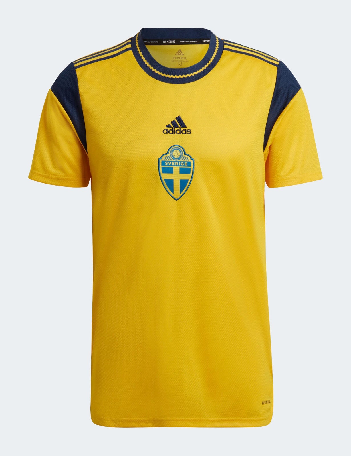
Sweden go again with the home kit they wore at the Euros last summer, which on the inside was said to have instructions on how other teams could beat them. Whether that remains this year, after Sweden’s 4-0 defeat to England in the Euros semi-finals, is unclear - but what remains is a Sweden home kit that should look a lot more iconic than this. You’d think a Sweden kit would be hard to mess up, but then you’d think you wouldn’t but both crest and kit manufacturer slap bang in the middle, wouldn’t you.
Spain - away
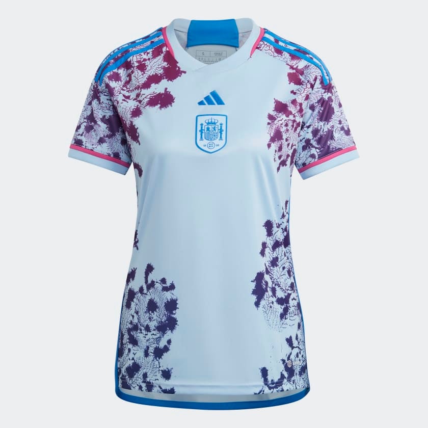
Spain’s away kit “puts the nation’s colourful marine life front and centre” with a design “inspired by coral from the Mediterranean Sea”. Of all the nature themes Adidas have served up, this is one of the weaker efforts, probably because the “coral” is spilling over the sides rather than properly flourishing all over the shirt. The contrast of the blue and red is pleasing but the overall print doesn’t quite add up, for me.
South Korea - away
The colour blocking on the sides here is a clear improvement on the home and at least follows the traditional colours of the South Korea flag. A minor detail but a big improvement on the home.
Norway - home
Bold, strong colours and no messing around on the combinations this time from Norway. It’s not a disaster, but does it add a second star above the crest? Absolutely not.
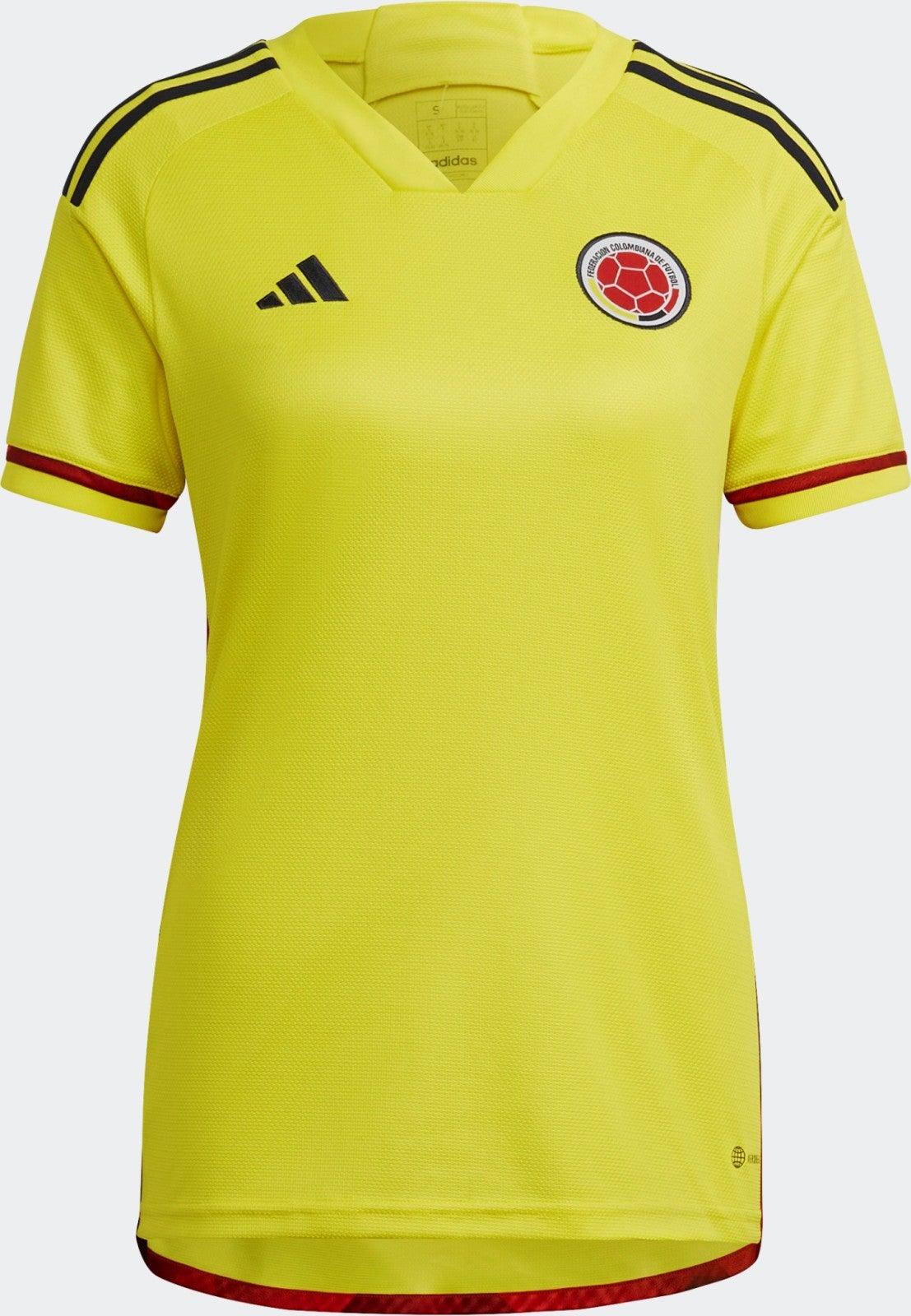
Colombia - home
There are few thrills on this Colombia home kit (very much saved for the away) but it remains a classic combination.
Nigeria - away
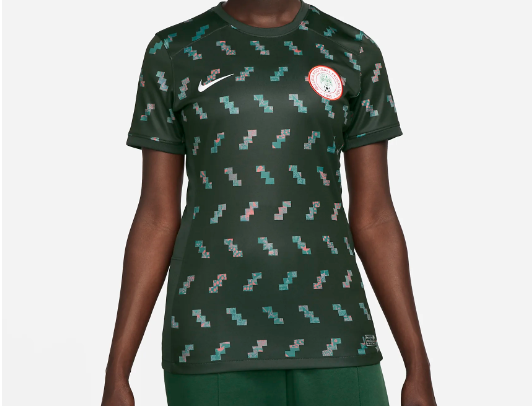
Zoom into these squiggly patterns close enough and you’ll find a series of very intricate designs featuring traditional prints, each one different from the next. It’s a smart feature, but zoom out and those squiggles start to look like… squiggles. Or the groovy bug emoji.
Brazil - away
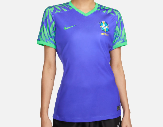
“Inspired by the Amazon”, Brazil have gone bright for this World Cup, like they are pitching a cartoon version of themselves. Leaves on the sleeves, but not quite packing a punch.
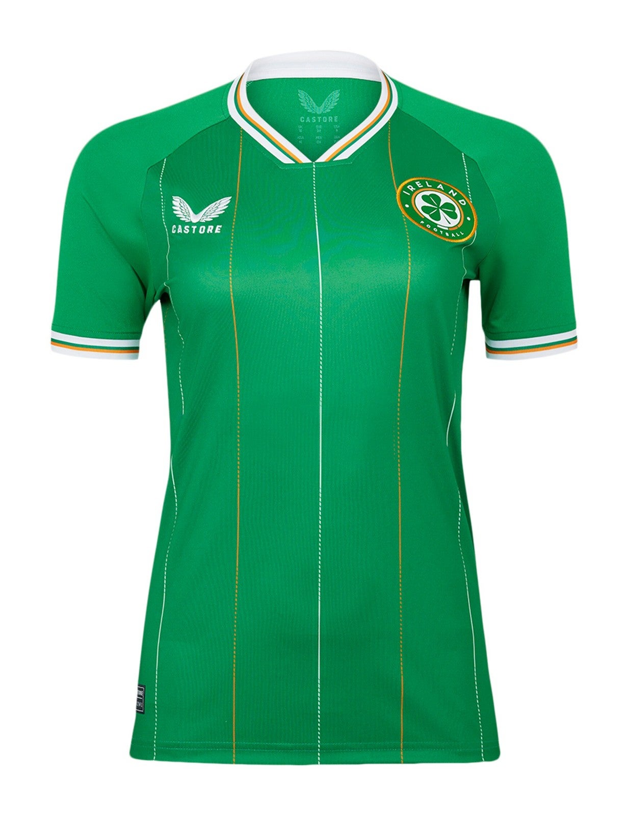
Ireland - away
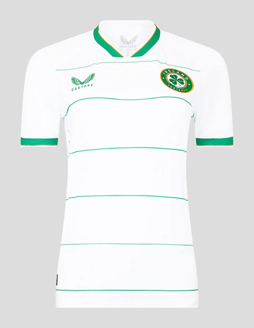
I’ve been caught out here by Ireland changing their badge since the last time I saw an Irish football shirt. This badge now features a much more distinct three leaf clover, which makes sense, but does it come across just a bit clip-arty? Like the logo of an Irish pub that doesn’t quite know how to be Irish? Safe to say I preferred the old one. The thin hoops make this look very Celtic, which tells you Castore have delivered an Ireland away kit, because there really is no difference.
Philippines - home

It’s a shame better commercial images weren’t available, because this looks like the makings of a very tidy kit from the Philippines as they make their World Cup debut. From the colouring of the collar to the continuation of the red on the shoulders through to the pinstripes, there’s a lot to admire here.
Germany - home
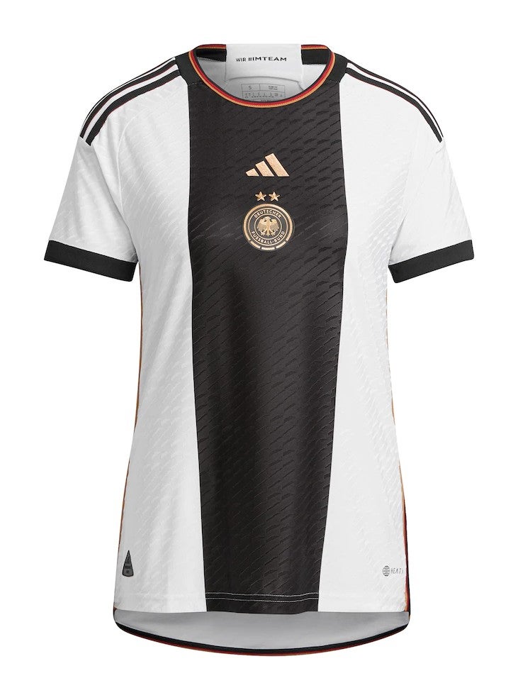
The same as Germany’s men’s kit at the 2022 World Cup, except with two stars representing victories at the 2003 and 2007 Women’s World Cup. The black middle panel is so strong and imposing, perfect for a player like Lena Oberdrof. On the whole, Germany will hope it’s more fitting than it was when the men’s side crashed out at the group stages in Qatar.
Zambia - home

Much better from Zambia here. A rare kit at this World Cup that manages to be impactful while remaining fairly simple in its design. Zambia aren’t overdoing anything but the vertical stripes of red, black and orange in front of the dark green is a smart nod to the nation’s flag.
Sweden - away
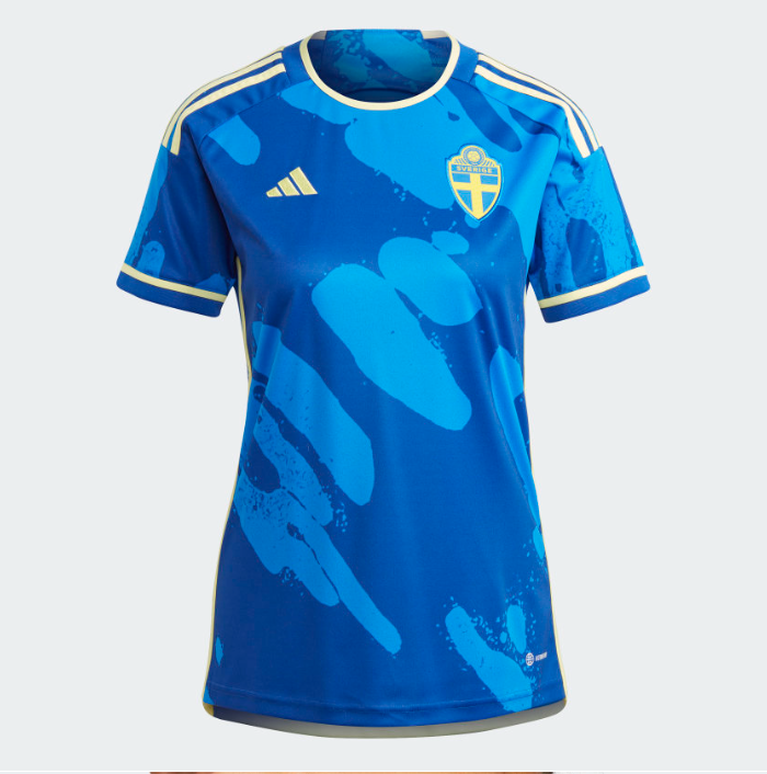
Honestly I’m annoyed because this is so close to being perfect. “The new Sweden World Cup away kit stands out with a design inspired by Sweden’s glacial rivers,” says Adidas, but what’s really happened here is a classic, deep blue away shirt with perfect hints of yellow has been tarnished by some icy light blue blobs. I’m disappointed, but I’m keeping it high because I can see why it’s still nice.
France - home
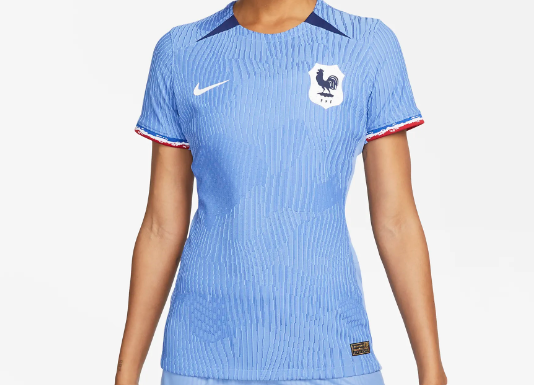
Yes, for a France kit the blue here is far too light. But hold your anger, the “light blue and lilac hues” are a nod to the first France women’s teams of the 1920s. Still, you want a France kit that is deep, dark blue, like the tricolour.
Switzerland - home
Pinstripes from Puma! But not just pinstripes: pinstripes punctuated by spots, which gets a bit too much if you stare at it for too long. There’s a lot going on across the chest, too, while Puma feature their own refrence to nature with some subtle mountain gradients. Imagine what Adidas would have done.
Brazil - home
The tropical vibes continue for Brazil. I would like to see a stronger shade of yellow and green rather than these more playful tones - this is Brazil we are talking about. It’s fine, but it’s not a classic.
Ireland - home
Again, no messing about from Castore in delivering an ‘Ireland shirt’. Once more, I’m left wobbling by the new badge design (unlicensed ProEvo vibes), but there are some fine details elsewhere here. The colours of the pinstripes and the trim cuffs are tidy touches. Edges ahead of the away kit because it’s more green.
Netherlands - home
After the controversy of the men’s World Cup in Qatar, where the Netherlands appeared in a home kit that was not actually, eh, orange, this is a much-needed return to convention and form. It’s a bit plain, lacking any interesting details other than the bold crest, but at least the colour is right this time, and that’s enough for me.
Spain - home
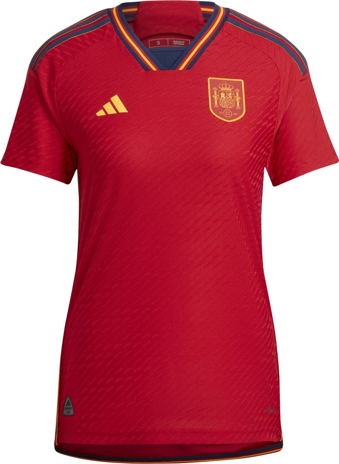
Royal. Regal. Very Spain. Clean and crisp with a lovely trim around the collar. I’m pleasantly surprised that the lack of yellow stripes on the sleeves isn’t taking anything away.
Argentina - home
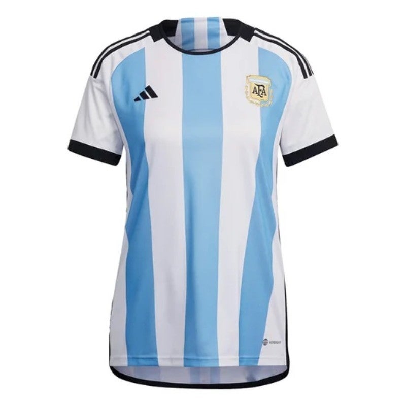
Another returning shirt from the men’s World Cup, except this time of course the familiar look of Lionel Messi’s winners. As a design, it’s timeless.
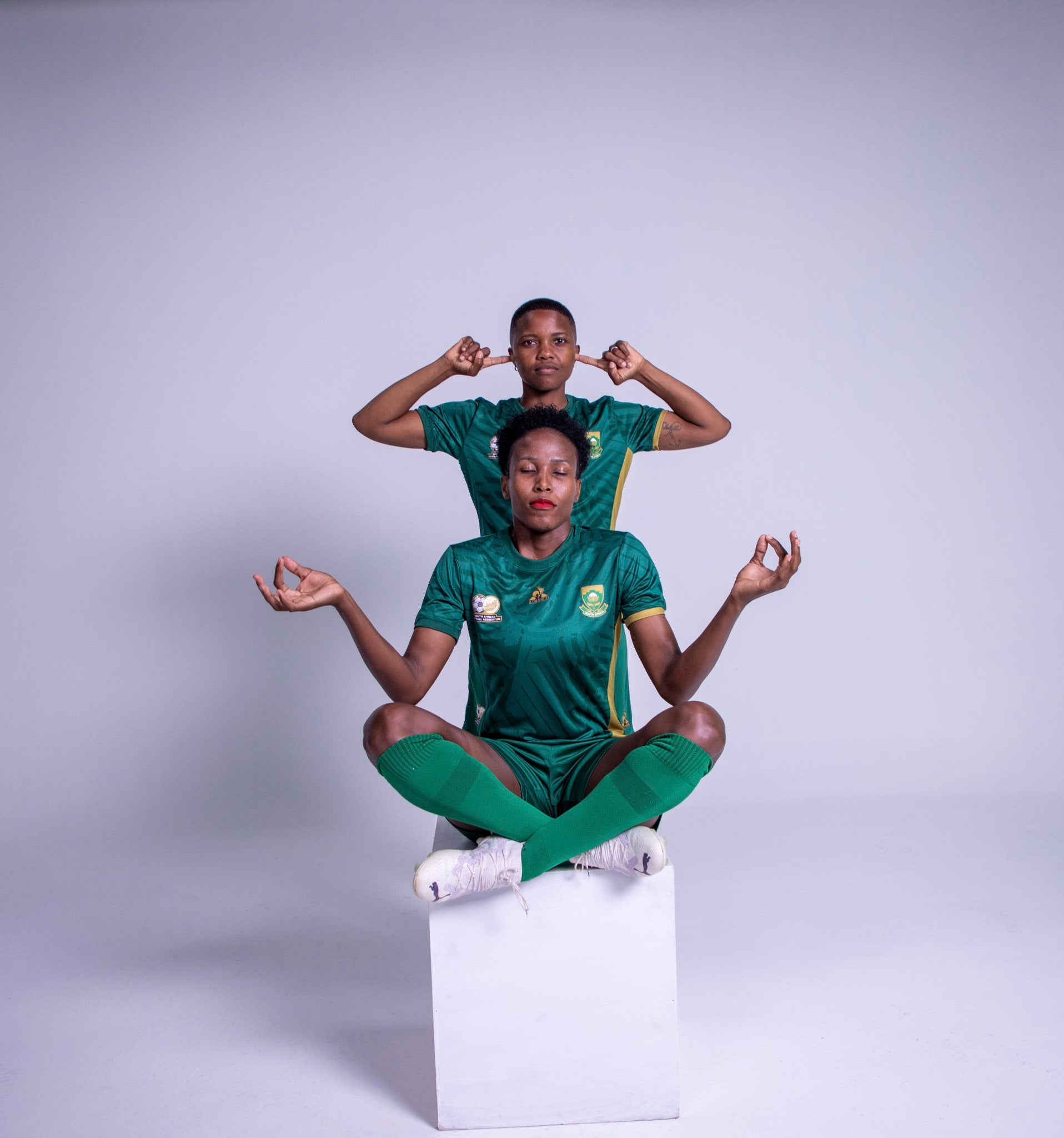
South Africa - home

Loving the energy. Full yellow is a lot, but Banyana Banyana can pull off this bold look.
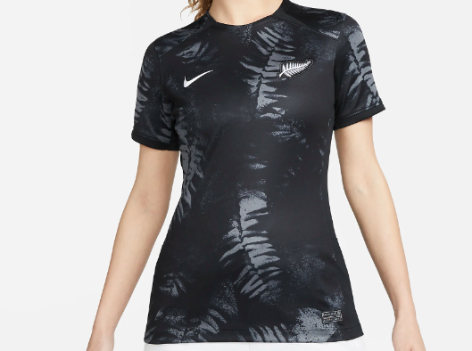
New Zealand - away
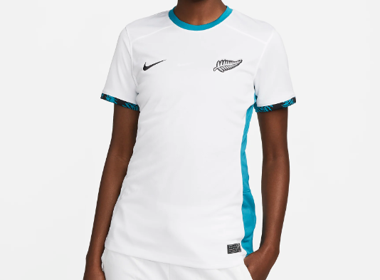
This bright blue trim is stunning, “futuristic” according to Nike. Just look at those sleeves and the little hints of fern on the cuff. A striking shirt, while remaining subtle at the same time. Nicely done.
Italy - home
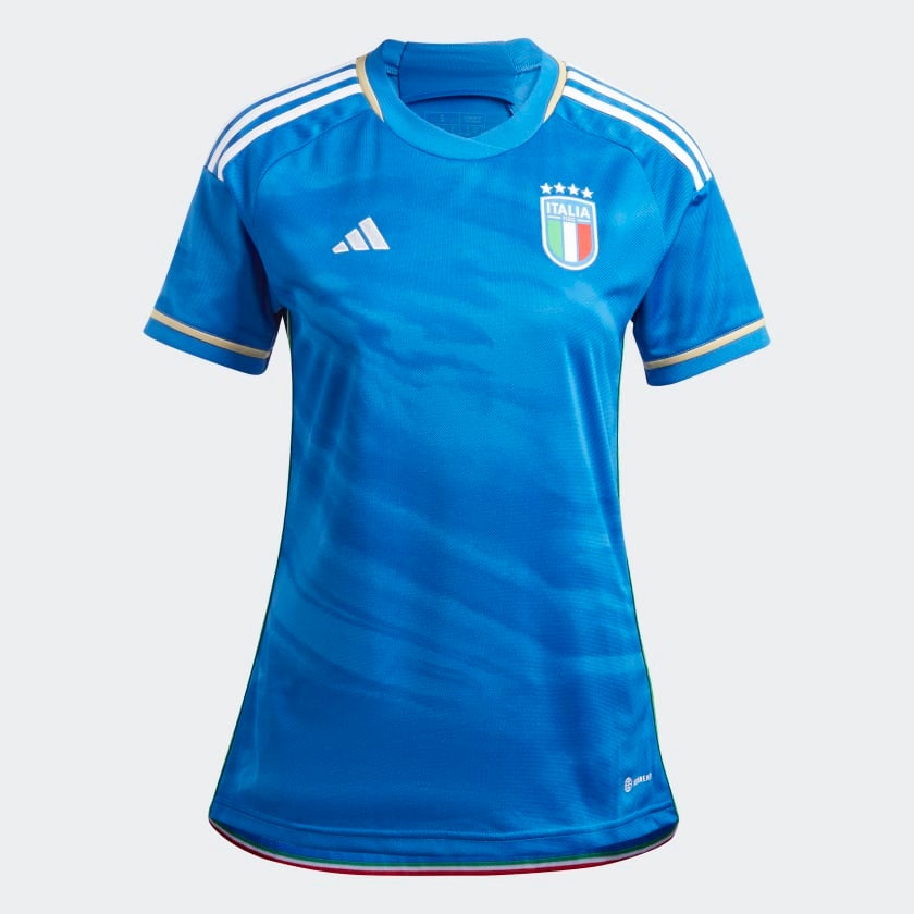
An Adidas Italy kit still takes some getting used to, but this is a lovely effort and is far more natural than Sweden’s previous attempt at a dark blue with its marble effect and gold trim. Pure Azzurri.
Portugal - home
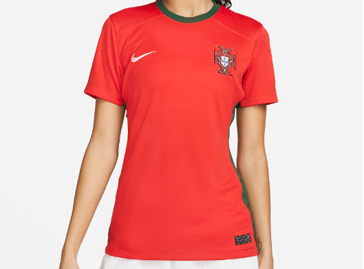
Sometimes you’ve got to just play the hits: Nike, Portugal, striking red with a deep green trim - it’s a classic combination that works and evokes strong World Cup memories. And with Portugal making their debut at the Women’s World Cup, this was always the way to go.
Japan - home
A dazzling effort. There’s a lot going on here across the front, an adventurous texture of shading and patterns. Does it make sense? Probably not. Does it look good? For me, yes.
South Africa - away
Lovely from South Africa. While it may immediately remind you of the Springboks, this is classic. Green and gold is a timeless combination.
France - away
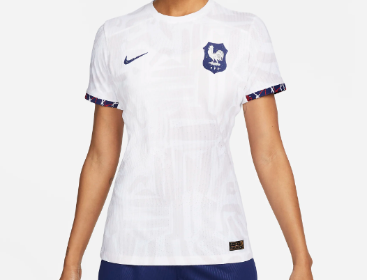
I’m a sucker for a clean, crisp France away shirt and this is ticking all the boxes. The design background design, if you’re interested, features “bespoke, hand-painted patterns” cut into hexagon shapes - the contrast with the sleeve cuffs adds a dimension as well.
Argentina - away
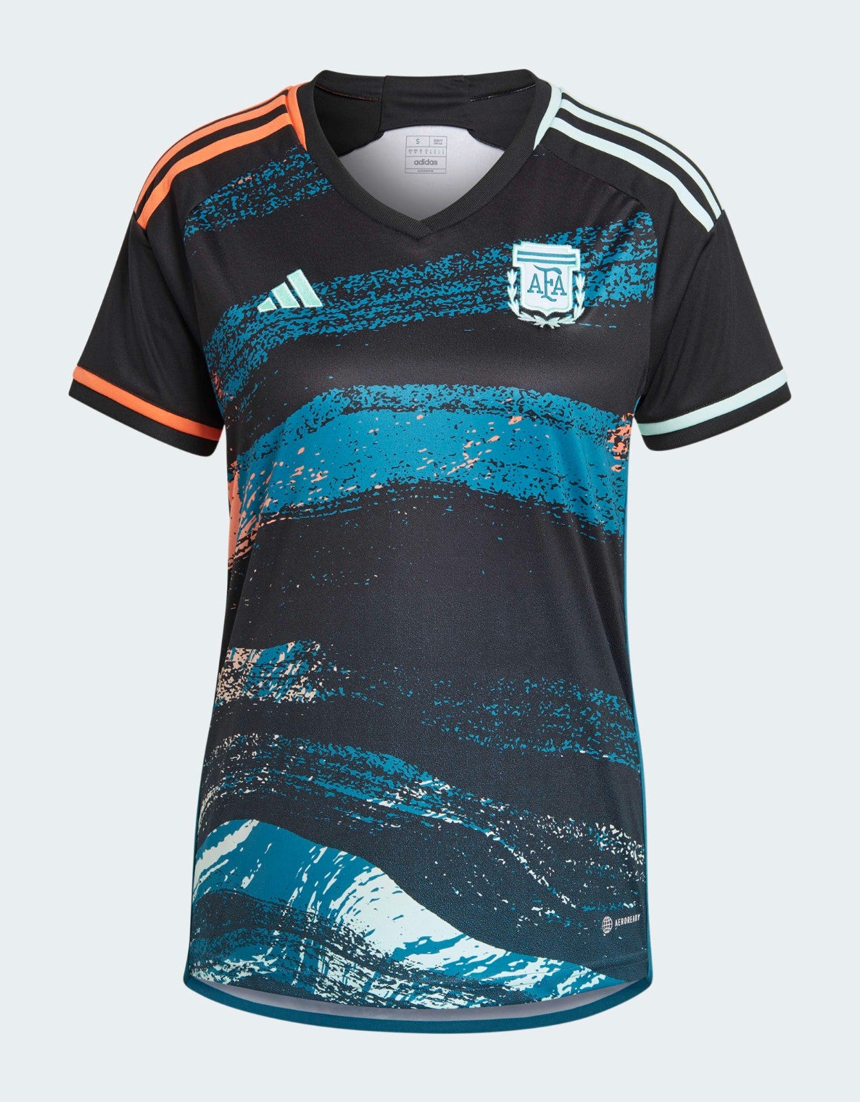
One of the maddest shirts at this World Cup, and that’s saying something. It’s about as unconventional as you can get: a completely new design and a totally new colour scheme for Argentina, inspired by the country’s colourful Quebrada de Humahuaca mountain range. Give that a quick Google and you’ll understand how this shirt came about. You have to applaud the invention.
Nigeria - away
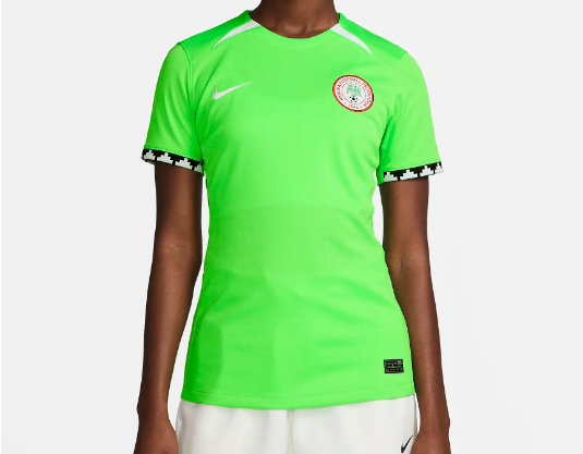
True to form, Nigeria will bring another sizzling home kit to the World Cup, as Nike this time steer into “electric green”. Perhaps a tad plainer than previous tournaments, but this is another shirt that features a stunning sleeve cuff. A fine addition to Nigeria’s growing catalogue.
Australia - home
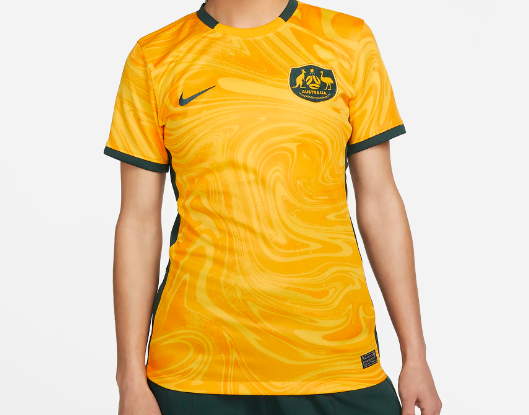
Beautiful. This swirly, marble-looking, pour pattern is exactly the bold and fearless attitude Australia will need if they are to win the World Cup on home soil. Overall a tremendous effort to make the yellow colour so deep - Sam Kerr will score goals in this, obviously, but Sam Kerr would also score goals in anything.
Jamaica - away
This isn’t just a reverse of the home kit, it’s so much more, retaining the feel of a Jamaica shirt while reimagining the colour scheme. The design feels high-end, classy, and as a pair to the home kit, it’s pretty much perfect.
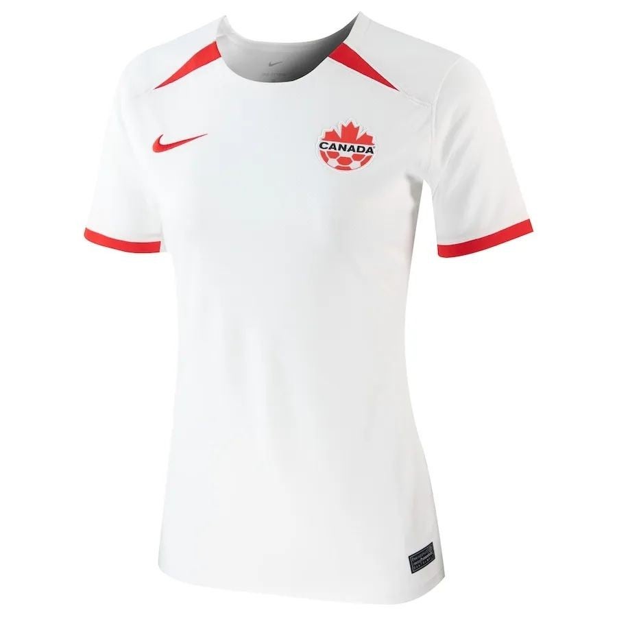
Canada - home
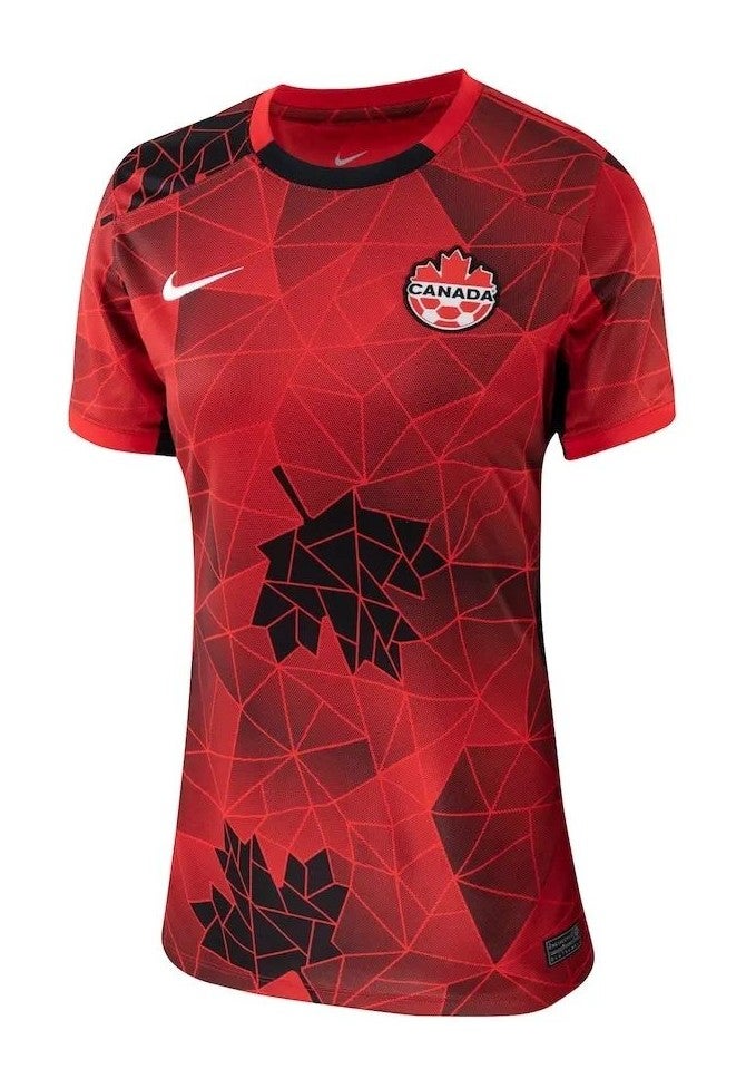
I’m on my feet applauding this after being knocked off my seat by what Canada and Nike have produced here. The vision.
England - away
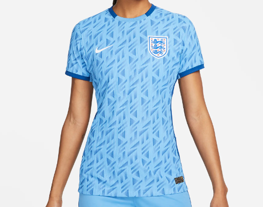
A stunner - capturing the essence of World Cup nostalgia and throwing it forward for the Lionesses to make new memories. No more notes - it’s just a thing of beauty.
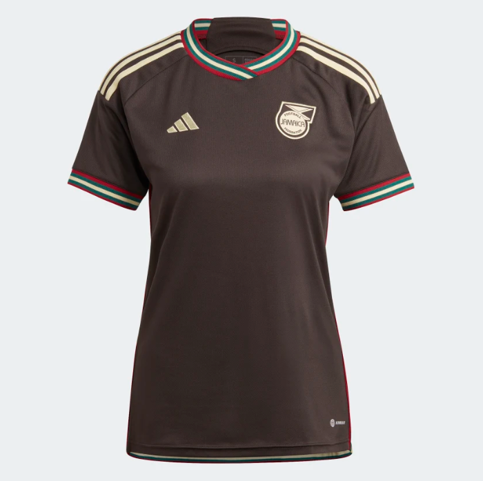
Jamaica - home
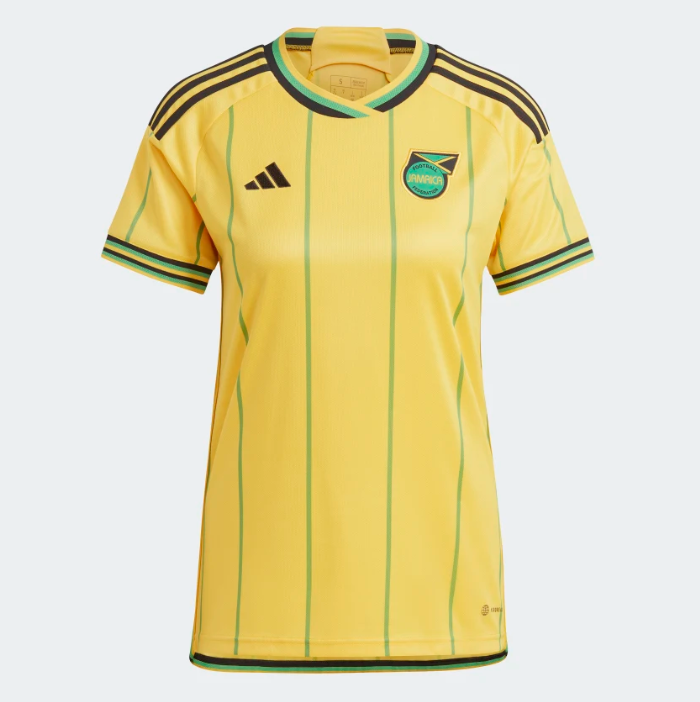
An instant classic. What Adidas have created here is not just the quintessential Jamaica home kit, but a fashion item and piece of street wear without going over the top with its design. It’s a beauty.
Colombia - away
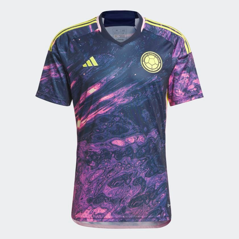
Stunning. Who knew a football kit could look like what Matthew McConaughey flew into at the end of Interstellar. I guess there was always a risk this kaleidoscopic design would be too much, but the way it seems to shimmer and move makes it an another instant classic.
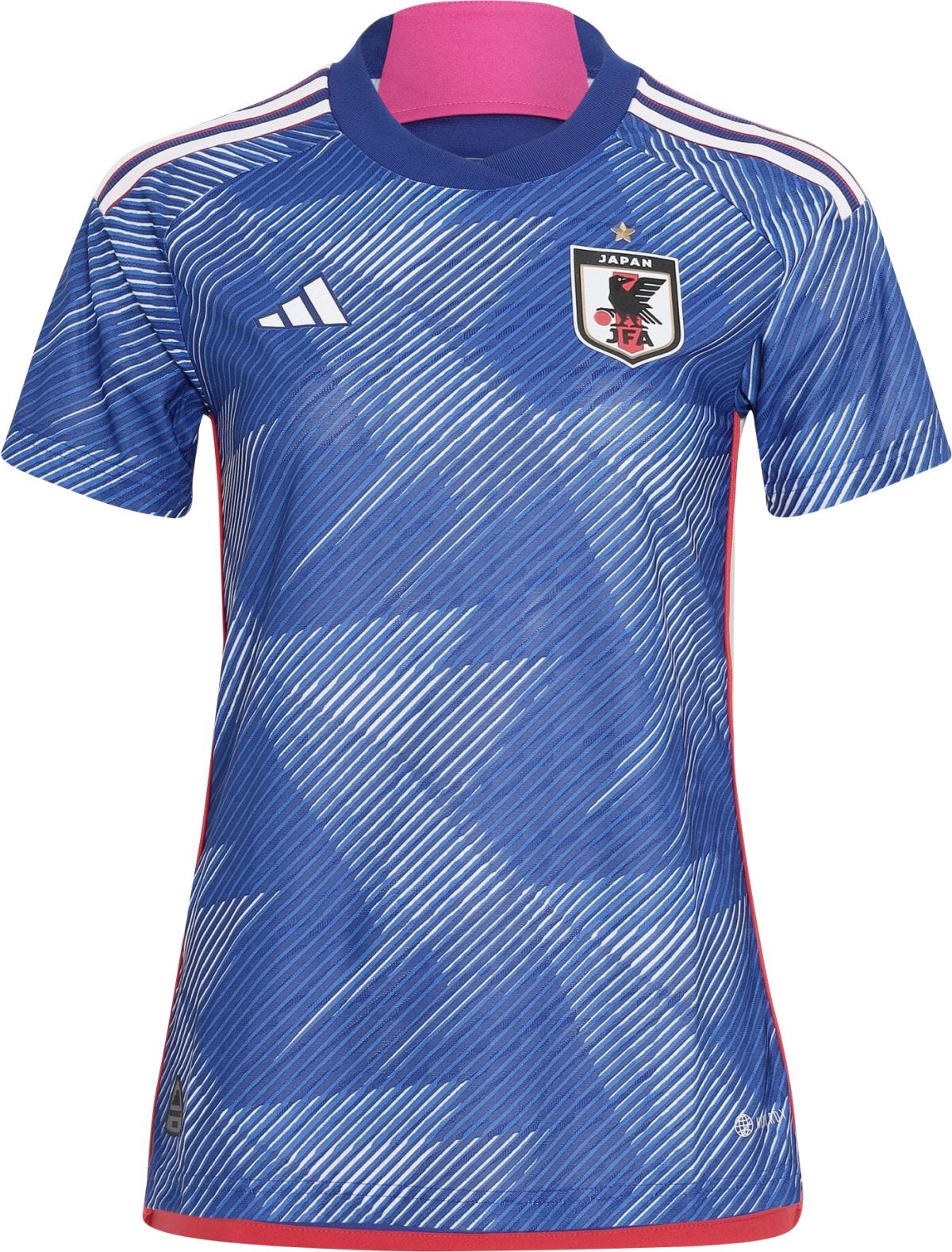
Japan - away
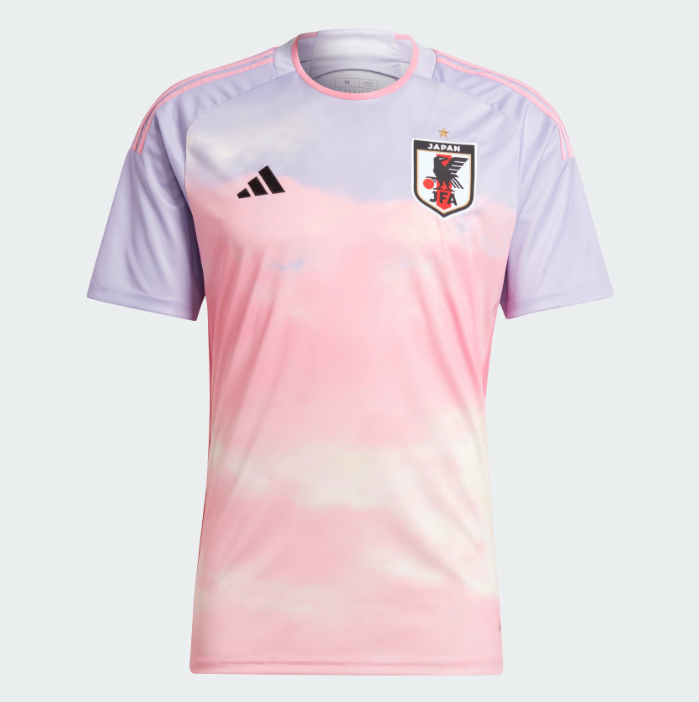
Wow. This is… a masterpiece? Adidas and Japan knock it out of the park with an away shirt that combines the pink of the country’s iconic cherry blossom and the hue of a morning sunrise. The colour appears to shift and shine everywhere you look. Land of the rising sun indeed.
Germany - away
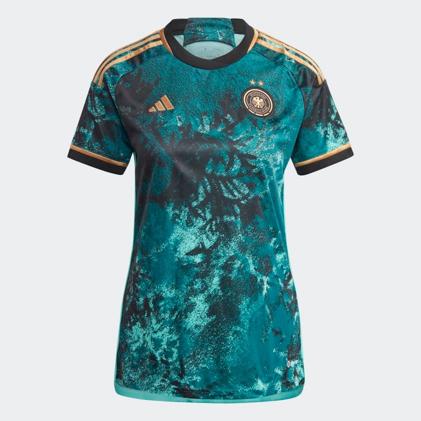
Just an unreal piece of work. Inspired by the country’s forests, this is majestic. The brilliance of these Adidas designs, when they hit, is that they represent a reimagining of what a football kit can look like, producing an item that is completely unique. This is the pick of the bunch.
Our winner.