Split complementary colors can be considered the sister to decorating with complementary color palettes — they are very similar, but their respective nuances make them unique.
While a complementary scheme pairs two colors directly opposite each other on the color wheel, a split-complementary color scheme takes a base color and pairs it with its direct complement, as well as the color adjacent to it.
When designing a space that needs both harmony and energy with a color wheel in interior design, "a split-complementary color palette is one of my favorite techniques to reach for," says interior designer Jen Baxter, founder of Baxter Hill Interiors. "It allows for contrast without chaos, vibrancy without jarring intensity — a subtle tension that brings a room to life."

In all honestly, I'd never heard the term 'split complementary colors' before this story came across my desk. But once I started digging, I started seeing these palettes everywhere.
My first call was to Tash Bradley, a color expert and director of interior design at paint brand, Lick, who helped me break down the color theory in more detail.
"A split-complementary scheme is a clever twist on the classic complementary color pairing," she explains. "Instead of choosing two colors that sit directly opposite each other on the color wheel (as in a complementary scheme), you pick one base color and then pair it with the two colors on either side of its direct opposite."
This creates a trio that offers contrast and energy, but with a softer, more harmonious effect. Both complementary and split complementary approaches to color are rooted in contrast, which is what gives them that visual zing.
But while a complementary scheme is bold and high-impact (think energetic colors like red and green, or blue and orange), "split-complementary combinations are a little gentler and easier to live with day to day," says Tash.
Basically, they're a great option if you're drawn to contrast but want something that feels more balanced and nuanced.
How to Use Split Complementary Colors in Interiors
So, how do you style split complementary colors? It's easier than you think, but like most color trends, it takes a bit of forward planning.
At first glance, split complementary colors are seemingly tricky to bring to life in a room, as there are so many different variations of every color (yellow, ochre yellow, lemon-lime yellow, butter yellow, the list goes on...), meaning you can get very different takes on what a split complementary scheme actually is.
"As with most things in design, the key is to take the inspiration and make it your own," says Jen Baxter.
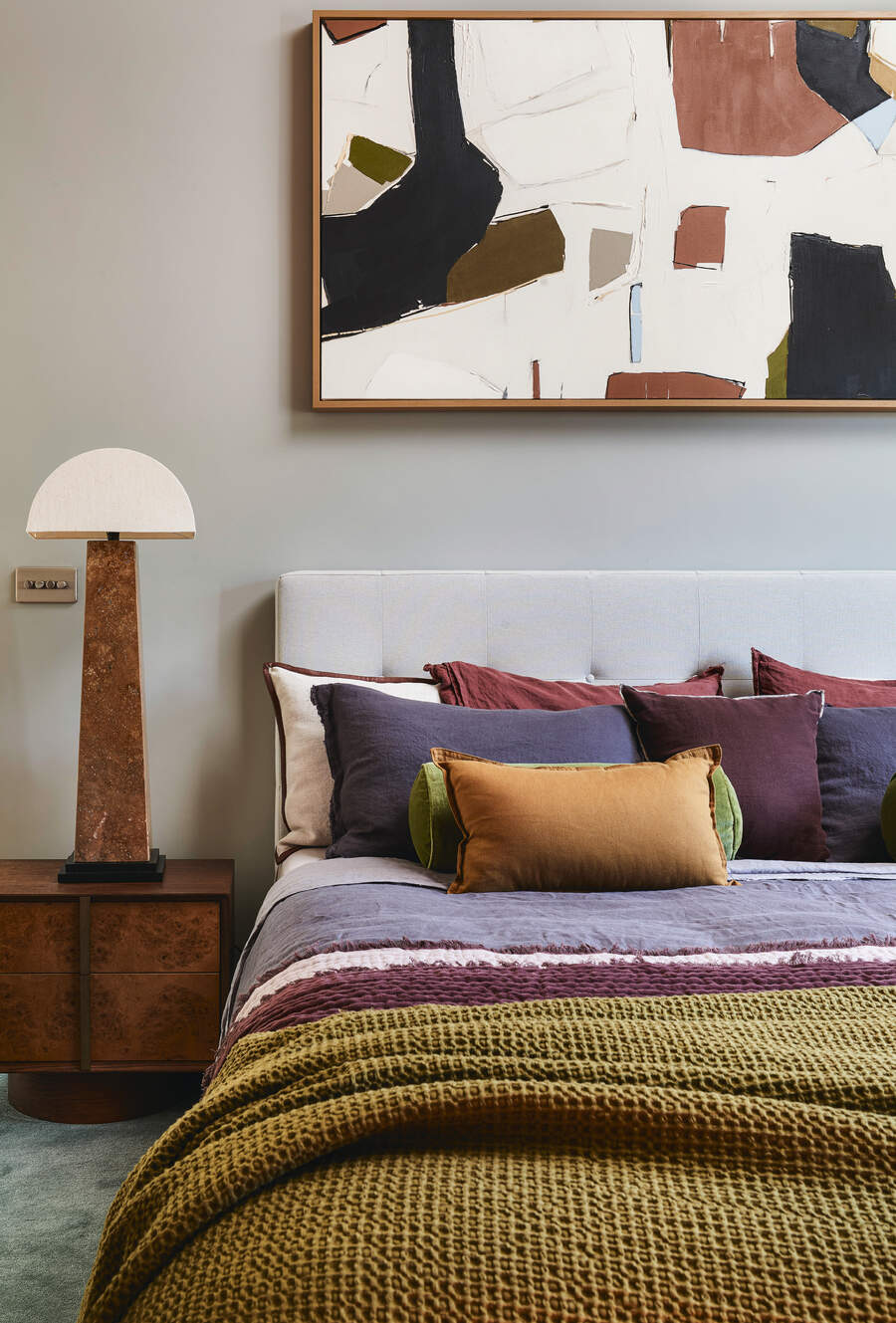
Start by choosing one color to lead the scheme. "Maybe you color drench the walls in a calming blue or sage green, and then use the other two as accent colors across artwork, upholstery, or soft furnishings," says Tash. This way, you have a clear base that keeps you from getting lost in the palette.
Another way is to "Use the deeper or cooler tone (like blues or greens) for larger areas like walls, upholstery, and rugs, then, let the warmer tones shine as accents: pillows, art, ceramics, wood, or leather," says Jen.
Playing with proportions is also key to the success of a split complementary color scheme. "I always suggest the 60-30-10 rule: use the dominant color across 60 percent of the space, the second color at 30 percent, and keep the punchiest one as a 10 percent accent," says Tash.
That way, you get an impact without being overwhelmed. And don’t forget to use neutrals to balance it all out and let the room breathe. "I think it helps if you can weave in some patterns that include at least a couple of the colors that help pull it together so it doesn’t look like a color-block room," adds Jen.
And remember, contrast in design doesn’t have to mean loud. "When you use slightly muted or dusky tones, split-complementary schemes can feel surprisingly soft and sophisticated," says Tash.
Examples of Split-Complementary Color Palettes
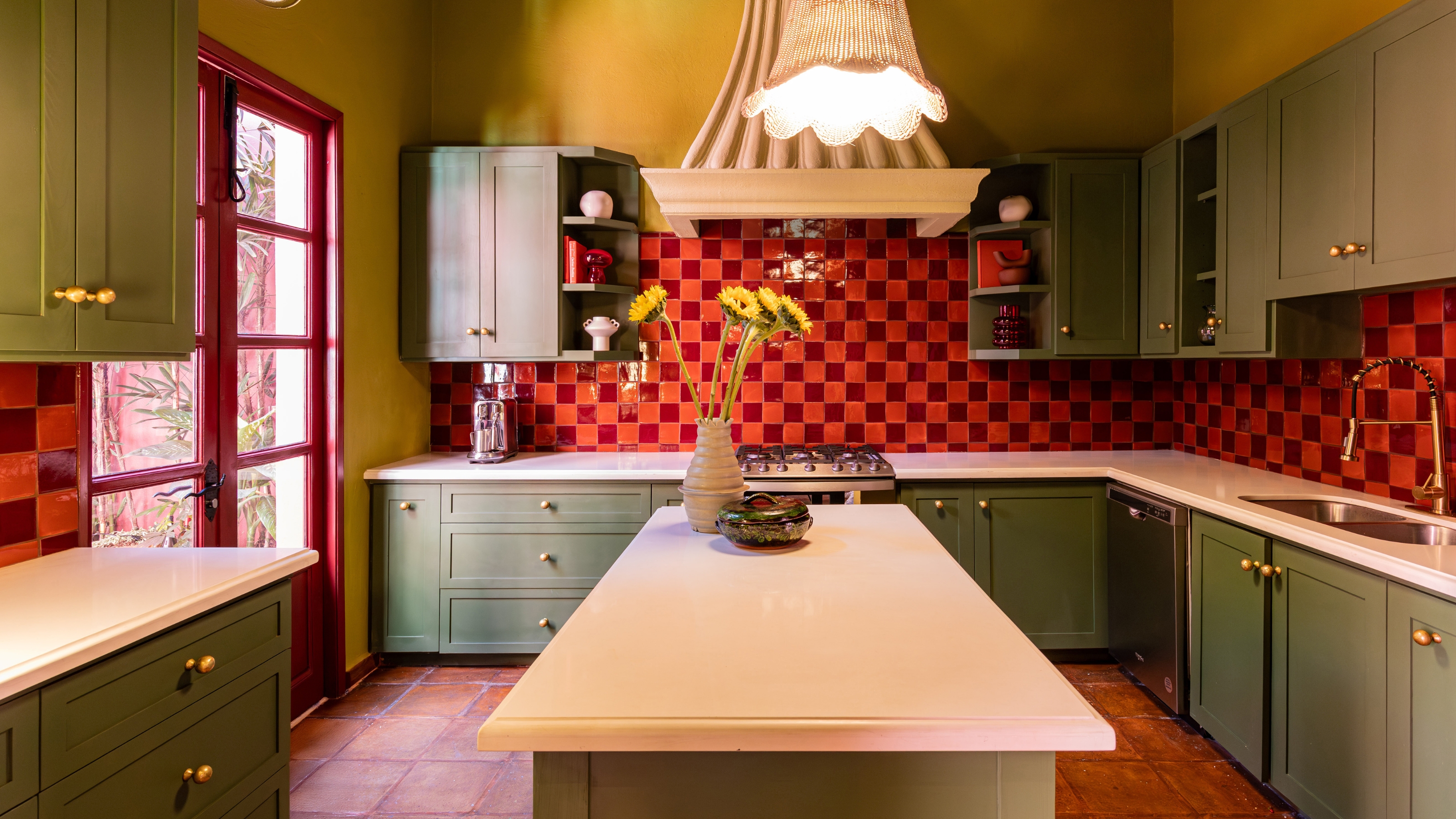
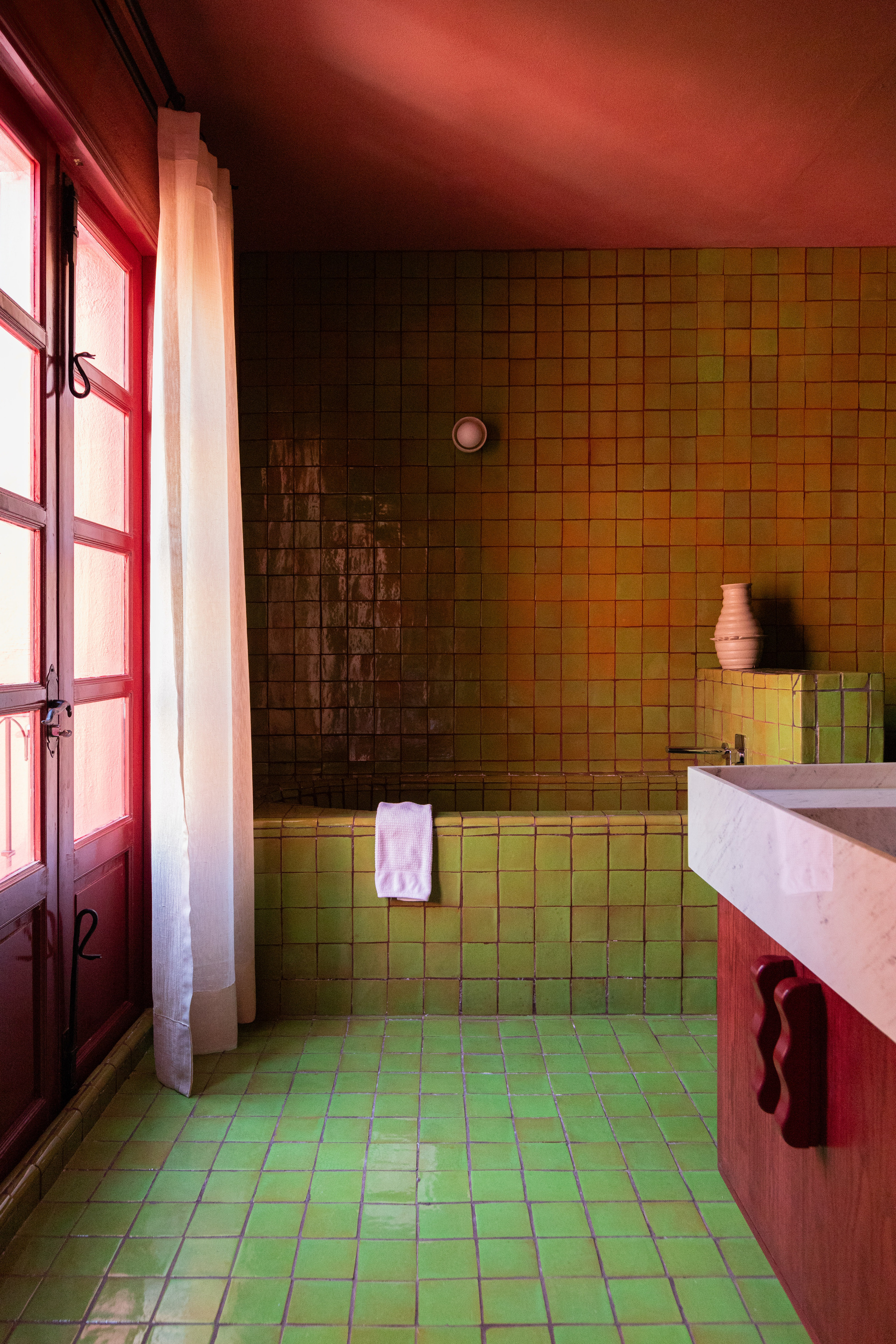
- Red: For a split complementary palette with a true red base, use a yellow-green and blue-tinted green as the split complements.
- Blue: For a split complementary palette with a true blue base, use an ochre yellow paired with a burnt orange or even terracotta red.
- Yellow: For a split complementary palette with a true yellow base, use a purple that leans more magenta with an indigo blue.
- Orange: For a split complementary palette with a true orange base, use deep teals and mid-tone blues with a slightly purple tint as accents.
- Green: For a split complementary palette with a true green base, use red-oranges and magentas as the accents.
-
Purple: For a split complementary palette with a true purple base, try using warm oranges and light olive greens as the split complements.
A split complementary palette is an amazing way to bring playful painting techniques like double drenching to life, and to make your home's color scheme feel refined, curated, and nuanced.