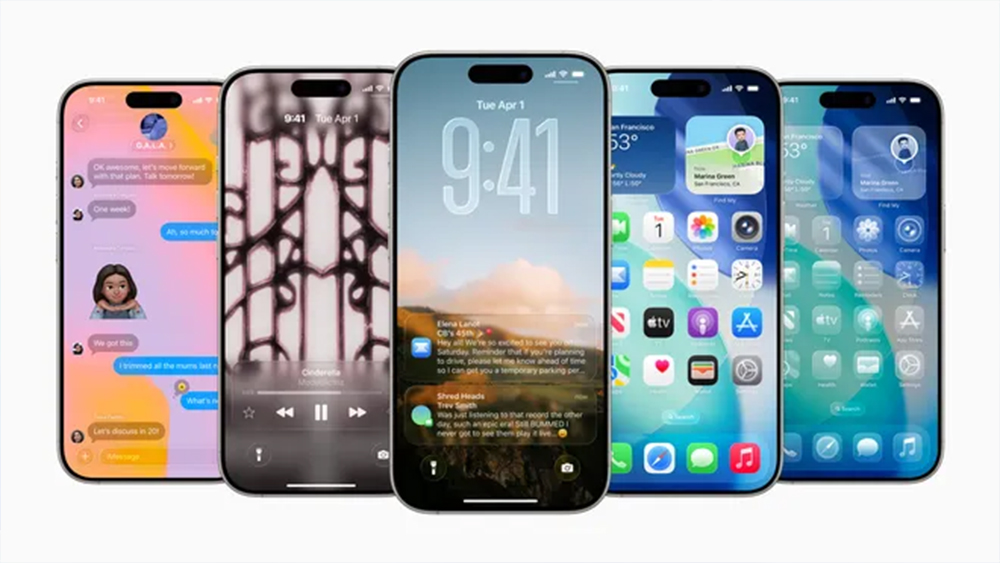
"Delightful", "elegant" and "modern" were the three main adjectives Apple used when it launched its new Liquid Glass UI design for iOS 26, iPadOS 26 and MacOS Tahoe 26 at Apple WWDC 2025 event this week. But for some the transparent elements looked positively retro.
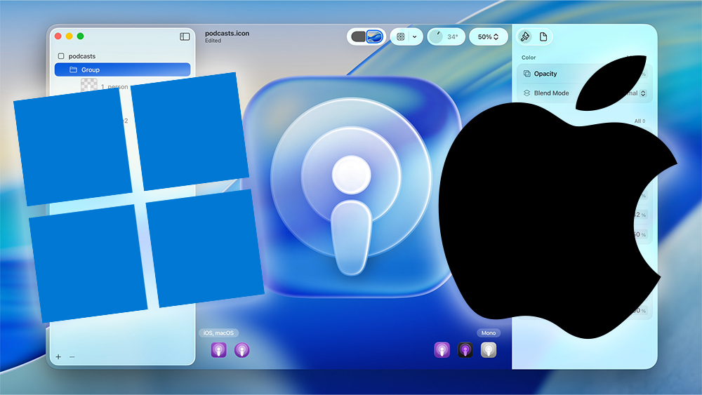
While the Cupertino tech giant sees VisionOS as the main inspiration, there were immediate comparisons to much older software that dates back to before even the iPhone (along with big, big controversy over the corner radiuses in MacOS Tahoe 26). Even Microsoft is suggesting that Apple stole the idea from Windows Vista, but the joke may have backfired.
@windows ♬ original sound - Windows
The official Windows account on TikTok was quick to respond to Apple's new UI, dropping a video compilation of screenshots from Windows Vista and Windows 7 with the text “Just gonna to leave this here".
Back in 2006, Windows Vista introduced Microsoft's Aero UI design language, which included glass-like translucent borders that showed content behind windows. Windows 7 built on the look, but the transparent aesthetic was dropped for Windows 8.
This kind of trolling goes down a storm on TikTok, and it's quickly become one of the account's most-watched recent videos with 1.5m views and over 5,000 comments. I guess it shows some personality for a brand that tends to be quite dry, but mocking rivals can quickly get cringey – just look at Pepsi's obsession with Coca-Cola.
Apple does have a tendency to launch things that already existed and brand them as new and revolutionary (Apple Intelligence, anyone), but I'm not convinced Vista was its inspiration here. And for some followers, the Windows account's jesting is reminding them where Microsoft went wrong.
"OK, now bring it back, and we'll forgive you for Windows 8," one person responds. "Dropping this style was a mistake," another person writes.
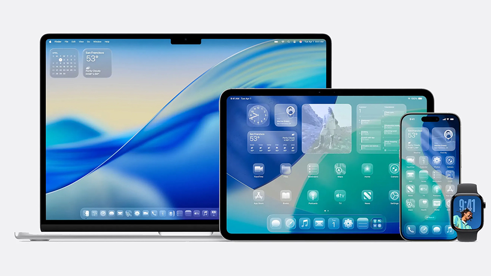
Others suggest the comparison doesn't hold water as Window's Aero Glass was merely superficial, while Apple's Liquid Glass is about more than just transparent elements. "Apple made a new real glass software that uses hardware acceleration and real life physics, real reflections and distortion and blur, but Windows think they copied them when they look nothing the same, and guess what? They will copy it eventually," one person argued.
"It's not always about being the first to do it but being the one that does it well," another person suggests, effectively summarising Apple's philosophy. "It took 8,000 errors, 2,500 virus y 700 blue screens to make this video," someone else jested. Others argue that Windows Vista was itself inspired by MacOS aqua from six years earlier. Perhaps we need a new adage: people who design glass UIs shouldn't throw bricks.
For more UI design news, see the Apple Design Awards 2025 and the Switch 2 eShop upgrade.