Coca-Cola has been breaking all the rules of logo design recently. First it was embracing hand-drawn Coca-Cola logo variations around the world in the fund free-for-all that is its heart-warmingly inclusive 'Every Coca-Cola is Welcome' campaign. Now it's defacing its logo itself in an eye-catching series of billboard ads.
Has a rogue rookie member of the marketing team been taking liberties with the brand manual. Nope. There's a good reason for the madness, but it's not something that every brand could get away with.
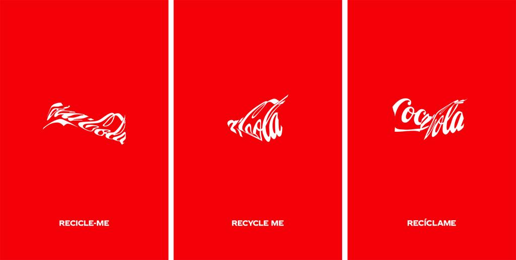
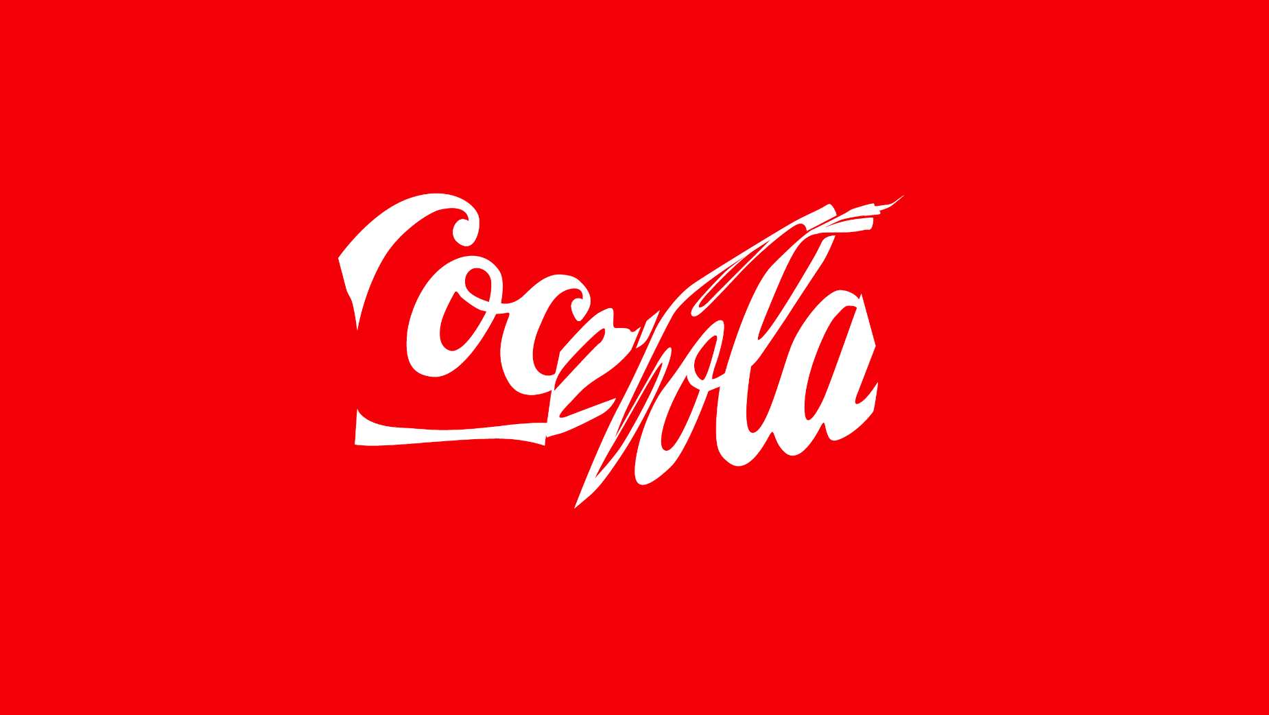
From WPP Open X and Ogilvy New York, Coca-Cola's Recycle Me campaign depicts skewed and distorted logo designs that represent the forms of cans that have been crushed by consumers before being sent for recycling. And they weren't made by simply letting a designer go wild with the warp tool in Photoshop. Ogilvy says the creative team used mechanical presses and vacuums to physically crush cans and capture the real distortions to the historic Coca-Cola script logo design that resulted.
Thus, each billboard depicts a one-off logo variation caused by crushing a real can. It's a creative approach to promoting recycling: simple, effective, and it gets more attention than a more straight informative message might. It doesn't feel the need to tell us why we should recycle Coke cans, taking for granted that we already know that. Instead, it depicts recycling as a normal, routine part of consuming a packaged drink.
Of course, it works precisely because we know the Coca-Cola logo so well. The design can be skewed and contorted quite severely and still be immediately recognisable. And the fact that Coca-Cola's prepared to do this when brands are normally so precious about the rules for the application of their logos is part of the confidence that comes from over a century of market dominance.
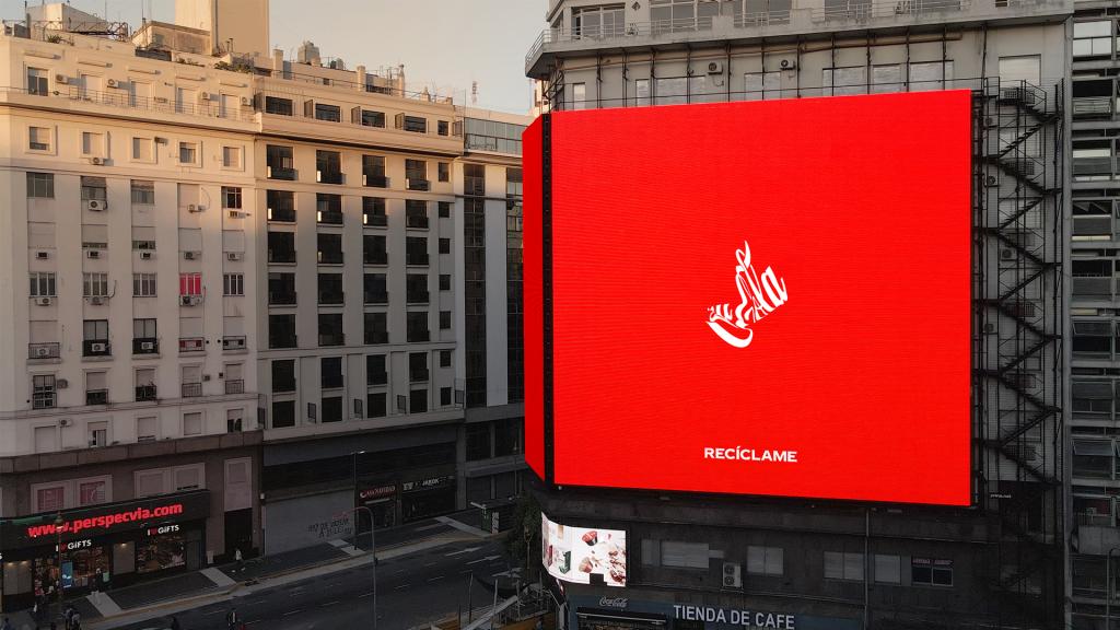
The campaign was designed to align with Coca-Cola’s World Without Waste strategy. Amid controversy over the amount of damage its packaging does to the environment, it's aiming to make all of its packaging recyclable by 2025 and wants to achieve a one-to-one collection and recycling rate by 2030. Ogilvy says a documentary on the process will be shared later in the month.
For more recent logo and advertising news, see the controversy over the Portugal logo reversal and the ingenious iPhone-inspired Faber-Castell billboard ads.