A succession of upheavals have characterised Elon Musk’s leadership of Twitter since he acquired the social media platform in November 2022 – from his U-turns on the acquisition, to firings and rehirings and a significant drop in advertising revenue. But his latest move is the most significant: abandoning the globally recognised Twitter brand and renaming the platform X.
Such drastic changes are usually accompanied by presentations delving into rebrand reasoning from company execs desperate to show how the new image aligns with organisational strategy and company vision.
But in keeping with Twitter’s disruptive nature of late, no in-depth explanation for the X rebrand was given to company outsiders, although Musk invited users to submit a logo design. In a widely reported-on internal memo, chief executive Linda Yaccarino invited staff to “build X” with her and Musk, without giving details as to how and why.
From a brand identity perspective, the choice of the X symbol was unsurprising. Musk has used the letter for his engineering company SpaceX, tech startup xAI and now X Corp (he already made the legal change from Twitter Inc. to X Corp in March 2023).
As a symbol, the character is distinctive and expresses a sense of mystery. Its general use as a stand-in for pretty much anything also aligns with Musk’s plans for an “everything app” that offers much more than a way to communicate. But marketing research and the spotty history of major rebrands indicates Musk will need to do a lot more than change Twitter’s name and a logo to ensure that X really does become “everything” to its users.

Corporate makeovers
Companies typically change brands in response to structural, strategic and functional drivers. A structural reason might be a change in ownership, with a new logo signalling a new direction. Strategic reasons frequently include either a perception issue – negative associations – or to signal a shift in activities, or reflect a change in consumer preferences. A functional reason could be optimising logo appearance on new platforms such as mobile apps, or to emphasise a brand’s continued relevance.
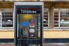
Structural and strategic drivers often reflect a more significant change in the logo’s expression. Early brand logos, for example, frequently express core activities – think British Telecom’s piper logo. Tech brands such as Netflix (which included a film reel in its early logo designs) have also followed this format.
This makes it easier for people to understand what the company does, which is especially important in an organisation’s early years.

Indeed, the Twitter brand identity immediately captured the nature of the platform: the idea of chirping out short bursts of thought as part of a public exchange. This is evident in the bird logo, but also the name – the suggestion of speed in the distinctive consonant blending of “t” and “w” in the brand name and in the user’s ability to “tweet” a short message.
Being known for a specific activity, however, can become a weakness. As brands evolve, a company’s range of activities can expand and the brand message no longer captures the scope of its activities.
In Twitter’s case, the core activity currently remains unchanged, but the rebrand aligns with Musk’s intention to make the platform more than a communication app. He has often discussed idea of creating an “everything app” – like Tencent’s popular WeChat app in China, which provides communications (similar to WhatsApp) and payment functionality.
WeChat, which has more than 1.3 billion monthly active users, proves there is scope for combining communications (like Twitter) and online financial transactions (like a Paypal) into a promising future proposition: “the global town square for everything”. In other words, a platform that is so central to authorisation, communications and transactions that it becomes a single arena for all kinds of exchanges.
Too soon to signal a new direction?
But it could be premature to signal an aspiration that is currently inaccurate. Back in 2000, energy giant BP (formerly British Petroleum) rebranded to express a vision of cleaner energy-related activities. First, it shifted to the abbreviation BP and then it claimed that the initials BP stood for “Beyond Petroleum”. But BP’s claim was perceived as misleading by the public because the message preceded the activity by decades.
On the other hand, in the latter part of the 20th century, US company Philip Morris wanted to move away from a strong association with tobacco brands built up over decades of selling cigarettes including Marlboro, Chesterfield and Parliament. In the 1970s it started to acquire food and beverage companies including Kraft Inc., before rebranding to Altria in 2003 (it then spun off its Kraft Food subsidiary in 2007). At the time of the rebrand, this showed the company was becoming more “diversified”. Importantly, the action preceded the message.
By shifting to X.com without much explanation, Twitter could risk following in the footsteps of BP rather than Altria. It’s not clear if Twitter’s users will stick with the platform long term without knowing the underlying reasoning and how it will serve their loyalty – particularly with newer alternatives available such as Meta’s Threads.
Read more: Threads: new Twitter rival looks like a shrewd move but Meta lacks credibility
On the other hand, by crowdsourcing X’s logo design (on Twitter, of course), Musk included users in the rebranding process. This is often a critical feature of successful corporate rebranding.
But of course, one of the biggest risks of changing a brand identity from one that has global recognition, recall and awareness, is that users may not like the change. By removing the Twitter brand there is an immediate loss of brand equity – the positive associations consumers have with the brand – which could ultimately encourage people to move to other platforms.
Musk and the rest of X’s leadership may hope that the recent publicity, as well as the established behaviour of using the app, might reduce some of the impact. But the importance of involving stakeholders in the process will need to extend beyond asking for help with a new logo design. Convincing users to remain loyal will require X to provide a more convenient and engaging future experience on the platform, whatever that may be.
Jamie Marsden does not work for, consult, own shares in or receive funding from any company or organisation that would benefit from this article, and has disclosed no relevant affiliations beyond their academic appointment.
This article was originally published on The Conversation. Read the original article.