
When redecorating a property, especially if you know it’s not your forever home, you might feel a bit unsure about what decisions to make that you won’t have to change when putting your house back on the market. Settling on a color to paint your walls is one of those decisions.
While home decor color trends tell us bold hues are having a moment, picking one for your home that you both love living in and will appeal to potential buyers means going more toward neutral, lighter tones. However, you can bring your personality in by playing with different undertones in your chosen neutral, to create a space you will love living in.
I spoke to Erin Dana Lichy, the successful realtor and interior designer appearing in season 14 of Real Housewives of New York, and she reveals how she chooses a white paint that not only will sell your home better, but that's the best shade to live with, too.
How Erin picks the right white paint
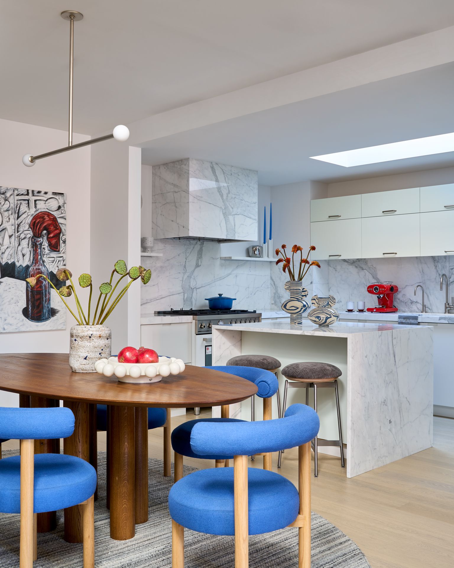
First things first, let’s address the elephant in the room: pure white. While it might be the go-to for many because it’s the easy choice, and we’d assume nobody would have an issue with it, the truth is that it lacks warmth, and in the long run, is not the most inviting to live in.
A pure white is not the only answer for a space that looks light and bright. Here’s what Erin Lichy, owner of interior design studio HOMEGIRL NY tells me: ‘Most people prefer light colors, but don’t underestimate the power of small differences in tone. In a light room, I won’t use a crisp white, because it will be too harsh, like you’re in a gallery, but I’ll introduce a creamier tone, and this can go a long way.’
The good news is that it’s hard to go wrong with neutral color schemes, and you can pick pops of color in your furniture which is always easier to change. Pick your undertone to be warmer, such as a creamy yellow base, if your room is north facing. Neutral as it may be, it looks incredibly elegant, and just in line with the minimaluxe movement that is all about quiet luxury. For a south facing room, you can get away with a more grey or blue undertone, if that’s what you prefer, as the warm natural light will soften it.