Q. I live in an apartment that is mostly north-facing and doesn’t get lots of natural light, but I want to paint the walls gray or white. What should I choose?
When looking for the best colors for north-facing rooms, whatever you do, stay away from brilliant white or any grays that have blue undertones in them. In a north-facing space, the white will seem stark and the blued gray will read cold — there is nothing cozy about either of these two shades.
When decorating with white in these spaces, look for warm whites that have beige or even subtle yellow undertones in them (it’s important to stress the word ‘subtle’ or you start veering very close to magnolia!). Farrow & Ball’s Skimming Stone is a nice, neutral off-white that is almost beige, while the same brand’s Schoolhouse White and Shadow White both have warmish tones.
I would also pay attention to what goes into the room — the wrong fabric on your upholstery can pull whatever paint you’ve opted for in the wrong direction. Steer clear of gray and blue fabrics, which will emphasize the room’s chilliness, and opt for rust colors like ocher, earthy greens, or even mustard instead. Yes, you can have a neutral scheme and still have a pop of yellow — as long as it’s more golden than primrose.
Q. When it comes to picking kitchen cabinet colors, I’m overwhelmed. The rest of my home is fairly pared back in its palette — what should I do?
If your home is already pared back, then lean into that and consider having a neutral kitchen cabinet color that complements the rest of your design choices. So often, I’ll see a white and gray home with a deep blue kitchen, as people feel obliged to make a bolder choice in this area for some reason. Don’t feel like you have to.
I like to view a home as a whole and allow people to flow from one area to the other, not to be jolted as they go from a minimalist living room to an overly colored kitchen. Little Greene’s paints are wonderful for cabinets — Slaked Lime Mid, Joanna, and Portland Stone all have a versatility to them that makes them very calming, the way they change in different lights and next to different things.
Q. I want to wallpaper my cloakroom but don’t know where to start — how do I choose a print that works with a marble vanity and how do I ensure that it’s durable?
Cloakrooms are actually one of my favorite spaces to decorate. My style is quite pared back, and my palette is pretty minimalist, but with a cloakroom, you have the opportunity to be a little more wild. They’re rarely seen for very long and are entirely closed off, so whatever design choices you make in there won’t affect the rest of the house. That said, I don’t want them to jar with my schemes elsewhere.
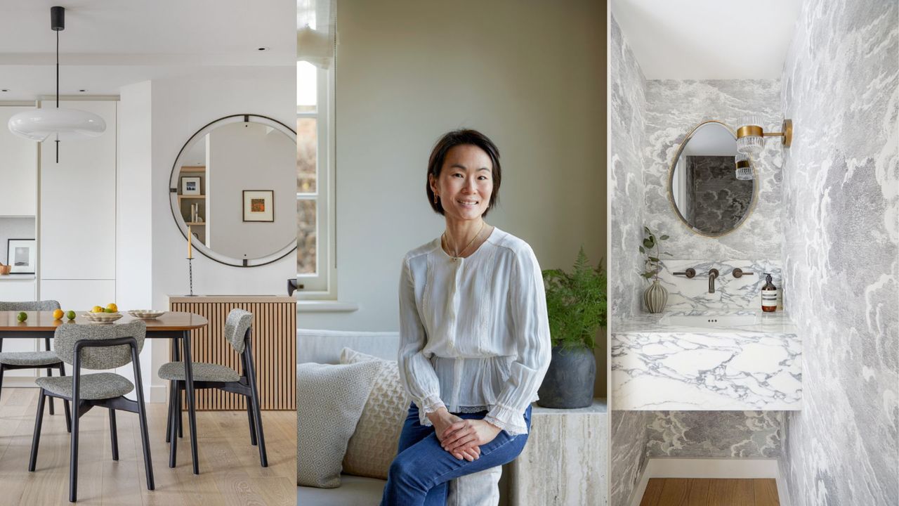
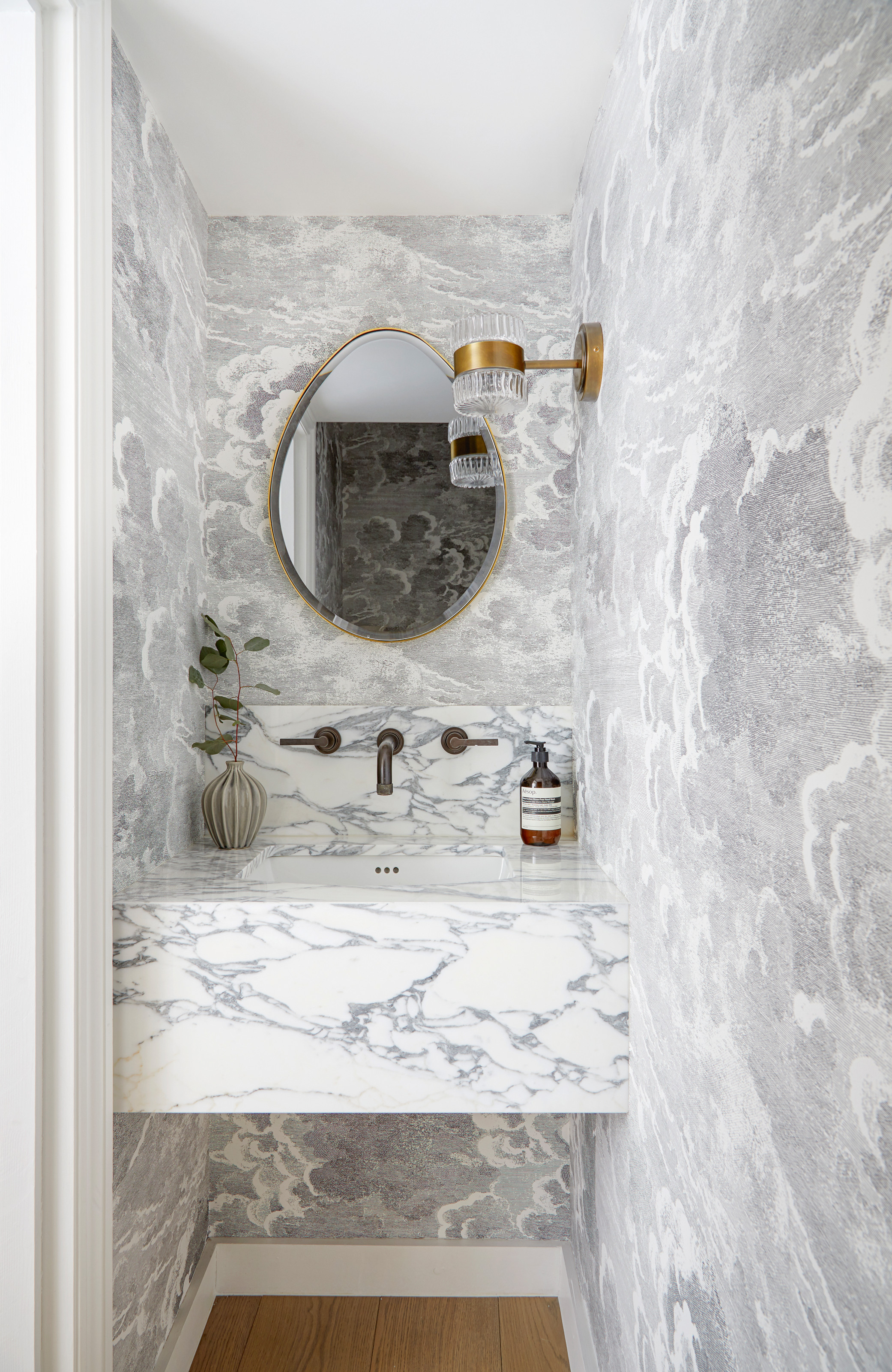
For this powder room, I wallpapered it in Cole & Son’s now-iconic Fornasetti Nuvolette; the palette of soft grays and whites in the print is the same seen in other spaces, but this is more patterned than I’ve gone in the living areas. It’s dreamy but provides an element of surprise, and I used the gray in it to inform my choice of marble basin, for which I found a stone with the exact same gray streaks. And that’s the thing about marble: there are so many variations in color that even if you choose a white-based one, you can still find one with veining that will match your wallpaper, whether it be red, green, or blue.
Practically speaking, I didn’t have to worry about treating the wallpaper to be waterproof, as it’s not a room people usually splash around in, but because I wanted wall-mounted taps, I made sure the backsplash was higher than you might expect, preserving any drops that might go flying when you wash your hands.