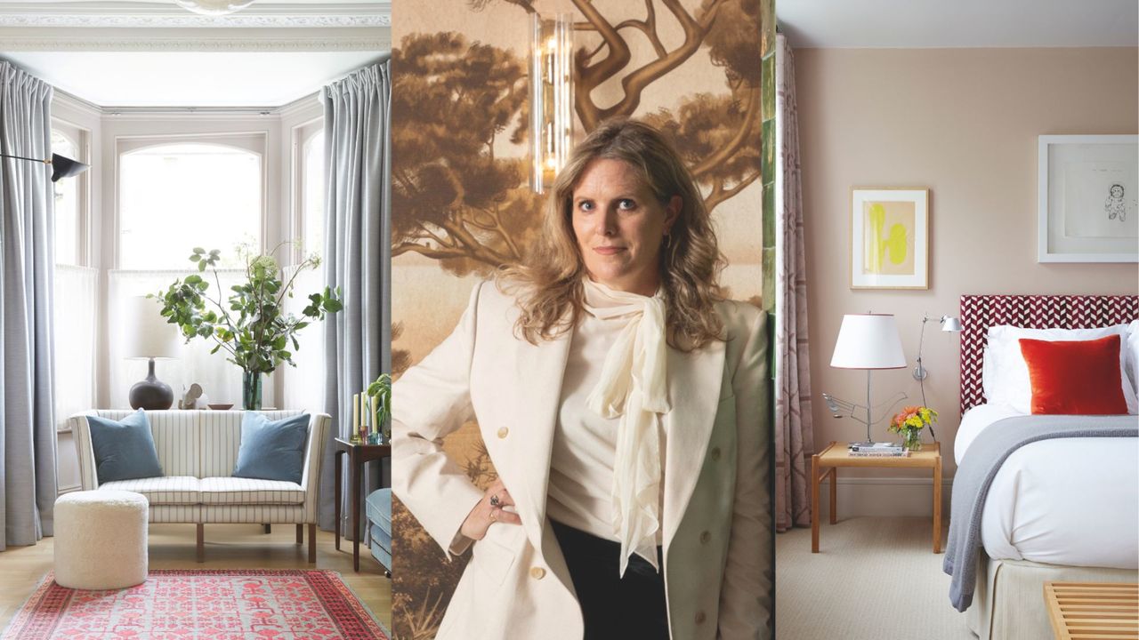
Q. I’m trying to create a really calming living room, and for me that means neutral colors. But I want layers and for it to still look interesting. How should I go about this?

I liken any scheme to a recipe — you need to put in the right mix of ingredients, and it’ll all come together as a whole. And like a delicious cake, it doesn’t have to be perfect — in fact, there is beauty and design magic in a place’s imperfections as they’re what make it seem lived in, like a true home, rather than a showpiece. An imperfection, though, isn’t a chip or a crack; it’s an unexpected addition that manages to make everything seem relaxed.
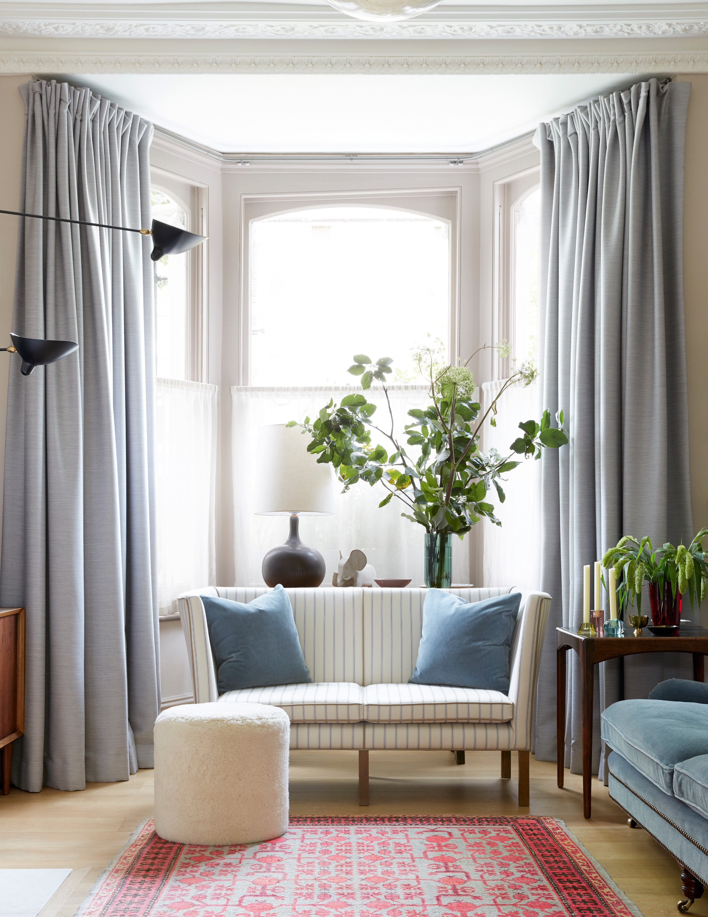
For a neutral color scheme, my approach would be to try and put each paint or fabric choice together so that it all seems perfectly matched, then throw in that unpredictability to rev it all up. In a recent living room, my starting point was a white fabric with slim gray-blue pinstripes. I took those stripes and found other pieces that matched tonally — a velvet blue sofa from George Smith, the soft gray of China Clay by Little Greene on the walls, and soothing gray curtains using fabric from Kvadrat.
Then, when it was all looking quite lovely, I gave it energy by adding a red rug — amping up the room with a bit of heat. That element of curation is what gives a room personality and makes it feel welcoming.
Q. You’re the master of the accent color. Any current favorite paint shades, and how would you use them?
In projects, I’ve been using a lot of monochrome recently — it’s such a "forever palette" and I find it very restful, and clients seem to find it a wonderful antidote to this crazy world.
But in my own home, I’ve embraced aubergine shades, redoing my kitchen in Tyger Moth Black by Papers and Paints, which has a wonderful eggplant tint to it.
Q. I’m nervous of pattern generally, but I love when I stay in boutique hotels and see those impressive upholstered headboards. How can I build them into my scheme and still create a restful look overall?

Modern bedrooms are all about balance. Really, we want them to be calm sanctuaries, but I always think they need the odd element of surprise, too. So I like to use pattern in them, but in a pulled-back, edited way, which means they’re still quite restful to be in. A headboard is the ideal place for this — they’re quite small surface areas and so feel quite easy to control, especially as they can be mostly covered by your plain white pillows, too.
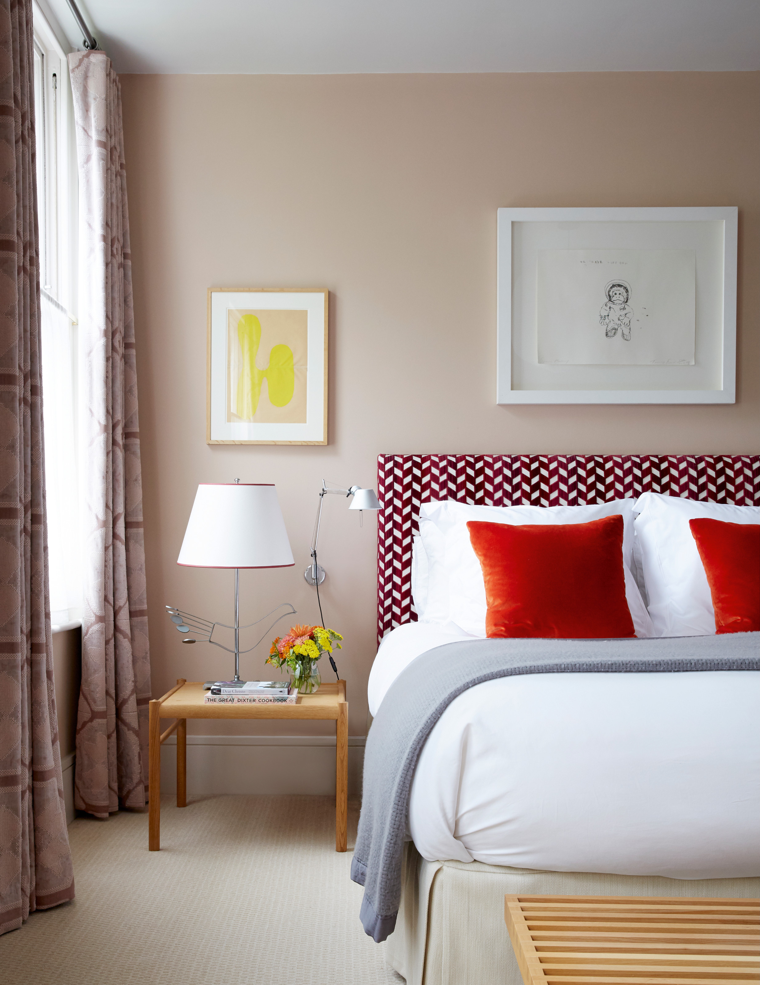
I recently used Chevron Strié Velvet in Garnet from Schumacher, a geometric pattern that is so graphic it could have felt busy, but pairing its vibrant red with the softness of Temple by Paint & Paper Library on the walls helped to ground it no end. The red of the headboard was then linked to the rest of the room by a very slim red trim on the lampshade — so slender it’s almost not there — which helps create a sense of continuity.
I actually then added a second pattern on the curtain that is so subtle you don’t quite notice it at first. It worked because the curtains, made from John Boyd Textiles’ Designs of the Time collection, were the same color as the walls — they almost became a texture rather than a visual element. There was rhythm, but still the idea that everything worked together.


