Domino's has delivered its first brand refresh in 13 years, topped with bolder visuals and a catchy sonic jingle. Following the golden recipe for the best rebrands, Domino's new look strikes a careful balance between heritage and modern style, resonating with both existing fans and future generations.
Whether a tactical refresh or an all-out rebrand, a design shakeup has the power to reinvigorate a brand for the better. With its subtle yet striking new look, Domino's brand refresh bursts with contemporary style without losing its signature flavour.
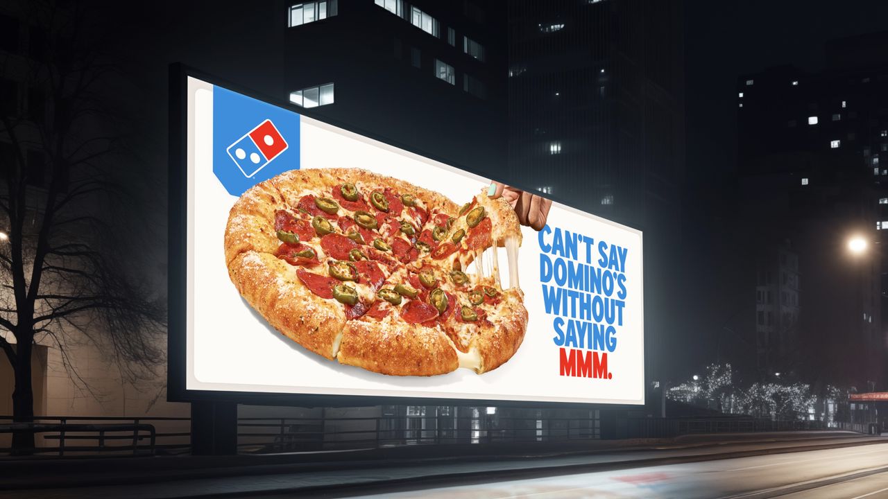
At the centre of Domino's brand refresh is its new jingle created by Grammy-nominated artist, Shaboozey. Coined as the brand's signature "Cravemark," the new sonic tune puts the "mmm" in "Dommmino's," making for an instant earworm.
"Rather than launching a more traditional tagline, we're baking craveability right into our name and every aspect of our brand as a reminder of this relentless focus. You literally can't say 'Domino's' without saying 'mmm'," says Kate Trumbull, Domino's executive vice president.
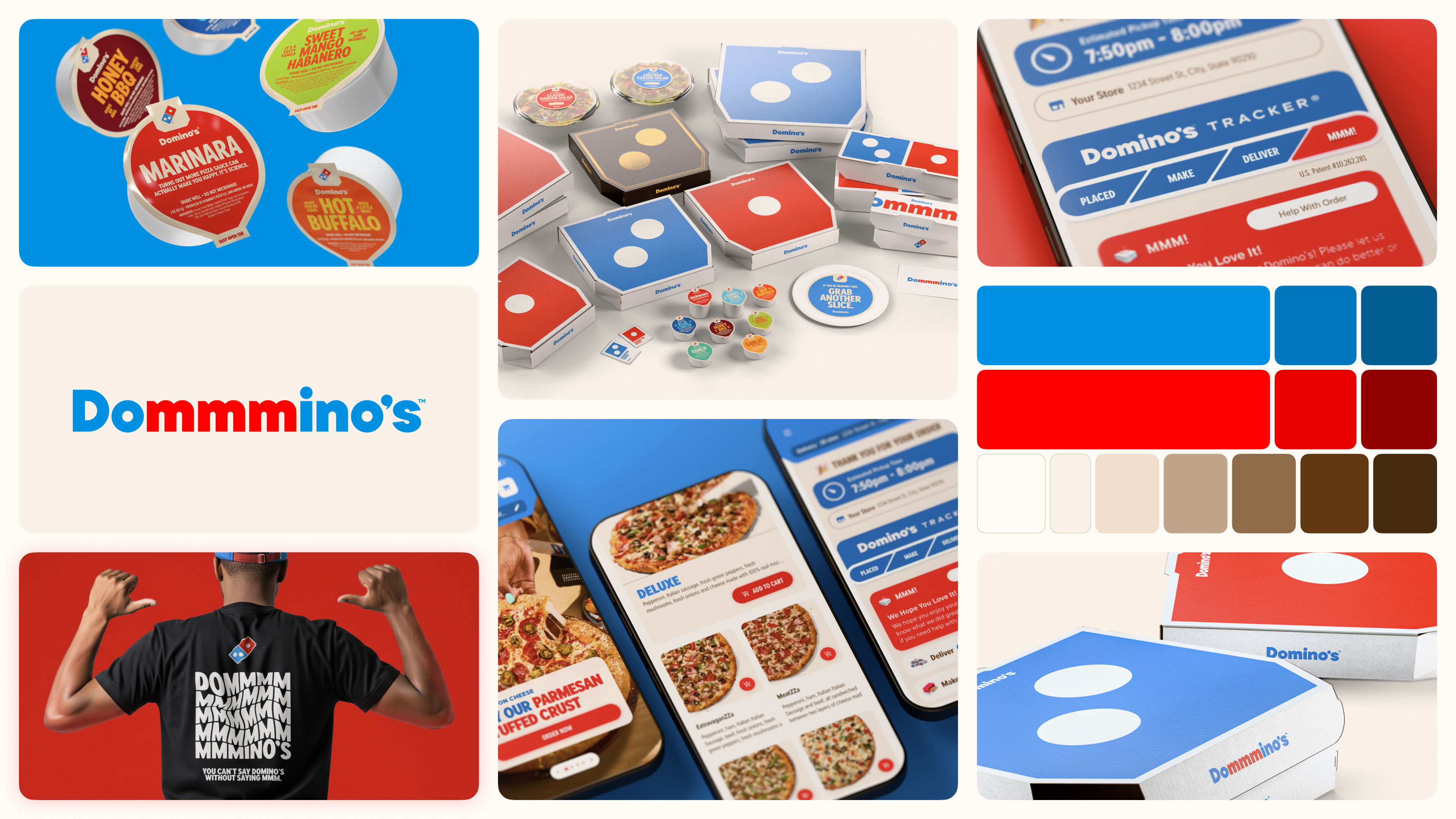
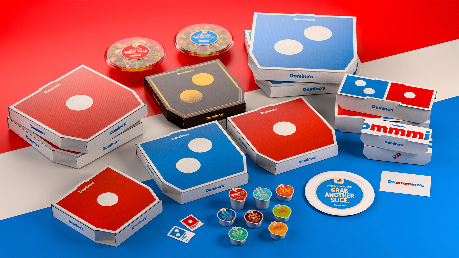
Alongside the sonic jingle is a bold custom typeface aptly named Domino's Sans. Designed with thicker, "doughier" lines and curves, the typography mimics the circles of Domino's signature pizzas for a playful appeal. Across the refreshed identity, vibrant colours bring a revived energy to the brand, from fiery reds to striking blues. A deluxe appeal comes to Stuffed-Crust customers with a new black and gold box celebrating a little added indulgence.
"Most companies rebrand themselves when they're struggling, but after years of category-defying growth, this refresh is about continuing to push to be the best version of ourselves," said Trumbull. "It's vibrant, it's bold, and it's fun. It's pizza!" adds Kate.
For more creative inspiration, check out Pizza Hut's subtle logo tweak or take a look at this restaurant's branding that's like a portal to Mexico.