It's no secret that lots of famous logos have hidden meanings. From Amazon's secret smile to FedEx's iconic arrow, we're no strangers to famous logo easter eggs here at Creative Bloq. But recently, thanks to the help of Reddit, we might have discovered a new one in none other than the USPS logo.
The best logos are often simple and memorable, so it's always a bonus when there's a hidden detail to be discovered. Redditors are certain there's a secret design nesting in the USPS logo; the trouble is, they can't decide what exactly it is.
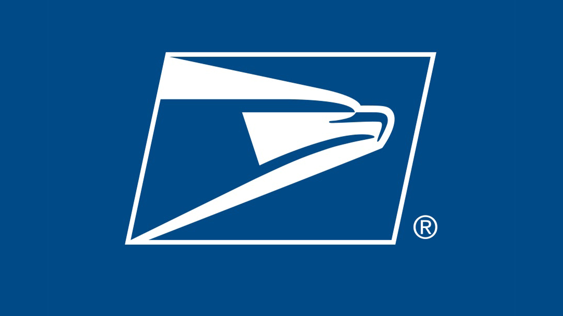
I have always thought the USPS logo (in addition to the obvious eagle) was depicting a very fast moving envelope. Does anybody else this see? from r/graphic_design
It's common knowledge that the USPS logo features an eagle – a patriotic symbol that has been its official seal since 1970. New debates began to spring up when a user on the r/graphic_design subreddit posted the following theory, writing, "I have always thought the USPS logo (in addition to the obvious eagle) was depicting a very fast-moving envelope. Does anybody else see this?"
The post was surprisingly divisive, with many agreeing with the OP while others had more abstract interpretations. "Never seen the eagle, always the envelope, this is the first time I’ve even thought about it," one user commented, while others thought it resembled a mail truck, a stapler and even a trombone. "I see lots of visual complexity. It needs a subtle makeover," another user suggested.
While I can neither confirm nor deny the theories, personally, I'm convinced by the hidden envelope design – let us know what you see in the comments below. For more logo news, check out the Hyundai logo's secret meaning or take a look at the outrageous Super Bowl logo conspiracy theory that just won't go away.