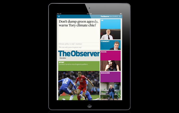
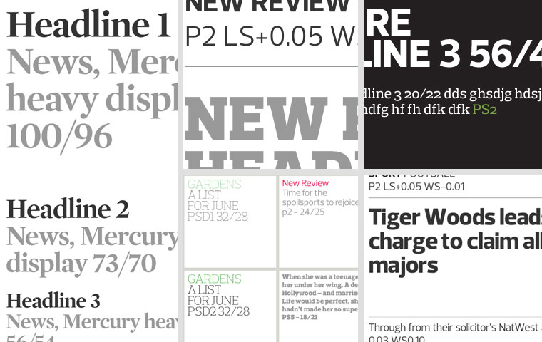
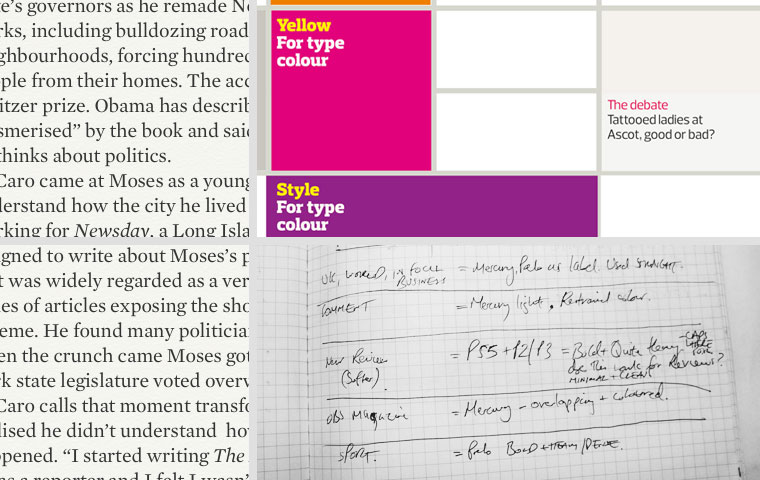
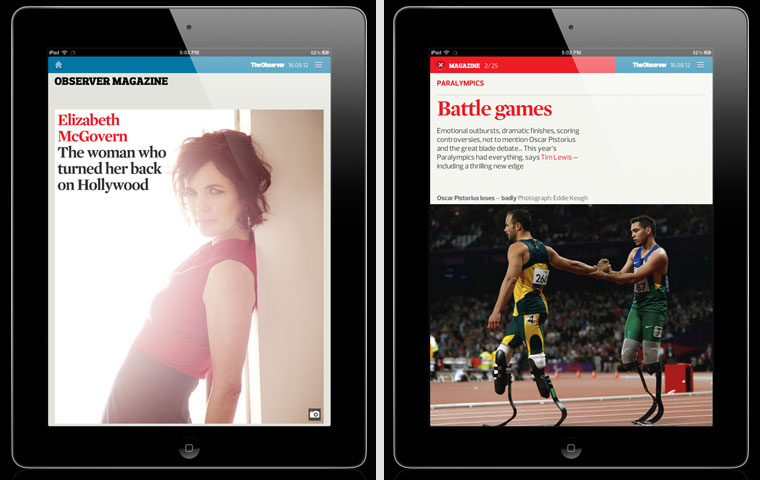
The Observer iPad edition sits alongside the Guardian edition in our award-winning app. From a design point of view it was a great opportunity to go back over what we had done before and see how it could work for the Observer.Photograph: guardian.co.ukThe Observer is a big Sunday paper, comprising four sections. The signature serif face used in headlines and body copy is Mercury, which is accompanied by Prelo, a sans and a slab serif font. Each section is given its character through the treatment of type and colour.Photograph: guardian.co.ukWe wanted to ensure the visual identity of the Observer translated well on to the app, but while certain design approaches work in print, we needed to ensure the design choices we made here would work well within the device. We created early tests that allowed us to rule out certain sizes and weights from the start. The Observer tends to use the Prelo Slab face for folio heads but we soon realised that it didn’t work so well for us at the smaller sizes we required. Photograph: guardian.co.uk
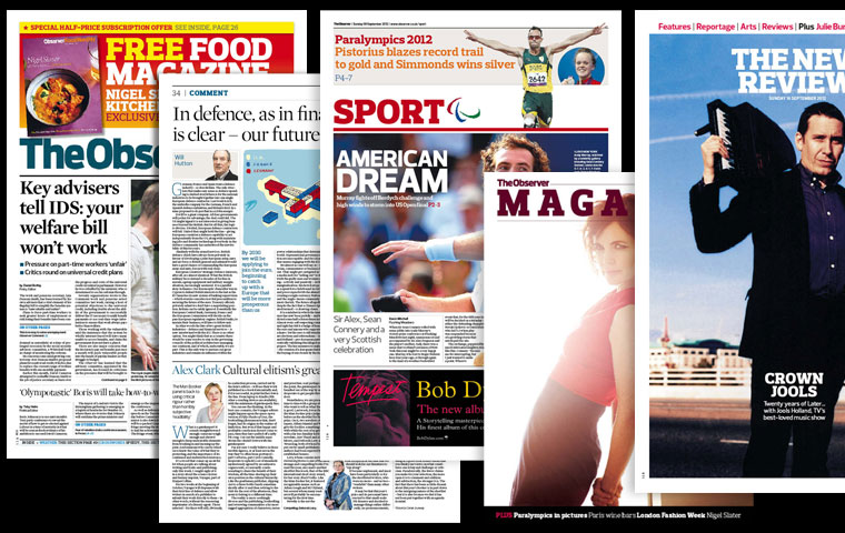
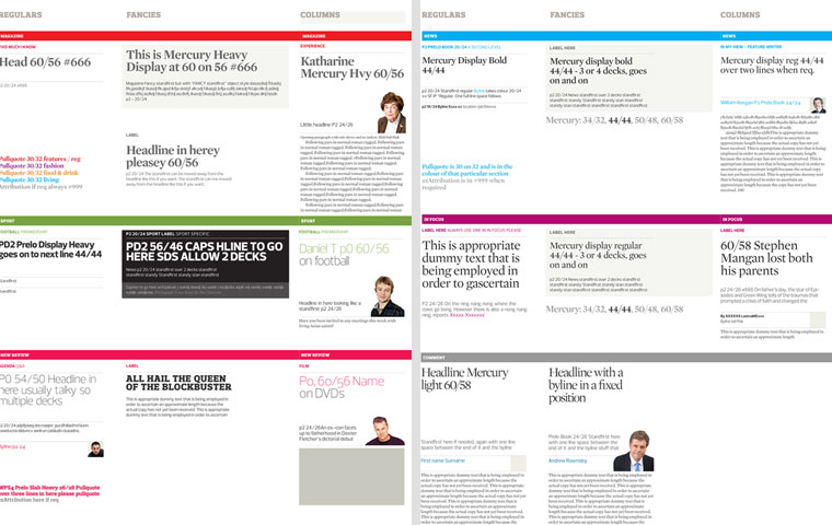
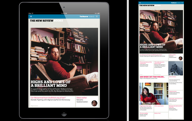
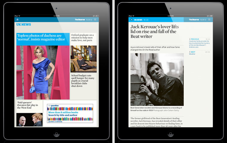
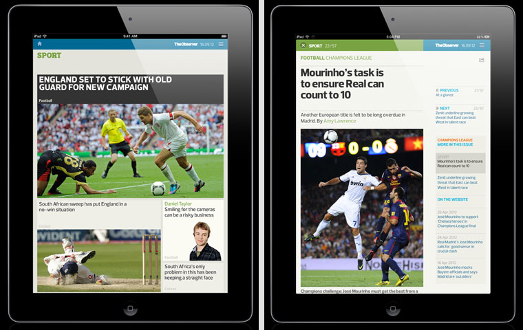
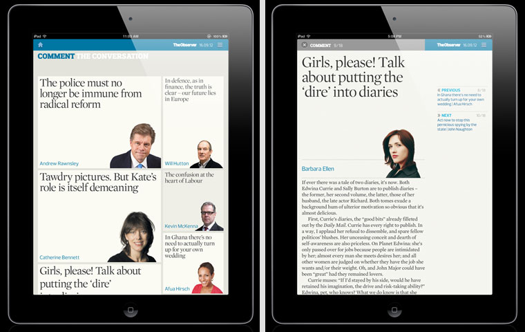
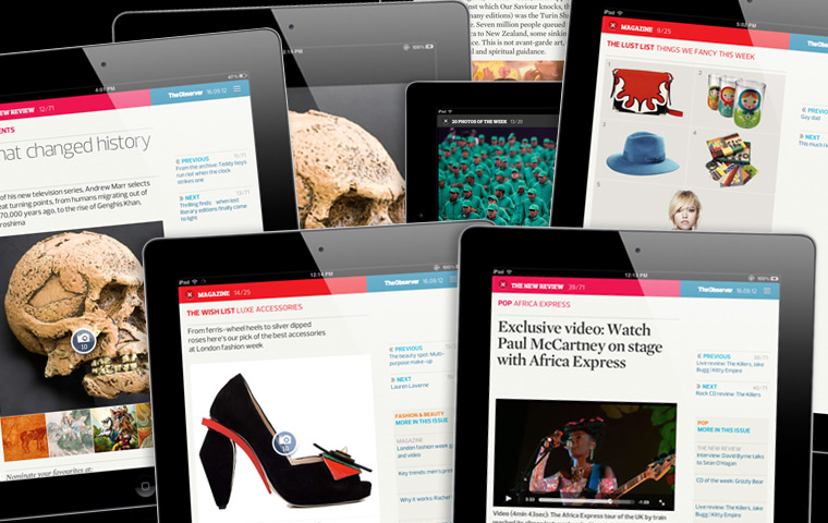
From the outset we knew we wanted to simplify the design language as much as possible. We used this document as a working style guide to help us keep track of the sizes and treatments as we went along, ensuring all the sections have a cohesive look.Photograph: guardian.co.ukMore type and colour experiments. Mercury text is used for the body copy, set much larger than in print, but very readable on the iPad’s screen. The notes show our intentions for each section. Photograph: guardian.co.ukWe broke The New Review down into several sections, all featuring the same typography - upper case Slab with tight leading (sitting over pictures in feature articles if the image allows) and quieter sans text elsewhere. The idea was to have just two levels of hierarchy, so only two or three blocks are given emphasis.Photograph: guardian.co.ukMercury is used for fronts and article pages in the UK News section. The same treatment is used throughout the news sections - UK, World and Business.Photograph: guardian.co.ukWe wanted to capture the character of the printed edition of Sport in the app. Here, Prelo Heavy is used in caps for lead features, and upper and lower case for smaller pieces and match reports.Photograph: guardian.co.ukThe magazine commissions some great photography which we wanted to display to its best in the app, so we kept the typography simple using Mercury Heavy as the signature font and using colour sparingly.Photograph: guardian.co.ukComment was designed to feel more refined and reflective. We added the subtitle 'The Conversation', bringing all our columnists from Andrew Rawnsley to Eva Wiseman together in one place.Photograph: guardian.co.ukThe full screen galleries in the app allow us to include more pictures and sometimes at a larger size than in the print version. This is particularly useful in the arts section of The New Review and fashion section of the Observer Magazine. We also include full screen videos where appropriate. Photograph: guardian.co.uk
Sign up to read this article
Read news from 100’s of titles, curated specifically for you.