Curtains are one of those deceptively influential details. They may seem like a background player, but the color you choose can dramatically shift the tone of a room – making it feel current and curated, or dated and flat.
Just like wall colors or furniture styles, curtain trends go through their own seasonal refresh. And in 2025, some shades that once felt like a safe bet are starting to lose their shine.
I've spoken to the experts and rounded up a few of the curtain color mistakes that designers are gently encouraging you to retire, and more importantly, the updated curtain ideas they'd like to see take their place.
Curtain colors going out of style in 2025, according to the experts
Curtain choices are often seen as an afterthought, but the wrong curtain color can really drag a room down. Even something as simple as a beige that’s too yellow or a gray that’s too cool can disrupt the entire palette of a space.
Interior designer Nina Lichtenstein explains, 'Certain curtain colors that once felt safe or trendy are beginning to feel dated. In 2025, designers are moving away from tones that flatten a space or clash with the new wave of nuanced palettes shaping the modern home.'
So, whether you’re giving your home a full refresh or just want to switch up your window treatments, there’s plenty of inspiration below to help you strike the perfect balance between timeless and on-trend.
1. Stark white
Once a modern curtain idea beloved for its clean, minimalist aesthetic, according to designers, stark white curtains are now a big no-no.
'Once prized for its crisp minimalism, stark white curtains are losing their appeal. In rooms that are already bathed in light neutrals, bright white can read as cold or clinical,' Nina explains. 'Designers now favor warm color schemes of off-whites, ivory, or soft pastels to add subtle depth without disrupting a neutral living room.'
Instead of crisp whites, trends are gravitating towards warmer shades, especially in rooms already painted in pale neutrals or bright finishes. White-on-white can come across as sterile and lacking in warmth.
Haley Weidenbaum, co-founder of Everhem, agrees, adding: 'In 2025, design is trending warmer, more textured, and more expressive. At Everhem, we’re seeing a departure from the cooler tones that once dominated, think icy greys and bright whites.'
More than cheap and cheerful, these budget-friendly H&M sheer panels are made from a high-quality woven linen and cotton blend with a multiway header so that they're easily adaptable for different rods or tracks.
Designed by Sarah Sherman Samuel for Lulu and Georgia, these curtains will give your neutral space a chic refresh. Made from the smoothest velvet in a natural and oat stripe for extra warmth.
Not quite ready to give up on white? These yarn-dyed cotton curtains are shown here in an off-white 'pampas' hue with a soft grid pattern to add some pattern to your windows without overwhelming your scheme.
2. Cool gray
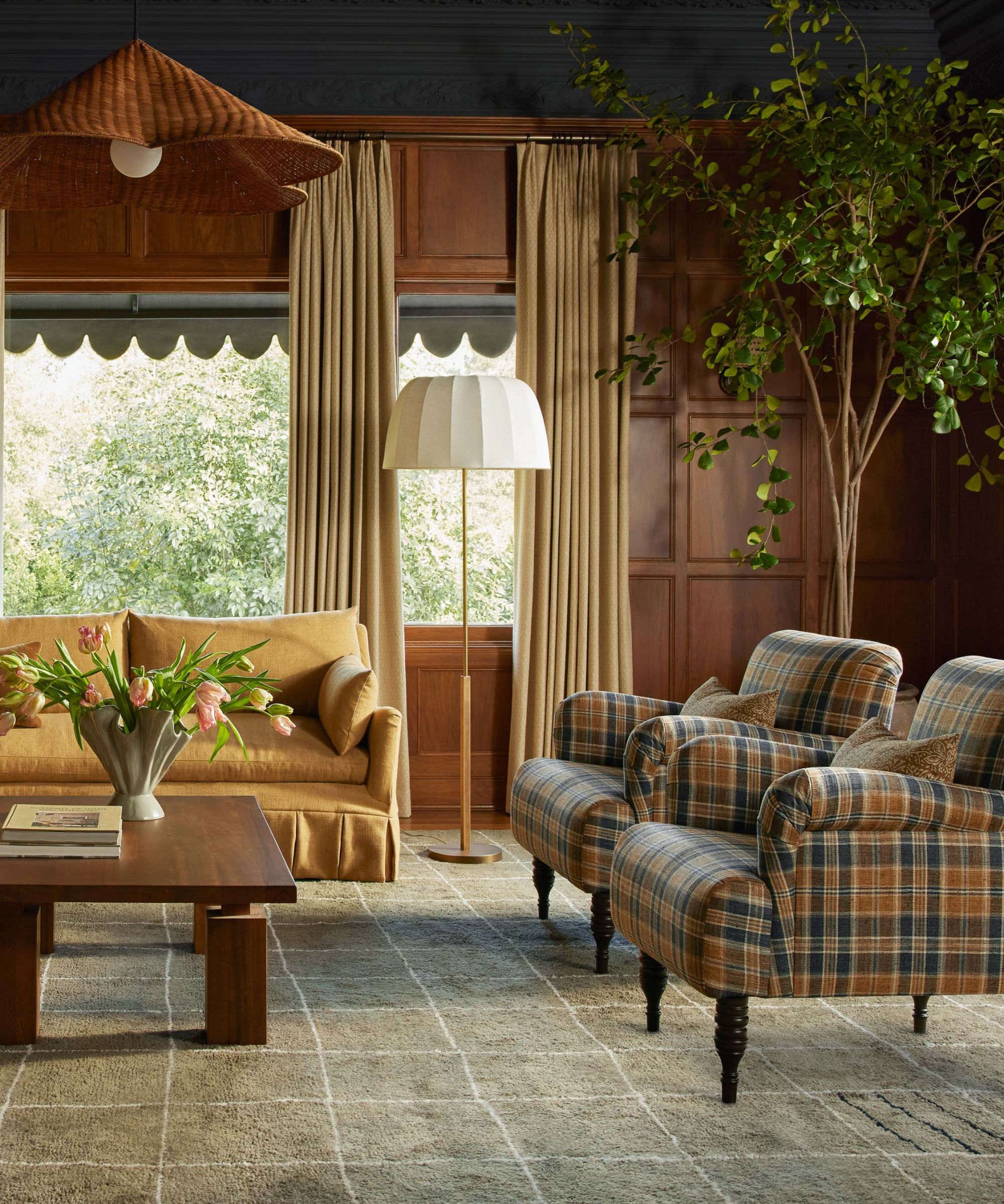
Cool grays – particularly those with blue undertones – were a hallmark of minimalist and modern decorating ideas throughout the 2010s. But in 2025, they’re firmly out of favor. These cooler shades can make a room feel cold and uninviting, especially when paired with other stark tones.
'The cool gray era is officially over,' says Nina. 'These days, richer mushroom tones or warm taupes offer the same neutrality without the chill.'
If you're wondering what color is replacing gray, look for earthy neutrals like clay, stone, or even a greige to achieve a more inviting and contemporary effect. These softer hues play nicely with organic textures and layered textiles, and are a safe bet for living room curtain ideas and bedroom curtain ideas for creating a cozy effect.
Finished with a raw-edge for a casual, textural feel, these open-weave, light-filtering curtains are actually crafted from a heavy blend of linen and viscose that delivers a lovely drape once hung.
Shown here in a warm 'Sandstone Melange' hue, these premium flax curtains have been pre-washed for a luxe yet lived-in look. They come with a sew-in blackout liner, making them ideal for bedrooms or nurseries.
Upgrade from gray with these subtle moss green curtains that have been embellished with sweet botanicals to bring a dainty, cottage feel to your room. They're sheer and unlined, so try to layer with window treatments like a blind.
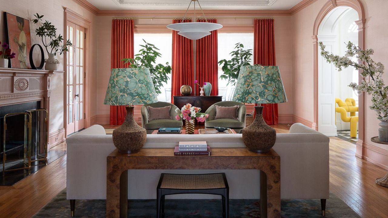
3. Primary colors
Decorating with primary colors – those unmistakable paint-box reds, blues, and yellows – was once favored for injecting bold personality, but these bright colors are now considered too harsh and rigid.
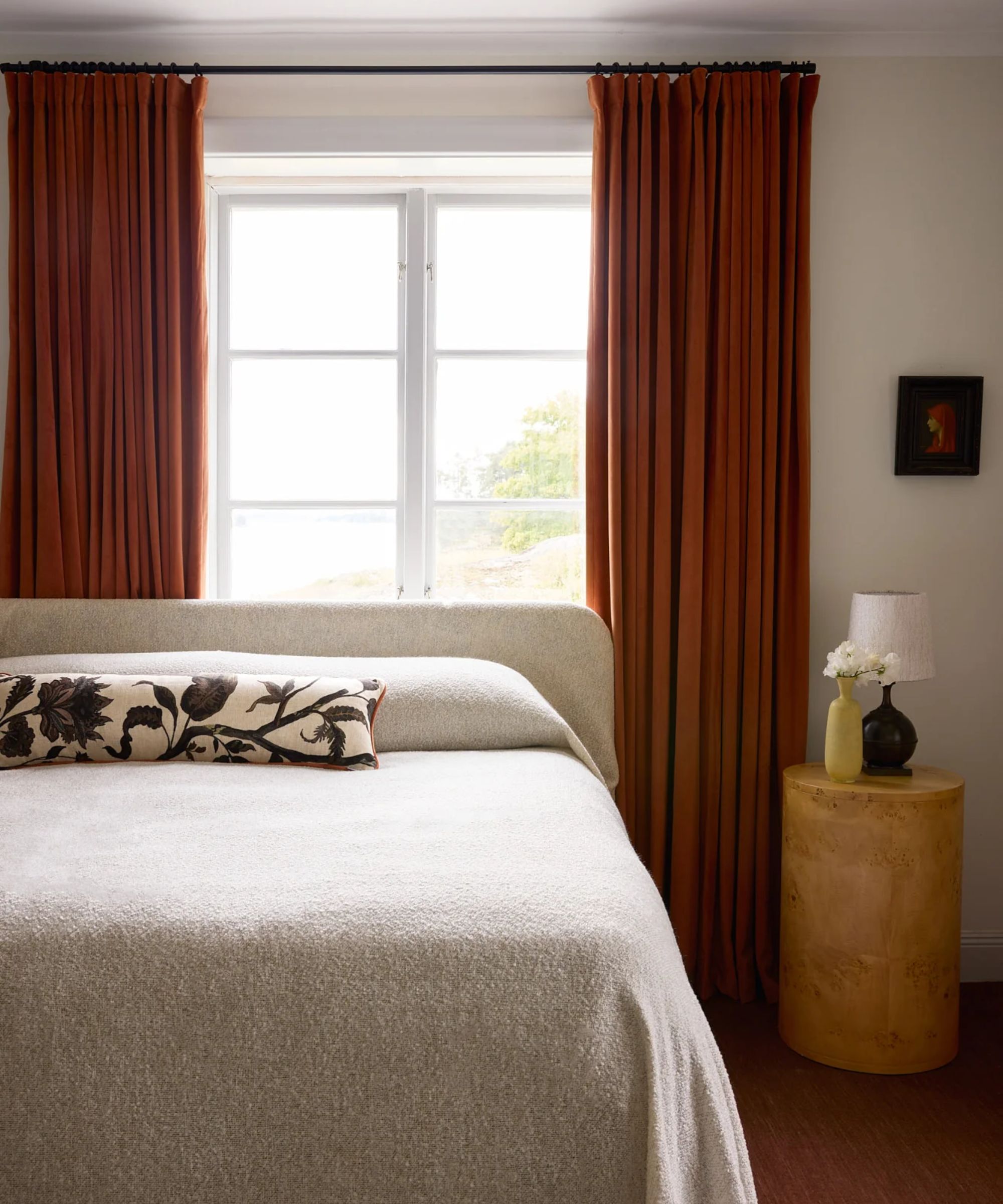
'Bright reds, blues, and yellows are being swapped out for more refined and desaturated versions of themselves,' adds Nina. That said, bold colors are not gone entirely. The emphasis now is on richer hues, such as a burnt orange instead of fire engine red, ochre or butter yellow instead of bright yellow, or moody navy instead of cobalt.
'We're seeing a confident return to bold, expressive color, particularly in curtains,' says Marisa Gutmacher, VP of design at Samuel & Sons. 'Jewel tones are taking center stage, transforming windows into powerful architectural statements. With this shift, there’s a renewed emphasis on passementerie as a finishing touch that elevates and defines. Take a look at the trimmings trend to elevate styles, whether in the form of a wide border, tailored cord, or sculptural tassel offer a refined layer of detail that anchors these bold fabrics and adds tailored contrast.'
These two panels from Amazon are made from a blend of cotton, linen, and polyester for an ultra-soft, washed look. Speaking of which, they're machine-washable, too. They allow for a gentle light filtering effect without being too sheer.
For a true luxury option, Gotain's stunning mustard yellow velvet curtains are all hand-sewn in Sweden to your exact measurements and have been finished with side seams and a bottom hem for a heavy, blackout drape.
Made from a medium-weight, 100% flax linen, these denim blue curtains are a much warmer alternative to vibrant hues. Choose from a light-filtering or blackout liner to suit your needs, and be sure to consult Pottery Barn's curtain guide.
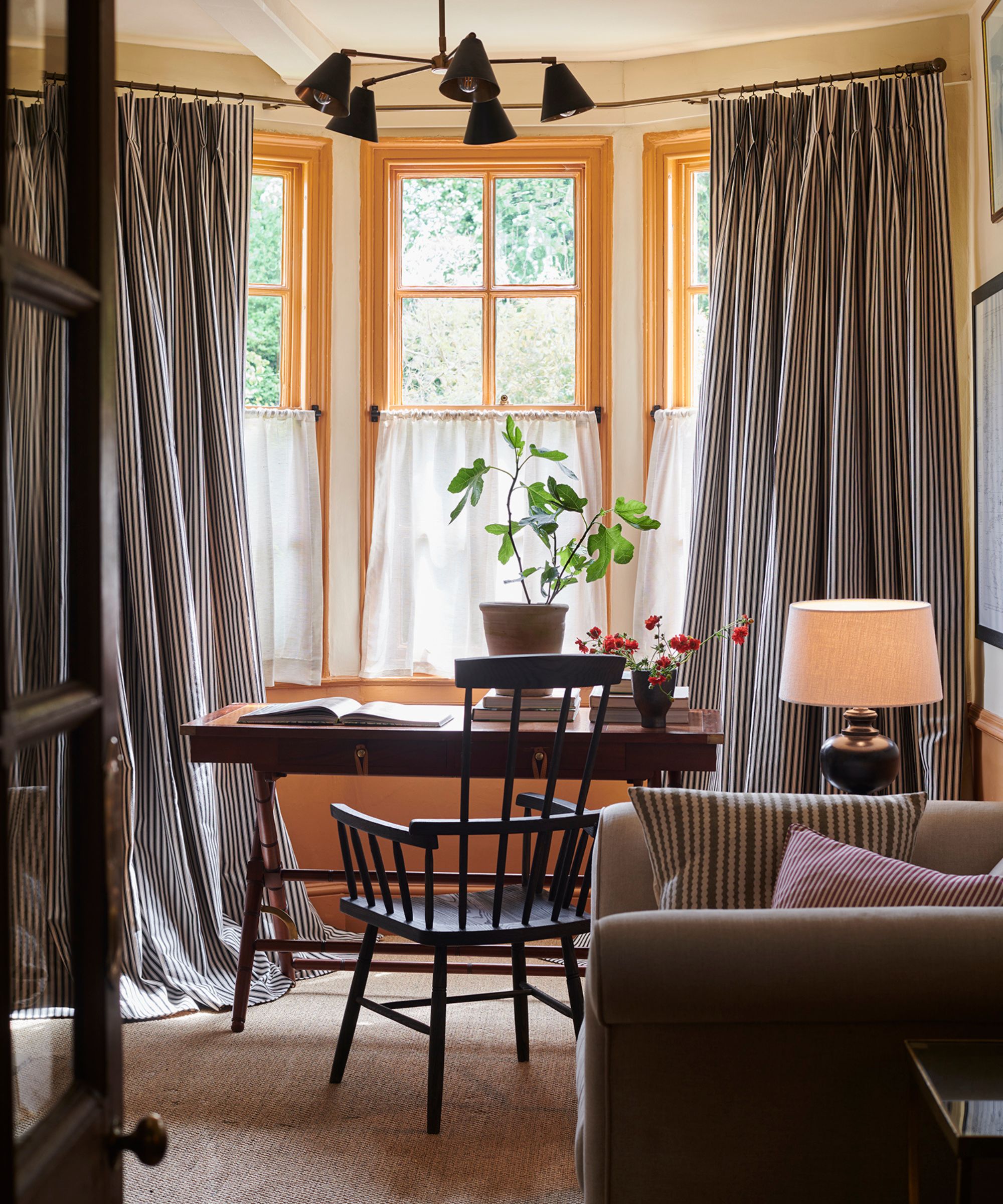
4. Bold color contrast
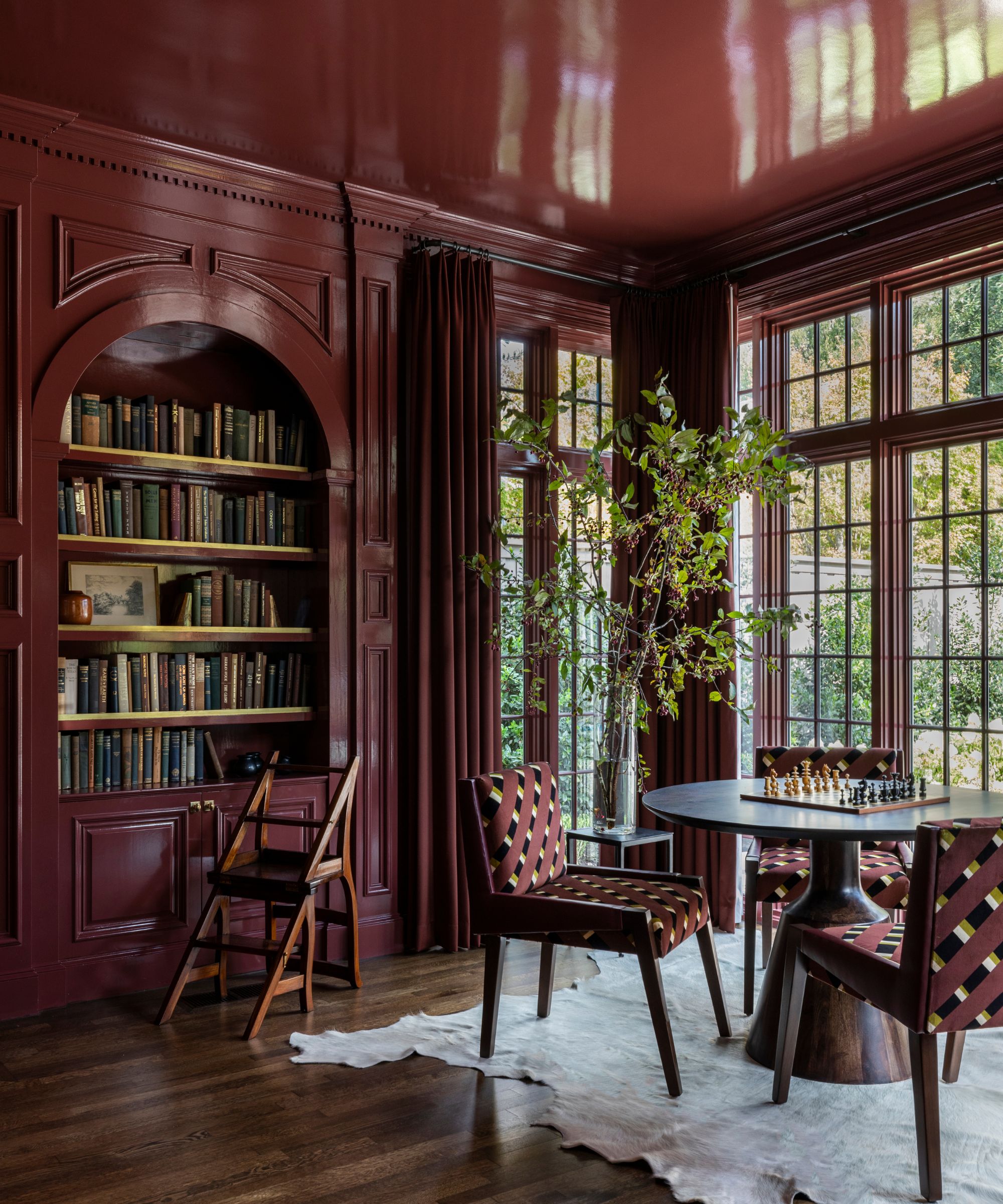
Rather than standing out in isolation, curtain colors are now being used to deepen and reinforce the room’s palette, blending into layered, tone-on-tone color schemes that feel intentional.
The rise of color drenching and pattern drenching – where walls, trims, upholstery, and window treatments match – is a much more harmonious way of decorating than creating a stark contrast or color pop with your drapes.
As Kailee Blalock from House of Hive explains, 'If you’re leaning into color, do it in ways that feel curated and considered. The key is investing in timeless materials and elevated detailing. Layered drapery is a standout area for exploration.' She suggests using pinch pleats, patterned linings, or rich materials like silk and mohair to add character, rather than relying on one loud color to do all the work.
'Boldly shaped window valances or unexpected hardware can infuse vibrancy without noise,' she adds. 'And remember: luxury lies in how something feels, not just how it looks, so opt for materials like silk, mohair, or shagreen in rich tones to deliver color that whispers, not shouts.'
If you've been convinced by the pattern-drenching trend, these chic fir green leafy curtains designed with Pierce & Ward for West Elm match perfectly with the Foliage Stripe Peel & Stick wallpaper.
Boring beige curtains looking a bit flat in your blush pink bedroom? These sweet curtains, made for Pottery Barn Kids, come in the softest pink hue and are finished with a scalloped valance and blackout lining. Too good to keep just for the kids.
If you're intrigued by stripe drenching, these woven cabana-stripe drapes from Greenrow are designed to match perfectly with other stripes in your space. They're lightweight, soft, and airy for a colorful yet casual feel.
As with any trend shift, curtain color preferences evolve not just because of aesthetics, but because of how we want our homes to feel. In 2025, it’s clear that comfort, warmth, and depth are taking precedence over stark contrasts and safe, outdated shades.
But of course, style is subjective, and if you've got a curtain color that is on this curtain mistakes to avoid list, if it works for you, then keep it! 'As always, context matters,' Nina agrees. 'A color that’s falling out of trend might still be perfect for the right room, especially when used intentionally.'
If you need a little more direction, check out our guide on how to choose curtain colors for any room.