Over the last decade, it is safe to say that gray has been one of the most popular colors to decorate with in the home.
A sophisticated, adaptable neutral that can coordinate with pretty much any other color, it is no wonder so many of us have embraced gray room ideas in our interior spaces. However, decorating with gray isn't always as simple as it seems – having too much of a good thing doesn't always equal decorating success. Indeed, it seems that many of us have fallen out of love with the shade: 'what color is replacing gray?' has soared in popularity as a search term online.
But what if you still love gray, like we do? How to get swerve the decor faux pas? From using too much of the same gray shade, resulting in an uninteresting and unwelcoming space, to ignoring the importance of uplifting accent colors that provide balance, we explore what not to do when decorating with gray – and how you can create the gray scheme of dreams, instead.
The 5 design mistakes to avoid when decorating with gray
Gray shades, from warm to cool, will forever be popular as room color ideas, as their versatile nature means they can seamlessly coordinate with a whole host of varied home decor ideas and styles.
However, without the right design knowledge, a gray scheme can quickly fall flat, so we have asked a collection of designers for their top design mistakes to avoid when decorating with gray.
1. Using too much of the same gray shade
As tempting as it may be to use a favorite color in abundance for your decorating ideas, overusing the same gray shade across paint ideas, furniture, accessories and more, will establish a bland and unexciting space that lacks colorful depth and contrast.
Instead, embrace multiple shades of gray to create a stylish, layered design rich in tonal variation.
When deciding on the perfect palette of grays for your space, Ruth Mottershead, creative director at Little Greene and Paint & Paper Library advises that 'different pigments in grays will affect the overall undertones and how the colors sit together in the scheme. If it’s continuity and consistency that you are aiming for, consider grays with similar undertones for a harmonious palette that ties together seamlessly. It’s much easier to go with grays from the same color family as this will make it easier to build a cohesive scheme.'
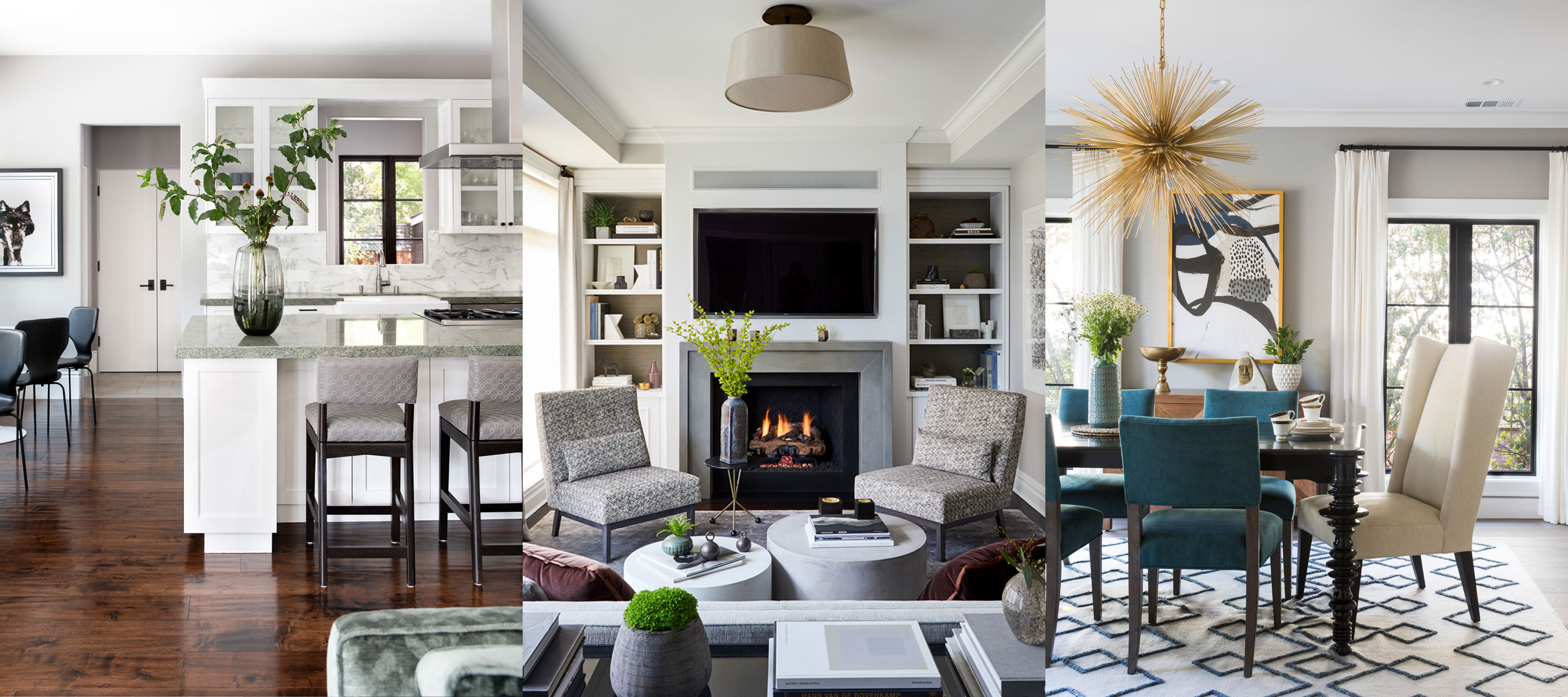
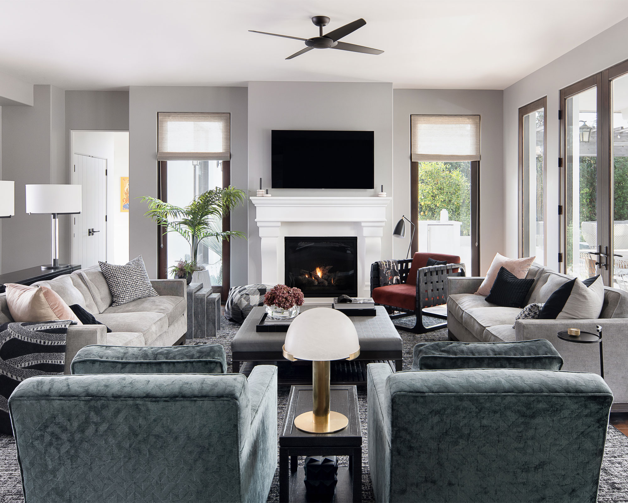
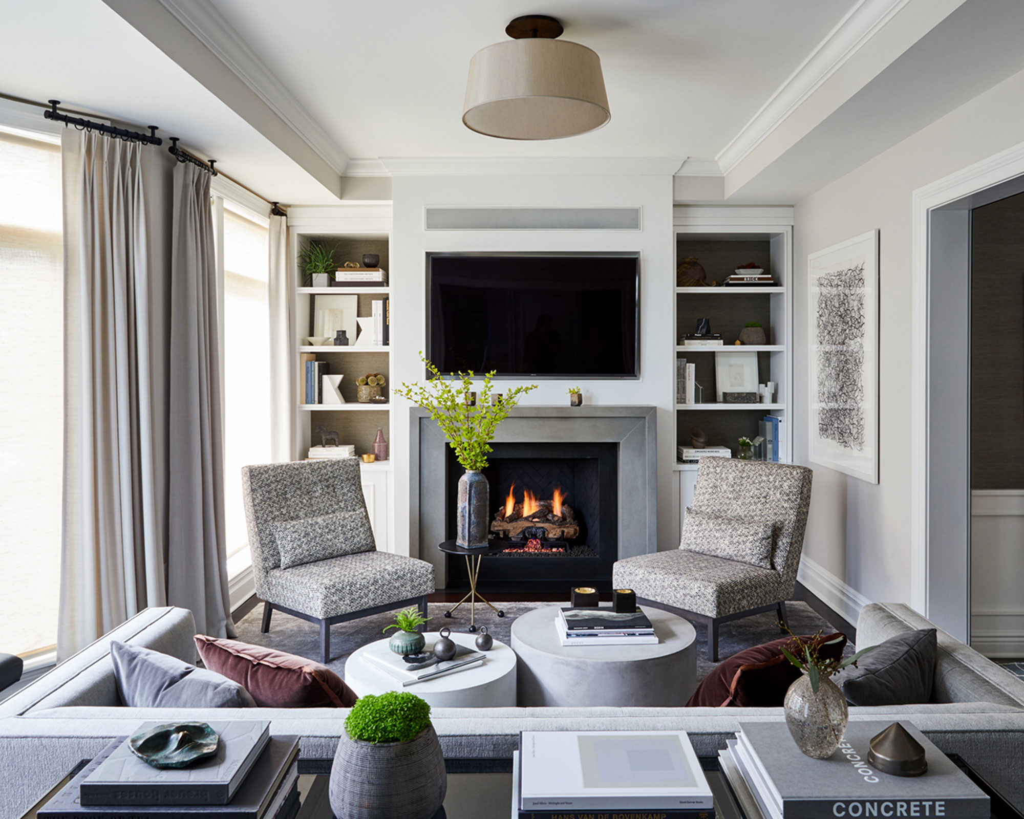
In this beautiful gray living room above, designed by Susie Novak Interiors, the gray color scheme establishes an elegant and sophisticated space. The light gray paint on the walls has been complemented by couches in a slightly lighter gray with the same tone, and gray shades with darker and bluer undertones have been used across other furniture pieces and accessories, establishing a successful gray room that feels perfectly balanced.
2. Lacking of complementary accents colors
As much as many of us love decorating with gray, there are a fair few that believe gray makes for a dull and uninteresting space – however, when pared with the right accent color, gray is anything but bland and boring.
From pretty pinks to bright blues, when it comes to accent colors for gray, the options really are endless.
'When choosing grays, go for something well balanced like our ‘French Grey’ family. ‘French Grey’ is very versatile as it is not too cold nor too warm. These grays can be paired with other shades with ease, combining well with blues, greens and pinks. Accent colors should be used to highlight and work in tandem with the base shade, rather than against it,' advises Ruth Mottershead.
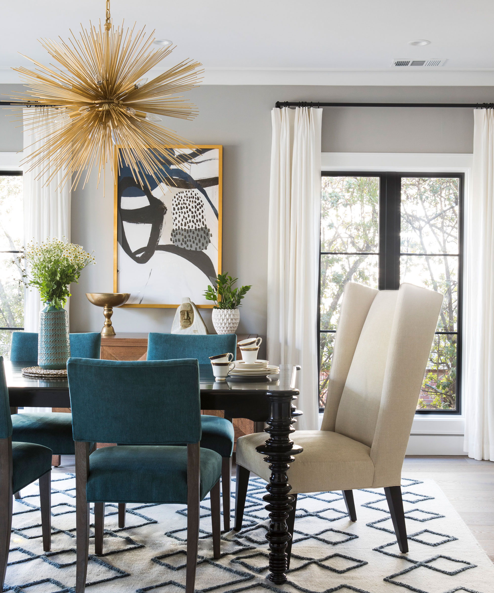
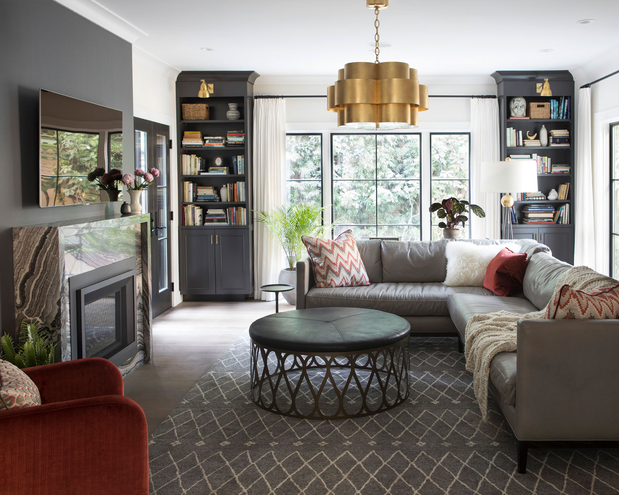
In this gray dining room, designed by Mary Jo Fiorella, the gray painted walls have been uplifted by the warming metal tones of the pendant and picture frame, and further complemented by the cream and blue seating, creating a harmonious mix of warm and cool tones.
3. Not considering the natural light in the room
When choosing a room's color scheme, Clara Ewart, head of design at Kitesgrove, advises 'considering the lighting of a room before confirming colors, and wherever possible, try the swatch in situ before making a final decision, as different lights and seasons can change its appearance.'
How much natural light a room receives, and the warmth (or coolness) of that light, can have a big impact in on your chosen color scheme. If a room is north-facing for example, and you want to enhance the cool, natural light as much as possible, stick to warmer, pale grays, which will help make a dark room lighter, brighter, and warmer, too. Or, go for darker, moodier shades, still with warm tones, if you want the effect to be cozy and cocooning.
If you're intending to design a space that contains lots of gray elements, always consider the overall mood and feel you are trying to create in comparison to the light the room receives. A room that fills with lots of natural light can help colors appear more vibrant and bright, whereas in a space where light is lacking, colors will appear duller and darker.
Bear in mind, too, how your evening lighting will affect the grays you choose – sample swatches on each wall, surveyed over days and evenings, are always worth the effort.
4. Creating a space that feels cold and uninviting
Interior designer, Stacy Garcia says, 'as pretty as gray is, it can be somewhat cold, so adding in warmer tones, like sand and taupe, to a gray room, will help cozy it up. If you're looking to stay on-trend, warmer neutrals or warm neutrals blended with gray is the way to go.'
Sue Wadden from Sherwin-Williams suggests that 'over the past few years, we’ve begun to see popular tones of gray shift from cooler, modern tones to warmer hues inspired by nature. The earthy undertones in Slate Tile SW 7624 make for a grounding hue that pairs well with warm neutrals like Shoji White SW 7042.'
To help a cool gray room look warmer, and prevent it from feeling too cold and uninviting, ensure to balance out cooler gray tones with warming neutrals such as beige and brown, or more colorful brights such as pink, yellow and orange; this can be achieved through paint, lighting, furniture accessories and more.
5. Ignoring the importance of textural elements
A room that lacks texture and depth will feel flat and lifeless – even more so when working with a neutral such as gray, so incorporating layers of textures, as well as complementary colors, is key.
'While many may think of gray as an overly-sophisticated color to weave into interior design, it can also be fun and eye-catching when used with the right texture.
For light gray walls, try a deep gray or charcoal-colored carpet to ground your room and create a cozier feel. For darker gray walls or accent walls in a deep gray shade, we love a natural fiber carpet with dark and light flecks – this balances the light in your room and creates a seamless transition from wall to floor, while helping the space to maintain an open atmosphere,' says Lorna Haigh, creative director at Alternative Flooring.
From the warmth of wooden furniture to the softness of carpet ideas underfoot, a thoughtful mix of textures and colors will help a gray scheme feel more balanced and rich with eye-catching visual interest.
FAQs
Does gray go well with everything?
The beauty of decorating with neutral shades such as gray is that they really can go well with everything.
From Scandi-inspired, modern minimalist spaces, to traditional homes rich with aged character, there will be a gray shade to perfectly suit.
Whether you want to add drama to a room with dark gray painted walls, or are choosing to invest in multiple pieces of gray furniture, as trends and styles change over time, gray will be able to adapt and coordinate with a whole host of varied colors and textures.
What colors brighten up a gray room?
For a more neutral, simple scheme, you cannot go wrong with using a classic white when brightening up a gray room.
White room ideas are renowned to make spaces feel lighter and brighter, and just like gray, white is incredibly versatile and timeless. From white furniture, to soft furnishings such as curtains and cushions, uniting white with gray will make for a soft and soothing space.
For more colorful room ideas, embrace a bold, bright accent color such as yellow or a beautiful sky blue. These inviting colors of nature will establish a stylish contrast with a gray room; and uplift the space with joyful color and character.
'We’ve seen gray take over home furnishings over the last few years, but now, I suggest using gray as more of an accent color, rather than for an "all-over" gray affect,' says interior designer Stacy Garcia.
As gray is such an adaptable shade, we should be celebrating its magnificent ability in being able to work wonderfully with literally any other color
As we have explored, using too much gray can create a design that is far from warm and welcoming. Instead, let gray provide a calming, neutral accent, or act as the backdrop for a standout piece of colorful furniture or artwork, and remember, a successful scheme is always one that embraces beautiful contrast.