There’s a depth and intensity to burgundy that our much-loved neutrals just can't match. Like brown – another shade on the up – this rich, red-wine hue is dark, moody, intriguing – and the fact that designers are using it more and more is a sign, perhaps, of turning inward and embracing our homes as a respite from a restless world.
Compared to the other big color trends of 2024, using burgundy can be a little daunting – but as with many darker colors, it’s often best to go all-in. We've seen it used in color-drenched schemes, paired alongside other red-wine adjacent shades like aubergine and bright red. It also stands up to textures like wool, bouclé and shearling, materials that will only help to amplify the feeling of luxury this color creates – and isn’t that what we all want from our interiors right now?
We promise you won't regret trying this bold color trend in your home, but if you need a little inspiration, take a look at these schemes from some of the best interior designers – featuring all sorts of ways to incorporate the shade into your home.
1. Take a color-drenching approach
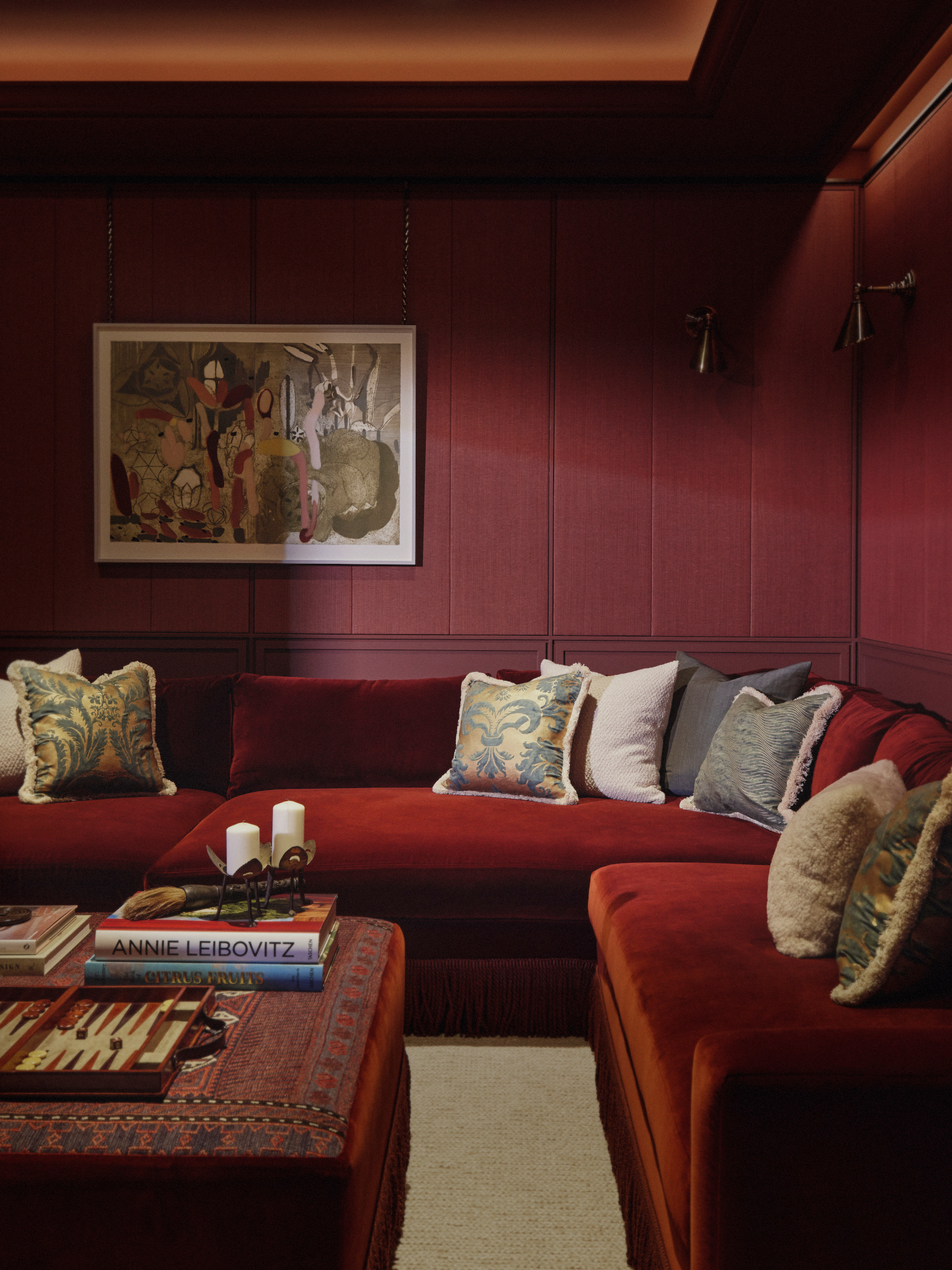
London interior design studio Albion Nord opted for a color-drench approach to this media room, varying the materials to create a rich, layered and luxurious finish.
‘We love to cocoon our cinema rooms with color; the deep burgundy tone adds warmth and comfort,’ explains the studio's creative director, Camilla Clarke. ‘When using one tone, the key is to mix up the textures. Here, we’ve chosen a rich red velvet sofa to sit against horsehair fabric panelled walls and a bespoke ottoman upholstered in an antique rug in the same hue.’
2. Mix in extra red tones for a layered look

In this entryway by Dublin-based Kingston Lafferty Design, combining the shade with aubergine and red – two colors that go with burgundy – leans into the lack of light. ‘We went quite rich and moody with the palette,’ says the studio's founder, Róisín Lafferty.
‘The walls [painted in Farrow & Ball's Eating Room Red] gives a sense of drama and brings all the color tones tighter. The contrast of the orange in the console and the bold red artwork completes the space.’
3. Bring burgundy in through a mix of materials
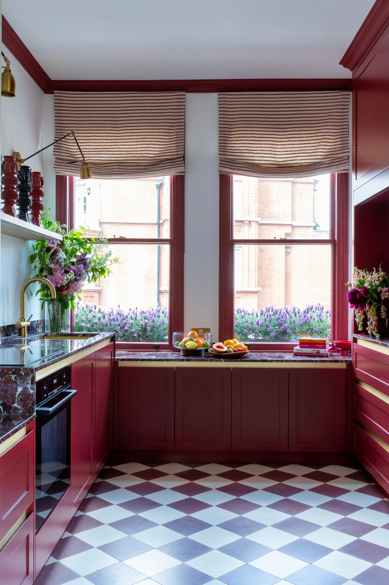
In this modern twist on a country-style kitchen, London-based interior designer Miriam Frowein added lacquered cupboard fronts and painted window frames, also in Farrow & Ball's Eating Room Red. ‘The scheme was inspired by the red bricks of the surrounding buildings,’ she says.
It's the mix of textures that makes this deep red kitchen idea really special: the burgundy appears in layers, the smooth satin finish of the cabinets tempered by a natural stone countertops veined with white. ‘The worktop is made from Rosso Levanto polished marble and the checked floor is aubergine and off-white encaustic tiles,' Miriam explains.
4. Nod to the trend with a single feature piece

If painting walls and ceilings in this rich shade feels like a design step too far, dip your toe in with a single piece that nods to the trend. In a living room, something like a side table or rug can work well, but our favorite way to integrate the trend is with upholstery – the addition of soft texture helps to maximize the luxe nature of the shade.
In this bedroom by London design firm Studio Duggan, a bespoke velvet headboard in an indulgent shade of claret creates a focal point in an otherwise light-colored space – note the use of pale blue, another 2024 color trend, on the wardrobe doors, too.
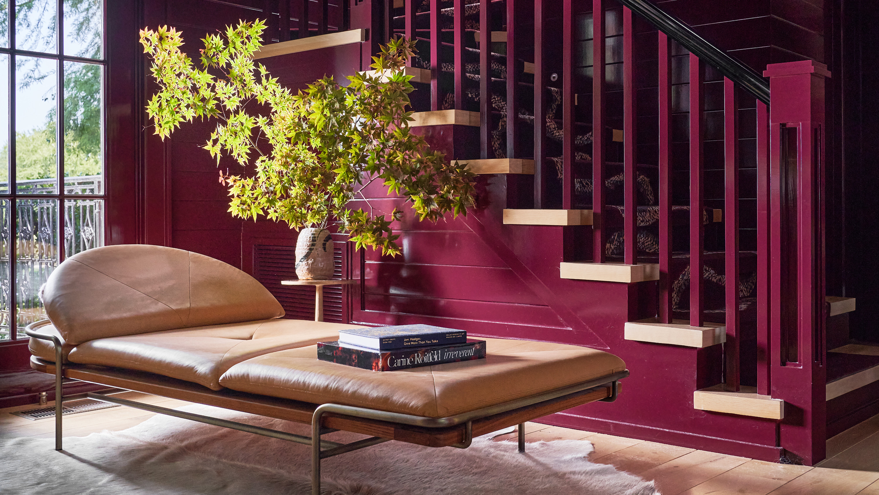
5. Up the intensity with high-gloss paint

An already vibrant and vivid burgundy is ramped up to new levels with a high-gloss paint idea in this project by Dallas studio Chad Dorsey Design – and in this home bar-cum-entertaining space, it elevates more traditional paneling with a large dose of glamor.
Tempered by statement mid-century-style furniture and natural wood, however, it’s still grounded enough to make us feel like we could relax here, tipple in hand, lounging on that daybed.