When an interior designer shares insight into the paint shades they always reach for, it's only wise to take note. When that designer happens to be the long-established legend, Leanne Ford, it's even more important to pay attention.
Taking to Instagram to share her best neutral paints (throwing in a single green paint too), Leanne said she has long been using these six shades in her interior design projects, hailing them as 'our greatest hits'. Each color feels ultra-chic and timeless, perfect for setting a tone of tranquillity. Leanne, who's spaces are always lessons in how to decorate with neutrals, explains, ''One of my most-asked questions is about paint colors. Here’s my guide to all my favorite white paints, neutrals, greens, and everything in between. These are the shades we come back to again and again – from soft whites to grounding earth tones that make any space feel cool, calm, and wonderfully homey.'
We've compiled a list of Leanne's favorite shades. Alongside the tips she's also shared in her blog, we discuss how to bring them into the home and create a lasting scheme that oozes sophisticated serenity.
1. Shoji White - Sherwin Williams
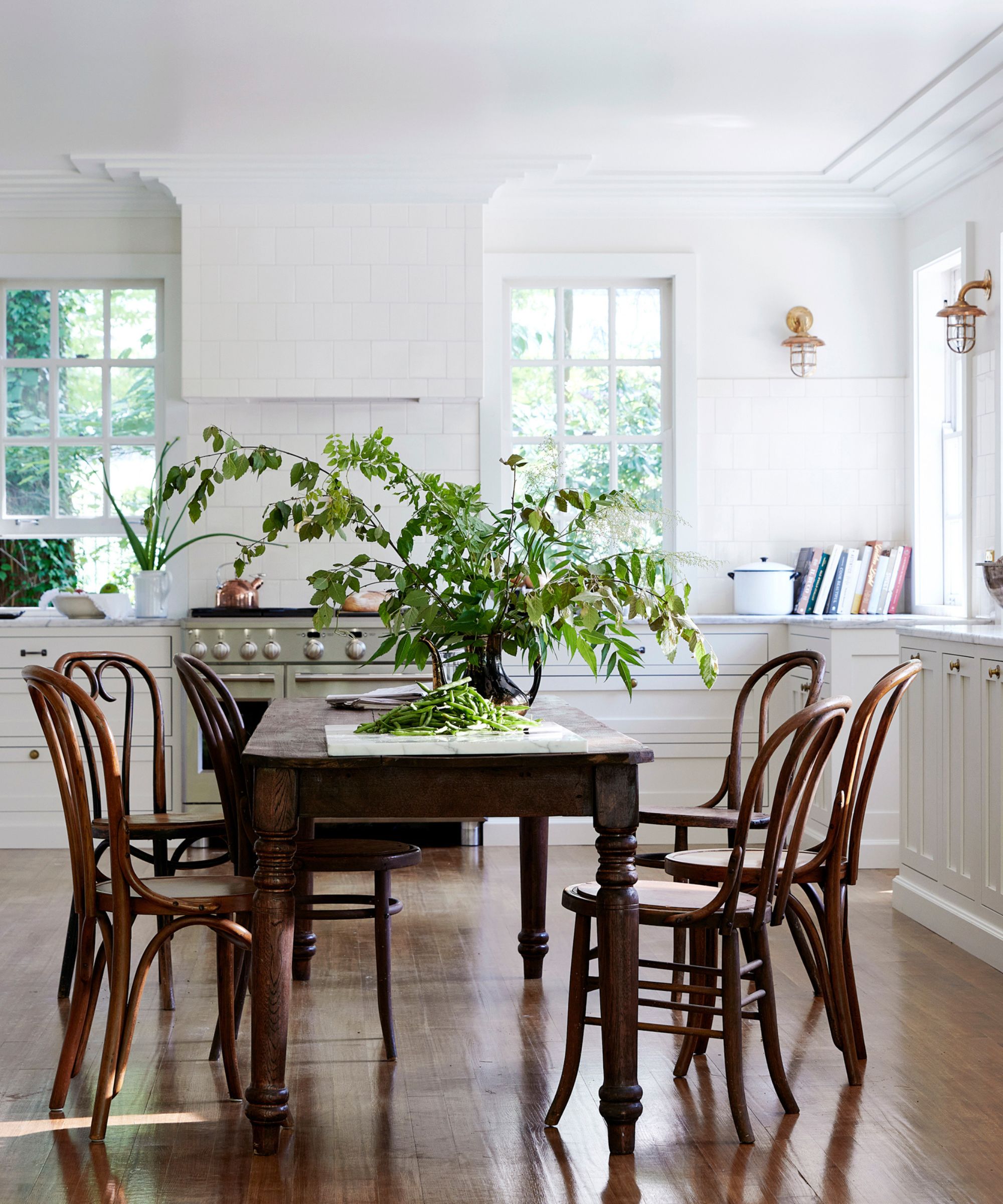
The first shade that Leanne includes in her spotlight of favorites is Sherwin-Williams Shoji White, which I have so often heard designers talk about. It's one of Sherwin-Williams' best sellers, but it's also a designer favorite. She shares some snaps of past projects, from a pared-back farmhouse kitchen to a rustic dining room where you can spot the classic paint color.
White often gets a bad rep for being clinical, but Leanne's use of the Shoji White proves otherwise. In the dining room, Leanne has covered the walls Shoji White. It gives the room a tranquility that pairs so beautifully with the rustic, organic touches. The kitchen is an entirely different vibe, showcasing the versatility of the color. She's used it on the ceiling trim and cabinetry, which work together to give the room a bright, lightness.
It makes sense that Leanne uses the shade on architectural points and larger areas, as it frames each space and creates a deeply calming effect. She says, 'It's a warmer, more natural-feeling white that is still clean and bright. It has a kind of ceramic feel to the color, and I love how that adds depth to any space that it is used in.'
An off-white with touches of warm beige, Shoji White is the perfect choice if you're looking to create a clean backdrop that radiates calmness.
2. Natural White - Behr Paints
Hailed as her 'Go-to exterior white', Leanne says that Natural White from BEHR is a color she often reaches for. White is often among the best exterior paint colors as it evokes a sense of sophistication and timeless elegance. It accentuates the architecture of any house style.
Proving the power of Natural White, Leanne shares a past project where she used the shade on the home's exterior architectural details, such as the pergola, window shutters, and the trim. It gives the property a real heritage feel and adds to its grandeur, bringing a historic home to life through color.
Leanne describes the shade as 'Light, Bright (say it with me!)…. and airy!', adding it to her list of best white paints.
A classic white with a hint of cream, Natural White by Behr is a lasting choice that will blend into any home, providing a refreshingly serene vibe.
3. Thyme Green - PPG Paints
Described as 'the perfect green paint', Leanne has used PPG Paints Thyme Green on the walls and ceiling of a past bathroom idea. An unexpected but chic choice, it adds to the heritage feel of the space and pairs beautifully with the many antique paintings and prints.
An olive green mixed with brighter tones, Thyme Green is one of those year-round shades that feels cozy, sophisticated, and timeless. Use it to color-drench your space or create a feature wall and balance it with other neutral shades.
Leanne uses a white trim to contrast against the richness of the paint shade. She explains, 'I love to play with this green in different sheens. I have it here in my powder bath in a matte sheen and then in a high gloss on the ceiling in my library. Same color, two totally different vibes – obsessed with them both!'
A gray-meets-green, PPG's Thyme Green is an enduring color that oozes sophistication and elegance. It's a warm embrace that will bring life to whatever wall, trim, or floor it's used on.
4. Crisp Linen - Behr Paints
Perhaps Leanne's favorite white paint, she says that Behr's Crisp Linen is a shade she continues to reach for. 'Seriously, though. I am currently on my third project, where I am covering both the interior and exterior in it. It's warm but still clean and fresh with a hint of vintage.'
You usually think of color drenching as being a bold look, using a dark or dramatic color, but it can work beautifully with neutrals too as can be seen in this space. Take a warm white like Crisp Linen over every surface of a room for a cozy, chic, totally timeless look.
A rich cream shade that evokes warmth and elegance. Crisp Linen is a no-brainer if you're looking to create depth and create a timeless scheme.
5. Sandstone Cliff - PPG Paints
Going for a full-on shine, Leanne used PPG Paints' Sandstone Cliff in a high gloss finish to adorn this living room ceiling.
The walls are covered in books, and a large window sits at the center of the room, so there's not much space for the walls to do the talking. So instead, Leanne has used the ceiling to balance out the dark wood elements with the white trim and the subtly shining ceiling.
She says, 'I took a big risk and had my painters paint the ceiling in my living room this color in a super high gloss sheen. I love how it turned out. The way the paint reflects light throughout the day is dreamy!'
The perfect beige, the clue is in the name with Behr's Sandstone Cliff. It's a color reminiscent of sandy beaches and cliffsides, evoking warmth and brightness all at once.
6. Ultra Pure White - Behr Paints
Leanne names Ultra Pure White by Behr as her final favorite paint shade. It's much starker than the other warmer whites, so if you're looking for a bright and refreshing shade that zings, this white paint is the one for you.
Leanne has used it on the exposed brick walls and ceiling of this living room. It's a clever way of framing the space, keeping the texture of the brick, the white lifts the space, without feeling one-dimensional. Leanne has kept the brick hearth bare, bringing warmth and coziness that's so important in a more minimalist room.
She says, 'You can get this one right off the shelf and paint away. My friends will write me constantly to ask which paint to use, and this is my forever suggestion. It's the perfect white for a modern space, no tint, and it works well in high gloss or flat. I love it.'
A white without any fuss or frills, Ultra Pure White is exactly what it says on the tin – an authentic, classic shade that uplifts and brightens wherever used.
Remember Leanne's trust advice before selecting a shade; 'The same paint color can look totally different from space to space. Always test your paint in your own home (and on a few different walls too!) to see how it plays with the light in your space. That said, these tones have proven themselves pretty failproof for me – time and time again...'