Let’s just be open about it. Decorating with primary colors is probably one of the scariest, most intimidating color concepts in the interiors world. They’re extreme. Brazen. Audacious. But, happily, with a few tips, tweaks, and tricks, there are ways to slip such richly pigmented tones into the home with ease, and harness their power for contemporary decorative good.
The primaries — red, yellow, and blue — are color stripped back to its purest form. They’re the origins, the base notes of the whole spectrum. Bold, punchy, full of possibility, they can’t be made by mixing other colors, yet together they can be combined to create almost any other shade on the spectrum. Think of all of the colors laid out like a family tree — the primaries are poised at the top, looking proudly down at the rainbow of life they’ve created.
It sounds simple, but the effect is anything but. Decorating with colors like these statement hues has a unique kind of impact: unapologetic, uplifting, unmistakable. They don’t tiptoe around; they stride forward with purpose, but that doesn’t mean they can’t be handled with subtlety. Used well, they can be graphic and grounded, timeless and modern, and joyful — without being juvenile.
But do primary colors have a place in today’s interiors? How do we stop them from feeling too basic, too brash, too bold? And how do we use them in ways that feel elegant rather than all-consuming? Let’s take a look.
1. Understanding the Primary Palette
When picturing primary color-based decorating, it’s easy to let images of alphabet-lined classrooms, crayon-covered table tops, and toy-strewn carpets swim across the mind’s eye. These are the most basic colors after all, the hues we first reach for as children, and they can’t help but summon a dollop of nostalgia. But don’t think of primaries as a purely pre-school palette — the modern way to dress spaces with primary colors is anything but childish.
Primary colors can have nuance. Red ranges from scarlet to coral to oxblood, yellow from the hottest midday sunshine to lightest lemon or soft ochre, and blue from bouncing baby blues to deepest denim.
There are plenty of ways to decorate with blue tones, explore the yellow tones, or embrace every shade of red. But the classic take on primary colors is all about brightness and boldness, and that’s what we’re talking about today — primary colors at their most pigmented and potent.
In such an undiluted form, primary colors hold immense power in design. They're unapologetically striking and unafraid to make their presence known. Primary red is fiery and commanding, primary yellow is fresh and optimistic, and primary blue is soothing yet intense.
Whether you choose one of the colors to make a statement or all three to create a vibrant composition, they imbue a space with a sense of vitality and character that no other palette (especially only a trio of hues) can replicate.
2. The Power of Primary Colors
The distinctiveness and clarity are valuable tools for curating spaces that are vivacious, memorable, and full of flair — their mere presence potent enough to redefine a room’s feel.
As Caroline Milns, head of interior design at Zulufish, explains, “Primary colors are the go-to for an immediate pop of personality and vibrancy. They make an instant visual impact, adding a moment to stop and pause within an interior.”
With such super pigmentation comes power. The vibrancy of decorating with primary colors doesn’t just embellish a room — it commands attention and evokes emotion. When used thoughtfully, these hues can inject a space with energy and warmth, creating an ambiance that’s both inviting and arresting.
However, it’s essential to consider how these bold tones interact within a scheme, and to give them the consideration they deserve. Kit Kemp, founder and creative director of Kit Kemp Design Studio, puts it beautifully: “Think about colors in a space in the way that you would about guests at a dinner party,” she advises. “Balance the big characters with something gentler, or create a dynamic clash and watch the sparks fly — primary colors should be considered larger than life characters, they will draw the eye and make a statement within a scheme.”
We can all agree that color in the home and emotion, mood, and atmosphere go hand in hand. So, it makes sense to start with how you want your primary-infused space to feel and build around that.
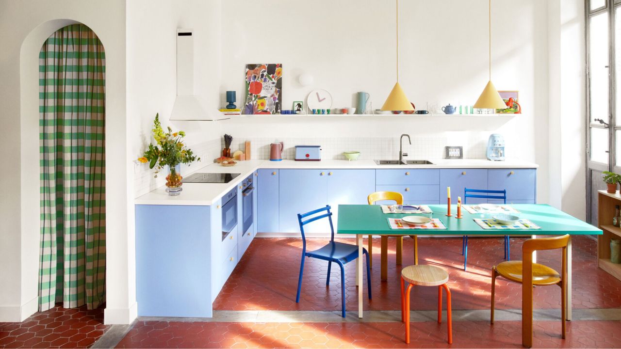
“Color has a direct emotional impact — think about the emotion you want to evoke. Red is lively, yellow uplifting, and blue calming,” notes Suzy Hoodless, founder and creative director of Suzy Hoodless Studio. “Yellow brings happiness and energy, so it is great for spaces such as kitchens or creative spaces. Blue calms and restores, which works well in bedrooms or bathrooms, and red adds drama and warmth, ideal in social spaces like dining rooms”.
3. A Fresh Take on Decorating With Primary Colors
Decorating with primary colors isn’t just about bangs, pops, whams, and pizzazz. They can also feel graceful, grounded, and grown-up. Yes, there’s a softer, more serene side to homes bedecked with reddest-red, yellowest-yellow, and bluest-blue; in fact, they’re surprisingly versatile. Used cleverly, the hues bring definition and energy to a space, offering charm and intrigue (along with visual oomph).
The key is proportion — what we’re looking to cultivate is an exciting equilibrium, a color harmony where curated primary hues are introduced with intent, not wild abandon. It’s about carefully folding and layering the shades into the home in a way that feels measured, not over-the-top.
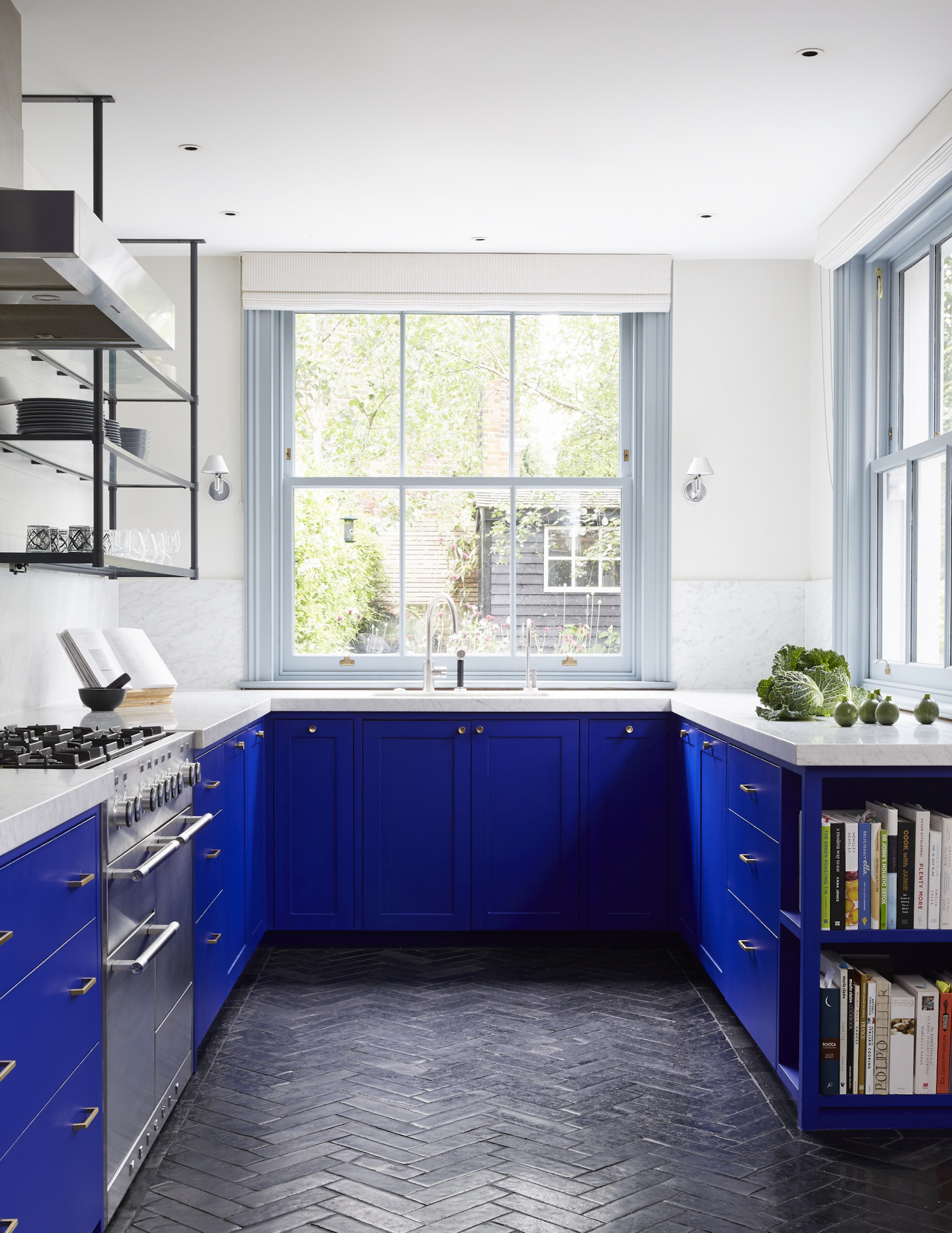
Decorating with primary colors naturally brings contrast. To temper this, add neutrals to tone everything down a bit and ground the bright hues with natural textures — timber, linen, brushed metal — to take the edge off.
This is the secret to making decorating with primary colors feel approachable rather than mildly alarming. “To prevent the room from feeling too intense or visually cluttered, it’s important to offset the boldness of primary hues with neutral tones,” agrees Caroline Milns. “Incorporating plenty of white, cream, beige, or other natural shades helps to create a sense of balance and calm. These grounding tones soften the impact of the brighter colors, allowing them to pop without overwhelming the eye.”
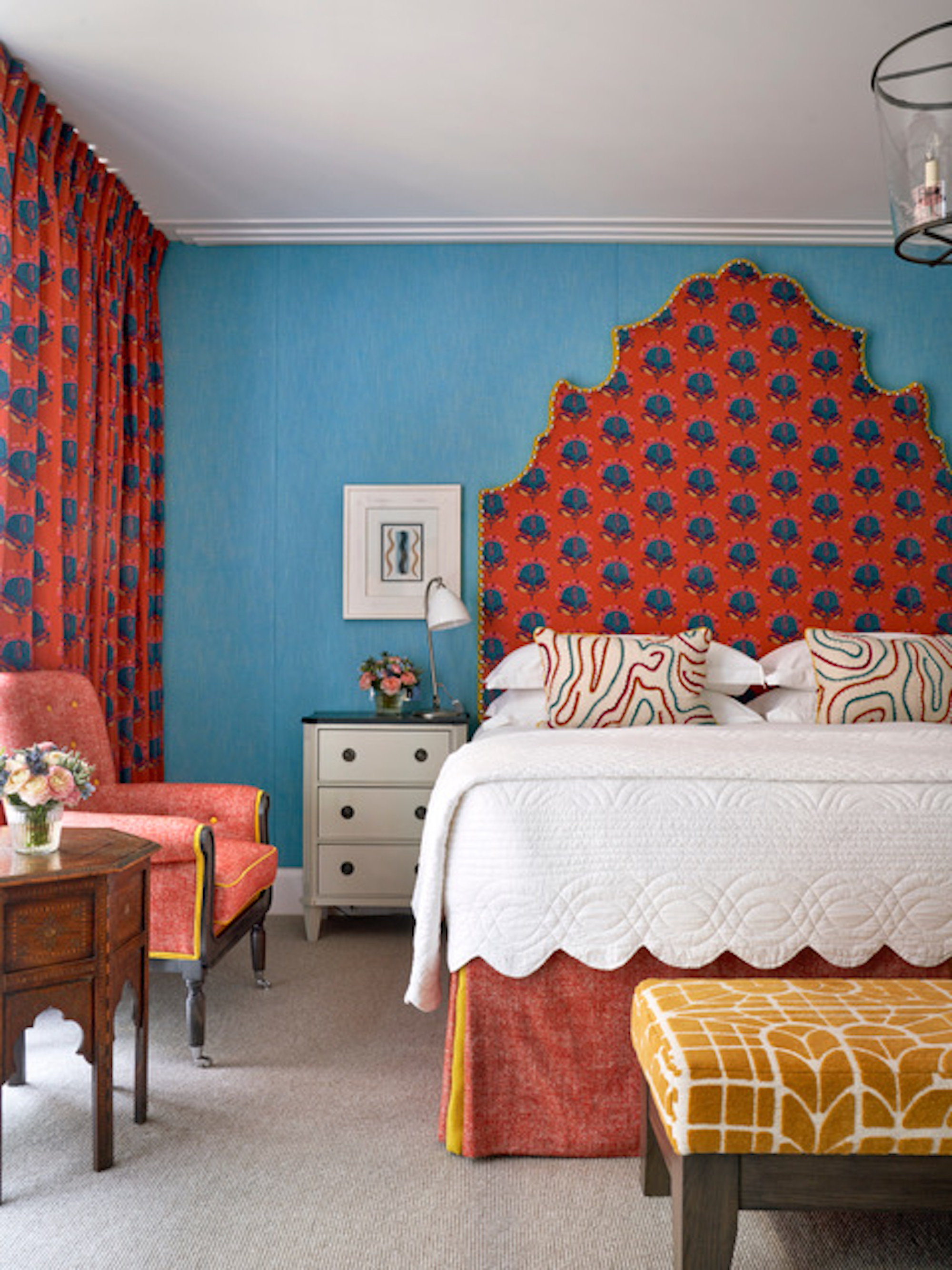
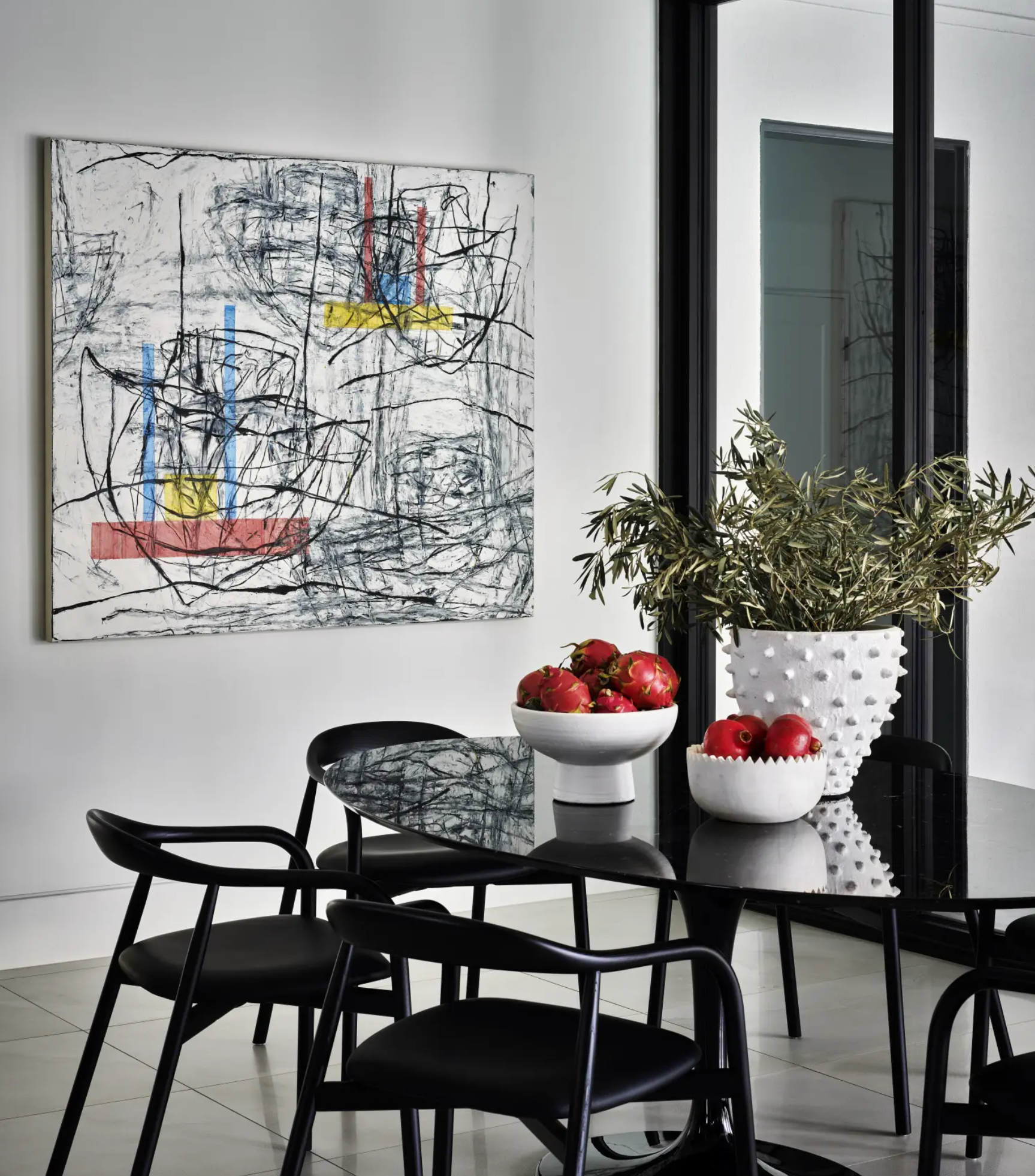
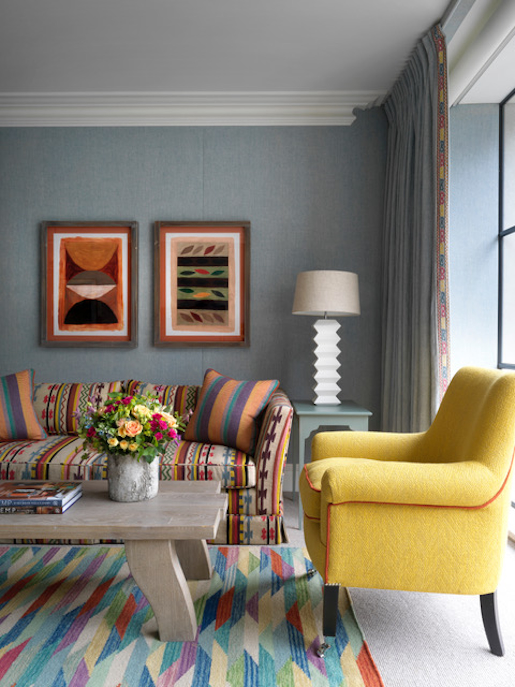
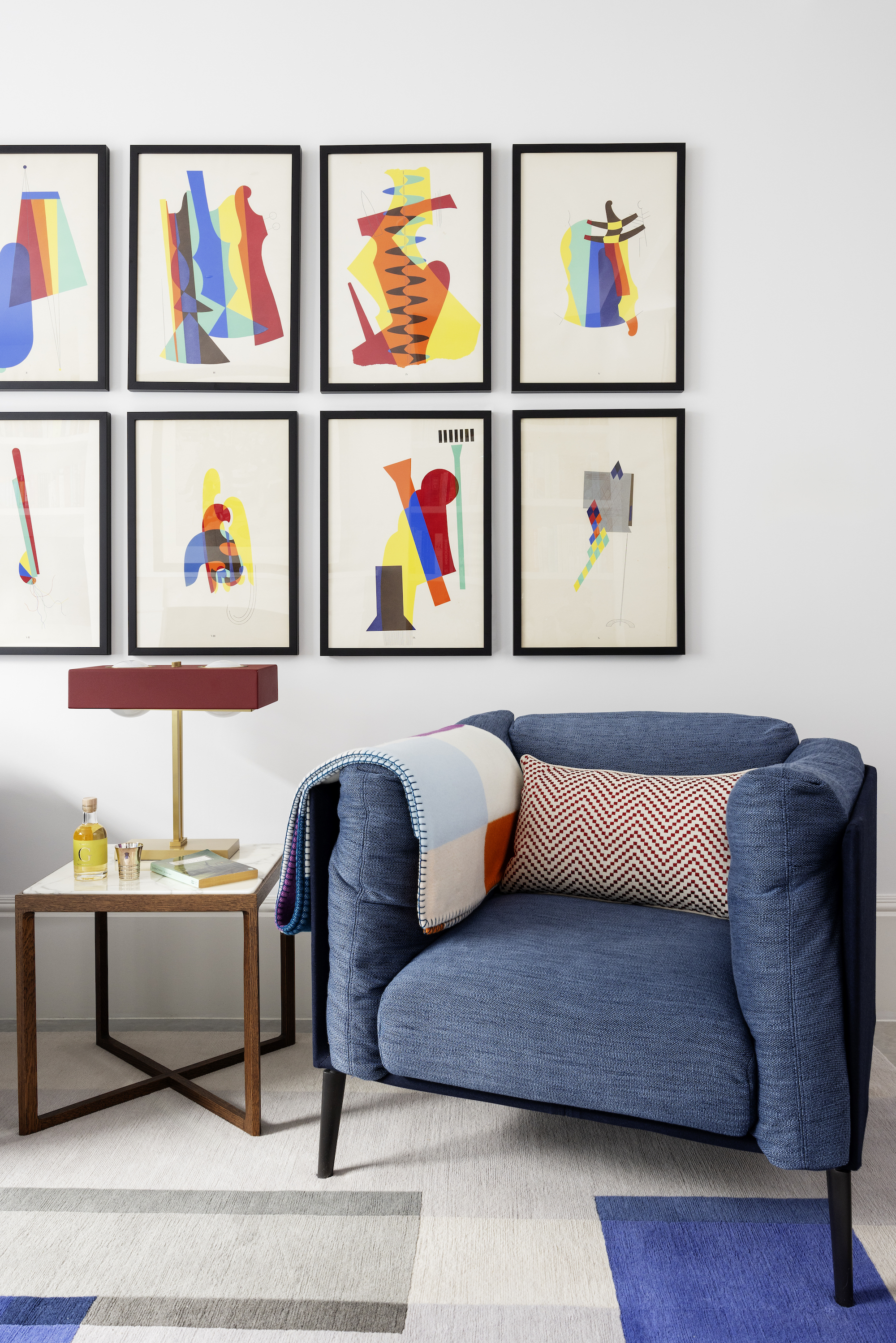
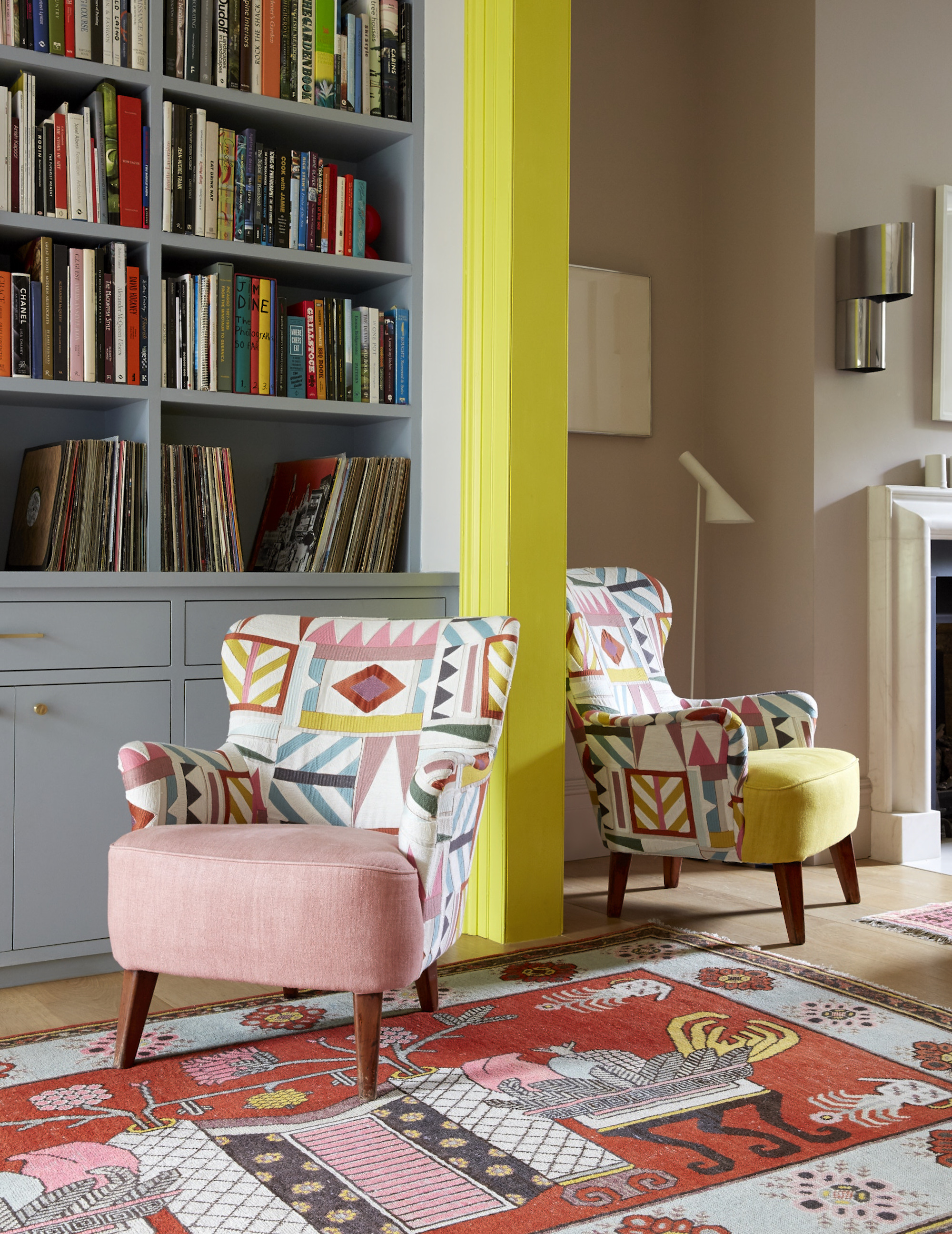
And if you’re still feeling a bit iffy about it all, there’s no harm in keeping things low-key. “You don’t have to opt for a large expanse of a primary color for it to pack a punch,” says Kit Kemp. “Playing with bold, vibrant color on small details is a clever way of achieving inviting interest and richness in a scheme — for instance, bright tomato red piping on an indigo sofa or a green chair will create a dramatic and fun contrast. A frame, border, leading edge, or piping in a contrasting primary color will act to visually disrupt, delineating or drawing the eye.”
When decorating with primary colors, a little goes a long way. Even the quietest pop can make a statement when used with care. Consider the 'Unexpected Red' Theory.
“If you're nervous, definitely try using primary colors in smaller doses first — trims, accessories, or even a painted door can be a great way to start,” adds Suzy Hoodless. “I love using primary colors as accents to add personality and vibrancy without overwhelming a space. A bold cobalt chair, a splash of red in a piece of art, or a sunny yellow cushion can completely change the feel of a room — primary colors help set the tone immediately, even in small touches.”
4. Craft a Primary Combination
Using primary tones in a contemporary way isn’t about creating a scheme that’s rigidly dedicated to only the three hues. What we’re aiming for is to deftly mix in the hard-hitting tones to other shades, allowing their strength to peek out at us from spots in the room (rather than completely dominating).
To make a primary hue-filled room feel natural, it helps to bring in other colors. Blending additional hues into an already vivid palette takes a bit of feel — but worry not, the right shades will reveal themselves as you play, tweak, and trust your eye.
What we’re seeking is tonal variation, subtle contrast in interior design, and enough breathing space so that the boldness adds just enough contrast and surprise to keep things interesting — without it feeling like the room’s turned up to full volume all the time.
Understanding color relationships is key. As Kit Kemp explains, the color wheel itself offers timeless guidance on how to either dial up or dial down the presence of a primary.
“The colors you choose to pair primary colors with will affect how dominant they are. By pairing a primary shade with complementary colors from the same side of the color wheel (blue with green and teal, for example), you reduce the power of the primary color by harmonizing it with colors that contain it, creating a gentler feel. If you pair a primary with a contrasting color (such as blue and yellow, or red and green), you embrace its power to create a dynamic and energetic combination,” she explains. “By dividing the wheel into warm and cool color groups, you can play into the feeling a primary color generates, creating a room that feels energetic and full of life, or more tranquil and calming."
For something a little more soothing, try Suzy Hoodless’s approach of anchoring the vivid with gentler shades. “Pairing primaries with earth tones or pastels can soften them and make them feel more sophisticated,” she says. “I love red with olive green, or cobalt with pale pink. When paired with neutrals like warm grays or soft whites, primary colors really pop. It’s a great way to create a striking but balanced look.”
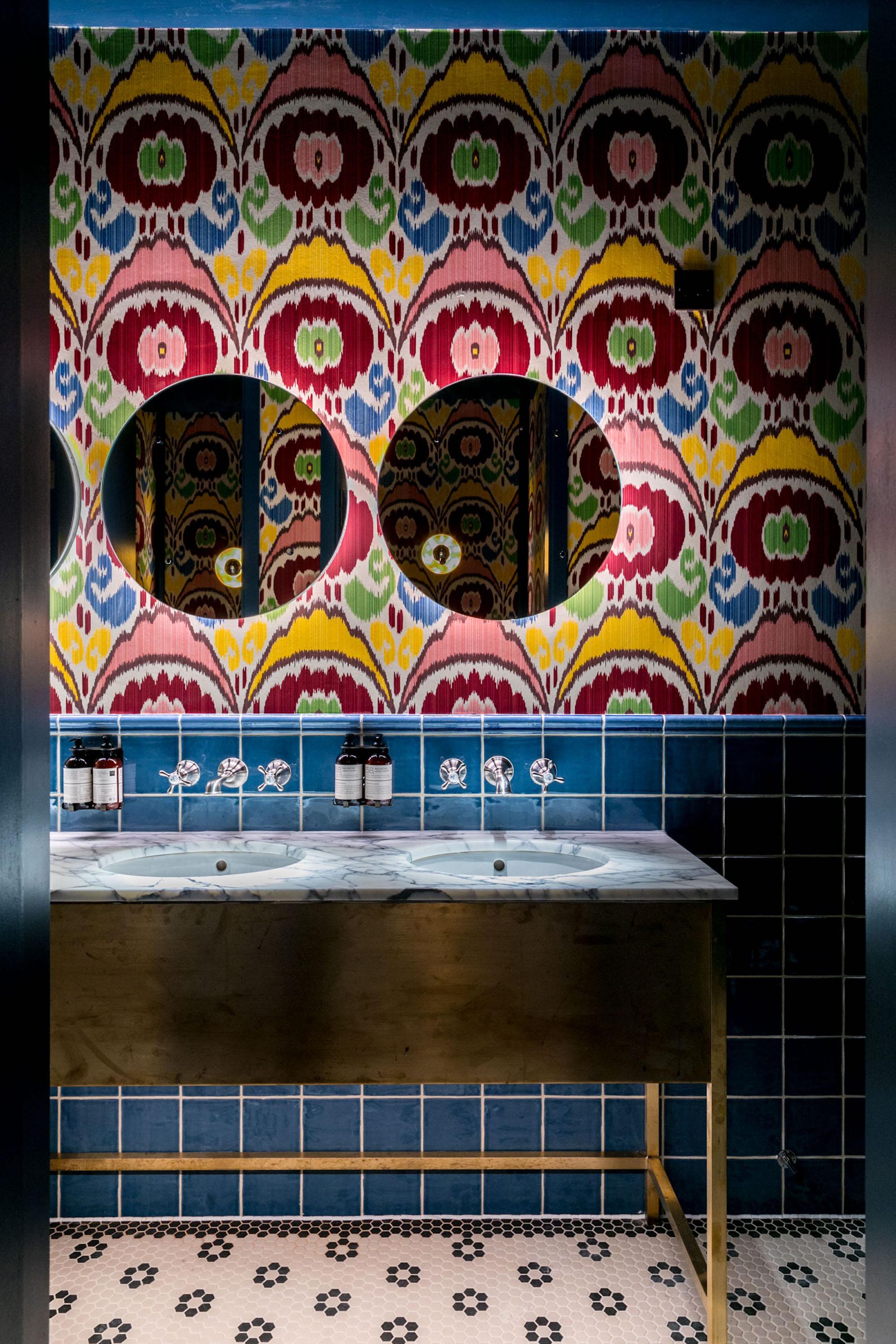
“In addition to neutrals, consider layering in strong patterns such as geometric designs or classic stripes,” adds Caroline Milns. “These motifs bring structure and rhythm to a space and can work in tandem with bold colors to create a dynamic yet cohesive look. The interplay between vibrant tones and bold patterns adds visual interest and can temper the intensity of the color, making the space feel curated rather than chaotic”.
Other classic color-wheel approved pairings for primary include royal blue with sunflower yellow or soft lilac, daffodil yellow with forest green or amber, and crimson with burnt orange or warm apricot. For something a bit more risqué, why not think about cobalt with fuchsia, canary yellow with violet, or ruby red with plum?
5. Balance Bold With Ease
They are bright, yes, but let’s put a halt to this fear of decorating with primary colors in the home, shall we? For all of the eye-popping zing, zap, and whizz-bang they bring, they’re worth the time figuring out how to make it all come together.
A lot of this is about mindset. When you think of decorating with shades like cherry, marigold, and sapphire, it sounds a lot less intimidating than ‘primary colors’, doesn’t it? So let’s flick the switch on our mental block to these hues and open our spaces to their bold brilliance and playful primary pops.
“Don’t be afraid to experiment!” urges Suzy Hoodless. “Primary colors can feel daring, but they’re actually incredibly versatile. It’s all about how you balance them. Trust your instinct — if it makes you smile, it’s probably right. And remember, color is meant to bring joy — use it in a way that feels authentic to you”.
So, go on, dive straight into the deep end and decorate with red.