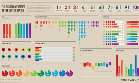
Whether you’re working on a presentation, a website or teaching materials, nothing tells a complex story faster than an infographic. This intensive course teaches you everything you need to create memorable static and interactive infographics – from how to find data and tailor it to your audience, to how to create maximum impact with your design.
The course comprises a series of lectures and workshops, as well as opportunities to get expert feedback on your work. Detailed handouts ensure this course offers long-term benefits to your communications.
This course is for you if...
- You have to present for a living, using Powerpoint, Prezi or similar software
- You work with data and wish to learn more about turning data into something visually compelling
- You’re a group of designers looking to learn more about creating infographics
- You’re a team of developers interested in creating more usable and elegant front-end solutions
Course content
- The importance of good visual storytelling
- The evolution of data visualisation, and examples of best practice
- Designing and presenting graphs and charts to maximise their impact and memorability
- How to find and analyse data, and match it to the needs of your audience
- Practical exercise: participants collaborate on creating their own visualisations before presenting back to the group
- Q&A and group discussion
PLEASE NOTE: Although the tutors will discuss the different visualisation software options available, this is not a software training course
This comprehensive course can be tailored to the needs of your team. Please contact alastair.price@theguardian.com with the name of this course in the subject line for more details.


