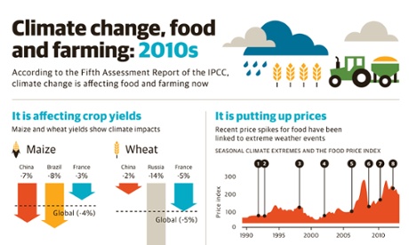
Researchers are increasingly being asked to visualise their data. While this used to mean bar charts and line graphs, there’s now a growing need to communicate with audiences outside of the research community, and this means using more striking and memorable visual techniques.
This introductory evening course looks at how to match data to the needs of your audience and how to keep them engaged using a powerful mixture of copywriting, storytelling and design. It looks at some of the common pitfalls that researchers fall into but also emphasises the crucial role of good research and solid data in the data visualisation process.
Led by Tobias Sturt and Adam Frost, directors of specialist data visualisation agency Graphic, the course delivers a series of lectures and practical workshops which gives you the opportunity to get expert feedback on your work. Detailed handouts ensure this course offers a long-term benefit to your communications.
This course is for you if...
- You have to present for a living, using Powerpoint, Prezi or similar software
- You are a researcher who is used to collecting and analysing data but not communicating research findings
- You are a researcher who has to regularly brief designers and developers
- You’re a designer working for a research company who wishes to learn more about information graphics and interactives
Course description
This evening masterclass will look at how raw data can be turned into striking visual stories – focusing specifically on the problems and issues faced by researchers and analysts. There will be a workshop in this masterclass in which participants will be asked to collaborate on creating their own wireframes before presenting back to the group. Topics covered on the day include:
- The importance of good visual storytelling
- Designing and presenting graphs and charts to maximise their impact and memorability
- Common mistakes that researchers make when talking to a general audience
- The evolution of data visualisation, and examples of best practice
PLEASE NOTE: Although we do discuss the different visualisation software options available, this is not a software training course
Tutor profile
Adam Frost is the content director at Graphic, an agency specialising in data visualisation. His work has appeared on the Guardian, the New Statesman, Buzzfeed and elsewhere. He has produced infographics and interactives for a range of public and private-sector clients including the Department for Education, HMRC, Google, P&G, Nestle and Unilever.
Tobias Sturt is the creative director of Graphic. He has been working in digital storytelling for almost two decades, in all kinds of media, from web to TV to games to infographics. He has also worked on more conventional digital development projects, from website design to branding, from mobile app interfaces to print projects.
Details
This course has now passed – but we update our programme all the time. For information on our full range of masterclasses, sign up to our newsletter, follow us on Twitter, or keep an eye on our calendar.
To contact us, click here. Terms and conditions can be found here.
Returns policy
Tickets may be refunded if you contact us at least 14 days before the course start date. Please see our terms and conditions for more information on our refund policy.


