Colour has been used to make symbolic statements in cinema since the days when “talkies” were tinted, toned or hand-coloured. From the Wizard of Oz, with its vibrant Emerald City and yellow brick road, to the dramatic and groundbreaking use of colour in Gone with the Wind, the most famous, early technicolour films harnessed the power of colour, not only to stimulate the senses, but to enhance and express the themes of the story.
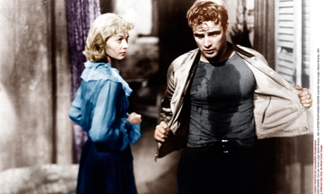
Throughout cinematic history, the tradition of colour storytelling thrived. In 1951’s A Streetcar Named Desire, director Elia Kazan used colour to convey themes of class and superficiality; dressing characters of a lower class in vibrant hues to symbolise their rise to power in the case of the former, and using Blanche DuBois’ love of colour as metaphor for her desire to gloss over life’s gritty realities in the case of the latter.
In 1968, Roman Polanski explored the relationship between colour and Christianity, dressing his protagonist, Mia Farrow’s Rosemary Woodhouse, in white (purity), yellow (hope) and red (martyrdom). In 1979’s Apocalypse Now, Francis Ford Coppola lashed the audience with deep red napalm flames, enveloping green jungle foliage and the foreboding, pitch black of Colonel Kurtz’s lair, all oversaturated to increase the claustrophobia and sense of death. In the 90s, M. Night Shyamalan first revealed his signature use of colour symbolism – in the Sixth Sense, for example, vivid pops of red show up in every scene where living characters connect with the dead.
And in 2000, two acclaimed movies used colour as a broad storytelling device. In Christopher Nolan’s Memento, colour sequences contrast with black and white to mark a simple differentiation between chronological and reverse-chronological events (in an otherwise complex and brain-teasing tale), and in Steven Soderbergh’s Traffic, each of the three separate story strands has its own palette. But since the turn of the century, there has been a shift. With the rise of superhero blockbusters and action-packed celebrity vehicles, cinema seats have been filled at the expense of subtlety. The craft of colour symbolism has been relegated to independent moviemakers, while mainstream jaunts blaze a 3D-enhanced trail.
Colour storytelling is far from passé, however. From the comfort of our sofas, we’ve watched the ambitions of small screen creativity explode. As competing broadcasters, including new players Netflix and Amazon, have lured movie stars and directors into TV contracts, the limitations (and stigma) of serial television has been obliterated.
Those early adopters who devoured Lost, The Wire and The Sopranos have been rewarded with a boom in “box set culture”. And this eruption in television scope, reach and budget can be seen in a riot of thematic hues.
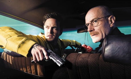
Take Breaking Bad. Vince Gilligan’s cult behemoth depicted a downtrodden, cancer-ravaged teacher’s transformation into a pork-pie-hat-wearing drug overlord, using “hot” colour to punch Walter White’s modern-day fable into living rooms across the globe. From the acid yellow of the meth makers’ jumpsuits to the bright blue shade of the “product” itself, Walter’s epic fall into criminality is characterised by larger-than-life colour.
Gilligan’s use of colour continued in spin-off series, Better Call Saul, with fans picking up on a “fire and ice” code; colder colours are used in scenes that convey themes of authority and respectability, while hotter colours are associated with crime and corruptibility.
Another crime-based drama, True Detective, took full advantage of Matthew McConaughey’s “McConaissance”, alongside fellow mumblecore megastar, Woody Harrelson. As if the televisual spectacle of the golden-haired duo was not enough to tantalise viewers, the series had divergent time strands, an unforgettable, six minute single tracking shot, and a protagonist who is a synesthete: McConaughey’s character, Rust Cohle, reveals that he can taste colour. “One sense triggers another sense,” he says. “Sometimes I’ll see a colour and it will put a taste in my mouth. A touch, a texture, a scent can put a note in my head.”
As the show’s creator, Nic Pizzolatto, is himself a synesthete [link to synesthete article], it’s perhaps unsurprising that his lead character has this unusual relationship with colour – or that the series itself used an overarching palette of filtered green and gold to project its unsettling, otherworldly exploration of childhood abuse, infidelity, loyalty and existentialism.
With a second “event series” of True Detective airing this summer, in which we are promised a new stellar cast of Hollywood stars (Colin Farrell, Vince Vaughn, Rachel McAdams) and a fresh colour palette, and the debut of the M. Night Shyamalan-produced Wayward Pines, in which Matt Dillon gets trapped in a mysterious, Truman Show-esque town with a disturbing colour mix of 1950s pastel chocolate box meets bleak, Hitchcockian noir, the symbolic use of colour on the small screen is only set to rise.
Add drama to your interiors with Valspar paint
Established in 1806, leading American paint brand Valspar is inspiring the UK to get colour confident with the launch of its extensive range of high quality paints and unique tinting technology, which has the ability to match any colour the eye can see – that’s around 2.2 million shades. Using their unique colour-matching technology, any colour can be scanned; be it the blue sky from a holiday photograph, or a vibrant pink from a favourite garment, and recreated in paint form.
Available exclusively at B&Q, Valspar’s Premium paints feature a super scrub formula so paint won’t fade or chip off when cleaned and it comes in a range of wide range of high quality interior and exterior paints in a variety of finishes. Valspar is available at B&Q stores nationwide, visit valsparpaint.co.uk or visit any B&Q store to find out more.