South-facing rooms are often the most desired orientation, offering generous amounts of sunlight throughout the whole day. And thanks to their brightness, the best paint colors for south-facing rooms are often bold, making them an ideal place to get creative.
When picking the best paint colors for south-facing rooms, you should first decide whether you want to counter the strong light with cooler, muted shades or lean into the warmth for a more energetic scheme. Ruth Mottershead, creative director at Little Greene, notes that south-facing rooms will often "see high contrast due to direct sunlight, creating shadows and giving a sun-bleached feel to very light colors", so it's important to choose your paint color ideas carefully.
Below, we've rounded up five of the best paint colors for south-facing rooms, as recommended by interior experts. From mellow neutrals to colorful hues, these ideas prove that you can make just about any color work in these light and airy rooms.
1. Bright Oranges
With consistent sunlight throughout the day, south-facing rooms allow you to go bold with your wall colors. If you want to enhance the generous, warm light these rooms receive — especially if you're looking for colors for south-facing living rooms — create a warmer scheme by decorating with orange for an uplifting and welcoming feel.
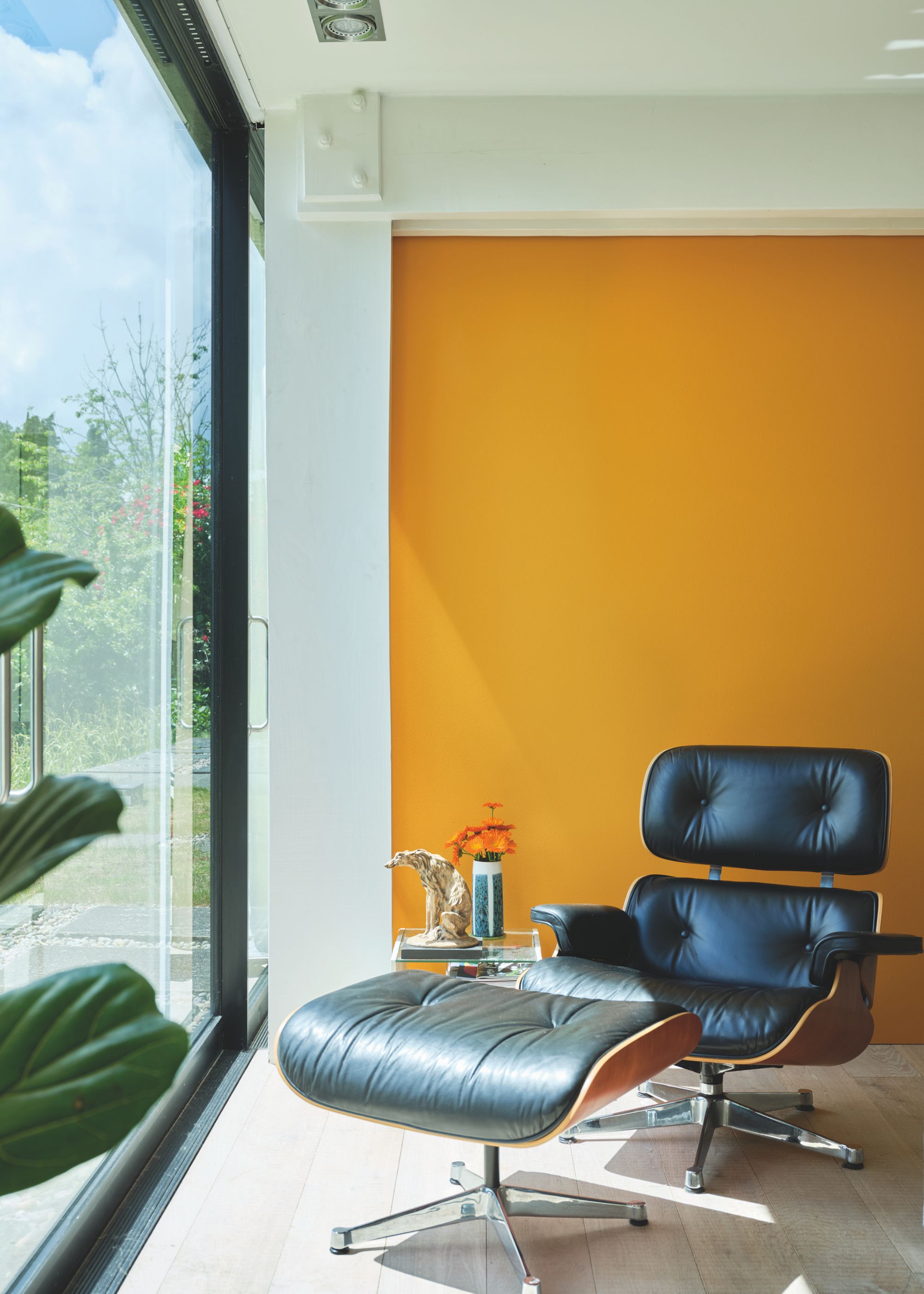
"If you are looking to stand out, try using Dutch Orange, a rich and warming shade that hovers between the deepest yellow and a blushed ripe apricot, delivering glowing joy," says Patrick O’Donnell, Farrow & Ball's paint color expert.
"Use it on walls in a south-facing sitting room drenched in light to appreciate its full warmth, teamed with its complementary white, Orange Coloured White," he adds.
Create a vibrant scheme with Dutch Orange, a bright and bold shade of orange that enhances the warmth in south-facing rooms.
2. Cool Blues
While saturated and energetic colors are bound to add vibrancy and extra warmth in south-facing rooms, cooler shades, such as the best blue paints, work well to create a restful feel.
"Blues are a fantastic choice for balancing out the warmth in a south-facing room," says Tash Bradley, director of interior design at Lick. "I often suggest soft powder blues or deeper, moodier mid-toned blues, which add depth and calm while staying fresh and light. Lick’s Blue 03 or Blue 18 work beautifully here — they’re cool enough to temper the sun but still full of personality."
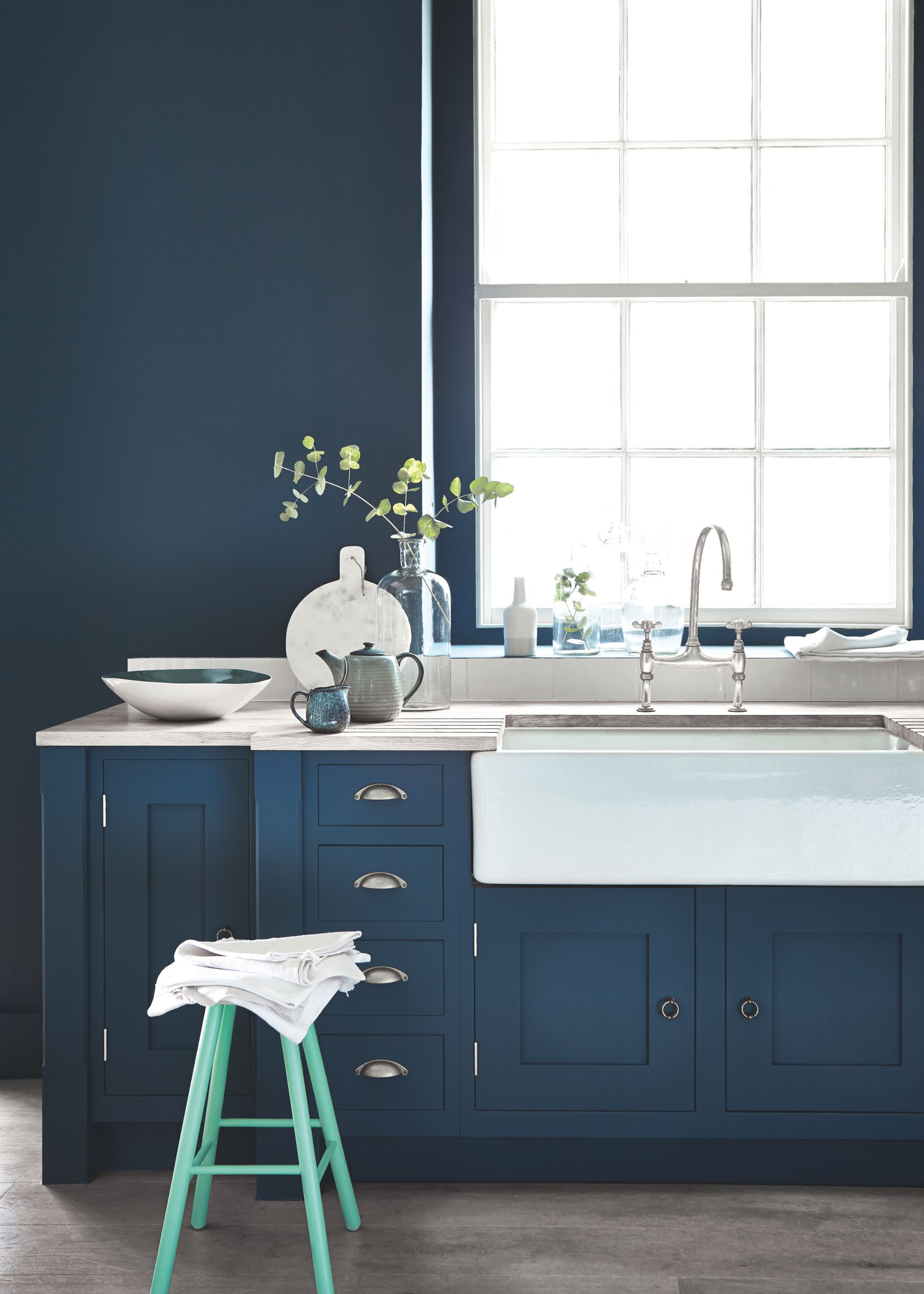
Dark blue is also one of the best paint colors for south-facing rooms as an alternative to decorating with neutrals, says Ruth Mottershead of Little Greene, who recommends Hicks' Blue (used on the walls and kitchen cabinets in the space shown above). She adds that this deep blue "can be used in place of grays and blacks to achieve a neutral scheme with more depth."
If your aim is to counter the warm sunlight to create a calming scheme, Hicks' Blue is a timeless choice.
3. Earthy Neutrals
While south-facing rooms can handle bold and vibrant wall colors, neutrals can also be effective colors for south-facing living rooms if you prefer an understated look. "Warm, earthy neutrals work beautifully in a south-facing room because they complement that golden light without making the space feel too stark," says Tash Bradley.
"Think soft taupes, warm beiges, or even a muted terracotta. These shades feel cocooning and calm — I love how Lick’s Taupe 03 or Beige 03 bring in that grounding warmth," she adds.
And of course, the best white paints can also be used to enhance a light and airy feel in south-facing rooms, but make sure to choose those with the right undertones. Anything with strong yellow undertones will appear more creamy in the direct sunlight, whereas those with subtle cooler undertones can create a more balanced look.
Helen Shaw, color expert at Benjamin Moore, recommends Decorator’s White OC-149, "which carries a light gray undertone," she says. "It doesn't lean into any particular color but still feels soft."
Complement the day-long sunlight in south-facing rooms with a warm and earthy neutral, such as Lick's Taupe 03.
4. Greens
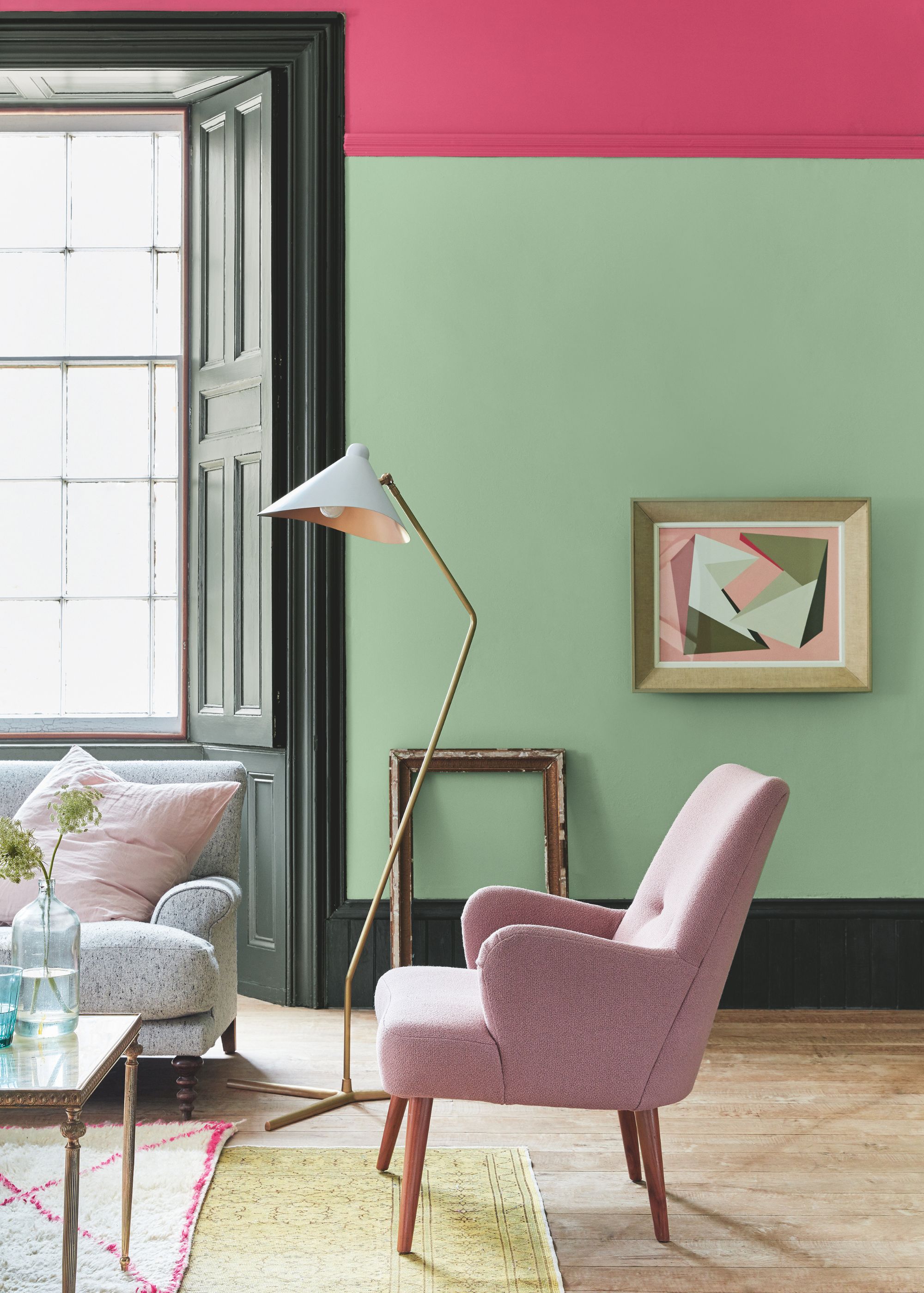
Green paints are a stylish wall color for all room orientations, and in south-facing rooms, they can feel especially fresh and uplifting. "Green is such a versatile choice in south-facing spaces — it feels connected to nature and works so well with that strong light," Tash Bradley explains.
Thanks to the ample amount of natural light in south-facing rooms, many different green paints will work well, whether you want to go bold with dark shades or keep it much lighter.
That said, Tash recommends those with an earthy feel, which can work in harmony with the warm light: "Gentle sage greens or olive tones like Lick’s Green 09 or Green 18 bring in a soft, natural feel that doesn’t compete with the brightness."
A warming shade of moss green, Green 18 is a great way to complement the sunlight in a south-facing room.
5. Dusky Pinks
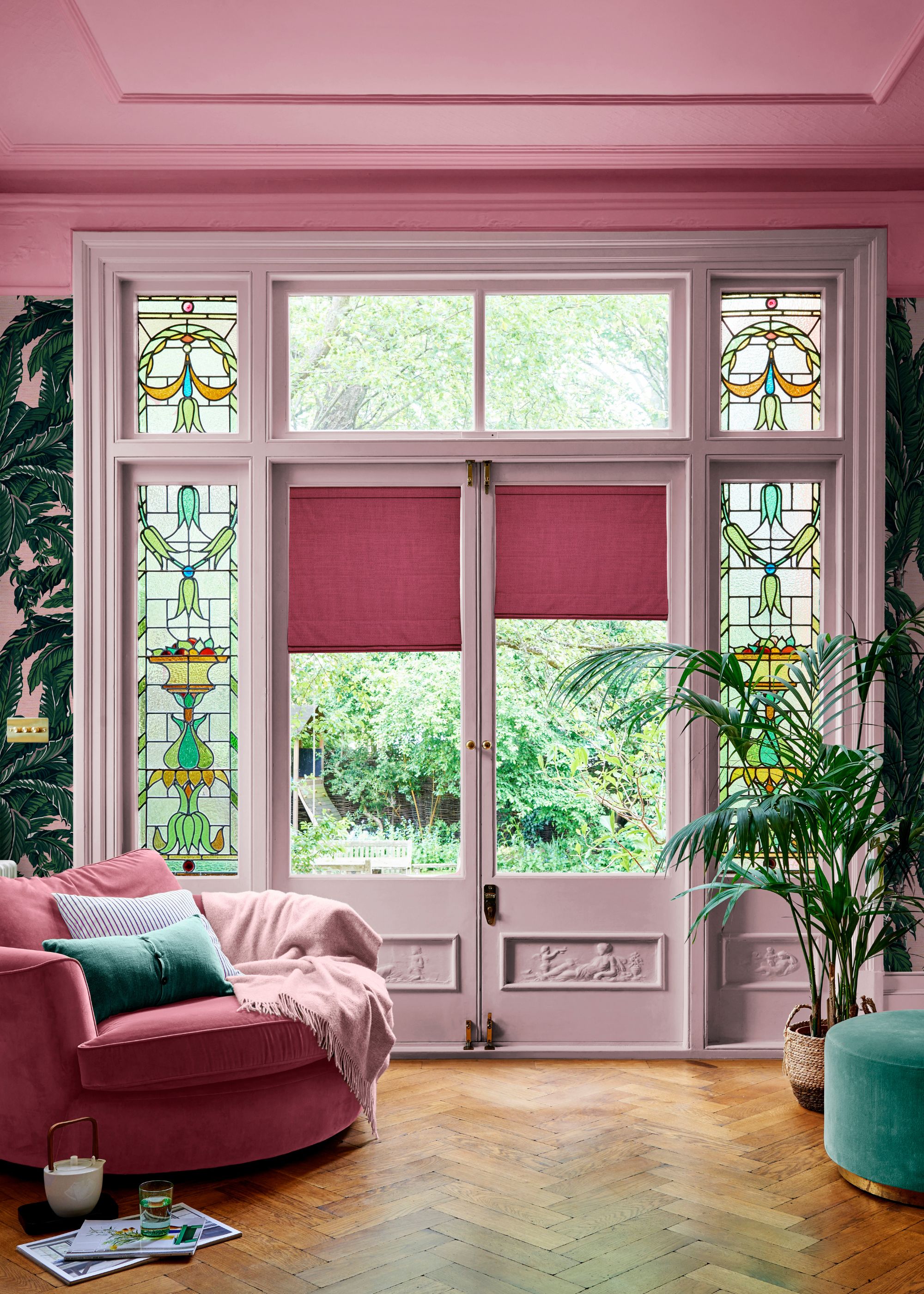
Dusky pinks are another great color for south-facing rooms living rooms, adding extra warmth and coziness, without overpowering the space with too much saturation. "If you’re after something playful and a little romantic, dusky pinks come alive in south-facing light," explains Tash Bradley. "They pick up the warmth and create a soft, grown-up glow."
For something fairly light, Tash recommends Lick’s Pink 07 and Pink 08, which she describes as "sophisticated and earthy enough to feel timeless." Alternatively, you can go darker with your dusky pink paints for a bolder look, as seen in this colorful living room, above.
Paula Taylor, stylist at Graham & Brown, recommends two of Graham & Brown's dark pink paints, Bittersweet and Bikini, adding that they "enhance the sunlight without overwhelming it".
With a muted, dusky quality, Bittersweet is a sophisticated way to embrace the warmth of pink.
FAQs
What Is the Best Color for a South-Facing Room?
South-facing rooms allow a creative approach to paint colors, providing flattering light for almost every color. "South-facing rooms get the best of the sun — they’re flooded with warm, bright light all day long, which means colors look their best," explains Tash Bradley. "It’s just about working out the placement of the color and how you want the room to feel."
That said, if you're struggling to whittle down your options, Tash is an advocate for colorful hues such as blue, green, or pink. "South-facing rooms are the perfect place to go a bit brighter and lean into the lightness. I usually advise against going too dark – keep things towards the lighter and mid tones, but embrace the brightness and play with those richer, more vibrant colors."
"The golden light here is a dream for color," she adds. "It makes everything feel warmer and more inviting."
What Is the Best Paint Finish to Use in a South-Facing Room?
Once you've chosen your color for your south-facing room, choosing the right paint finish is the next step. Since these rooms benefit from plenty of light throughout the day, finishes that reflect less light can create a balanced look.
"Look to use a matte or eggshell finish to avoid unwanted glare," recommends Paula Taylor. "Glossy finishes can reflect too much of the strong sunlight."
How Do I Balance Sunlight in a South-Facing Room?
While the natural light brings warmth and brightness to south-facing rooms, in some cases, you may need to balance the light rather than enhance it. If it's a space used for relaxing, such as a south-facing living room or bedroom, countering the warm light can help create a restful space. To do so, choose paint colors with cool undertones, from cool earthy neutrals to calming shades of blue.
It's also important to use paint samples before committing, to ensure your chosen color feels balanced as the day progresses, recommends Ruth Mottershead: "Use tester pots and painted sheets of paper to test how the natural light works with your chosen colors throughout the day. This will give you an idea of any tonal shifts that occur and help you find the perfect shade for your space."
If you're lucky enough to be decorating a south-facing room, just remember, the first thing you should consider how you're going to use the space. If it's a social space where you want to enhance the natural light, create a playful and vibrant space by decorating with saturated colors. For somewhere more relaxing, choose soft and light neutrals.