Some interiors make a statement, and Martha Stewart’s three-season room does this effortlessly. It showcases a bold mastery of color while quietly anticipating one of 2025’s most talked-about trends: color capping – but in reverse.
Traditionally, the color capping trend is immersive. A single hue is chosen and layered tonally, deepening as it rises up the walls and often culminating in a bold, enveloping ceiling. The effect is dramatic, drawing the eye upward, stretching the room visually, and transforming the ceiling into a defining element of the design.
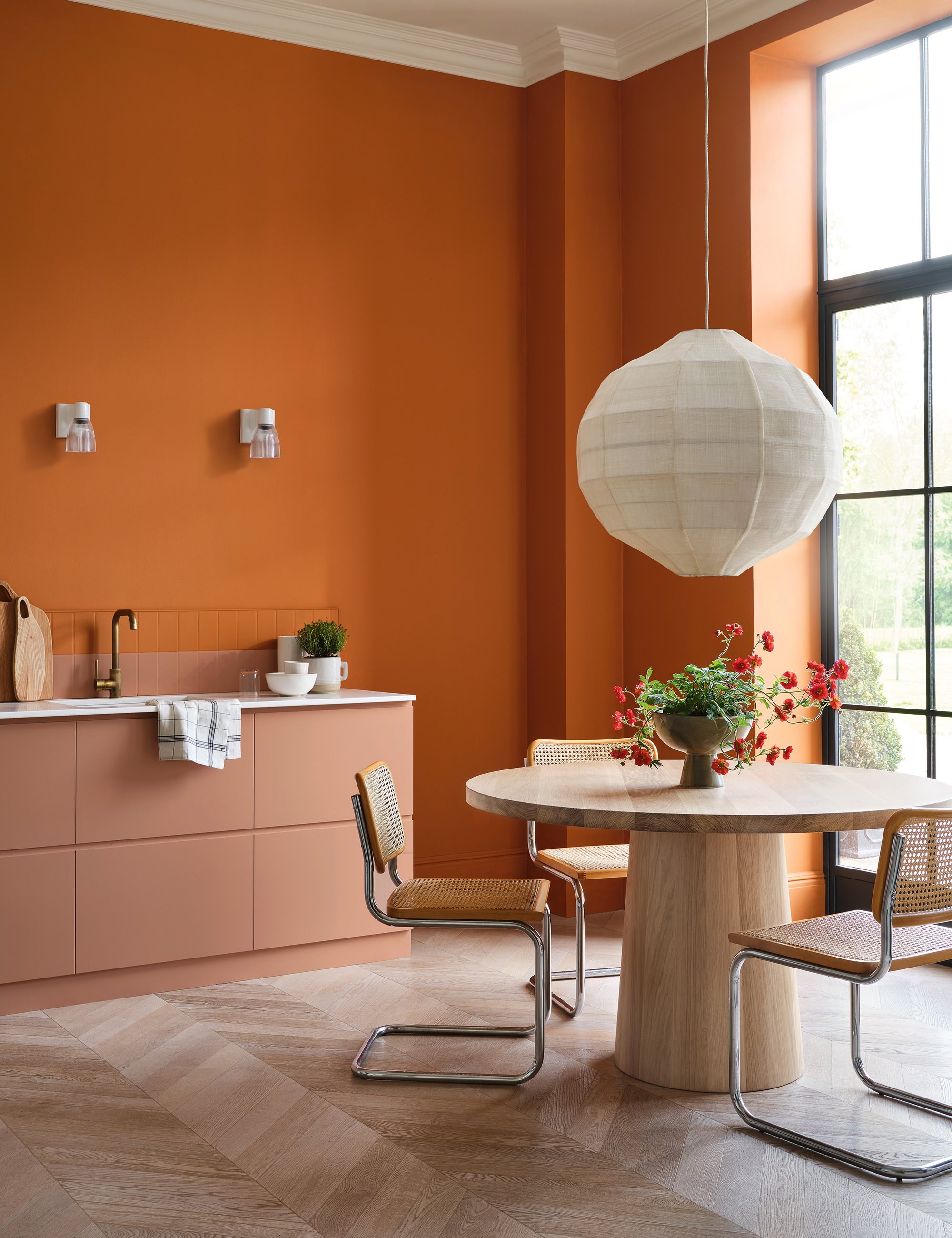
In Martha Stewart’s Lily Pond Lane home, that logic is gently inverted. The richest, grounded shades of burnt orange and warm terracotta anchor the lower walls, while the palette eases upward into softer apricot and peach tones, finishing with a ceiling so pale it evokes the first light of morning. The result is striking yet balanced, with the space feeling anchored at floor level yet open and airy above.
It is no surprise that America’s favorite TV personality was ahead of the curve with her daring orange three-season room. This space embodies the essence of reverse color capping. The darker lower walls provide weight and presence, while the lighter upper tones lift the room, creating harmony without diminishing the energy of the bold palette. The gradient mirrors the natural flow of light, rising gently and dispersing throughout the space.
Bright colors add personality to a home, and decorating with orange is a perfect choice for this color trend. It brings warmth and energy during the day and creates a cozy, inviting atmosphere in the evening. When layered tonally or paired with a contrasting shade, such as teal, as Martha has done, it achieves a vibrant yet sophisticated look.
Martha Stewart’s three-season room demonstrates how interior design trends evolve in expert hands. It captures the principles of color capping – tonal immersion, ceiling inclusion, and a cohesive palette – but reimagines them with refinement and restraint.
In a design world often dominated by bold statements, Martha’s approach proves that powerful interiors are about balance. Sometimes the most compelling choices combine vivid color with careful layering, allowing space, color, and light to live harmoniously.
Shop the look
You don’t need paint to refresh your space. This fall, add a touch of orange with my curated picks for a subtle pumpkin-spice glow that feels both cozy and chic.
Indulge in luxury with the Mauree pillow, crafted in sumptuous velvet and finished with a delicate ruffled flange. Its solid design provides the perfect balance, creating a glamorous yet refined accent for any space. Soft to the touch and rich in texture, this pillow elevates layered interiors with effortless sophistication.
Add a pop of warm, autumnal charm to your dining space with the Madeline Table Runner in Pumpkin. Crafted from soft cotton, this runner features a scalloped edge and delicate embroidery, offering a playful yet sophisticated touch. Its rich orange hue brings a cozy, inviting feel to any table setting.
Add understated elegance to any space with the Idris Vase. Its classic, rounded silhouette and stoneware construction create dimension in your décor, while the dripped warm-hued glaze brings a touch of unique, artisanal beauty to every vignette. Perfect for fresh blooms or as a standalone accent piece.
Introduced by Benjamin Moore’s team, this color trend is taking the interiors world by storm, but will you take the plunge?