We've been debating recently the difference between rebrand vs brand refresh. Perhaps, we can now add a new term to muddy the waters further: a 'brand reinforcement'.
Coca-Cola's update of the visual identity for its Bodyarmor sports drink feels like more than a mere refresh, but it isn't going as far as to rebrand its strategy or values: it's amplifying them.
“Over the years, the landscape has evolved but our DNA remains the same – bold, authentic, and unapologetically real," says chief marketing officer Tom Gargiulo. "This new visual identity is not just about a fresh look, it’s about reinforcing who we are and where we’re headed."
At the heart of that reinforcement, there's one key weapon that seems so obvious now that the brand's made the change.
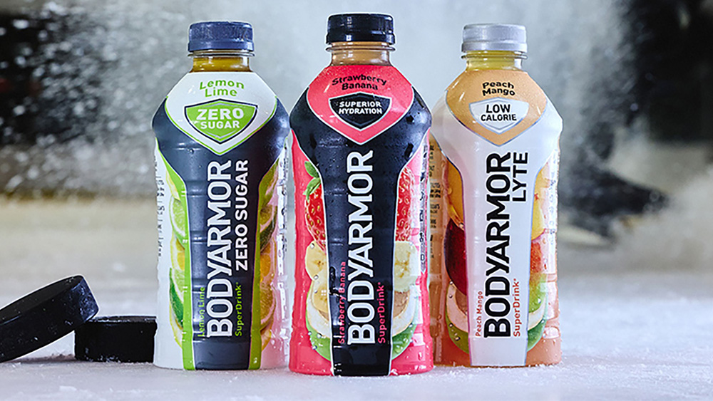
The bodyarmor brand reinforcement as I've decided to call it includes a streamlined new logo. It might be hard to spot the subtle differences, but the serifs on the logotype have been refined – some dropped and others lengthened – for a more modern and dynamic feel (compare to the old design below).
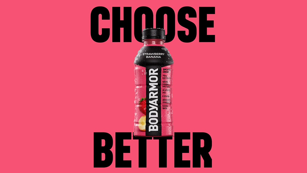
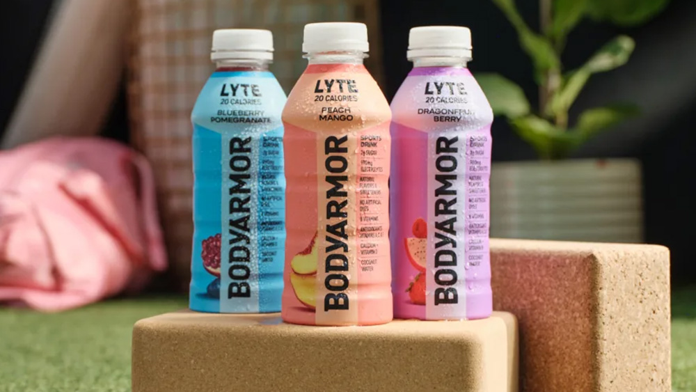
The packaging design has been updated too. A simpler, straighter shield motif makes the flavour description stand out more. But the most significant change is that a list of details about ingredients and nutrition now takes pride of place on the front of the packaging.
This changes feels like a nobrainer for what's supposed to be a functional performance drink. Athletes aren't just looking to quench their thirst – water will do that. They're looking for vitamins, electrolytes, and increasingly for natural rather than artificial ingredients.
Some energy drinks make a brief claim on the front of the bottle emphasising 'hydration' or briefly mentioning electrolytes, but they don't tend to go any further, all leading to the suspicion that they're just sugar water.
Bodyarmor now highlights that it's made with coconut water and with natural flavors and sweeteners, vitamins. It even gives the exact amount electrolytes.
That might sound like waffle to some customers, but putting these claims up front is a strong weapon in the battle for gymgoers and athletes' attentions. If the product's all about the science of hydration, why hide the science on the back?
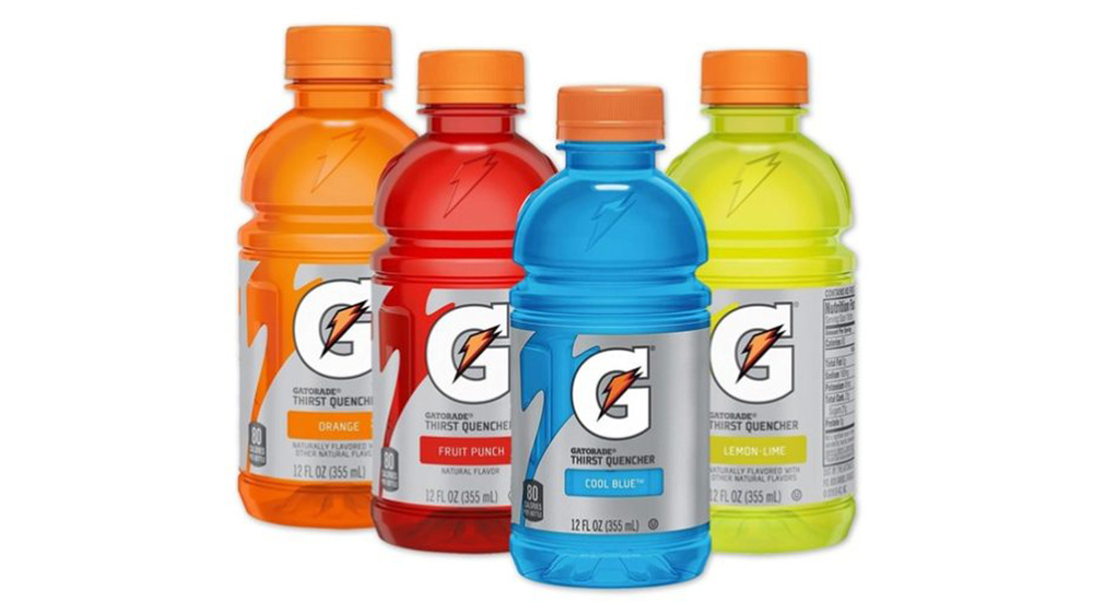
Bodyarmor's new tagline, 'Choose Better', reflects this focus. It could be read as suggesting that the product is superior to its main rivals, PepsiCo's market-leading Gatorade and Coca-Cola's own cheaper brand Powerade. Or it could also be read as a critique of consumers' own behaviour – imploring us to make a better decision.
Devised by Jones Knowles Ritchie, the new visual identity also rocks a cleaner colour palette and more modern images of fruit to reflect that natural ingredients claim. The flavour description has been made to stand out since the brand's more unusual combinations, like strawberry banana and peach mango, are another part of what makes it stand out against other brands.
The rebrand / refresh / reinforcement is being launched with a major ad campaign. A TV spot created by Bodyarmor’s in-house team and Cartwright shows athletes training like drones in a dystopian underground world with a toxic-orange sports drink beside them while up in the natural world outside, people train with Bodyarmor.
It feels a bit like it's going for the vibe of Apple's famous 1984 ad, though it doesn't hit like that piece did (literally). It's interesting though that it marks a change from using celebrity athletes to showing everyday people choosing the product and breaking out of routines.
That's not to say there won't be big names involved too. Connor McDavid, Sabrina Ionescu, Joe Burrow and CeeDee Lamb are all on board for the campaign.
Back in 1991 Gatorade, shook up the energy drinks market with its Michael Jordan campaign, Be Like Mike. Since then, the market has matured and consumers are now much more informed and savvy. A different approach focusing on the actual product could give Bodyarmor the offensive edge.
For more branding news, see the proposed new Microsoft Office icons and the hand-carved new Corona beer advert. Also see why one agency hates the word rebrand.